

Android App中DrawerLayout抽屉效果的菜单编写实例_php技巧

抽屉效果的导航菜单
看了很多应用,觉得这种侧滑的抽屉效果的菜单很好。

不用切换到另一个页面,也不用去按菜单的硬件按钮,直接在界面上一个按钮点击,菜单就滑出来,而且感觉能放很多东西。
库的引用:
首先, DrawerLayout这个类是在Support Library里的,需要加上android-support-v4.jar这个包。
然后程序中用时在前面导入import android.support.v4.widget.DrawerLayout;
如果找不到这个类,首先用SDK Manager更新一下Android Support Library,然后在Android SDK\extras\android\support\v4路径下找到android-support-v4.jar,复制到项目的libs路径,将其Add to Build Path.
代码1
布局:
<RelativeLayout xmlns:android="http://schemas.android.com/apk/res/android"
  xmlns:tools="http://schemas.android.com/tools"
  android:layout_width="match_parent"
  android:layout_height="match_parent" >

  <android.support.v4.widget.DrawerLayout
    xmlns:android="http://schemas.android.com/apk/res/android"
    android:id="@+id/drawer_layout"
    android:layout_width="match_parent"
    android:layout_height="match_parent" >

    <!-- The main content view -->
    <!-- main content must be the first element of DrawerLayout because it will be drawn first and drawer must be on top of it -->

    <FrameLayout
      android:id="@+id/content_frame"
      android:layout_width="match_parent"
      android:layout_height="match_parent" />

    <!-- The navigation drawer -->

    <ListView
      android:id="@+id/left_drawer"
      android:layout_width="240dp"
      android:layout_height="match_parent"
      android:layout_gravity="left"
      android:background="#111"
      android:choiceMode="singleChoice"
      android:divider="@android:color/transparent"
      android:dividerHeight="0dp" />
  </android.support.v4.widget.DrawerLayout>

</RelativeLayout>
DrawerLayout的第一个子元素是主要内容,即抽屉没有打开时显示的布局。这里采用了一个FrameLayout,里面什么也没放。
DrawerLayout的第二个子元素是抽屉中的内容,即抽屉布局,这里采用了一个ListView。
主要的Activity(从官方实例中扒出来的):
package com.example.hellodrawer;
import android.os.Bundle;
import android.app.Activity;
import android.content.res.Configuration;
import android.view.MenuItem;
import android.view.View;
import android.widget.AdapterView;
import android.widget.AdapterView.OnItemClickListener;
import android.widget.ArrayAdapter;
import android.widget.ListView;
import android.support.v4.app.ActionBarDrawerToggle;
import android.support.v4.view.GravityCompat;
import android.support.v4.widget.DrawerLayout;
public class HelloDrawerActivity extends Activity
{
private String[] mPlanetTitles;
private DrawerLayout mDrawerLayout;
private ActionBarDrawerToggle mDrawerToggle;
private ListView mDrawerList;
@Override
public void onCreate(Bundle savedInstanceState)
{
super.onCreate(savedInstanceState);
setContentView(R.layout.activity_hello_drawer);
mDrawerLayout = (DrawerLayout) findViewById(R.id.drawer_layout);
// init the ListView and Adapter, nothing new
initListView();
// set a custom shadow that overlays the main content when the drawer
// opens
mDrawerLayout.setDrawerShadow(R.drawable.drawer_shadow,
GravityCompat.START);
mDrawerToggle = new ActionBarDrawerToggle(this, mDrawerLayout,
R.drawable.ic_drawer, R.string.drawer_open,
R.string.drawer_close)
{
/** Called when a drawer has settled in a completely closed state. */
public void onDrawerClosed(View view)
{
invalidateOptionsMenu(); // creates call to
// onPrepareOptionsMenu()
}
/** Called when a drawer has settled in a completely open state. */
public void onDrawerOpened(View drawerView)
{
invalidateOptionsMenu(); // creates call to
// onPrepareOptionsMenu()
}
};
// Set the drawer toggle as the DrawerListener
mDrawerLayout.setDrawerListener(mDrawerToggle);
// enable ActionBar app icon to behave as action to toggle nav drawer
getActionBar().setDisplayHomeAsUpEnabled(true);
// getActionBar().setHomeButtonEnabled(true);
// Note: getActionBar() Added in API level 11
}
private void initListView()
{
mDrawerList = (ListView) findViewById(R.id.left_drawer);
mPlanetTitles = getResources().getStringArray(R.array.planets_array);
// Set the adapter for the list view
mDrawerList.setAdapter(new ArrayAdapter<String>(this,
R.layout.list_item, mPlanetTitles));
// Set the list's click listener
mDrawerList.setOnItemClickListener(new OnItemClickListener()
{
@Override
public void onItemClick(AdapterView<?> parent, View view,
int position, long id)
{
// Highlight the selected item, update the title, and close the
// drawer
mDrawerList.setItemChecked(position, true);
setTitle(mPlanetTitles[position]);
mDrawerLayout.closeDrawer(mDrawerList);
}
});
}
@Override
protected void onPostCreate(Bundle savedInstanceState)
{
super.onPostCreate(savedInstanceState);
// Sync the toggle state after onRestoreInstanceState has occurred.
mDrawerToggle.syncState();
}
@Override
public void onConfigurationChanged(Configuration newConfig)
{
super.onConfigurationChanged(newConfig);
mDrawerToggle.onConfigurationChanged(newConfig);
}
@Override
public boolean onOptionsItemSelected(MenuItem item)
{
// Pass the event to ActionBarDrawerToggle, if it returns
// true, then it has handled the app icon touch event
if (mDrawerToggle.onOptionsItemSelected(item))
{
return true;
}
// Handle your other action bar items...
return super.onOptionsItemSelected(item);
}
}
比较纠结的是用了Level 11的一个API,这样minSdkVersion就有限制,不能太低。
图片资源Android官网示例处提供下载了。
程序运行后效果如下:
抽屉打开前:

抽屉打开后:

代码2
今天又看了一下DrawerLayout的类,发现有很多方法可以直接用的。
重新试了一下,其实不用上面那么麻烦,随便自己定义一个按钮控制抽屉的打开就行:
布局:
<RelativeLayout xmlns:android="http://schemas.android.com/apk/res/android"
  xmlns:tools="http://schemas.android.com/tools"
  android:layout_width="match_parent"
  android:layout_height="match_parent"
  android:paddingBottom="@dimen/activity_vertical_margin"
  android:paddingLeft="@dimen/activity_horizontal_margin"
  android:paddingRight="@dimen/activity_horizontal_margin"
  android:paddingTop="@dimen/activity_vertical_margin"
  tools:context=".DrawerActivity" >

  <android.support.v4.widget.DrawerLayout
    android:id="@+id/drawer_layout"
    android:layout_width="match_parent"
    android:layout_height="match_parent" >

    <!-- The main content view -->

    <FrameLayout
      android:id="@+id/content_frame"
      android:layout_width="match_parent"
      android:layout_height="match_parent" >

      <Button
        android:id="@+id/btn"
        android:layout_width="match_parent"
        android:layout_height="wrap_content"
        android:text="open"
        />
    </FrameLayout>

    <!-- The navigation drawer -->

    <ListView
      android:id="@+id/left_drawer"
      android:layout_width="240dp"
      android:layout_height="match_parent"
      android:layout_gravity="start"
      android:background="#111"
      android:choiceMode="singleChoice"
      android:divider="@android:color/transparent"
      android:dividerHeight="0dp" />
  </android.support.v4.widget.DrawerLayout>

</RelativeLayout>
主要代码:
package com.example.hellodrawer;

import android.os.Bundle;
import android.app.Activity;
import android.support.v4.widget.DrawerLayout;
import android.view.Gravity;
import android.view.View;
import android.view.View.OnClickListener;
import android.widget.Button;

public class DrawerActivity extends Activity
{
  private DrawerLayout mDrawerLayout = null;

  @Override
  protected void onCreate(Bundle savedInstanceState)
  {
    super.onCreate(savedInstanceState);
    setContentView(R.layout.activity_drawer);

    mDrawerLayout = (DrawerLayout) findViewById(R.id.drawer_layout);

    Button button = (Button) findViewById(R.id.btn);
    button.setOnClickListener(new OnClickListener()
    {

      @Override
      public void onClick(View v)
      {
        // 按钮按下,将抽屉打开
        mDrawerLayout.openDrawer(Gravity.LEFT);

      }
    });
  }

}
使用Toolbar + DrawerLayout快速实现高大上菜单侧滑
如果你有在关注一些遵循最新的Material Design设计规范的应用的话(如果没有,假设你有!),也许会发现有很多使用了看起来很舒服、很高大上的侧滑菜单动画效果,示例如下(via 参考2):

今天就来使用官方支持库来快速实现这类效果,需要使用到Toolbar和DrawerLayout,详细步骤如下:(如果你还不知道这两个Widget,先自己Google吧~)
首先需要添加appcompat-v7支持:
如果是在Android Studio 1.0 RC4上创建的项目,默认已经添加了appcompat-v7支持了,如果不是最新版AS则需要在build.gradle中添加如下代码:
dependencies {
  ...//其他代码
  compile 'com.android.support:appcompat-v7:21.0.2'
}
添加完成后需要同步一下gradle
添加Toolbar:
由于Toolbar是继承自View,所以可以像其他标准控件一样直接主布局文件添加Toolbar,但是为了提高Toolbar的重用效率,可以在layout创建一个custom_toolbar.xml代码如下:
<?xml version="1.0" encoding="utf-8"?>
<android.support.v7.widget.Toolbar xmlns:android="http://schemas.android.com/apk/res/android"
xmlns:app="http://schemas.android.com/apk/res-auto"
android:id="@+id/tl_custom"
android:layout_width="match_parent"
android:layout_height="wrap_content"
android:background="?attr/colorPrimary"
android:minHeight="?attr/actionBarSize"
android:popupTheme="@style/ThemeOverlay.AppCompat.Light"
app:theme="@style/ThemeOverlay.AppCompat.ActionBar">
</android.support.v7.widget.Toolbar>
说明:
android.support.v7.widget.Toolbar - 当然如果只在Lollipop中可以直接使用Toolbar而不需要加上v7支持
xmlns:app - 自定义xml命名控件,在AS中可以直接指定res-auto而不需要使用完整包名
android:background 和 android:minHeight 均可以在styles.xml中声明
添加DrawerLayout:
和Toolbar类似,为了提高代码重用效率,可以在layout中创建一个custom_drawerlayout.xml代码如下:
<?xml version="1.0" encoding="utf-8"?>
<android.support.v4.widget.DrawerLayout xmlns:android="http://schemas.android.com/apk/res/android"
android:id="@+id/dl_left"
android:layout_width="match_parent"
android:layout_height="match_parent">
<!--主布局-->
<LinearLayout
android:layout_width="match_parent"
android:layout_height="match_parent">
<ImageView
android:id="@+id/iv_main"
android:layout_width="100dp"
android:layout_height="100dp" />
</LinearLayout>
<!--侧滑菜单-->
<LinearLayout
android:layout_width="match_parent"
android:layout_height="match_parent"
android:background="#fff"
android:layout_gravity="start">
<ListView
android:id="@+id/lv_left_menu"
android:layout_width="match_parent"
android:layout_height="match_parent"
android:divider="@null"
android:text="DrawerLayout" />
</LinearLayout>
</android.support.v4.widget.DrawerLayout>
Drawerlayout标签中有两个子节点,一个是左边菜单,一个是主布局,另外需要在左边菜单起始位置设置为android:layout_gravity="start"
实现activity_main.xml:
<LinearLayout xmlns:android="http://schemas.android.com/apk/res/android"
  xmlns:tools="http://schemas.android.com/tools"
  android:layout_width="match_parent"
  android:layout_height="match_parent"
  android:orientation="vertical"
  tools:context=".MainActivity">
    <!--Toolbar-->
    <include layout="@layout/custom_toolbar" />
    <!--DrawerLayout-->
    <include layout="@layout/custom_drawerlayout" />
</LinearLayout>
直接使用include标签,简洁明了
完善Java代码:
public class MainActivity extends ActionBarActivity {
  //声明相关变量
  private Toolbar toolbar;
  private DrawerLayout mDrawerLayout;
  private ActionBarDrawerToggle mDrawerToggle;
  private ListView lvLeftMenu;
  private String[] lvs = {"List Item 01", "List Item 02", "List Item 03", "List Item 04"};
  private ArrayAdapter arrayAdapter;
  private ImageView ivRunningMan;
  private AnimationDrawable mAnimationDrawable;
  @Override
  protected void onCreate(Bundle savedInstanceState) {
    super.onCreate(savedInstanceState);
    setContentView(R.layout.activity_main);
    findViews(); //获取控件
    //京东RunningMan动画效果,和本次Toolbar无关
    mAnimationDrawable = (AnimationDrawable) ivRunningMan.getBackground();
    mAnimationDrawable.start();
    toolbar.setTitle("Toolbar");//设置Toolbar标题
    toolbar.setTitleTextColor(Color.parseColor("#ffffff")); //设置标题颜色
    setSupportActionBar(toolbar);
    getSupportActionBar().setHomeButtonEnabled(true); //设置返回键可用
    getSupportActionBar().setDisplayHomeAsUpEnabled(true);
    //创建返回键,并实现打开关/闭监听
    mDrawerToggle = new ActionBarDrawerToggle(this, mDrawerLayout, toolbar, R.string.open, R.string.close) {
      @Override
      public void onDrawerOpened(View drawerView) {
        super.onDrawerOpened(drawerView);
        mAnimationDrawable.stop();
      }
      @Override
      public void onDrawerClosed(View drawerView) {
        super.onDrawerClosed(drawerView);
        mAnimationDrawable.start();
      }
    };
    mDrawerToggle.syncState();
    mDrawerLayout.setDrawerListener(mDrawerToggle);
    //设置菜单列表
    arrayAdapter = new ArrayAdapter(this, android.R.layout.simple_list_item_1, lvs);
    lvLeftMenu.setAdapter(arrayAdapter);
  }
  private void findViews() {
    ivRunningMan = (ImageView) findViewById(R.id.iv_main);
    toolbar = (Toolbar) findViewById(R.id.tl_custom);
    mDrawerLayout = (DrawerLayout) findViewById(R.id.dl_left);
    lvLeftMenu = (ListView) findViewById(R.id.lv_left_menu);
  }
}
当然比较重要还有styles.xml和colors.xml,具体如下:
<resources>
<style name="AppTheme" parent="Theme.AppCompat.Light.NoActionBar">
<!--状态栏颜色-->
<item name="colorPrimaryDark">@color/Indigo_colorPrimaryDark</item>
<!--Toolbar颜色-->
<item name="colorPrimary">@color/Indigo_colorPrimary</item>
<!--返回键样式-->
<item name="drawerArrowStyle">@style/AppTheme.DrawerArrowToggle</item>
</style>
<style name="AppTheme.DrawerArrowToggle" parent="Base.Widget.AppCompat.DrawerArrowToggle">
<item name="color">@android:color/white</item>
</style>
</resources>
<?xml version="1.0" encoding="utf-8"?>
<resources>
<color name="Indigo_colorPrimaryDark">#303f9f</color>
<color name="Indigo_colorPrimary">#3f51b5</color>
<color name="Indigo_nav_color">#4675FF</color>
</resources>
到此就实现了高大上菜单侧滑,最终效果如下(注:在Yosemite上貌似直接Record手机屏幕貌似不起作用,而且动画由于帧率原因无法实时,就先这样看吧~)


Heiße KI -Werkzeuge

Undresser.AI Undress
KI-gestützte App zum Erstellen realistischer Aktfotos

AI Clothes Remover
Online-KI-Tool zum Entfernen von Kleidung aus Fotos.

Undress AI Tool
Ausziehbilder kostenlos

Clothoff.io
KI-Kleiderentferner

AI Hentai Generator
Erstellen Sie kostenlos Ai Hentai.

Heißer Artikel
Heiße Werkzeuge

Notepad++7.3.1
Einfach zu bedienender und kostenloser Code-Editor

SublimeText3 chinesische Version
Chinesische Version, sehr einfach zu bedienen

Senden Sie Studio 13.0.1
Leistungsstarke integrierte PHP-Entwicklungsumgebung

Dreamweaver CS6
Visuelle Webentwicklungstools

SublimeText3 Mac-Version
Codebearbeitungssoftware auf Gottesniveau (SublimeText3)
Heiße Themen
 1378
1378
 52
52

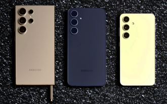
 Neuer Bericht liefert eine vernichtende Einschätzung der angeblichen Kamera-Upgrades für das Samsung Galaxy S25, Galaxy S25 Plus und Galaxy S25 Ultra
Sep 12, 2024 pm 12:23 PM
Neuer Bericht liefert eine vernichtende Einschätzung der angeblichen Kamera-Upgrades für das Samsung Galaxy S25, Galaxy S25 Plus und Galaxy S25 Ultra
Sep 12, 2024 pm 12:23 PM
In den letzten Tagen hat Ice Universe immer wieder Details zum Galaxy S25 Ultra enthüllt, von dem allgemein angenommen wird, dass es das nächste Flaggschiff-Smartphone von Samsung ist. Der Leaker behauptete unter anderem, Samsung plane nur ein Kamera-Upgrade
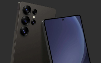 Beim Samsung Galaxy S25 Ultra sind erste Renderbilder durchgesickert und Gerüchte über Designänderungen wurden enthüllt
Sep 11, 2024 am 06:37 AM
Beim Samsung Galaxy S25 Ultra sind erste Renderbilder durchgesickert und Gerüchte über Designänderungen wurden enthüllt
Sep 11, 2024 am 06:37 AM
OnLeaks hat sich nun mit Android Headlines zusammengetan, um einen ersten Blick auf das Galaxy S25 Ultra zu werfen, nur wenige Tage nach dem gescheiterten Versuch, mehr als 4.000 US-Dollar von seinen X-Followern (ehemals Twitter) zu generieren. Für den Kontext sind die unten eingebetteten Renderbilder h
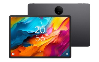 IFA 2024 | Das NXTPAPER 14 von TCL wird in der Leistung nicht mit dem Galaxy Tab S10 Ultra mithalten können, in der Größe aber fast
Sep 07, 2024 am 06:35 AM
IFA 2024 | Das NXTPAPER 14 von TCL wird in der Leistung nicht mit dem Galaxy Tab S10 Ultra mithalten können, in der Größe aber fast
Sep 07, 2024 am 06:35 AM
Neben der Ankündigung zweier neuer Smartphones hat TCL auch ein neues Android-Tablet namens NXTPAPER 14 angekündigt, dessen riesige Bildschirmgröße eines seiner Verkaufsargumente ist. Das NXTPAPER 14 verfügt über Version 3.0 der matten LCD-Panels der Signaturmarke von TCL
 Das Vivo Y300 Pro bietet einen 6.500-mAh-Akku in einem schlanken 7,69-mm-Gehäuse
Sep 07, 2024 am 06:39 AM
Das Vivo Y300 Pro bietet einen 6.500-mAh-Akku in einem schlanken 7,69-mm-Gehäuse
Sep 07, 2024 am 06:39 AM
Das Vivo Y300 Pro wurde gerade vollständig vorgestellt und ist eines der schlanksten Mittelklasse-Android-Telefone mit einem großen Akku. Genauer gesagt ist das Smartphone nur 7,69 mm dick, verfügt aber über einen 6.500 mAh starken Akku. Dies ist die gleiche Kapazität wie bei der kürzlich eingeführten Version
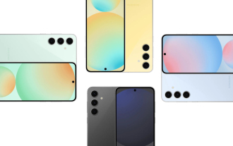 Das Samsung Galaxy S24 FE soll in vier Farben und zwei Speicheroptionen für weniger als erwartet auf den Markt kommen
Sep 12, 2024 pm 09:21 PM
Das Samsung Galaxy S24 FE soll in vier Farben und zwei Speicheroptionen für weniger als erwartet auf den Markt kommen
Sep 12, 2024 pm 09:21 PM
Samsung hat noch keine Hinweise darauf gegeben, wann es seine Smartphone-Serie Fan Edition (FE) aktualisieren wird. Derzeit ist das Galaxy S23 FE nach wie vor die jüngste Ausgabe des Unternehmens und wurde Anfang Oktober 2023 vorgestellt
 Neuer Bericht liefert eine vernichtende Einschätzung der angeblichen Kamera-Upgrades für das Samsung Galaxy S25, Galaxy S25 Plus und Galaxy S25 Ultra
Sep 12, 2024 pm 12:22 PM
Neuer Bericht liefert eine vernichtende Einschätzung der angeblichen Kamera-Upgrades für das Samsung Galaxy S25, Galaxy S25 Plus und Galaxy S25 Ultra
Sep 12, 2024 pm 12:22 PM
In den letzten Tagen hat Ice Universe immer wieder Details zum Galaxy S25 Ultra enthüllt, von dem allgemein angenommen wird, dass es das nächste Flaggschiff-Smartphone von Samsung ist. Der Leaker behauptete unter anderem, Samsung plane nur ein Kamera-Upgrade
 Xiaomi Redmi Note 14 Pro Plus erscheint als erstes Qualcomm Snapdragon 7s Gen 3 Smartphone mit Light Hunter 800 Kamera
Sep 27, 2024 am 06:23 AM
Xiaomi Redmi Note 14 Pro Plus erscheint als erstes Qualcomm Snapdragon 7s Gen 3 Smartphone mit Light Hunter 800 Kamera
Sep 27, 2024 am 06:23 AM
Das Redmi Note 14 Pro Plus ist nun offiziell als direkter Nachfolger des letztjährigen Redmi Note 13 Pro Plus (aktuell 375 $ bei Amazon) erhältlich. Wie erwartet steht das Redmi Note 14 Pro Plus neben dem Redmi Note 14 und dem Redmi Note 14 Pro an der Spitze der Redmi Note 14-Serie. Li
 iQOO Z9 Turbo Plus: Die Reservierungen für das möglicherweise aufgepeppte Serien-Flaggschiff beginnen
Sep 10, 2024 am 06:45 AM
iQOO Z9 Turbo Plus: Die Reservierungen für das möglicherweise aufgepeppte Serien-Flaggschiff beginnen
Sep 10, 2024 am 06:45 AM
Die Schwestermarke von OnePlus, iQOO, hat einen Produktzyklus von 2023 bis 2024, der möglicherweise fast abgeschlossen ist. Dennoch hat die Marke erklärt, dass sie mit ihrer Z9-Serie noch nicht fertig sei. Seine letzte und möglicherweise hochwertigste Turbo+-Variante wurde gerade wie vorhergesagt angekündigt. T
