

CSS3, um einen animierten Fahrradeffekt zu erzielen
Dieses Mal bringe ich Ihnen CSS3, um den animierten Fahrradeffekt zu realisieren. Was sind die Vorsichtsmaßnahmen, um den animierten Fahrradeffekt mit CSS3 zu realisieren?
Werfen wir zunächst einen Blick auf die implementierten Renderings (statisch):
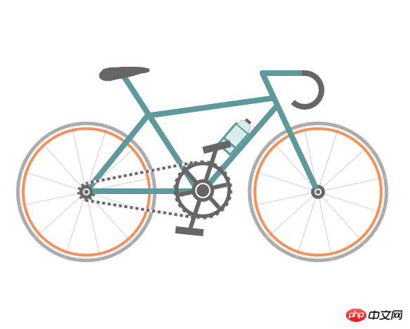
Instanz-Quellcode:
<!DOCTYPE html>
<html>
 <head>
  <meta charset="UTF-8">
  <title>自行车</title>
  <style type="text/css">
   * {
    margin: 0;
    padding: 0
   }

   ol,
   ul {
    list-style: none/*去掉圆点或数字*/
   }

   .cycle-outer {
    width: 534px;
    height: 260px;
    position: absolute;
    /*绝对定位*/
    top: 50%;
    /*距离顶部*/
    margin: -160px 0 0 -267px;
    /*距离外边距*/
    left: 50%;
   }

   .cycle-wrapper {
    width: 534px;
    height: 260px;
    margin: 0 auto;
    position: relative;
    /*相对定位*/
   }

   .cycle-wheel-front {
    /*前轮*/
    margin: 100px 0 0 330px;
   }

   .cycle-wheel-back {
    /*后轮*/
    margin: 100px 0 0 0px;
   }

   .cycle-wheel-outer {
    background: transparent;
    border: 5px solid #aaa;
    border-radius: 50%;
    /*画外轮圆圈*/
    width: 190px;
    height: 190px;
    position: absolute;
    margin-top: 5px;
    animation: wheel-rotate 2s linear infinite;
    /*定义动画*/
   }
   /*轮胎开始旋转*/
   @keyframes wheel-rotate {
    from {
     transform: rotate(0deg);
    }
    to {
     transform: rotate(360deg);
    }
   }

   .cycle-wheel-outer:after {
    /*插入内轮胎圆圈*/
    background: transparent;
    border: 4px solid #EF9058;
    border-radius: 50%;
    width: 176px;
    height: 176px;
    position: absolute;
    margin: 3px;
    content: "";
   }

   .spoke {
    /*开始画车轮线条*/
    position: absolute;
    width: 1px;
    height: 200px;
    background: #ccc;
    margin: -5px 0 0 95px;
    z-index: 0;
   }

   .spoke:after {
    /*在后面插入两条*/
    content: "";
    position: absolute;
    width: 1px;
    height: 200px;
    background: #ccc;
    transform: rotate(120deg);
   }

   .spoke:before {
    /*在前面插入两条*/
    content: "";
    position: absolute;
    width: 1px;
    height: 200px;
    background: #ccc;
    transform: rotate(240deg);
   }
   /*轮胎线条完成*/

   .spoke-container li:nth-child(2) {
    /*中心点旋转*/
    transform: rotate(30deg);
   }

   .inner-disc {
    /*画中心轴圆点*/
    background: #666;
    width: 20px;
    height: 20px;
    border-radius: 50%;
    position: absolute;
    left: 50%;
    margin: -10px 0 0 -10px;
    top: 50%;
   }
   /*.cycle-wheel-back .inner-disc:after {
    content: "";
    background: #666;
    width: 20px;
    height: 20px;
    border-radius: 50%;
    position: absolute;
    left: 50%;
    margin: -10px 0 0 -10px;
    top: 50%;
   }*/

   .inner-disc-2 {
    /*画轮胎中心轴的圆圈*/
    background: transparent;
    width: 6px;
    height: 6px;
    border: 2px solid #FFF;
    border-radius: 50%;
    position: absolute;
    left: 50%;
    margin: -5px 0 0 -5px;
    top: 50%;
   }

   .cycle-wheel-back .inner-disc-2:after {
    /*插入后轮轴心齿轮*/
    content: "";
    background: transparent;
    width: 18px;
    height: 18px;
    border-radius: 50%;
    position: absolute;
    left: 50%;
    margin: -13px 0 0 -13px;
    top: 50%;
    border: 4px dotted #666;
   }
   .cycle-body {
    margin-left: 125px;
   }
   .front-wheel-frame {/*前叉*/
    background: #5E999B;
    width: 8px;
    height: 180px;
    position: absolute;
    z-index: 2;
    transform: rotate(-25deg);
    margin: -72px 0 0 260px;
   }
   .top-frame {/*上管*/
    background: #5E999B;
    width: 180px;
    height: 8px;
    position: absolute;
    z-index: 2;
    margin: -20px 0 0 62px;
    transform: rotate(-8deg);
   }
   .front-frame {/*下管*/
    background: #5E999B;
    width: 8px;
    height: 160px;
    position: absolute;
    z-index: 2;
    transform: rotate(41deg);
    margin: -36px 0 0 189px;
   }
   .center-frame { /*坐杆*/
    background: #5E999B;
    width: 8px;
    height: 205px;
    position: absolute;
    z-index: 2;
    transform: rotate(-33deg);
    margin: -84px 0 0 75px;
   }
   .back-frame {/*后管*/
    background: #5E999B;
    width: 8px;
    height: 136px;
    position: absolute;
    z-index: 2;
    transform: rotate(39deg);
    margin: -23px 0 0 19px;
   }
   .bottom-frame {/*后叉or平管*/
    background: #5E999B;
    width: 159px;
    height: 8px;
    position: absolute;
    z-index: 2;
    margin: 100px 0 0 -16px;
   }
   .handlebar-front {/*车把*/
    width: 60px;
    height: 8px;
    background: #5E999B;
    z-index: 2;
    position: absolute;
    margin: -68px 0 0 222px;
    border-top-left-radius: 3px;
    border-bottom-left-radius: 3px;
   }
   .handlebar-curve {/*车把手*/
    width: 40px;
    height: 40px;
    border: 8px solid #666;
    border-top-right-radius: 100%;
    border-bottom-right-radius: 100%;
    border-bottom-left-radius: 100%;
    background: transparent;
    position: absolute;
    margin: -68px 0 0 258px;
    border-left: 8px solid transparent;
    border-top: 8px solid #666;
    border-bottom: 8px solid #666;
   }
   /*座垫*/
   .seat {
    width: 50px;
    height: 10px;
    background: #666;
    border-radius: 44%;
    position: absolute;
    margin: -73px 0 0 15px;
   }

   .seat:after {
    width: 0px;
    height: 0px;
    border-style: solid;
    border-width: 0 40px 16px 40px;
    border-color: transparent transparent #666 transparent;
    content: "";
    position: absolute;
    z-index: 3;
    transform: rotate(-12deg);
    position: absolute;
    border-radius: 100%;
    margin: 0 0 0 -26px;
   }
   .seat:before {
    width: 0px;
    height: 0px;
    border-style: solid;
    border-width: 0 40px 16px 40px;
    border-color: transparent transparent #666 transparent;
    content: "";
    position: absolute;
    z-index: 3;
    transform: rotate(179deg);
    position: absolute;
    border-radius: 100%;
    margin: 0 0 0 -26px;
   }
   .seat span {
    width: 32px;
    height: 19px;
    background: #666;
    border-radius: 100%;
    position: absolute;
    margin: 1px 0 0 -22px;
    transform: rotate(-11deg);
   }
   /*去掉中心轴的*/
   .chain-rotation {
    position: absolute;
    z-index: 16;
   }
   /*中心轴*/
   .chain-disc-inner {
    background: #666;
    width: 18px;
    height: 18px;
    border-radius: 50%;
    position: absolute;
    margin: 2px;
    z-index: 4;
   }
   .chain-disc-outer {
    background: #FFF;
    width: 22px;
    height: 22px;
    border: 5px solid #666;
    border-radius: 50%;
    position: absolute;
    margin: 87px 0 0 250px;
    z-index: 3;
    content: "";
   }
   /*牙盘*/
   .chain-rods {
    height: 70px;
    width: 6px;
    background: #666;
    position: absolute;
    margin: 67px 0 0 263px;
    z-index: 15;
    animation: wheel-rotate 2s linear infinite;
   }
   .chain-rods:before {
    content: "";
    height: 70px;
    width: 6px;
    background: #666;
    position: absolute;
    transform: rotate(120deg);
   }
   .chain-rods:after {
    content: "";
    height: 70px;
    width: 6px;
    background: #666;
    position: absolute;
    transform: rotate(240deg);
    -webkit-transform: rotate(240deg);
    -moz-transform: rotate(240deg);
   }
   .outer-axle {
    height: 70px;
    width: 70px;
    border-radius: 50%;
    background: transparent;
    border: 5px solid #666;
    position: absolute;
    margin: 62px 0 0 226px;
    z-index: 3;
   }

   .outer-axle:after {
    content: "";
    height: 74px;
    width: 74px;
    border-radius: 50%;
    background: transparent;
    border: 5px dotted #666;
    margin: -7px;
    position: absolute;
    z-index: 3;
    animation: wheel-rotate 2s linear infinite;
   }
   /*车链子*/
   .chain-up {
    background-color: transparent;
    background-size: 8px 2px;
    background-position: 0 0, 30px 30px;
    width: 155px;
    height: 4px;
    position: absolute;
    z-index: 9;
    background: #EEE;
    transform: rotate(-11deg);
    margin: 76px 0 0 98px;
   }
   .chain-up:before {
    content: "";
    background-color: transparent;
    background-image: linear-gradient(90deg, #666 25%, transparent 25%, transparent 75%, #666 75%, #666);
    background-size: 8px 2px;
    background-position: 0 0, 30px 30px;
    width: 155px;
    height: 4px;
    animation: chainUp 2s linear infinite;
    position: absolute;
    z-index: 10;
   }
   .chain-bottom {
    background-color: transparent;
    background-size: 8px 2px;
    background-position: 0 0, 30px 30px;
    width: 155px;
    height: 4px;
    position: absolute;
    z-index: 9;
    background: #EEE;
    -webkit-transform: rotate(9deg);
    -moz-transform: rotate(9deg);
    transform: rotate(9deg);
    margin: 127px 0 0 98px;
   }

   .chain-bottom:before {
    content: "";
    background-color: transparent;
    background-image: linear-gradient(90deg, #666 25%, transparent 25%, transparent 75%, #666 75%, #666);
    background-size: 8px 2px;
    background-position: 0 0, 30px 30px;
    width: 155px;
    height: 4px;
    animation: chainDown 2s linear infinite;
    position: absolute;
    z-index: 10;
   }
   /*脚踏*/
   .pedal-rod {
    height: 120px;
    width: 6px;
    background: #666;
    position: absolute;
    margin: -25px 0 0 0px;
   }

   .pedal-rod:before {
    width: 40px;
    height: 10px;
    background: #666;
    position: absolute;
    margin: 10px;
    content: "";
    margin: -7px -17px;
    animation: pedal1 2s linear infinite;
   }

   .pedal-rod:after {
    width: 40px;
    height: 10px;
    background: #666;
    position: absolute;
    margin: 10px;
    content: "";
    margin: 119px -17px;
    animation: pedal2 2s linear infinite;
   }
   /*水壶架*/
   .bottle-holder {
    width: 20px;
    height: 36px;
    background: #daeded;
    border: 3px solid #5E999B;
    position: absolute;
    margin: 54px 0 0 -25px;
   }

   .bottle-holder:after {
    width: 20px;
    height: 3px;
    content: "";
    background: #5E999B;
    position: absolute;
    margin: 24px 0 0 0px;
   }
   /*水壶*/
   .bottle-holder:before {
    background-color: #daeded;
    width: 18px;
    height: 10px;
    border-radius: 30% / 100%;
    border-bottom-left-radius: 0;
    border-bottom-right-radius: 0;
    content: "";
    position: absolute;
    margin-top: -13px;
    border: 1px solid #98baba;
    border-bottom: 0;
   }
   .bottle-holder span {
    position: absolute;
    width: 9px;
    height: 4px;
    background: #666;
    margin: -17px 0 0 5px;
   }
   /*车链子动画*/
   @keyframes chainUp {
    0% {
     background-position: 0 25%;
    }
    100% {
     background-position: 100% 0;
    }
   }
   @keyframes chainDown {
    0% {
     background-position: 100% 0;
    }
    100% {
     background-position: 0 25%;
    }
   }
   /*脚踏动画*/
   @keyframes pedal1 {
    0% {
     transform: rotate(00deg);
    }
    25% {
     transform: rotate(-140deg);
    }
    50% {
     transform: rotate(-180deg);
    }
    75% {
     transform: rotate(-240deg);
    }
    100% {
     transform: rotate(-360deg);
    }
   }
   @keyframes pedal2 {
    0% {
     transform: rotate(00deg);
    }
    25% {
     transform: rotate(-60deg);
    }
    50% {
     transform: rotate(-180deg);
    }
    75% {
     transform: rotate(-340deg);
    }
    100% {
     transform: rotate(-360deg);
    }
   }
  </style>
 </head>
 <body>
  <p class="cycle-outer">
   <p class="cycle-wrapper">
    <!--
                 描述:车架
                -->
    <p class="cycle-body">
     <p class="seat">
      <span></span>
     </p>
     <p class="front-wheel-frame"></p>

     <p class="top-frame"></p>
     <p class="front-frame">
      <p class="bottle-holder">
       <span></span>
      </p>
     </p>
     <p class="center-frame"></p>
     <p class="back-frame"></p>
     <p class="bottom-frame"></p>
     <p class="handlebar-front"></p>
     <p class="handlebar-curve"></p>
    </p>
    <!--
                 描述:后轮
                -->
    <p class="cycle-wheel cycle-wheel-back">
     <p class="cycle-wheel-outer">
      <p class="cycle-wheel-inner">
       <p class="cycle-wheel-inner-padding">
        <ul class="spoke-container">
         <li class="spoke"></li>
         <li class="spoke"></li>
        </ul>
        <p class="inner-disc"></p>
        <p class="inner-disc-2"></p>
       </p>
      </p>
     </p>
    </p>
    <!--
                 描述:前轮
                -->
    <p class="cycle-wheel cycle-wheel-front">
     <p class="cycle-wheel-outer">
      <p class="cycle-wheel-inner">
       <p class="cycle-wheel-inner-padding">
        <ul class="spoke-container">
         <li class="spoke"></li>
         <li class="spoke"></li>
        </ul>
        <p class="inner-disc"></p>
        <p class="inner-disc-2"></p>
       </p>
      </p>
     </p>
    </p>
    <!--
                 描述:中心轴  车链子 牙盘 水壶架  水壶   脚踏
                -->
    <p class="chain-up"></p>
    <p class="chain-bottom"></p>
    <p class="chain-rotation">
     <p class="outer-axle"></p>
     <p class="chain-disc-outer">
      <p class="chain-disc-inner"></p>
     </p>
    </p>
    <p class="chain-rods">
     <p class="pedal-rod"></p>
    </p>
   </p>
  </p>
  <p style="text-align:center;clear:both;">
 </body>
</html>Ich glaube, dass Sie die Methode beherrschen, nachdem Sie den Fall in diesem Artikel gelesen haben. Weitere spannende Informationen finden Sie in anderen verwandten Artikeln auf der chinesischen PHP-Website!
Empfohlene Lektüre:
Detaillierte Erklärung der Verwendung des CSS3-Mehrklassenselektors
CSS zum Erstellen von Ripple-Animationen
Erweiterte Verwendung von Hintergrundanhängen in CSS
Das obige ist der detaillierte Inhalt vonCSS3, um einen animierten Fahrradeffekt zu erzielen. Für weitere Informationen folgen Sie bitte anderen verwandten Artikeln auf der PHP chinesischen Website!

Heiße KI -Werkzeuge

Undresser.AI Undress
KI-gestützte App zum Erstellen realistischer Aktfotos

AI Clothes Remover
Online-KI-Tool zum Entfernen von Kleidung aus Fotos.

Undress AI Tool
Ausziehbilder kostenlos

Clothoff.io
KI-Kleiderentferner

Video Face Swap
Tauschen Sie Gesichter in jedem Video mühelos mit unserem völlig kostenlosen KI-Gesichtstausch-Tool aus!

Heißer Artikel
Heiße Werkzeuge

Notepad++7.3.1
Einfach zu bedienender und kostenloser Code-Editor

SublimeText3 chinesische Version
Chinesische Version, sehr einfach zu bedienen

Senden Sie Studio 13.0.1
Leistungsstarke integrierte PHP-Entwicklungsumgebung

Dreamweaver CS6
Visuelle Webentwicklungstools

SublimeText3 Mac-Version
Codebearbeitungssoftware auf Gottesniveau (SublimeText3)
Heiße Themen
 1393
1393
 52
1207
24
52
1207
24

 So verwenden Sie Bootstrap in Vue
Apr 07, 2025 pm 11:33 PM
So verwenden Sie Bootstrap in Vue
Apr 07, 2025 pm 11:33 PM
Die Verwendung von Bootstrap in Vue.js ist in fünf Schritte unterteilt: Startstrap installieren. Bootstrap in main.js. Verwenden Sie die Bootstrap -Komponente direkt in der Vorlage. Optional: benutzerdefinierter Stil. Optional: Verwenden Sie Plug-Ins.
 Die Rollen von HTML, CSS und JavaScript: Kernverantwortung
Apr 08, 2025 pm 07:05 PM
Die Rollen von HTML, CSS und JavaScript: Kernverantwortung
Apr 08, 2025 pm 07:05 PM
HTML definiert die Webstruktur, CSS ist für Stil und Layout verantwortlich, und JavaScript ergibt eine dynamische Interaktion. Die drei erfüllen ihre Aufgaben in der Webentwicklung und erstellen gemeinsam eine farbenfrohe Website.
 So schreiben Sie geteilte Zeilen auf Bootstrap
Apr 07, 2025 pm 03:12 PM
So schreiben Sie geteilte Zeilen auf Bootstrap
Apr 07, 2025 pm 03:12 PM
Es gibt zwei Möglichkeiten, eine Bootstrap -Split -Zeile zu erstellen: Verwenden des Tags, das eine horizontale Split -Linie erstellt. Verwenden Sie die CSS -Border -Eigenschaft, um benutzerdefinierte Style Split -Linien zu erstellen.
 HTML, CSS und JavaScript verstehen: Ein Anfängerhandbuch
Apr 12, 2025 am 12:02 AM
HTML, CSS und JavaScript verstehen: Ein Anfängerhandbuch
Apr 12, 2025 am 12:02 AM
WebdevelopmentRelieSonHtml, CSS und JavaScript: 1) HtmlStructuresContent, 2) CSSstylesit und 3) JavaScriptaddssinteraktivität, Bildung von TheBasisofModerernwebexperiences.
 So richten Sie das Framework für Bootstrap ein
Apr 07, 2025 pm 03:27 PM
So richten Sie das Framework für Bootstrap ein
Apr 07, 2025 pm 03:27 PM
Um das Bootstrap -Framework einzurichten, müssen Sie die folgenden Schritte befolgen: 1. Verweisen Sie die Bootstrap -Datei über CDN; 2. Laden Sie die Datei auf Ihrem eigenen Server herunter und hosten Sie sie. 3.. Fügen Sie die Bootstrap -Datei in HTML hinzu; 4. Kompilieren Sie Sass/weniger bei Bedarf; 5. Importieren Sie eine benutzerdefinierte Datei (optional). Sobald die Einrichtung abgeschlossen ist, können Sie die Grid -Systeme, -Komponenten und -stile von Bootstrap verwenden, um reaktionsschnelle Websites und Anwendungen zu erstellen.
 So fügen Sie Bilder auf Bootstrap ein
Apr 07, 2025 pm 03:30 PM
So fügen Sie Bilder auf Bootstrap ein
Apr 07, 2025 pm 03:30 PM
Es gibt verschiedene Möglichkeiten, Bilder in Bootstrap einzufügen: Bilder direkt mit dem HTML -IMG -Tag einfügen. Mit der Bootstrap -Bildkomponente können Sie reaktionsschnelle Bilder und weitere Stile bereitstellen. Legen Sie die Bildgröße fest und verwenden Sie die IMG-Fluid-Klasse, um das Bild anpassungsfähig zu machen. Stellen Sie den Rand mit der img-beliebten Klasse ein. Stellen Sie die abgerundeten Ecken ein und verwenden Sie die IMG-Rund-Klasse. Setzen Sie den Schatten, verwenden Sie die Schattenklasse. Größen Sie die Größe und positionieren Sie das Bild im CSS -Stil. Verwenden Sie mit dem Hintergrundbild die CSS-Eigenschaft im Hintergrund.
 So verwenden Sie die Bootstrap -Taste
Apr 07, 2025 pm 03:09 PM
So verwenden Sie die Bootstrap -Taste
Apr 07, 2025 pm 03:09 PM
Wie benutze ich die Bootstrap -Taste? Führen Sie Bootstrap -CSS ein, um Schaltflächenelemente zu erstellen, und fügen Sie die Schaltfläche "Bootstrap" hinzu, um Schaltflächentext hinzuzufügen
 So ändern Sie Bootstrap
Apr 07, 2025 pm 03:18 PM
So ändern Sie Bootstrap
Apr 07, 2025 pm 03:18 PM
Um die Größe der Elemente in Bootstrap anzupassen, können Sie die Dimensionsklasse verwenden, einschließlich: Einstellbreite:.
