
Im Folgenden werde ich Ihnen ein Beispiel für das responsive Framework Bootstrap-Grid-System vorstellen, das einen guten Referenzwert hat und ich hoffe, dass es für alle hilfreich sein wird.
Beispiele sind wie folgt:
<!DOCTYPE html>
<html>
<head lang="en">
<meta charset="UTF-8">
<title></title>
<meta name="viewport" content="width=device-width, initial-scale=1">
<link rel="stylesheet" href="css/bootstrap.min.css" rel="external nofollow" />
<script language="JavaScript" src="js/jquery-3.js"></script>
<style type="text/css">
*{
top: 0px;
padding: 0px;
text-decoration: none;
list-style-type: none;
}
.top-styl{
height: 50px;
border: 1px solid red;
background-color: #000000;
}
.img-styl{
width: 174px;
height: 50px;
background: url("imges/logo.png")no-repeat 0px 3px;
background-size: contain;
float: left;
}
.sousuo-styl{
width: 187px;
float: left;
}
.top-search-input{
width: 150px;
padding: 0 5px;
height: 30px;
border: 0;
background: #363636;
float: left;
color: #ccc;
}
.top-search-submit{
width: 30px;
height: 30px;
border: 0;
background: green url("imges/zoom.gif")center center no-repeat;
float: left;
cursor: pointer; //光标指针
}
.dao-styll{
float: left;
font-size: 16px;
width: 329px;
margin-left: 33px;
margin-top: 11px;
}
.dao-styll li{
float: left;
position: relative; //相对定位
text-align: center;
padding: 0 7px;
}
.dao-styll >li:hover{
background-color: #999;
}
.dao-styll >li >a{
color: #FFF;
width: 100%;
height: 34px;
text-decoration: none; //取消下划线
}
.dz-styl{
float: right;
margin: -19px -9px 6px 21px;
}
.imgs-styl{
padding: 11px 0px 0px 114px;
float: right;
margin: 0px -98px -3px 8px;
}
.green-styl{
color: green;
}
.zc-styl{
color: white;
}
a{
text-decoration: none;
}
</style>
</head>
<body>
<p class="container-fluid"> //fluid表示用 百分比
<p class="row"> //row 行
<p class="top-styl col-md-12"> //col-md-12 每行桌面占12列
<p class="row">
<p class=" col-md-offset-1 col-md-9"> //col-md-offset-1 列偏移1列
<p class="row">
<p class="col-md-3 col-xs-4">
<p class="img-styl"></p>
</p>
<p class="col-md-3 ">
<p class="sousuo-styl" style="padding-left: 7px; margin: 8px auto;">
<input class="top-search-input" value="" type="text"><input
class="top-search-submit" type="submit" value="" />
</p>
</p>
<p class="col-md-4 hidden-xs" style="padding: 0px">
<ul class="dao-styll">
<li class=""><a href="#" rel="external nofollow" rel="external nofollow" rel="external nofollow" rel="external nofollow" rel="external nofollow" rel="external nofollow" >风格</a>
</li>
<li class=""><a href="#" rel="external nofollow" rel="external nofollow" rel="external nofollow" rel="external nofollow" rel="external nofollow" rel="external nofollow" >造型师</a></li>
<li class=""><a href="#" rel="external nofollow" rel="external nofollow" rel="external nofollow" rel="external nofollow" rel="external nofollow" rel="external nofollow" >众分享</a>
</li>
<li class=""><a href="#" rel="external nofollow" rel="external nofollow" rel="external nofollow" rel="external nofollow" rel="external nofollow" rel="external nofollow" >我的美丽衣橱</a></li>
</ul>
</p>
<p class="col-md-2">
<p class="imgs-styl">
<img src="imges/sina.gif">
</p>
<p class="dz-styl">
<span><a href="#" rel="external nofollow" rel="external nofollow" rel="external nofollow" rel="external nofollow" rel="external nofollow" rel="external nofollow" class="green-styl">登录</a> | </span><span>
<a href="#" rel="external nofollow" rel="external nofollow" rel="external nofollow" rel="external nofollow" rel="external nofollow" rel="external nofollow" class="zc-styl">注册</a></span>
</p>
</p>
</p>
</p>
</p>
</p>
</p>
<p class="row">
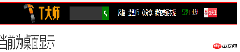
<p class="visible-md"><h1>当前为桌面显示</h1></p> //visible默认占满整行
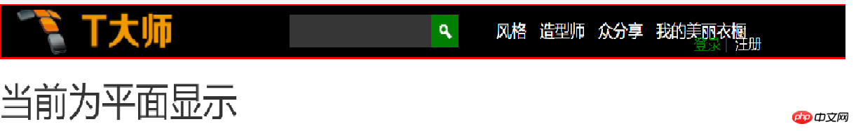
<p class="visible-sm"><h1>当前为平面显示</h1></p>
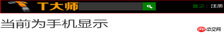
<p class="visible-xs"><h1>当前为手机显示</h1></p>
</p>
</p>
</body>
</html>Effektanzeige:
Das Obige habe ich für Sie zusammengestellt und hoffe, dass es Ihnen in Zukunft hilfreich sein wird.
Verwandte Artikel:
So implementieren Sie den Pixelvergleich mit casperjs und ähneln.js (ausführliches Tutorial)
So schreiben Sie mit Async -validator Formularkomponente (ausführliches Tutorial)
So implementieren Sie eine schnelle Sortierung mit JavaScript (ausführliches Tutorial)
Das obige ist der detaillierte Inhalt vonBootstrap-Grid-System (ausführliches Tutorial). Für weitere Informationen folgen Sie bitte anderen verwandten Artikeln auf der PHP chinesischen Website!


![[Web-Frontend] Node.js-Schnellstart](https://img.php.cn/upload/course/000/000/067/662b5d34ba7c0227.png)


