

第 27 章 CSS 传统布局[上] - 水之原

学习要点:
1.布局模型
2.表格布局
3.浮动布局
主讲教师:李炎恢
本章主要探讨 HTML5 中 CSS 早期所使用的传统布局,很多情况下,这些布局方式还是非常有用的。
一.布局模型
在早期没有平板和智能手机等移动设备大行其道的时期,Web 页面的设计主要是面向 PC 端电脑分辨率展开的。这种分辨率比例比较单一,基本上只要满足最低分辨率设计即可。一般来说有 4:3、16:10、16:9 这样的主要分辨率。那么,从这种比例上来看,长度总是大于宽度的。从最低分辨率 1024 * 768 设计即可。为了使浏览器底部不出现滚动条,需要减去适当的宽度,比如减去 28,最终固定长度设置为 996 即可。当然,也有一些网站在近两年讲最低分辨率设置为 1280 减去滚动条宽度,因为大显示器逐步主流。
除了刚才所说的固定长度的布局,还有一种是流体布局,就是布局的长度为百分比,比如 100%。不管你是什么分辨率,它都能全屏显示,当然,局限性也特别大,只适合一些单一页面,复杂的页面,会随着不同浏览器产生各种阅读障碍。
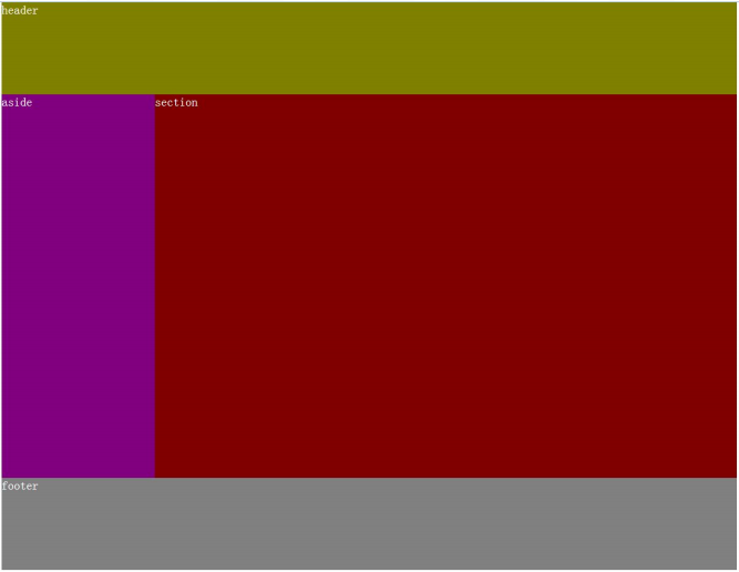
我们创建一个三行两列模型。并采用表格布局和浮动布局,构建固定和流体布局的方式,模型图如下:
二.表格布局
表格布局,就是通过设定固定的单元格,去除表格边框和填充实现的布局。当然这个布局非常不建议使用,只是教学了解。表格应该用它最为语义的地方,就是二维表的数据显示。
1.固定布局
//HTML 部分
<span style="color: #0000ff;"><span style="color: #800000;">table </span><span style="color: #ff0000;">border</span><span style="color: #0000ff;">="0"</span><span style="color: #0000ff;">></span>
    <span style="color: #0000ff;"><span style="color: #800000;">tr</span><span style="color: #0000ff;">></span>
        <span style="color: #0000ff;"><span style="color: #800000;">td </span><span style="color: #ff0000;">colspan</span><span style="color: #0000ff;">="2"</span><span style="color: #ff0000;"> class</span><span style="color: #0000ff;">="header"</span><span style="color: #0000ff;">></span>header<span style="color: #0000ff;"></span><span style="color: #800000;">td</span><span style="color: #0000ff;">></span>
    <span style="color: #0000ff;"></span><span style="color: #800000;">tr</span><span style="color: #0000ff;">></span>
    <span style="color: #0000ff;"><span style="color: #800000;">tr</span><span style="color: #0000ff;">></span>
        <span style="color: #0000ff;"><span style="color: #800000;">td </span><span style="color: #ff0000;">class</span><span style="color: #0000ff;">="aside"</span><span style="color: #0000ff;">></span>aside<span style="color: #0000ff;"></span><span style="color: #800000;">td</span><span style="color: #0000ff;">></span>
        <span style="color: #0000ff;"><span style="color: #800000;">td </span><span style="color: #ff0000;">class</span><span style="color: #0000ff;">="section"</span><span style="color: #0000ff;">></span>section<span style="color: #0000ff;"></span><span style="color: #800000;">td</span><span style="color: #0000ff;">></span>
    <span style="color: #0000ff;"></span><span style="color: #800000;">tr</span><span style="color: #0000ff;">></span>
    <span style="color: #0000ff;"><span style="color: #800000;">tr</span><span style="color: #0000ff;">></span>
        <span style="color: #0000ff;"><span style="color: #800000;">td </span><span style="color: #ff0000;">colspan</span><span style="color: #0000ff;">="2"</span><span style="color: #ff0000;"> class</span><span style="color: #0000ff;">="footer"</span><span style="color: #0000ff;">></span>footer<span style="color: #0000ff;"></span><span style="color: #800000;">td</span><span style="color: #0000ff;">></span>
    <span style="color: #0000ff;"></span><span style="color: #800000;">tr</span><span style="color: #0000ff;">></span>
<span style="color: #0000ff;"></span><span style="color: #800000;">table</span><span style="color: #0000ff;">></span></span></span></span></span></span></span></span></span>//CSS 部分
<span style="color: #800000;">body </span>{<span style="color: #ff0000;">
    margin</span>:<span style="color: #0000ff;"> 0</span>;
}<span style="color: #800000;">

table </span>{<span style="color: #ff0000;">
    margin</span>:<span style="color: #0000ff;"> 0 auto</span>;<span style="color: #ff0000;">
    width</span>:<span style="color: #0000ff;"> 960px</span>;<span style="color: #ff0000;">
    border-spacing</span>:<span style="color: #0000ff;"> 0</span>;
}<span style="color: #800000;">

.header </span>{<span style="color: #ff0000;">
    height</span>:<span style="color: #0000ff;"> 120px</span>;
}<span style="color: #800000;">

.aside </span>{<span style="color: #ff0000;">
    width</span>:<span style="color: #0000ff;"> 200px</span>;<span style="color: #ff0000;">
    height</span>:<span style="color: #0000ff;"> 500px</span>;
}<span style="color: #800000;">

.section </span>{<span style="color: #ff0000;">
    width</span>:<span style="color: #0000ff;"> 760px</span>;<span style="color: #ff0000;">
    height</span>:<span style="color: #0000ff;"> 500px</span>;
}<span style="color: #800000;">

.footer </span>{<span style="color: #ff0000;">
    height</span>:<span style="color: #0000ff;"> 120px</span>;
}2.流体布局
表格的固定布局改成流体布局非常简单,只需要设置 table 为 100%即可。
//修改 table
<span style="color: #800000;">table </span>{<span style="color: #ff0000;">
    width</span>:<span style="color: #0000ff;"> 100%</span>;
}
三.浮动布局
浮动布局主要采用 float 和 clear 两个属性来构建。
1.固定布局
//HTML 部分
<span style="color: #0000ff;"><span style="color: #800000;">header</span><span style="color: #0000ff;">></span><span style="color: #000000;">
    header
</span><span style="color: #0000ff;"></span><span style="color: #800000;">header</span><span style="color: #0000ff;">></span>

<span style="color: #0000ff;"><span style="color: #800000;">aside</span><span style="color: #0000ff;">></span><span style="color: #000000;">
    aside
</span><span style="color: #0000ff;"></span><span style="color: #800000;">aside</span><span style="color: #0000ff;">></span>

<span style="color: #0000ff;"><span style="color: #800000;">section</span><span style="color: #0000ff;">></span><span style="color: #000000;">
    section
</span><span style="color: #0000ff;"></span><span style="color: #800000;">section</span><span style="color: #0000ff;">></span>

<span style="color: #0000ff;"><span style="color: #800000;">footer</span><span style="color: #0000ff;">></span><span style="color: #000000;">
    footer
</span><span style="color: #0000ff;"></span><span style="color: #800000;">footer</span><span style="color: #0000ff;">></span></span></span></span></span>//CSS 部分
<span style="color: #800000;">body </span>{<span style="color: #ff0000;">
    width</span>:<span style="color: #0000ff;"> 960px</span>;<span style="color: #ff0000;">
    margin</span>:<span style="color: #0000ff;"> 0 auto</span>;<span style="color: #ff0000;">
    color</span>:<span style="color: #0000ff;"> white</span>;
}<span style="color: #800000;">

header </span>{<span style="color: #ff0000;">
    height</span>:<span style="color: #0000ff;"> 120px</span>;
}<span style="color: #800000;">

aside </span>{<span style="color: #ff0000;">
    width</span>:<span style="color: #0000ff;"> 200px</span>;<span style="color: #ff0000;">
    height</span>:<span style="color: #0000ff;"> 500px</span>;<span style="color: #ff0000;">
    float</span>:<span style="color: #0000ff;"> left</span>;
}<span style="color: #800000;">

section </span>{<span style="color: #ff0000;">
    width</span>:<span style="color: #0000ff;"> 760px</span>;<span style="color: #ff0000;">
    height</span>:<span style="color: #0000ff;"> 500px</span>;<span style="color: #ff0000;">
    float</span>:<span style="color: #0000ff;"> right</span>;
}<span style="color: #800000;">

footer </span>{<span style="color: #ff0000;">
    height</span>:<span style="color: #0000ff;"> 120px</span>;<span style="color: #ff0000;">
    clear</span>:<span style="color: #0000ff;"> both</span>;
}2.流体布局
流体布局只要更改 body 元素的限定长度为 auto 或 100%。然后左右两列分别设置 20% 和 80%即可。
//CSS 部分
<span style="color: #800000;">body </span>{<span style="color: #ff0000;">
    width</span>:<span style="color: #0000ff;"> auto</span>;
}<span style="color: #800000;">

aside </span>{<span style="color: #ff0000;">
    width</span>:<span style="color: #0000ff;"> 20%</span>;
}<span style="color: #800000;">

section </span>{<span style="color: #ff0000;">
    width</span>:<span style="color: #0000ff;"> 80%</span>;
}<span style="font-family: verdana, Arial, Helvetica, sans-serif; font-size: 14px; line-height: 1.5; background-color: #ffffff;"> </span>
Heiße KI -Werkzeuge

Undresser.AI Undress
KI-gestützte App zum Erstellen realistischer Aktfotos

AI Clothes Remover
Online-KI-Tool zum Entfernen von Kleidung aus Fotos.

Undress AI Tool
Ausziehbilder kostenlos

Clothoff.io
KI-Kleiderentferner

AI Hentai Generator
Erstellen Sie kostenlos Ai Hentai.

Heißer Artikel
Heiße Werkzeuge

Notepad++7.3.1
Einfach zu bedienender und kostenloser Code-Editor

SublimeText3 chinesische Version
Chinesische Version, sehr einfach zu bedienen

Senden Sie Studio 13.0.1
Leistungsstarke integrierte PHP-Entwicklungsumgebung

Dreamweaver CS6
Visuelle Webentwicklungstools

SublimeText3 Mac-Version
Codebearbeitungssoftware auf Gottesniveau (SublimeText3)
Heiße Themen
 1377
1377
 52
52

 Was ist der Zweck des & lt; Fortschritts & gt; Element?
Mar 21, 2025 pm 12:34 PM
Was ist der Zweck des & lt; Fortschritts & gt; Element?
Mar 21, 2025 pm 12:34 PM
Der Artikel erörtert den HTML & lt; Progress & gt; Element, Absicht, Styling und Unterschiede vom & lt; Meter & gt; Element. Das Hauptaugenmerk liegt auf der Verwendung & lt; Fortschritt & gt; Für Aufgabenabschluss und & lt; Meter & gt; für stati
 Was ist der Zweck des & lt; datalist & gt; Element?
Mar 21, 2025 pm 12:33 PM
Was ist der Zweck des & lt; datalist & gt; Element?
Mar 21, 2025 pm 12:33 PM
Der Artikel erörtert den HTML & lt; Datalist & gt; Element, das die Formulare verbessert, indem automatische Vorschläge bereitgestellt, die Benutzererfahrung verbessert und Fehler reduziert werden.Character Count: 159
 Was sind die besten Praktiken für die Kompatibilität des Cross-Browsers in HTML5?
Mar 17, 2025 pm 12:20 PM
Was sind die besten Praktiken für die Kompatibilität des Cross-Browsers in HTML5?
Mar 17, 2025 pm 12:20 PM
In Artikel werden Best Practices zur Gewährleistung der HTML5-Cross-Browser-Kompatibilität erörtert und sich auf die Erkennung von Merkmalen, die progressive Verbesserung und die Testmethoden konzentriert.
 Was ist der Zweck des & lt; Meter & gt; Element?
Mar 21, 2025 pm 12:35 PM
Was ist der Zweck des & lt; Meter & gt; Element?
Mar 21, 2025 pm 12:35 PM
Der Artikel erörtert das HTML & lt; Meter & gt; Element, verwendet zur Anzeige von Skalar- oder Bruchwerten innerhalb eines Bereichs und seine gemeinsamen Anwendungen in der Webentwicklung. Es differenziert & lt; Meter & gt; von & lt; Fortschritt & gt; und Ex
 Wie verwende ich HTML5 -Formularvalidierungsattribute, um die Benutzereingabe zu validieren?
Mar 17, 2025 pm 12:27 PM
Wie verwende ich HTML5 -Formularvalidierungsattribute, um die Benutzereingabe zu validieren?
Mar 17, 2025 pm 12:27 PM
In dem Artikel werden unter Verwendung von HTML5 -Formularvalidierungsattributen wie Erforderlich, Muster, Min, MAX und Längengrenzen erörtert, um die Benutzereingabe direkt im Browser zu validieren.
 Was ist das Ansichtsfenster -Meta -Tag? Warum ist es wichtig für reaktionsschnelles Design?
Mar 20, 2025 pm 05:56 PM
Was ist das Ansichtsfenster -Meta -Tag? Warum ist es wichtig für reaktionsschnelles Design?
Mar 20, 2025 pm 05:56 PM
In dem Artikel wird das Ansichtsfenster -Meta -Tag erörtert, das für das reaktionsschnelle Webdesign auf mobilen Geräten unerlässlich ist. Es wird erläutert, wie die ordnungsgemäße Verwendung eine optimale Skalierung von Inhalten und Benutzerinteraktion gewährleistet, während Missbrauch zu Design- und Zugänglichkeitsproblemen führen kann.
 Was ist der Zweck des & lt; iframe & gt; Etikett? Was sind die Sicherheitsüberlegungen bei der Verwendung?
Mar 20, 2025 pm 06:05 PM
Was ist der Zweck des & lt; iframe & gt; Etikett? Was sind die Sicherheitsüberlegungen bei der Verwendung?
Mar 20, 2025 pm 06:05 PM
Der Artikel erörtert das & lt; iframe & gt; Der Zweck von Tag, externe Inhalte in Webseiten, seine gemeinsamen Verwendungen, Sicherheitsrisiken und Alternativen wie Objekt -Tags und APIs einzubetten.
 Gitee Pages statische Website -Bereitstellung fehlgeschlagen: Wie können Sie einzelne Dateien 404 Fehler beheben und beheben?
Apr 04, 2025 pm 11:54 PM
Gitee Pages statische Website -Bereitstellung fehlgeschlagen: Wie können Sie einzelne Dateien 404 Fehler beheben und beheben?
Apr 04, 2025 pm 11:54 PM
GitePages statische Website -Bereitstellung fehlgeschlagen: 404 Fehlerbehebung und Auflösung bei der Verwendung von Gitee ...
