

第 16 章 CSS 盒模型[上] - 水之原

学习要点:
1.元素尺寸
2.元素内边距
3.元素外边距
4.处理溢出
主讲教师:李炎恢
本章主要探讨 HTML5 中 CSS 盒模型,学习怎样了解元素的外观配置以及文档的整体布局。
一.元素尺寸
CSS 盒模型中最基础的就是设置一个元素的尺寸大小。有三组样式来配置一个元素的尺寸大小,样式表如下:
|
属性 |
值 |
说明 |
CSS 版本 |
|
width |
auto、长度值或百分比 |
设置元素的宽度 |
1 |
|
height |
auto、长度值或百分比 |
设置元素的高度 |
1 |
|
min-width |
auto、长度值或百分比 |
设置元素最小宽度 |
2 |
|
min-height |
auto、长度值或百分比 |
设置元素最小高度 |
2 |
|
max-width |
auto、长度值或百分比 |
设置元素最大宽度 |
2 |
|
max-height |
auto、长度值或百分比 |
设置元素最大高度 |
2 |
//设置元素尺寸
<span style="color: #800000;">div </span>{<span style="color: #ff0000;">
    width</span>:<span style="color: #0000ff;"> 200px</span>;<span style="color: #ff0000;">
    height</span>:<span style="color: #0000ff;"> 200px</span>;
}解释:设置元素的固定尺寸。
//限制元素尺寸
<span style="color: #800000;">div </span>{<span style="color: #ff0000;">
    min-width</span>:<span style="color: #0000ff;"> 100px</span>;<span style="color: #ff0000;">
    min-height</span>:<span style="color: #0000ff;"> 100px</span>;<span style="color: #ff0000;">
    max-width</span>:<span style="color: #0000ff;"> 300px</span>;<span style="color: #ff0000;">
    max-height</span>:<span style="color: #0000ff;"> 300px</span>;
}解释:这一组主要是应对可能动态产生元素尺寸变大变小的问题,从而限制它最大和最小的值。
//auto 自适应
<span style="color: #800000;">div </span>{<span style="color: #ff0000;">
    width</span>:<span style="color: #0000ff;"> auto</span>;<span style="color: #ff0000;">
    height</span>:<span style="color: #0000ff;"> auto</span>;
}解释:auto 是默认值,width 在 auto 下是 100%的值;height 在 auto 下是自适应。
//百分比方式
<span style="color: #800000;">#a </span>{<span style="color: #ff0000;">
    background</span>:<span style="color: #0000ff;"> silver</span>;<span style="color: #ff0000;">
    width</span>:<span style="color: #0000ff;"> 200px</span>;<span style="color: #ff0000;">
    height</span>:<span style="color: #0000ff;"> 200px</span>;
}<span style="color: #800000;">

#b </span>{<span style="color: #ff0000;">
    background</span>:<span style="color: #0000ff;"> gray</span>;<span style="color: #ff0000;">
    width</span>:<span style="color: #0000ff;"> 80%</span>;<span style="color: #ff0000;">
    height</span>:<span style="color: #0000ff;"> 80%</span>;
}<span style="color: #0000ff;"><span style="color: #800000;">div </span><span style="color: #ff0000;">id</span><span style="color: #0000ff;">="a"</span><span style="color: #0000ff;">></span>
<span style="color: #0000ff;"><span style="color: #800000;">div </span><span style="color: #ff0000;">id</span><span style="color: #0000ff;">="b"</span><span style="color: #0000ff;">></span><span style="color: #000000;">
我是 html5
</span><span style="color: #0000ff;"></span><span style="color: #800000;">div</span><span style="color: #0000ff;">></span>
<span style="color: #0000ff;"></span><span style="color: #800000;">div</span><span style="color: #0000ff;">></span></span></span>解释:百分比就是相对于父元素长度来衡定的。
二.元素内边距
CSS 盒模型中可以设置元素内部边缘填充空白的大小,我们成为内边距。样式表如下:
|
属性 |
值 |
说明 |
CSS 版本 |
|
padding-top |
长度值或百分比 |
设置顶部内边距 |
1 |
|
padding-bottom |
长度值或百分比 |
设置底部内边距 |
1 |
|
padding-left |
长度值或百分比 |
设置左边内边距 |
1 |
|
padding-right |
长度值或百分比 |
设置右边内边距 |
1 |
|
padding |
1 ~ 4 个长度值或百分比 |
简写属性 |
1 |
//设置四个内边距
<span style="color: #800000;">div </span>{<span style="color: #ff0000;">
    padding-top</span>:<span style="color: #0000ff;"> 10px</span>;<span style="color: #ff0000;">
    padding-bottom</span>:<span style="color: #0000ff;"> 10px</span>;<span style="color: #ff0000;">
    padding-left</span>:<span style="color: #0000ff;"> 10px</span>;<span style="color: #ff0000;">
    padding-right</span>:<span style="color: #0000ff;"> 10px</span>;
}
//简写形式,分别为上 10px、右 10px、下 10px、左 10px
<span style="color: #800000;">div </span>{<span style="color: #ff0000;">
    padding</span>:<span style="color: #0000ff;"> 10px 10px 10px 10px</span>;
}
//简写形式,分别为上 10px,左右 50px,下 200px
<span style="color: #800000;">div </span>{<span style="color: #ff0000;">
    padding</span>:<span style="color: #0000ff;"> 10px 50px 200px</span>;
}
//简写形式,分别是上下 10px,左右 20px
<span style="color: #800000;">div </span>{<span style="color: #ff0000;">
    padding</span>:<span style="color: #0000ff;"> 10px 20px</span>;
}
//简写形式:上下左右均 10px
<span style="color: #800000;">div </span>{<span style="color: #ff0000;">
    padding</span>:<span style="color: #0000ff;"> 10px</span>;
}
三.元素外边距
CSS 盒模型中可以设置元素外部边缘填充空白的大小,我们成为外边距。样式表如下:
|
属性 |
值 |
说明 |
CSS 版本 |
|
margin-top |
长度值或百分比 |
设置顶部内边距 |
1 |
|
margin-bottom |
长度值或百分比 |
设置底部内边距 |
1 |
|
margin-left |
长度值或百分比 |
设置左边内边距 |
1 |
|
margin-right |
长度值或百分比 |
设置右边内边距 |
1 |
|
margin |
1 ~ 4 长度值或百分比 |
简写属性 |
1 |
//设置四个内边距
<span style="color: #800000;">div </span>{<span style="color: #ff0000;">
    margin-top</span>:<span style="color: #0000ff;"> 10px</span>;<span style="color: #ff0000;">
    margin-bottom</span>:<span style="color: #0000ff;"> 10px</span>;<span style="color: #ff0000;">
    margin-left</span>:<span style="color: #0000ff;"> 10px</span>;<span style="color: #ff0000;">
    margin-right</span>:<span style="color: #0000ff;"> 10px</span>;
}
//简写形式,分别为上 10px、右 10px、下 10px、左 10px
<span style="color: #800000;">div </span>{<span style="color: #ff0000;">
    margin</span>:<span style="color: #0000ff;"> 10px 10px 10px 10px</span>;
}
//简写形式,分别为上 10px,左右 50px,下 200px
<span style="color: #800000;">div </span>{<span style="color: #ff0000;">
    margin</span>:<span style="color: #0000ff;"> 10px 50px 200px</span>;
}
//简写形式,分别是上下 10px,左边 20px
<span style="color: #800000;">div </span>{<span style="color: #ff0000;">
    margin</span>:<span style="color: #0000ff;"> 10px 20px</span>;
}
//简写形式:上下左右均 10px
<span style="color: #800000;">div </span>{<span style="color: #ff0000;">
    margin</span>:<span style="color: #0000ff;"> 10px</span>;
}
四.处理溢出
当设置了元素固定尺寸且内容过大时,就会出现溢出的问题。溢出主要朝两个方向:右侧和底部。我们可以通过 overflow 系列样式来控制它。
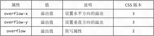
溢出处理主要有四种处理值:

//设置溢出为 auto 值
<span style="color: #800000;">div </span>{<span style="color: #ff0000;">
    overflow-x</span>:<span style="color: #0000ff;"> auto</span>;
}
Heiße KI -Werkzeuge

Undresser.AI Undress
KI-gestützte App zum Erstellen realistischer Aktfotos

AI Clothes Remover
Online-KI-Tool zum Entfernen von Kleidung aus Fotos.

Undress AI Tool
Ausziehbilder kostenlos

Clothoff.io
KI-Kleiderentferner

Video Face Swap
Tauschen Sie Gesichter in jedem Video mühelos mit unserem völlig kostenlosen KI-Gesichtstausch-Tool aus!

Heißer Artikel
Heiße Werkzeuge

Notepad++7.3.1
Einfach zu bedienender und kostenloser Code-Editor

SublimeText3 chinesische Version
Chinesische Version, sehr einfach zu bedienen

Senden Sie Studio 13.0.1
Leistungsstarke integrierte PHP-Entwicklungsumgebung

Dreamweaver CS6
Visuelle Webentwicklungstools

SublimeText3 Mac-Version
Codebearbeitungssoftware auf Gottesniveau (SublimeText3)
Heiße Themen
 1393
1393
 52
1205
24
52
1205
24

 Ist HTML für Anfänger leicht zu lernen?
Apr 07, 2025 am 12:11 AM
Ist HTML für Anfänger leicht zu lernen?
Apr 07, 2025 am 12:11 AM
HTML ist für Anfänger geeignet, da es einfach und leicht zu lernen ist und schnell Ergebnisse sehen kann. 1) Die Lernkurve von HTML ist glatt und leicht zu beginnen. 2) Beherrschen Sie einfach die grundlegenden Tags, um Webseiten zu erstellen. 3) hohe Flexibilität und kann in Kombination mit CSS und JavaScript verwendet werden. 4) Reiche Lernressourcen und moderne Tools unterstützen den Lernprozess.
 Die Rollen von HTML, CSS und JavaScript: Kernverantwortung
Apr 08, 2025 pm 07:05 PM
Die Rollen von HTML, CSS und JavaScript: Kernverantwortung
Apr 08, 2025 pm 07:05 PM
HTML definiert die Webstruktur, CSS ist für Stil und Layout verantwortlich, und JavaScript ergibt eine dynamische Interaktion. Die drei erfüllen ihre Aufgaben in der Webentwicklung und erstellen gemeinsam eine farbenfrohe Website.
 Was ist ein Beispiel für ein Start -Tag in HTML?
Apr 06, 2025 am 12:04 AM
Was ist ein Beispiel für ein Start -Tag in HTML?
Apr 06, 2025 am 12:04 AM
AnexampleofaTartingTaginHtmlis, die, die starttagsaresesinginhtmlastheyinitiateElements, definetheirtypes, andarecrucialForstructuringwebpages und -konstruktionsthedoms.
 HTML, CSS und JavaScript verstehen: Ein Anfängerhandbuch
Apr 12, 2025 am 12:02 AM
HTML, CSS und JavaScript verstehen: Ein Anfängerhandbuch
Apr 12, 2025 am 12:02 AM
WebdevelopmentRelieSonHtml, CSS und JavaScript: 1) HtmlStructuresContent, 2) CSSstylesit und 3) JavaScriptaddssinteraktivität, Bildung von TheBasisofModerernwebexperiences.
 Gitee Pages statische Website -Bereitstellung fehlgeschlagen: Wie können Sie einzelne Dateien 404 Fehler beheben und beheben?
Apr 04, 2025 pm 11:54 PM
Gitee Pages statische Website -Bereitstellung fehlgeschlagen: Wie können Sie einzelne Dateien 404 Fehler beheben und beheben?
Apr 04, 2025 pm 11:54 PM
GitePages statische Website -Bereitstellung fehlgeschlagen: 404 Fehlerbehebung und Auflösung bei der Verwendung von Gitee ...
 Wie kann man adaptives Layout der Y-Achse-Position in Webanmerkungen implementieren?
Apr 04, 2025 pm 11:30 PM
Wie kann man adaptives Layout der Y-Achse-Position in Webanmerkungen implementieren?
Apr 04, 2025 pm 11:30 PM
Der ad-axis-Position adaptive Algorithmus für Webanmerkungen In diesem Artikel wird untersucht, wie Annotationsfunktionen ähnlich wie Word-Dokumente implementiert werden, insbesondere wie man mit dem Intervall zwischen Anmerkungen umgeht ...
 Wie verwendet ich CSS3 und JavaScript, um den Effekt der Streuung und Vergrößerung der umgebenden Bilder nach dem Klicken zu erreichen?
Apr 05, 2025 am 06:15 AM
Wie verwendet ich CSS3 und JavaScript, um den Effekt der Streuung und Vergrößerung der umgebenden Bilder nach dem Klicken zu erreichen?
Apr 05, 2025 am 06:15 AM
Um den Effekt der Streuung und Vergrößerung der umgebenden Bilder nach dem Klicken auf das Bild zu erreichen, müssen viele Webdesigns einen interaktiven Effekt erzielen: Klicken Sie auf ein bestimmtes Bild, um die Umgebung zu machen ...
 HTML, CSS und JavaScript: Wesentliche Tools für Webentwickler
Apr 09, 2025 am 12:12 AM
HTML, CSS und JavaScript: Wesentliche Tools für Webentwickler
Apr 09, 2025 am 12:12 AM
HTML, CSS und JavaScript sind die drei Säulen der Webentwicklung. 1. HTML definiert die Webseitenstruktur und verwendet Tags wie z.
