

Was sind die neuen Farbmodi in CSS3?

css hat 3 neue Farbmodi hinzugefügt: 1. RGBA-Modus, der dem RGB-Modus Alpha-Transparenz hinzufügt, z. B. „rgba(255,0,0,0.5)“; 2. HSL-Modus, z. B. „hsl( 360 ,50%,50%)"; 3. HSLA-Modus, der dem HSL-Modus Alpha-Transparenz hinzufügt.

Die Betriebsumgebung dieses Tutorials: Windows 7-System, CSS3-Version, Dell G3-Computer.
1. CSS1- und 2-Farbdarstellungsmethode (W3C-Standard)
1. Farbnamenmethode (Verwenden Sie Farbschlüsselwörter, um die entsprechende Farbe darzustellen.)
Zum Beispiel: rot (rot), blau ( blau), rosa (rosa)
Vorteile: Bequem und schnell und genauer für bestimmte Farben
Nachteile:
Gibt eine begrenzte Anzahl von Farben an.
Unterstützt keine transparenten Farben
2. HEX-Modus Hexadezimalmodus (Hexadezimal zur Darstellung von Farben verwenden)
Syntax:
#RRGGBB 或 #RGB
Wert:
RR: Roter Wert. Hexadezimale positive Ganzzahl
GG: Grüner Wert. Hexadezimale positive Ganzzahl
BB: Blauer Wert. Hexadezimale positive Ganzzahl
Wertebereich: 00-FF
Zum Beispiel: #FF0000 rot #FFFF00 gelb. #FF0000红色 #FFFF00 黄色。
优点:表示颜色种类多,使用较方便
缺点:
16进制单位换算很成问题
不支持透明颜色。
特定颜色需要工具配合或者一定的颜色调配知识
3、RGB方式 三原色配色方式
语法:
RGB(R,G,B)
取值:
R: 红色值。正整数 | 百分数
G: 绿色值。正整数 | 百分数
B: 蓝色值。正整数 | 百分数
取值范围:0~255或者0%~100%
例如:rgb(255,0,0)红色 rgb(255,255,0)黄色
优点:表示颜色种类多,使用较方便
缺点:
不支持透明颜色
特定颜色需要工具配合或者一定的颜色调配知识
二、CSS3 新增颜色表示方式
1、RGBA模式
此色彩模式与RGB相同,只是在RGB模式上新增了Alpha透明度。
语法:
RGBA(R,G,B,A)
取值:
R: 红色值。正整数 | 百分数
G: 绿色值。正整数 | 百分数
B: 蓝色值。正整数 | 百分数
A: Alpha透明度。取值0~1之间。
例如:rgba(255,0,0,0.5)半透明红色
<style type="text/css">
    body{background:rgba(255,0,0,1)}
    div{width:300px;
        height:300px;
        background:rgba(0,0,255,0.4);
        position:absolute;
        top:0;
        left:0;
    }
</style>
<body>
    猜猜我在哪里
    <div></div>
</body>2、HSL模式(色轮模式没有透明度)
语法:
HSL(H,S,L)
取值:
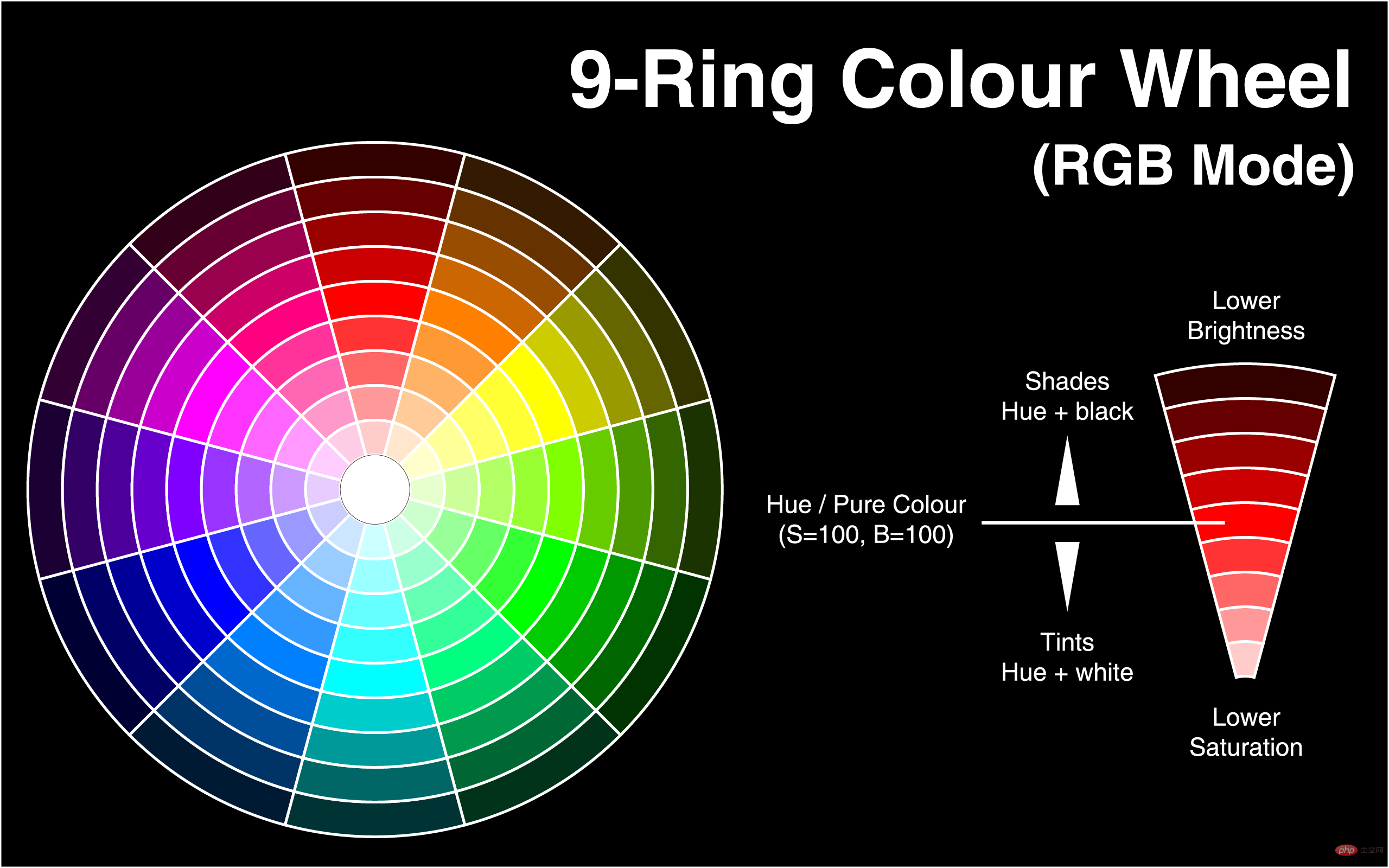
H: Hue(色调)。–0(或360)表示红色,120表示绿色,240表示蓝色,也可取其他数值来指定颜色。取值为:0 - 360
S: Saturation(饱和度)。取值为:0.0% - 100.0%
L: Lightness(亮度)。取值为:0.0% - 100.0%
例如:hsl(360,50%,50%) 红色
<style type="text/css">
    body{background:rgba(0,0,255,0.5);}
    div{width:300px;
        height:300px;
        background:hsl(140,50%,50%);
        position:absolute;
        top:0;
        left:0;
    }
</style>
<body>
    <div></div>
</body>3、HSLA模式(色轮模式有透明度)
语法:
HSLA(H,S,L,A)
取值:
H: Hue(色调)。–0(或360)表示红色,120表示绿色,240表示蓝色,也可取其他数值来指定颜色。取值为:0 - 360
S: Saturation(饱和度)。取值为:0.0% - 100.0%
L: Lightness(亮度)。取值为:0.0% - 100.0%
A: Alpha透明度。取值0~1之间。
例如:hsl(360,50%,50%,0.5
Transparente Farben werden nicht unterstützt. Bestimmte Farben erfordern Werkzeugkoordination oder bestimmte Farbmischungskenntnisse. Positive ganze Zahl |. Prozent
G: Grüner Wert. Positive ganze Zahl |. Prozent B: Blauer Wert. Positive ganze Zahl | Prozent GelbVorteile: Es repräsentiert eine große Farbvielfalt und ist bequemer zu verwenden
2 . Neue Farben in der CSS3-Darstellung
1. RGBA-Modus 🎜🎜🎜🎜Dieser Farbmodus ist derselbe wie RGB, außer dass dem RGB-Modus Alpha-Transparenz hinzugefügt wird. 🎜🎜Syntax: 🎜<style>
body{background:HSL(0,100%,50%)}
div{width:300px;
height:300px;
background:HSLA(230,100%,50%,0);
position:absolute;
top:0;
left:0;
}
</style>
</head>
<body>
猜猜我在哪里
<div></div>
</body>rgba(255,0,0,0.5) Durchscheinendes Rot🎜<style type="text/css">
body{background:hsl(270,100%,50%)}
p{
font-size:50px;
font-family:"黑体";
/*浏览器私有属性*/
-webkit-text-fill-color:transparent;/*设置文本透明*/
/*使用rgba(0,0,0,0);也可以实现全透明模式*/
-webkit-text-stroke:2px yellow;/*将文本设置透明,再设置个边框后就实现镂空字了*/
/*W3C标准属性*/
/*text-fill-color:transparent;*/
/*text-stroke:2px yellow;*/
}
</style>
<body>
<p>2012年过去了,最忙的是元芳,你怎么看?</p>
</body><style>
body{background:red}
div{background:blue;
width:300px;
height:300px;
opacity:0.5;
position:absolute;
top:0;
left:0
}
</style>
</head>
<body>
看到我你就成功了
<div></div>
</body>hsl(360,50%,50%) Red🎜🎜 🎜
🎜background-image: -ms-linear-gradient(top, #D35644 0%, #31264D 100%) !important;/* Mozilla Firefox */
background-image: -moz-linear-gradient(top, #D35644 0%, #31264D 100%) !important;/* Opera */
background-image: -o-linear-gradient(top, #D35644 0%, #31264D 100%) !important;/* Webkit (Safari/Chrome 10) */
background-image: -webkit-gradient(linear, left bottom, left top, color-stop(0, #D35644), color-stop(1, #31264D)) !important;/* Webkit (Chrome 11+) */
background-image: -webkit-linear-gradient(top, #D35644 0%, #31264D 100%) !important;/* W3C Markup, IE10 Release Preview */
background-image: linear-gradient(to bottom, #D35644 0%, #31264D 100%) !important; }<style>
div{height:30px}
div:nth-child(1){background:HSLA(120,100%,50%,0.1)}
div:nth-child(2){background:HSLA(120,100%,50%,0.2)}
div:nth-child(3){background:HSLA(120,100%,50%,0.3)}
div:nth-child(4){background:HSLA(120,100%,50%,0.4)}
div:nth-child(5){background:HSLA(120,100%,50%,0.5)}
div:nth-child(6){background:HSLA(120,100%,50%,0.6)}
div:nth-child(7){background:HSLA(120,100%,50%,0.7)}
div:nth-child(8){background:HSLA(120,100%,50%,0.8)}
div:nth-child(9){background:HSLA(120,100%,50%,0.9)}
div:nth-child(10){background:HSLA(120,100%,50%,1.0)}
</style>
</head>
<body>
<div></div>
<div></div>
<div></div>
<div></div>
<div></div>
<div></div>
<div></div>
<div></div>
<div></div>
<div></div>
</body>hsl(360,50%,50%,0.5) red🎜<style>
div{height:30px}
div:nth-child(1){background:HSLA(120,100%,50%,1)}
div:nth-child(2){background:HSLA(120,90%,50%,1)}
div:nth-child(3){background:HSLA(120,80%,50%,1)}
div:nth-child(4){background:HSLA(120,70%,50%,1)}
div:nth-child(5){background:HSLA(120,60%,50%,1)}
div:nth-child(6){background:HSLA(120,50%,50%,1)}
div:nth-child(7){background:HSLA(120,40%,50%,1)}
div:nth-child(8){background:HSLA(120,30%,50%,1)}
div:nth-child(9){background:HSLA(120,20%,50%,1)}
div:nth-child(10){background:HSLA(120,10%,50%,1)}
</style>
</head>
<body>
<div></div>
<div></div>
<div></div>
<div></div>
<div></div>
<div></div>
<div></div>
<div></div>
<div></div>
<div></div>
</body>
</html><style>
div{height:30px}
div:nth-child(1){background:HSLA(120,100%,100%,1)}
div:nth-child(2){background:HSLA(120,100%,90%,1)}
div:nth-child(3){background:HSLA(120,100%,80%,1)}
div:nth-child(4){background:HSLA(120,100%,70%,1)}
div:nth-child(5){background:HSLA(120,100%,60%,1)}
div:nth-child(6){background:HSLA(120,100%,50%,1)}
div:nth-child(7){background:HSLA(120,100%,40%,1)}
div:nth-child(8){background:HSLA(120,100%,30%,1)}
div:nth-child(9){background:HSLA(120,100%,20%,1)}
div:nth-child(10){background:HSLA(120,100%,10%,1)}
</style>
</head>
<body>
<div></div>
<div></div>
<div></div>
<div></div>
<div></div>
<div></div>
<div></div>
<div></div>
<div></div>
<div></div>
</body>注意:对于尚不支持opacity属性的IE浏览器
滤镜:filter:alpha(opacity=50) 仅限IE
<style>
    body{background:red}
    div{background:blue;
        width:300px;
        height:300px;
        opacity:0.5;
        position:absolute;
        top:0;
        left:0
    }
</style>
</head>
<body>
    看到我你就成功了
    <div></div>
</body>四、CSS3 颜色使用实例
background-image: -ms-linear-gradient(top, #D35644 0%, #31264D 100%) !important;/* Mozilla Firefox */
     background-image: -moz-linear-gradient(top, #D35644 0%, #31264D 100%) !important;/* Opera */
     background-image: -o-linear-gradient(top, #D35644 0%, #31264D 100%) !important;/* Webkit (Safari/Chrome 10) */
     background-image: -webkit-gradient(linear, left bottom, left top, color-stop(0, #D35644), color-stop(1, #31264D)) !important;/* Webkit (Chrome 11+) */
     background-image: -webkit-linear-gradient(top, #D35644 0%, #31264D 100%) !important;/* W3C Markup, IE10 Release Preview */
background-image: linear-gradient(to bottom, #D35644 0%, #31264D 100%) !important; }1、模拟渐变效果
使用透明度来模拟渐变
<style>
    div{height:30px}
    div:nth-child(1){background:HSLA(120,100%,50%,0.1)}
    div:nth-child(2){background:HSLA(120,100%,50%,0.2)}
    div:nth-child(3){background:HSLA(120,100%,50%,0.3)}
    div:nth-child(4){background:HSLA(120,100%,50%,0.4)}
    div:nth-child(5){background:HSLA(120,100%,50%,0.5)}
    div:nth-child(6){background:HSLA(120,100%,50%,0.6)}
    div:nth-child(7){background:HSLA(120,100%,50%,0.7)}
    div:nth-child(8){background:HSLA(120,100%,50%,0.8)}
    div:nth-child(9){background:HSLA(120,100%,50%,0.9)}
    div:nth-child(10){background:HSLA(120,100%,50%,1.0)}
</style>
</head>
<body>
    <div></div>
    <div></div>
    <div></div>
    <div></div>
    <div></div>
    <div></div>
    <div></div>
    <div></div>
    <div></div>
    <div></div>
</body>使用饱和度模拟渐变
<style>
            div{height:30px}
            div:nth-child(1){background:HSLA(120,100%,50%,1)}
            div:nth-child(2){background:HSLA(120,90%,50%,1)}
            div:nth-child(3){background:HSLA(120,80%,50%,1)}
            div:nth-child(4){background:HSLA(120,70%,50%,1)}
            div:nth-child(5){background:HSLA(120,60%,50%,1)}
            div:nth-child(6){background:HSLA(120,50%,50%,1)}
            div:nth-child(7){background:HSLA(120,40%,50%,1)}
            div:nth-child(8){background:HSLA(120,30%,50%,1)}
            div:nth-child(9){background:HSLA(120,20%,50%,1)}
            div:nth-child(10){background:HSLA(120,10%,50%,1)}
        </style>
    </head>
    <body>
        <div></div>
        <div></div>
        <div></div>
        <div></div>
        <div></div>
        <div></div>
        <div></div>
        <div></div>
        <div></div>
        <div></div>
    </body>
</html>使用亮度来实现模拟渐变
<style>
    div{height:30px}
    div:nth-child(1){background:HSLA(120,100%,100%,1)}
    div:nth-child(2){background:HSLA(120,100%,90%,1)}
    div:nth-child(3){background:HSLA(120,100%,80%,1)}
    div:nth-child(4){background:HSLA(120,100%,70%,1)}
    div:nth-child(5){background:HSLA(120,100%,60%,1)}
    div:nth-child(6){background:HSLA(120,100%,50%,1)}
    div:nth-child(7){background:HSLA(120,100%,40%,1)}
    div:nth-child(8){background:HSLA(120,100%,30%,1)}
    div:nth-child(9){background:HSLA(120,100%,20%,1)}
    div:nth-child(10){background:HSLA(120,100%,10%,1)}
</style>
</head>
<body>
    <div></div>
    <div></div>
    <div></div>
    <div></div>
    <div></div>
    <div></div>
    <div></div>
    <div></div>
    <div></div>
    <div></div>
</body>使用背景颜色:
<style>
#div1 { width:200px; height:200px; border:1px solid #333;
background:-moz-linear-gradient(top, red, yellow);
background:-webkit-linear-gradient(top, red, yellow);
background:-ms-linear-gradient(top, red, yellow);
background:linear-gradient(top, red, yellow);
-ms-filter:"progid:DXImageTransform.Microsoft.gradient (GradientType=0, startColorstr=red, endColorstr=yellow)";
+background:#f9f9f9;/*兼容IE9,8,7*/
}
</style>

</head>

<body>

<div id="div1"></div>

</body>更多编程相关知识,请访问:编程视频!!
Das obige ist der detaillierte Inhalt vonWas sind die neuen Farbmodi in CSS3?. Für weitere Informationen folgen Sie bitte anderen verwandten Artikeln auf der PHP chinesischen Website!

Heiße KI -Werkzeuge

Undresser.AI Undress
KI-gestützte App zum Erstellen realistischer Aktfotos

AI Clothes Remover
Online-KI-Tool zum Entfernen von Kleidung aus Fotos.

Undress AI Tool
Ausziehbilder kostenlos

Clothoff.io
KI-Kleiderentferner

AI Hentai Generator
Erstellen Sie kostenlos Ai Hentai.

Heißer Artikel
Heiße Werkzeuge

Notepad++7.3.1
Einfach zu bedienender und kostenloser Code-Editor

SublimeText3 chinesische Version
Chinesische Version, sehr einfach zu bedienen

Senden Sie Studio 13.0.1
Leistungsstarke integrierte PHP-Entwicklungsumgebung

Dreamweaver CS6
Visuelle Webentwicklungstools

SublimeText3 Mac-Version
Codebearbeitungssoftware auf Gottesniveau (SublimeText3)
Heiße Themen
 1378
1378
 52
52

 Wie erzielt man mit reinem CSS3 einen Welleneffekt? (Codebeispiel)
Jun 28, 2022 pm 01:39 PM
Wie erzielt man mit reinem CSS3 einen Welleneffekt? (Codebeispiel)
Jun 28, 2022 pm 01:39 PM
Wie erzielt man mit reinem CSS3 einen Welleneffekt? In diesem Artikel erfahren Sie, wie Sie mit SVG- und CSS-Animationen Welleneffekte erstellen.
 Verwenden Sie CSS geschickt, um verschiedene seltsam geformte Schaltflächen zu realisieren (mit Code).
Jul 19, 2022 am 11:28 AM
Verwenden Sie CSS geschickt, um verschiedene seltsam geformte Schaltflächen zu realisieren (mit Code).
Jul 19, 2022 am 11:28 AM
Dieser Artikel zeigt Ihnen, wie Sie mithilfe von CSS auf einfache Weise verschiedene seltsam geformte Schaltflächen realisieren können, die häufig vorkommen. Ich hoffe, dass er Ihnen hilfreich sein wird!
 So verstecken Sie Elemente in CSS, ohne Platz zu beanspruchen
Jun 01, 2022 pm 07:15 PM
So verstecken Sie Elemente in CSS, ohne Platz zu beanspruchen
Jun 01, 2022 pm 07:15 PM
Zwei Methoden: 1. Fügen Sie mit dem Anzeigeattribut einfach den Stil „display:none;“ zum Element hinzu. 2. Verwenden Sie die Attribute „position“ und „top“, um die absolute Positionierung des Elements festzulegen, um das Element auszublenden. Fügen Sie dem Element einfach den Stil „position:absolute;top:-9999px;“ hinzu.
 Was ist der RGB-Farbmodus?
Feb 28, 2023 pm 04:01 PM
Was ist der RGB-Farbmodus?
Feb 28, 2023 pm 04:01 PM
Der RGB-Farbmodus ist ein Bildschirmanzeigemodus; auf dem Monitor erzeugt der RGB-Farbmodus Farben, indem er mit einer Elektronenkanone auf die roten, grünen und blauen Lichtemissionselektroden trifft. Computer können im Allgemeinen 32-Bit-Farben anzeigen. mit etwa mehr als einer Million Farben. Der RGB-Farbmodus ist ein Farbstandardisierungsmodus, der die drei Grundfarben Rot, Blau und Grün verwendet, um andere Farben zu erzeugen, indem er sie auf unterschiedliche Weise überlagert und mischt. Diese drei Farben sind auch die drei Primärfarben, die andere Farben erzeugen können bilden alle gesehenen Farben.
 So implementieren Sie Spitzenränder in CSS3
Sep 16, 2022 pm 07:11 PM
So implementieren Sie Spitzenränder in CSS3
Sep 16, 2022 pm 07:11 PM
In CSS können Sie das Attribut „border-image“ verwenden, um einen Spitzenrand zu erzielen. Das Attribut „border-image“ kann Bilder zum Erstellen von Rändern verwenden, d. h. zum Hinzufügen eines Hintergrundbilds zum Rand. Sie müssen lediglich das Hintergrundbild als Spitzenstil angeben Bildrandbreite nach innen. Ob der Anfang wiederholt wird;".
 Es zeigt sich, dass Textkarussell und Bildkarussell auch mit reinem CSS realisierbar sind!
Jun 10, 2022 pm 01:00 PM
Es zeigt sich, dass Textkarussell und Bildkarussell auch mit reinem CSS realisierbar sind!
Jun 10, 2022 pm 01:00 PM
Wie erstelle ich ein Textkarussell und ein Bildkarussell? Das erste, woran jeder denkt, ist die Verwendung von js. Tatsächlich können Textkarussell und Bildkarussell auch einen Blick auf die Implementierungsmethode werfen.
 So vergrößern Sie das Bild durch Klicken mit der Maus in CSS3
Apr 25, 2022 pm 04:52 PM
So vergrößern Sie das Bild durch Klicken mit der Maus in CSS3
Apr 25, 2022 pm 04:52 PM
Implementierungsmethode: 1. Verwenden Sie den Selektor „:active“, um den Status des Mausklicks auf das Bild auszuwählen. 2. Verwenden Sie das Transformationsattribut und die Funktion „scale()“, um den Bildvergrößerungseffekt zu erzielen. Die Syntax „img:active {transform : Skala(x-Achsen-Vergrößerung, y-Achsen-Vergrößerung);}".
 So legen Sie die Rotationsgeschwindigkeit der Animation in CSS3 fest
Apr 28, 2022 pm 04:32 PM
So legen Sie die Rotationsgeschwindigkeit der Animation in CSS3 fest
Apr 28, 2022 pm 04:32 PM
In CSS3 können Sie das Attribut „animation-timing-function“ verwenden, um die Rotationsgeschwindigkeit der Animation festzulegen. Dieses Attribut wird verwendet, um anzugeben, wie die Animation einen Zyklus abschließt und die Geschwindigkeitskurve der Animation festlegt. Animation-Timing-Funktion: Geschwindigkeitsattributwert;}".
