
 Web-Frontend
CSS-Tutorial
Einfaches Verständnis der grundlegenden CSS-Navigationsleiste und des CSS-Dropdown-Menüs anhand von Beispielen
Web-Frontend
CSS-Tutorial
Einfaches Verständnis der grundlegenden CSS-Navigationsleiste und des CSS-Dropdown-Menüs anhand von Beispielen
Einfaches Verständnis der grundlegenden CSS-Navigationsleiste und des CSS-Dropdown-Menüs anhand von Beispielen

Dieser Artikel vermittelt Ihnen relevantes Wissen über css, in dem hauptsächlich verwandte Themen wie die Implementierungseigenschaften der grundlegenden CSS-Navigationsleiste und des Dropdown-Menüs vorgestellt werden. Mithilfe von CSS können Sie diese in eine gut aussehende Navigationsleiste umwandeln Werfen wir einen Blick auf das HTML-Menü. Ich hoffe, es wird für alle hilfreich sein.

(Teilen von Lernvideos: CSS-Video-Tutorial, HTML-Video-Tutorial)
Navigationsleiste
Die kompetente Verwendung der Navigationsleiste ist für jede Website sehr wichtig.
Mit CSS können Sie eine schöne Navigationsleiste anstelle eines langweiligen HTML-Menüs erstellen.
Navigationsleiste = Linkliste
Als Standard-HTML-Basis ist eine Navigationsleiste ein Muss.
In unserem Beispiel erstellen wir eine Standard-HTML-Listen-Navigationsleiste.
Eine Navigationsleiste ist im Grunde eine Liste von Links, daher ist die Verwendung der Elemente <ul></ul> und <li> sehr sinnvoll, Common HTML: <ul></ul> 和 <li> 元素非常有意义,公共HTML:
-
<li><a>主页
<li><a>新闻
<li><a>联系
<li><a>关于
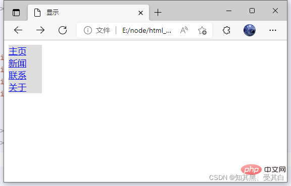
现在,让我们从列表中删除边距和填充:
ul {
    list-style-type: none;
    margin: 0;
    padding: 0;}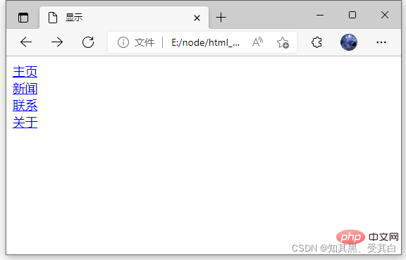
例子解析:list-style-type:none – 移除列表前小标志,一个导航栏并不需要列表标记。
移除浏览器的默认设置将边距和填充设置为0。
上面的例子中的代码是垂直和水平导航栏使用的标准代码。
nbsp;html>


    <meta>
    <title>显示</title>
    <style>
        ul {
            list-style-type: none;
            margin: 0;
            padding: 0;
        }
    </style>
-
<li><a>主页
<li><a>新闻
<li><a>联系
<li><a>关于
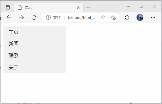
垂直导航栏
上面的代码,我们只需要 <a></a> 元素的样式,建立一个垂直的导航栏:
li a {
  display: block;
  width: 60px;
background-color: #dddddd;}示例说明:
display:block 显示块元素的链接,让整体变为可点击链接区域(不只是文本),它允许我们指定宽度 width:60px 。
块元素默认情况下是最大宽度。我们要指定一个60像素的宽度。
注意: 请务必指定 <a></a> 元素在垂直导航栏的的宽度。如果省略宽度,IE6可能产生意想不到的效果。
nbsp;html>


    <meta>
    <title>显示</title>
    <style>
        ul {
            list-style-type: none;
            margin: 0;
            padding: 0;
        }
        li a {
            display: block;
            width: 60px;
            background-color: #dddddd;
        }
    </style>
-
<li><a>主页
<li><a>新闻
<li><a>联系
<li><a>关于
垂直导航条实例
创建一个简单的垂直导航条实例,在鼠标移动到选项时,修改背景颜色:
nbsp;html>


    <meta>
    <title>显示</title>
    <style>
        ul {
            list-style-type: none;
            margin: 0;
            padding: 0;
            width: 200px;
            background-color: #f1f1f1;
        }
        li a {
            display: block;
            color: #000;
            padding: 8px 16px;
            text-decoration: none;
        }
        /* 鼠标移动到选项上修改背景颜色 */
        li a:hover {
            background-color: #555;
            color: white;
        }
    </style>
-
<li><a>主页
<li><a>新闻
<li><a>联系
<li><a>关于
激活/当前导航条实例
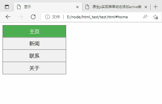
在点击了选项后,我们可以添加 “active” 类来标准哪个选项被选中: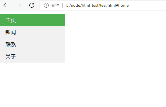
li a.active {
    background-color: #4CAF50;
    color: white;}li a:hover:not(.active) {
    background-color: #555;
color: white;}示例代码:
nbsp;html>


    <meta>
    <title>显示</title>
    <style>
        ul {
            list-style-type: none;
            margin: 0;
            padding: 0;
            width: 200px;
            background-color: #f1f1f1;
        }
        li a {
            display: block;
            color: #000;
            padding: 8px 16px;
            text-decoration: none;
        }
        /* 鼠标移动到选项上修改背景颜色 */
        li a:hover {
            background-color: #555;
            color: white;
        }
        li a.active {
            background-color: #4CAF50;
            color: white;
        }
        li a:hover:not(.active) {
            background-color: #555;
            color: white;
        }
    </style>
-
<li><a>主页
<li><a>新闻
<li><a>联系
<li><a>关于
创链接并添加边框
可以在 <li> or <a> </a>
</li> 上添加 text-align:center 样式来让链接居中。
可以在 border <ul></ul> 上添加 border 属性来让导航栏有边框。
如果要在每个选项上添加边框,可以在每个 <li> 元素上添加 border-bottom :
nbsp;html>


    <meta>
    <title>显示</title>
    <style>
        ul {
            list-style-type: none;
            margin: 0;
            padding: 0;
            width: 200px;
            background-color: #f1f1f1;
            border: 1px solid #555;
        }

        li a {
            display: block;
            color: #000;
            padding: 8px 16px;
            text-decoration: none;
        }

        li {
            text-align: center;
            border-bottom: 1px solid #555;
        }

        li:last-child {
            border-bottom: none;
        }

        li a.active {
            background-color: #4CAF50;
            color: white;
        }

        li a:hover:not(.active) {
            background-color: #555;
            color: white;
        }
    </style>
-
<li><a>主页
<li><a>新闻
<li><a>联系
<li><a>关于
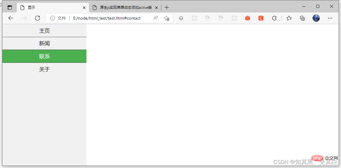
全屏高度的固定导航条
接下来我们创建一个左边是全屏高度的固定导航条,右边是可滚动的内容。
ul {
    list-style-type: none;
    margin: 0;
    padding: 0;
    width: 25%;
    background-color: #f1f1f1;
    height: 100%; /* 全屏高度 */
    position: fixed;
overflow: auto; /* 如果导航栏选项多,允许滚动 */}注意: 该实例可以在移动设备上使用。
源码
nbsp;html>


    <meta>
    <title>显示</title>
    <style>
        *{
            margin: 0;
            padding: 0;
        }
        ul {
            list-style-type: none;
            margin: 0;
            padding: 0;
            width: 25%;
            background-color: #f1f1f1;
            height: 100%; /* 全屏高度 */
            position: fixed;
            overflow: auto; /* 如果导航栏选项多,允许滚动 */
        }

        li a {
            display: block;
            color: #000;
            padding: 8px 16px;
            text-decoration: none;
        }

        li {
            text-align: center;
            border-bottom: 1px solid #555;
        }

        li:last-child {
            border-bottom: none;
        }

        li a.active {
            background-color: #4CAF50;
            color: white;
        }

        li a:hover:not(.active) {
            background-color: #555;
            color: white;
        }
    </style>
-
<li><a>主页
<li><a>新闻
<li><a>联系
<li><a>关于
水平导航栏
有两种方法创建横向导航栏。使用 内联 (inline) 或 浮动 (float) 的列表项。
这两种方法都很好,但如果你想链接到具有相同的大小,你必须使用浮动的方法。
内联列表项
建立一个横向导航栏的方法之一是指定元素, 上述代码是标准的内联:
ul {
    list-style-type:none;
    margin:0;
    padding:0;}li {
display:inline;}实例解析:
display:inline; -默认情况下,<li> 元素是块元素。
在这里,我们删除换行符之前和之后每个列表项,以显示一行。
浮动列表项
在上面的例子中链接有不同的宽度。
对于所有的链接宽度相等,浮动 <li> 元素,并指定为 <a></a>
ul {
    list-style-type:none;
    margin:0;
    padding:0;
    overflow:hidden;}li {
    float:left;}li a {
    display: block;
    color: #000;
    padding: 8px 16px;
text-decoration: none;}float:left – 使用浮动块元素的幻灯片彼此相邻。 display:block – 显示块元素的链接,让整体变为可点击链接区域(不只是文本),它允许我们指定宽度。 width:60px – 块元素默认情况下是最大宽度。我们要指定一个60像素的宽度。
ul {
list-style-type: none;
margin: 0;
padding: 0;
overflow: hidden;
background-color: #333;}
li {
float: left;}
li a {
display: block;
color: white;
text-align: center;
padding: 14px 16px;
text-decoration: none;}
/*鼠标移动到选项上修改背景颜色 */li a:hover {
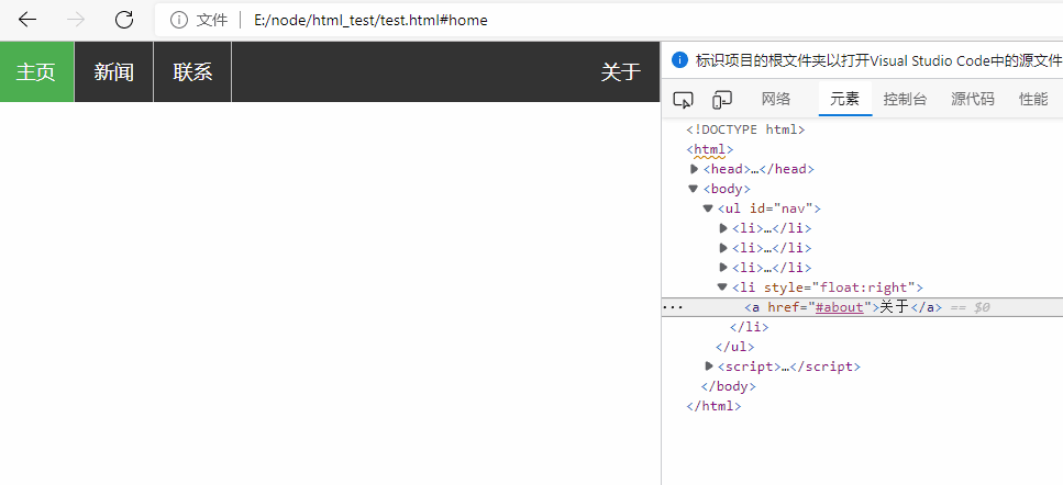
background-color: #111;}🎜Vertikale Navigationsleiste🎜🎜Für den obigen Code benötigen wir nur den Stil des <a>-Elements, um eine vertikale Navigationsleiste zu erstellen: 🎜<li style=" float:right><a>关于</a>🎜Beispielbeschreibung: 🎜🎜<code> display: block </code> zeigt den Link des Blockelements an, sodass der gesamte Linkbereich (nicht nur der Text) anklickbar ist. Dadurch können wir die Breite angeben: 60 Pixel. 🎜🎜Blockelemente haben standardmäßig die maximale Breite. Wir geben eine Breite von 60 Pixel an. 🎜🎜Hinweis: Bitte geben Sie unbedingt die Breite des <code> <a></a></code>-Elements in der vertikalen Navigationsleiste an. Wenn Sie die Breite weglassen, kann IE6 unerwartete Auswirkungen haben. 🎜🎜<img src="/static/imghw/default1.png" data-src="https://img.php.cn/upload/article/000/000/067/8048fb7f71d8a7bb45551a5ac22c1d67-1.png" class="lazy" alt="Bildbeschreibung hier einfügen">🎜<div class="code" style="position:relative; padding:0px; margin:0px;"><div class="code" style="position:relative; padding:0px; margin:0px;"><pre class="brush:php;toolbar:false">/* 除了最后一个选项(last-child) 其他的都添加分割线 */
li {
border-right: 1px solid #bbb;
}
li:last-child {
border-right: none;
}-
<li><a>主页
<li><a>新闻
<li><a>联系
<li><a>关于
🎜ul {
position: fixed;
top: 0;
width: 100%;}"active" zum Standard-Which hinzufügen Option ist ausgewählt: 🎜🎜ul {
position: fixed;
bottom: 0;
width: 100%;}nbsp;html>
<meta>
<title>显示</title>
<style>
*{
margin: 0;
padding: 0;
}
ul {
list-style-type: none;
margin: 0;
padding: 0;
overflow: hidden;
background-color: #333;
}
li {
float: left;
border-right: 1px solid #bbb;
}
li a {
display: block;
color: white;
text-align: center;
padding: 14px 16px;
text-decoration: none;
}
/*鼠标移动到选项上修改背景颜色 */
li a:hover {
background-color: #111;
}
li a.active {
background-color: #4CAF50;
color: white;
}
li a:hover:not(.active) {
background-color: #555;
color: white;
}
</style>
-
<li><a>主页
<li><a>新闻
<li><a>联系
<li><a>关于
text-align:center auf <li> hinzufügen, um ihn zu erstellen der Link zentriert. 🎜🎜Sie können das Randattribut zu Rand <ul></ul> hinzufügen, damit die Navigationsleiste einen Rand hat. 🎜 Wenn Sie jeder Option einen Rahmen hinzufügen möchten, können Sie border-bottom zu jedem <li>-Element hinzufügen: 🎜🎜 🎜
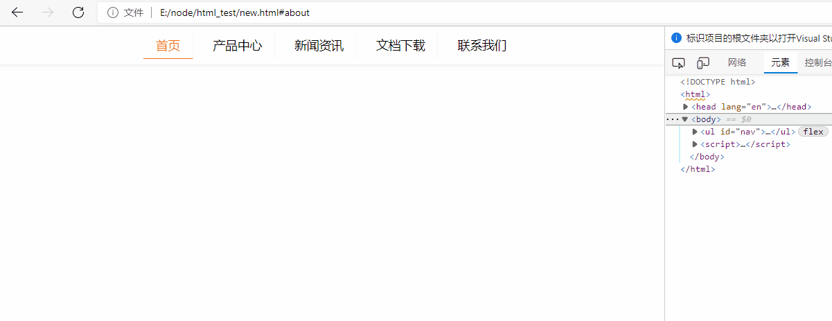
🎜nbsp;html>
<meta>
<title>原生js实现菜单动态添加active类</title>
<style>
*{
margin: 0;
padding: 0;
}
ul{
margin: 0 auto;
display: flex;
justify-content: center;
align-items: center;
height: 50px;
list-style: none;
box-shadow: 0 2px 4px #eeeeee;
}
ul > li {
padding: 6px 16px;
margin: 0 5px;
border-right: 1px solid #f7f7f7;
border-bottom: 1px solid transparent;
cursor: pointer;
}
ul > li:last-child{
border-right: none;
}
li:hover, li:focus, .active {
color: #ff6615;
border-bottom: 1px solid #ff6615;
}
</style>
Nach dem Login kopierenNach dem Login kopieren
<li>首页
<li>产品中心
<li>新闻资讯
<li>文档下载
<li>联系我们
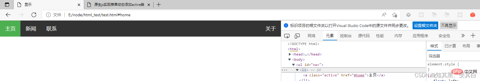
<script>
function removeActiveClass(node) {
node.className = '';
}
let menus = document.querySelectorAll('#nav');
menus.forEach(function (value, index) {
value.addEventListener('click', function (e) {
var target = e.target;
Array.prototype.forEach.call(document.querySelectorAll('#nav li'), removeActiveClass);
target.className = 'active';
})
});
</script>
🎜Feste Navigationsleiste mit voller Bildschirmhöhe🎜🎜Als nächstes erstellen wir eine feste Navigation mit voller Bildschirmhöhe auf der linke Leiste, mit scrollbarem Inhalt auf der rechten Seite. 🎜nbsp;html>
<meta>
<title>下拉菜单</title>
<style>
/*鼠标下拉菜单*/
.dropdown {
position: relative;
display: inline-block;
}
.dropdown-content {
display: none;
position: absolute;
background-color: #f9f9f9;
min-width: 160px;
box-shadow: 0px 8px 16px 0px rgba(0,0,0,0.2);
padding: 12px 16px;
}
.dropdown:hover .dropdown-content {
display: block;
}
</style>
<div>
<span>鼠标移动到我这看到下拉菜单!</span>
<div>
<p>CSDN博客</p>
<p>wgchen.blog.csdn.net</p>
</div>
</div>
Nach dem Login kopierenNach dem Login kopieren🎜Hinweis: Dieses Beispiel kann auf mobilen Geräten verwendet werden. 🎜🎜🎜 Quellcode 🎜nbsp;html>
<meta>
<title>下拉菜单</title>
<style>
/* 下拉按钮样式 */
.dropbtn {
background-color: #4CAF50;
color: white;
padding: 16px;
font-size: 16px;
border: none;
cursor: pointer;
}
/* 容器 <div> - 需要定位下拉内容 */
.dropdown {
position: relative;
display: inline-block;
}
/* 下拉内容 (默认隐藏) */
.dropdown-content {
display: none;
position: absolute;
background-color: #f9f9f9;
min-width: 160px;
box-shadow: 0px 8px 16px 0px rgba(0, 0, 0, 0.2);
}
/* 下拉菜单的链接 */
.dropdown-content a {
color: black;
padding: 12px 16px;
text-decoration: none;
display: block;
}
/* 鼠标移上去后修改下拉菜单链接颜色 */
.dropdown-content a:hover {
background-color: #f1f1f1
}
/* 在鼠标移上去后显示下拉菜单 */
.dropdown:hover .dropdown-content {
display: block;
}
/* 当下拉内容显示后修改下拉按钮的背景颜色 */
.dropdown:hover .dropbtn {
background-color: #3e8e41;
}
</style>
<div>
<button>下拉菜单</button>
<div>
<a>CSDN博客 1</a>
<a>CSDN博客 2</a>
<a>CSDN博客 3</a>
</div>
</div>
Nach dem Login kopierenNach dem Login kopieren🎜Level Navigationsleiste 🎜🎜Es gibt zwei Möglichkeiten, eine horizontale Navigationsleiste zu erstellen. Verwenden Sie inline oder float für Listenelemente. 🎜🎜Beide Methoden sind in Ordnung, aber wenn Sie möchten, dass Links die gleiche Größe haben, müssen Sie die Float-Methode verwenden. 🎜🎜Inline-Listenelemente🎜🎜Eine Möglichkeit, eine horizontale Navigationsleiste zu erstellen, besteht darin, das Element anzugeben. Der obige Code ist standardmäßig inline: 🎜rrreee🎜Beispielanalyse: 🎜🎜display:inline - Standard: In diesem Fall ist das <li>-Element ein Blockelement. 🎜 Hier entfernen wir die Zeilenumbrüche vor und nach jedem Listenelement, um eine einzelne Zeile anzuzeigen. 🎜🎜 Floating List Items 🎜🎜 Im obigen Beispiel haben die Links unterschiedliche Breiten. 🎜🎜Damit alle Links die gleiche Breite haben, schweben Sie das Element <li> und geben Sie die Breite des Elements <a></a> an: 🎜rrreee🎜Beispielanalyse: 🎜 rrreee🎜 Beispiel für eine horizontale Navigationsleiste🎜🎜Erstellen Sie eine horizontale Navigationsleiste und ändern Sie die Hintergrundfarbe, nachdem Sie die Maus auf die Option bewegt haben. 🎜ul {
list-style-type: none;
margin: 0;
padding: 0;
overflow: hidden;
background-color: #333;}
li {
float: left;}
li a {
display: block;
color: white;
text-align: center;
padding: 14px 16px;
text-decoration: none;}
/*鼠标移动到选项上修改背景颜色 */li a:hover {
background-color: #111;}Nach dem Login kopieren
链接右对齐
将导航条最右边的选项设置右对齐 (float:right;):
Nach dem Login kopierenNach dem Login kopieren
<li><a>关于
添加分割线
<li> 通过 border-right 样式来添加分割线:
/* 除了最后一个选项(last-child) 其他的都添加分割线 */
li {
border-right: 1px solid #bbb;
}
li:last-child {
border-right: none;
}Nach dem Login kopierenNach dem Login kopieren
<li><a>主页
<li><a>新闻
<li><a>联系
<li><a>关于
固定导航条
可以设置页面的导航条固定在头部或者底部。
固定在头部:
ul {
    position: fixed;
    top: 0;
    width: 100%;}
Nach dem Login kopierenNach dem Login kopieren
固定在底部:
ul {
    position: fixed;
    bottom: 0;
    width: 100%;}
Nach dem Login kopierenNach dem Login kopieren
注意: 该实例可以在移动设备上使用。
源码
nbsp;html>


    <meta>
    <title>显示</title>
    <style>
        *{
            margin: 0;
            padding: 0;
        }
        ul {
            list-style-type: none;
            margin: 0;
            padding: 0;
            overflow: hidden;
            background-color: #333;
        }
        li {
            float: left;
            border-right: 1px solid #bbb;
        }
        li a {
            display: block;
            color: white;
            text-align: center;
            padding: 14px 16px;
            text-decoration: none;
        }
        /*鼠标移动到选项上修改背景颜色 */
        li a:hover {
            background-color: #111;
        }
        li a.active {
            background-color: #4CAF50;
            color: white;
        }
        li a:hover:not(.active) {
            background-color: #555;
            color: white;
        }
    </style>
Nach dem Login kopierenNach dem Login kopieren
<li><a>主页
<li><a>新闻
<li><a>联系
<li><a>关于
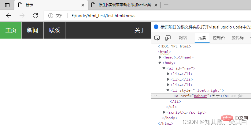
<script>
function removeActiveClass(node) {
node.className = '';
}
let menus = document.querySelectorAll('#nav');
menus.forEach(function (value, index) {
value.addEventListener('click', function (e) {
var target = e.target;
Array.prototype.forEach.call(document.querySelectorAll('#nav li a'), removeActiveClass);
target.className = 'active';
})
});
</script>
示例 1
nbsp;html>
<meta>
<title>原生js实现菜单动态添加active类</title>
<style>
*{
margin: 0;
padding: 0;
}
ul{
margin: 0 auto;
display: flex;
justify-content: center;
align-items: center;
height: 50px;
list-style: none;
box-shadow: 0 2px 4px #eeeeee;
}
ul > li {
padding: 6px 16px;
margin: 0 5px;
border-right: 1px solid #f7f7f7;
border-bottom: 1px solid transparent;
cursor: pointer;
}
ul > li:last-child{
border-right: none;
}
li:hover, li:focus, .active {
color: #ff6615;
border-bottom: 1px solid #ff6615;
}
</style>
Nach dem Login kopierenNach dem Login kopieren
<li>首页
<li>产品中心
<li>新闻资讯
<li>文档下载
<li>联系我们
<script>
function removeActiveClass(node) {
node.className = '';
}
let menus = document.querySelectorAll('#nav');
menus.forEach(function (value, index) {
value.addEventListener('click', function (e) {
var target = e.target;
Array.prototype.forEach.call(document.querySelectorAll('#nav li'), removeActiveClass);
target.className = 'active';
})
});
</script>
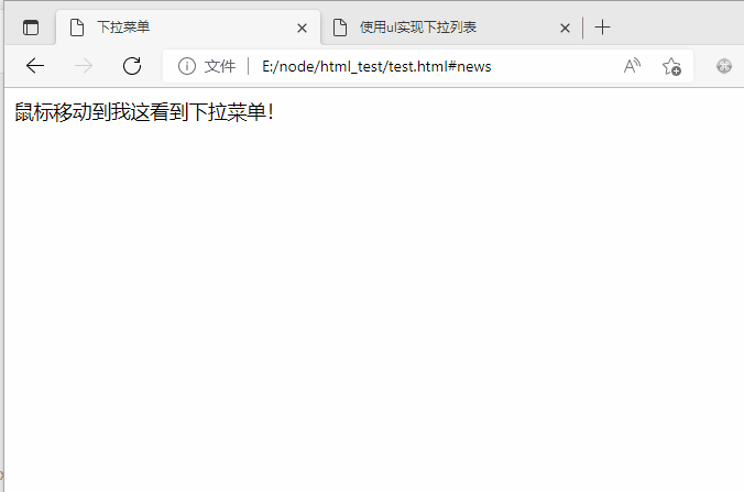
CSS 下拉菜单
使用 CSS 创建一个鼠标移动上去后显示下拉菜单的效果。
基本下拉菜单
当鼠标移动到指定元素上时,会出现下拉菜单。
nbsp;html>
<meta>
<title>下拉菜单</title>
<style>
/*鼠标下拉菜单*/
.dropdown {
position: relative;
display: inline-block;
}
.dropdown-content {
display: none;
position: absolute;
background-color: #f9f9f9;
min-width: 160px;
box-shadow: 0px 8px 16px 0px rgba(0,0,0,0.2);
padding: 12px 16px;
}
.dropdown:hover .dropdown-content {
display: block;
}
</style>
<div>
<span>鼠标移动到我这看到下拉菜单!</span>
<div>
<p>CSDN博客</p>
<p>wgchen.blog.csdn.net</p>
</div>
</div>
Nach dem Login kopierenNach dem Login kopieren
实例解析
HTML 部分
我们可以使用任何的 HTML 元素来打开下拉菜单,如:<span></span> , 或 a <button></button> 元素。
使用容器元素 (如: <p></p> ) 来创建下拉菜单的内容,并放在任何你想放的位置上。
使用 <p> </p> 元素来包裹这些元素,并使用 CSS 来设置下拉内容的样式。
CSS 部分
.dropdown 类使用 position:relative:
这将设置下拉菜单的内容放置在下拉按钮 (使用 position:absolute ) 的右下角位置。
.dropdown-content 类中是实际的下拉菜单。
默认是隐藏的,在鼠标移动到指定元素后会显示。 注意 min-width 的值设置为 160px。你可以随意修改它。
注意:如果你想设置下拉内容与下拉按钮的宽度一致,可设置 width 为 100%
( overflow:auto 设置可以在小尺寸屏幕上滚动)。
我们使用 box-shadow 属性让下拉菜单看起来像一个”卡片”。
:hover 选择器用于在用户将鼠标移动到下拉按钮上时显示下拉菜单。
下拉菜单
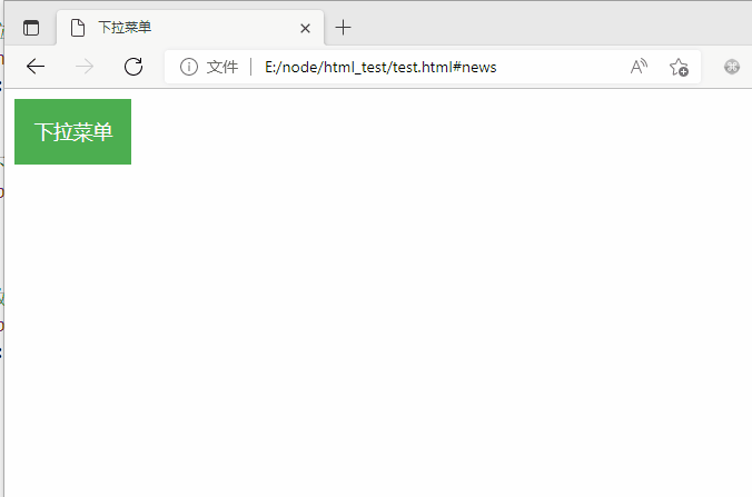
创建下拉菜单,并允许用户选取列表中的某一项:
nbsp;html>
<meta>
<title>下拉菜单</title>
<style>
/* 下拉按钮样式 */
.dropbtn {
background-color: #4CAF50;
color: white;
padding: 16px;
font-size: 16px;
border: none;
cursor: pointer;
}
/* 容器 <div> - 需要定位下拉内容 */
.dropdown {
position: relative;
display: inline-block;
}
/* 下拉内容 (默认隐藏) */
.dropdown-content {
display: none;
position: absolute;
background-color: #f9f9f9;
min-width: 160px;
box-shadow: 0px 8px 16px 0px rgba(0, 0, 0, 0.2);
}
/* 下拉菜单的链接 */
.dropdown-content a {
color: black;
padding: 12px 16px;
text-decoration: none;
display: block;
}
/* 鼠标移上去后修改下拉菜单链接颜色 */
.dropdown-content a:hover {
background-color: #f1f1f1
}
/* 在鼠标移上去后显示下拉菜单 */
.dropdown:hover .dropdown-content {
display: block;
}
/* 当下拉内容显示后修改下拉按钮的背景颜色 */
.dropdown:hover .dropbtn {
background-color: #3e8e41;
}
</style>
<div>
<button>下拉菜单</button>
<div>
<a>CSDN博客 1</a>
<a>CSDN博客 2</a>
<a>CSDN博客 3</a>
</div>
</div>
Nach dem Login kopierenNach dem Login kopieren
Das obige ist der detaillierte Inhalt vonEinfaches Verständnis der grundlegenden CSS-Navigationsleiste und des CSS-Dropdown-Menüs anhand von Beispielen. Für weitere Informationen folgen Sie bitte anderen verwandten Artikeln auf der PHP chinesischen Website!

Heiße KI -Werkzeuge

Undresser.AI Undress
KI-gestützte App zum Erstellen realistischer Aktfotos

AI Clothes Remover
Online-KI-Tool zum Entfernen von Kleidung aus Fotos.

Undress AI Tool
Ausziehbilder kostenlos

Clothoff.io
KI-Kleiderentferner

Video Face Swap
Tauschen Sie Gesichter in jedem Video mühelos mit unserem völlig kostenlosen KI-Gesichtstausch-Tool aus!

Heißer Artikel
Heiße Werkzeuge

Notepad++7.3.1
Einfach zu bedienender und kostenloser Code-Editor

SublimeText3 chinesische Version
Chinesische Version, sehr einfach zu bedienen

Senden Sie Studio 13.0.1
Leistungsstarke integrierte PHP-Entwicklungsumgebung

Dreamweaver CS6
Visuelle Webentwicklungstools

SublimeText3 Mac-Version
Codebearbeitungssoftware auf Gottesniveau (SublimeText3)
Heiße Themen


 So verwenden Sie Bootstrap in Vue
Apr 07, 2025 pm 11:33 PM
So verwenden Sie Bootstrap in Vue
Apr 07, 2025 pm 11:33 PM
Die Verwendung von Bootstrap in Vue.js ist in fünf Schritte unterteilt: Startstrap installieren. Bootstrap in main.js. Verwenden Sie die Bootstrap -Komponente direkt in der Vorlage. Optional: benutzerdefinierter Stil. Optional: Verwenden Sie Plug-Ins.
 Die Rollen von HTML, CSS und JavaScript: Kernverantwortung
Apr 08, 2025 pm 07:05 PM
Die Rollen von HTML, CSS und JavaScript: Kernverantwortung
Apr 08, 2025 pm 07:05 PM
HTML definiert die Webstruktur, CSS ist für Stil und Layout verantwortlich, und JavaScript ergibt eine dynamische Interaktion. Die drei erfüllen ihre Aufgaben in der Webentwicklung und erstellen gemeinsam eine farbenfrohe Website.
 So schreiben Sie geteilte Zeilen auf Bootstrap
Apr 07, 2025 pm 03:12 PM
So schreiben Sie geteilte Zeilen auf Bootstrap
Apr 07, 2025 pm 03:12 PM
Es gibt zwei Möglichkeiten, eine Bootstrap -Split -Zeile zu erstellen: Verwenden des Tags, das eine horizontale Split -Linie erstellt. Verwenden Sie die CSS -Border -Eigenschaft, um benutzerdefinierte Style Split -Linien zu erstellen.
 HTML, CSS und JavaScript verstehen: Ein Anfängerhandbuch
Apr 12, 2025 am 12:02 AM
HTML, CSS und JavaScript verstehen: Ein Anfängerhandbuch
Apr 12, 2025 am 12:02 AM
WebdevelopmentRelieSonHtml, CSS und JavaScript: 1) HtmlStructuresContent, 2) CSSstylesit und 3) JavaScriptaddssinteraktivität, Bildung von TheBasisofModerernwebexperiences.
 So fügen Sie Bilder auf Bootstrap ein
Apr 07, 2025 pm 03:30 PM
So fügen Sie Bilder auf Bootstrap ein
Apr 07, 2025 pm 03:30 PM
Es gibt verschiedene Möglichkeiten, Bilder in Bootstrap einzufügen: Bilder direkt mit dem HTML -IMG -Tag einfügen. Mit der Bootstrap -Bildkomponente können Sie reaktionsschnelle Bilder und weitere Stile bereitstellen. Legen Sie die Bildgröße fest und verwenden Sie die IMG-Fluid-Klasse, um das Bild anpassungsfähig zu machen. Stellen Sie den Rand mit der img-beliebten Klasse ein. Stellen Sie die abgerundeten Ecken ein und verwenden Sie die IMG-Rund-Klasse. Setzen Sie den Schatten, verwenden Sie die Schattenklasse. Größen Sie die Größe und positionieren Sie das Bild im CSS -Stil. Verwenden Sie mit dem Hintergrundbild die CSS-Eigenschaft im Hintergrund.
 So richten Sie das Framework für Bootstrap ein
Apr 07, 2025 pm 03:27 PM
So richten Sie das Framework für Bootstrap ein
Apr 07, 2025 pm 03:27 PM
Um das Bootstrap -Framework einzurichten, müssen Sie die folgenden Schritte befolgen: 1. Verweisen Sie die Bootstrap -Datei über CDN; 2. Laden Sie die Datei auf Ihrem eigenen Server herunter und hosten Sie sie. 3.. Fügen Sie die Bootstrap -Datei in HTML hinzu; 4. Kompilieren Sie Sass/weniger bei Bedarf; 5. Importieren Sie eine benutzerdefinierte Datei (optional). Sobald die Einrichtung abgeschlossen ist, können Sie die Grid -Systeme, -Komponenten und -stile von Bootstrap verwenden, um reaktionsschnelle Websites und Anwendungen zu erstellen.
 So ändern Sie Bootstrap
Apr 07, 2025 pm 03:18 PM
So ändern Sie Bootstrap
Apr 07, 2025 pm 03:18 PM
Um die Größe der Elemente in Bootstrap anzupassen, können Sie die Dimensionsklasse verwenden, einschließlich: Einstellbreite:.
 So verwenden Sie die Bootstrap -Taste
Apr 07, 2025 pm 03:09 PM
So verwenden Sie die Bootstrap -Taste
Apr 07, 2025 pm 03:09 PM
Wie benutze ich die Bootstrap -Taste? Führen Sie Bootstrap -CSS ein, um Schaltflächenelemente zu erstellen, und fügen Sie die Schaltfläche "Bootstrap" hinzu, um Schaltflächentext hinzuzufügen
