Website http://zm.163.com/
So erzielen Sie diesen Effekt
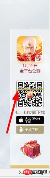
就是一个简单CSS3 动画
.light_pc {
        width: 93px;
        height: 9px;
        position: absolute;
        top: 0;
        left: 50%;
        margin-left: -46px;
        background: url(https://zm.res.netease.com/pc/fab/20161226201931/img/light_pc_f3d5dee.png?_sprite) no-repeat;
        -moz-animation: light_pc 4s linear 0s infinite;
        -webkit-animation: light_pc 4s linear 0s infinite;
        -o-animation: light_pc 4s linear 0s infinite;
        -ms-animation: light_pc 4s linear 0s infinite;
        animation: light_pc 4s linear 0s infinite
    }

    @-webkit-keyframes light_pc {
        0% {
            top: 0
        }
        50% {
            top: 83px
        }
        100% {
            top: 0
        }
    }

    @-moz-keyframes light_pc {
        0% {
            top: 0
        }
        50% {
            top: 83px
        }
        100% {
            top: 0
        }
    }

    @-ms-keyframes light_pc {
        0% {
            top: 0
        }
        50% {
            top: 83px
        }
        100% {
            top: 0
        }
    }

    @-o-keyframes light_pc {
        0% {
            top: 0
        }
        50% {
            top: 83px
        }
        100% {
            top: 0
        }
    }

    @keyframes light_pc {
        0% {
            top: 0
        }
        50% {
            top: 83px
        }
        100% {
            top: 0
        }
    }
查看元素,具体了解下css的animation
二维码图片外面有一个p和图片高度大小一致用:before做出一条横线写css3动画移动
我也晒一下我的动画
  demo {
  transform: translate3d(0, 0, 0);
  animation: bounce 0.8s infinite ease-out;
}
@-webkit-keyframes bounce {
  50% {
    transform: translate3d(0, -0.2rem, 0);
  }
}


![[Web-Frontend] Node.js-Schnellstart](https://img.php.cn/upload/course/000/000/067/662b5d34ba7c0227.png)


就是一个简单CSS3 动画
查看元素,具体了解下css的animation
二维码图片外面有一个p和图片高度大小一致
用:before
做出一条横线
写css3动画移动
我也晒一下我的动画