Combining 2D and 3D in HTML and CSS3 to achieve animation effects
This article introduces you to the combination of 2D and 3D in HTML and CSS3 to achieve animation effects. It has certain reference value. Friends in need can refer to it. I hope it will be helpful to you.
Although we are working on the front end, we generally do not use 2D and 3D animation effects. We basically use JS or jQ to complete these animation effects, but the most basic ones Have you forgotten it?
I reviewed these things yesterday and wrote two small examples
1. Use css to draw a heart
First define a div in HTML,
<div class="heart"></div>
Only one p is needed, I use pseudo elements to draw it;
  <style>
        /* 基于父级定位 */
    .heart{
     position: relative;
    }
    /* 使用伪元素画出两个图像,使用图形拼接来造出一个心 */
    .heart::after,
    .heart::before{
        content: "";
        position: absolute;
        top: 100px;
        left: 0;
        right: 0;
        margin: auto;
        width: 50px;
        height: 80px;
        background: red;
        /* borde-radius 有四个值 分别对应四个角,分别对应 左上 右上 右下 左下 */
        border-radius: 50px 50px 0 0;

        /* 旋转元素,两个一起旋转。等下只需要调动一个即可 */
        transform: rotate(-45deg);
        transform-origin: 0 100%;
    }
    /* 旋转元素 使它和before伪元素 拼接成一个心 */
    .heart::after{
        left: -100px;
        transform: rotate(45deg);
        transform-origin: 100% 100%;
    }
</style>Through the above code, we get a prosperous heart

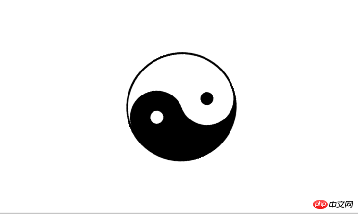
2. Use css to draw a Tai Chi diagram, and add animation to make it rotate automatically
Like the heart shape above, I still use pseudo elements to write it
First define a div and name it taiji
<div id="taiji"></div>
Then use pseudo elements and see how I create it. Without further ado, just add the code
<style type="text/css">
        #taiji {
            position: relative;
            width: 200px;
            height: 100px;
            background: white;
            border-color: black;
            border-style: solid;
            border-width: 4px 4px 100px 4px;
                  /*变成圆形*/
            border-radius: 50%;

            margin: 100px auto;
               /* 定义动画 名称 时长  匀速 无限循环播放 */
            animation: myfirst 4s linear infinite;

        }

        #taiji::before,
        #taiji::after {
            content: " ";
            position: absolute;
            top: 50%;
            left: 0;
            width: 25px;
            height: 25px;
            background: white;
            border: 38px solid black;

            border-radius: 50%;
        }

        #taiji::after {
            left: 50%;
            background: black;
            border-color: white;
        }

        /* 定义动画 */

        @keyframes myfirst {
            0% {

                transform: rotate(0deg);
            }
            100% {

                transform: rotate(360deg);
            }

        }
</style>and the effect is as follows:

Recommended related articles:
How to use pure CSS to achieve the effect of a green pig
How to enlarge images with css? (Example of cool special effects)
The above is the detailed content of Combining 2D and 3D in HTML and CSS3 to achieve animation effects. For more information, please follow other related articles on the PHP Chinese website!

Hot AI Tools

Undresser.AI Undress
AI-powered app for creating realistic nude photos

AI Clothes Remover
Online AI tool for removing clothes from photos.

Undress AI Tool
Undress images for free

Clothoff.io
AI clothes remover

Video Face Swap
Swap faces in any video effortlessly with our completely free AI face swap tool!

Hot Article

Hot Tools

Notepad++7.3.1
Easy-to-use and free code editor

SublimeText3 Chinese version
Chinese version, very easy to use

Zend Studio 13.0.1
Powerful PHP integrated development environment

Dreamweaver CS6
Visual web development tools

SublimeText3 Mac version
God-level code editing software (SublimeText3)

Hot Topics
 1677
1677
 14
14
 1431
1431
 52
52
 1334
1334
 25
25
 1280
1280
 29
29
 1257
1257
 24
24
 Table Border in HTML
Sep 04, 2024 pm 04:49 PM
Guide to Table Border in HTML. Here we discuss multiple ways for defining table-border with examples of the Table Border in HTML.
 Nested Table in HTML
Sep 04, 2024 pm 04:49 PM
This is a guide to Nested Table in HTML. Here we discuss how to create a table within the table along with the respective examples.
 HTML margin-left
Sep 04, 2024 pm 04:48 PM
Guide to HTML margin-left. Here we discuss a brief overview on HTML margin-left and its Examples along with its Code Implementation.
 HTML Table Layout
Sep 04, 2024 pm 04:54 PM
Guide to HTML Table Layout. Here we discuss the Values of HTML Table Layout along with the examples and outputs n detail.
 HTML Input Placeholder
Sep 04, 2024 pm 04:54 PM
Guide to HTML Input Placeholder. Here we discuss the Examples of HTML Input Placeholder along with the codes and outputs.
 How do you parse and process HTML/XML in PHP?
Feb 07, 2025 am 11:57 AM
This tutorial demonstrates how to efficiently process XML documents using PHP. XML (eXtensible Markup Language) is a versatile text-based markup language designed for both human readability and machine parsing. It's commonly used for data storage an
 HTML Ordered List
Sep 04, 2024 pm 04:43 PM
Guide to the HTML Ordered List. Here we also discuss introduction of HTML Ordered list and types along with their example respectively
 HTML onclick Button
Sep 04, 2024 pm 04:49 PM
Guide to HTML onclick Button. Here we discuss their introduction, working, examples and onclick Event in various events respectively.


