 Web Front-end
 HTML Tutorial
 Compilation of daily study notes on HTML design patterns_HTML/Xhtml_Web page production
Compilation of daily study notes on HTML design patterns_HTML/Xhtml_Web page production
HTML design pattern study notes
This week I mainly learned about HTML design patterns. I now summarize my learning content as follows:
1. Learning of box model
There is a basic design model in CSS called the box model, which defines how elements are parsed as boxes. I mainly learned six types of box models, namely inline box model (inline box), inline block box model (inline-block box), block box model (block box), table box model (table box), Absolute box model (absolute box) and floating box model (floated box).
The box model design pattern is built into CSS and defines the relationship between the following properties: border, border, padding, and content. Each attribute includes four parts: top, right, bottom, left; these four parts can be set at the same time or separately; the border has size and color, which we can understand as the thickness of the box we see in life and the What color material the box is made of, the boundary is the distance between the box and other things, the content is the content of the box, and the material filling the empty space in the filling box.
1.1 Inline Box Model
Inline box models are parsed in inline order, they are sorted horizontally from left to right, and moved to a new line when they exceed the width of their nearest terminal block ancestor. width, height and overflow don't work on inline elements because they always match the width and height of the content. Margin and line-height can be applied to inline elements in a special way. Horizontal margins change the position of inline elements in the collation order. A positive value for margin-left will move the element further away from the element in front of it, while a negative value will bring it closer. A positive value for margin-right will move the element further away from its next element, while a negative value will bring it closer. margin-top and margin-bottom have no effect on inline elements. Border sets a border for inline elements in a special way. The horizontal border will change the position of inline elements in the arrangement. The left border moves the element to the left, and the right border moves the next element to the right. The top and bottom borders will appear outside the padding, but will not extend to the line height or change the vertical position of the element. The template for this pattern can be represented as follows:
INLINE_SELECTOR{
display:inline;
visibility:value;
line-height:value;
margin:value;
padding:value;
border: width style color;
}
This design pattern can be applied to any inline element and any element displayed inline.
1.2 Inline Block Box Model
The inline block element is located in the inline sort order, just like other inline boxes, except that it also contains some properties of the block element: margin, border, padding, width and high. Inline block elements will not intersect other lines. Inline block elements add line height to accommodate their height, padding, borders, and margins. width and height set the height and width of the element. You can expand or shrink an alternative element, such as an image, by setting their width or height to a specific value. You can also use width:auto and height:auto to make the size of the replacement element match the actual size. Assuming a span with display:inline-block, you can adjust the size by setting their width and height. You can also use width:auto and height:auto to wrap inline block elements. You can use width:100% to stretch the inline block element, which is the same as the block element. The margin element will change the size of the element from the four directions of top, bottom, left and right. margin-top and margin-bottom will increase or decrease the line height. margin-left and margin-right will bring the element closer or expand it in the horizontal direction. The distance of the elements. Borders and padding can also be used to extend the outer dimensions of inline elements.
The typical pattern of the inline box model is as follows:
SELECTOR{
display:inline- block;
line-height:value;
overflow:value;
visibility:value;
width:value;
height:value;
margin:value;
padding :value;
border:width style color;
}
This design pattern can be applied to all inline elements.
1.3 Block Box Model
In a block formatting environment, the block box model is arranged vertically from top to bottom, which is the normal arrangement of block elements. Block box models can contain other block box models, or they can terminate a block formatting environment and start an inline formatting environment containing inline box models. The terminal block element creates an inline formatting environment within its inner box, but its outer box must be in a block formatting environment at this time.
The length of a block element can be the same as its parent element, or it can be smaller or larger than its parent element. When its size is larger than the parent element, it will overflow. The overflow attribute is used to control how the browser handles overflow. In the block box model, width and height are still used to set the width and height of elements. Among them, width:auto means that it makes the width of the element consistent with the parent element, and height:auto means that it makes the height of the element wrap all its child elements. margin-left and margin-right will indent or extend the sides of a stretched block element, and they will adjust the size of the block element. margin-top and margin-bottom can increase or decrease the distance between different block elements, or even make them overlap. Browsers offset the top and bottom margins of adjacent block elements. Use margin-left:auto and margin-right:auto to control the horizontal arrangement of fixed-size block elements. If a block element has width set, margin-left:auto will arrange the block element to the right of the parent element, and margin-right:auto will arrange the block element to the left of the parent element. Setting margin-left:auto and margin-right:auto at the same time will place the block element in the middle of the parent element. Borders and padding also extend the outer width and height of the box model. The block box model is patterned as follows:
SELECTOR{
display:block;
overflow:value;
visibility:value;
width:value;
height:value;
margin:value;
padding:value;
border:width style color ;
}
This design pattern can be used for all block elements.
1.4 Table Box Model
A table is a block box model with many rows of cells. Tables are also located in an arrangement of block elements, while the cells in tables are arranged in "rows" and "columns". The table has margins but no padding. The cells have inner margins but no outer margins. Use width to set the width of the table. Width here refers to the width outside the border rather than the width inside the padding. Use height to set the height of the table. The height here refers to the height outside the border rather than the height inside the padding. The way margins are parsed depends on whether the table is sized, wrapped, or stretched. Margins move the table and subsequent elements when it is sized and wrapped. Negative margins will cause adjacent elements to overlap the table. When a table is stretched, the margins cause the table to indent, which makes its inner dimensions smaller and reduces the size of the cells. Border will make the inner box of a table that has defined dimensions or stretching smaller. Overflow cannot be applied to tables, because tables cannot overflow, only the cells of the table can overflow. Overflow:hidden should be assigned to the cell to ensure consistent behavior across all browsers when a fixed-size cell overflows. Border-collapse determines whether adjacent borders are merged into one, and table-layout determines whether the table is of fixed size (fixed) or changes based on its content (auto). The schema of the table box model is as follows:
SELECTOR{
display:table;
visibility:value;
width:value;
height:value;
margin:value;
border:width style color;
border-collapse:value;
table -layout:value;
}
This design pattern can be used for all table elements.
1.5 Absolute Positioning Box Model
Absolutely positioned elements are separated from the normal arrangement order of elements and placed at a higher or lower level. It is positioned relative to the nearest positioned ancestor or fixed to a position in the viewport. You can set dimensions, wrap it, or stretch it to the same size as the parent element. Any element can be positioned absolutely. The position of an absolutely positioned box model does not affect the position of other box models.
z-index controls the stacking order of positioned elements. Negative values will place them below the normal arrangement layer, positive values will place them above. The larger the value, the further forward it will be in the vertical arrangement. You can assign top, left, bottom, and right to the absolutely positioned box model. When a value is set, left will be positioned based on the container of the absolutely positioned element and positioned according to the positive or negative value you set. The same principle applies to the other three attributes. Use width to set the width of the element, and height to set the height of the element. When margin is positive, it will move the absolutely positioned box model toward the center of its container. When it is negative, it will move away from the center. Border and padding will shrink the inner box of the stretched absolutely positioned box model. The mode of the absolutely positioned box model is as follows:
SELECTOR{
position:absolute_fixed;
z-index:value;
overflow:value;
visibility:value;
left:value;
right:value;
top:value;
bottom:value ;
width:value;
height:value;
margin:value;
padding:value;
border:width style color;
}
This design pattern can be applied to all elements.
1.6 Floating Box Model
Use float:left or float:right to float any element. Floated elements are also out of the normal order of elements and placed on top of the borders and backgrounds of adjacent block elements. This shrinks the floated element's parent element and completely disappears when all of its children are floated. Even if the floating element breaks away from the original arrangement of elements, it will cause adjacent content in the queue to be indented in a certain direction. Floating left will cause adjacent content to be indented to the right, while floating right will cause content to be indented to the left. Floated elements are positioned vertically in their original position. And within the parent element's padding, it is positioned horizontally from the right or left. Floated elements are arranged vertically at their original positions. When a floated element cannot be immediately adjacent to its next floated element, it will move below. The position, size, padding, borders, and margins of a floated element all affect the position of adjacent floated elements and adjacent inline content. width and height are used to set the width and height of floating elements. Margin has a unique floating function. Positive margins will move the floating element away from its original position and keep other floating elements and inline content away from it. Negative margins will do the opposite. Border and padding increase the outer box size of floating elements. A left-floated element's left margin and left padding will push it to the right, while its right margin and right padding will push other floated elements and inline content on the right further to the right. For right-floated elements, the opposite is true. The pattern of the floating box model is as follows:
SELECTOR{
float:left_right;
width:value;
height:value;
z-index:value;
margin:value;
padding:value;
border:width style color;
overflow :value;
visibility:value;
}
This design pattern can be applied to all elements.
2: Learning of positioning model
CSS provides 6 positioning models for placing elements: static, absolute, fixed, relative, floating and relative floating. Static positioning models are capable of positioning inline, inline block, block, and table box models. Absolute and fixed positioning models enable positioning of absolute box models. The floating positioning model can position the floating box model. The relative positioning model can perform relative positioning on any box model except the absolute box model. The relative floating positioning model can relative position the floating box model. Each positioning model uses the same basic set of attributes to control positioning.
2.1 Static Positioning
If you want the elements to be arranged one after another in the order of inline and block elements, you can use position:static to apply to the elements. Within a block element, one or more block or inline elements resolve vertically downward. Within inline elements, text and objects are parsed horizontally, line by line. The starting position of a static element is determined by the previous static element. The pattern is as follows:
Inline static elements:
INLINE-SELECTOR{
position:static;
line-height:value;
margin-left:value;
margin-right:value;
}
Blocky static element:
BLOCK-SELECTOR{
position: static;
width:value;
height:value;
margin:value;
}
2.2 Absolute Positioning
Absolute elements allow you to precisely control their position relative to their positioned closest ancestor element. Absolute elements are parsed at a positioning level above the normal element order, just like a separate box model. Unlike floated elements, absolute elements are not fluid. You can use position:absolute to parse any element as an absolute box model. Use width and height to set its size. The percentage is relative to its positioned closest box model, not the parent element. You can assign values to left, right, bottom, and top and place them on one side of the nearest ancestor element. You can use margin to offset the edge of an element relative to the edge of its nearest ancestor element. Use z-index to control the stacking order of elements. Elements with a large z-index value will be positioned closer to the user. The pattern is as follows:
SELECTOR{
position:absolute;
z-index:value;
width:value;
left:value;
right:value;
top:value;
bottom:value;
margin:value ;
}
2.3 Fixed Positioning
You want the element to be removed from its positioning layer and fixed somewhere in the viewport, or you want it to stay in its original position in the order of elements. When the window scrolls, you don't want it to freeze. This is called a fixed positioned element or fixed element. You can use position:fixed to convert any element into a fixed positioning element. Fixed elements are positioned relative to the viewport rather than to other nearest ancestor elements. So if you fix an element to its original position in the order, it will stay put when the window scrolls. The pattern is as follows:
SELECTOR{
position:fixed;
z-index:value;
width:value;
height:value;
margin:value;
left:value;
top:value;
bottom:value ;
right:value;
}
2.4 Relative positioning
In order to control the stacking order of elements in their normal arrangement, you can use position:relative to position them relative to each other. The positioning of a relative element does not deviate from the normal arrangement of the element, nor does it change its shape in the normal arrangement. For example, if an inline element spans multiple lines (one or more lines), it will retain this unique layout when positioned relatively. You can optionally offset a relatively positioned element from its original arrangement using left and top. Assign position:relative to any element so that absolute descendant elements can be positioned relative to it. The pattern is as follows:
SELECTOR{
position:relative;
z-index:value;
left:auto;
top:auto;
}
3: Box Model Exploration and Learning
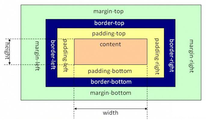
In CSS2.1, block-level elements can only be rectangular in shape. When we need to calculate the overall size of a block-level element, we need to take into account the length and width of the content area, as well as the element's margins, padding, and borders. The box model can be divided into the standard W3C box model and the IE box model. The standard W3C box model is as shown below:
Picture 1
The scope of this box model includes margin, border, padding, and content, and the content part does not include other parts. That is to say, when we design the width and height attributes of a block-level element in CSS, such as .box{width: 100px; height:100px}, the width and height are only set for the content part, that is, the above figure is defined The length of the area between padding-top and padding-bottom (the width of the area between padding-left and padding-right). Rather than the sum of content, padding, and borders. The IE box model is as shown below:
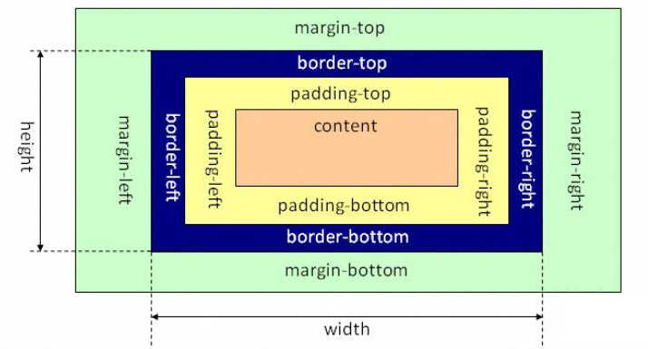
Picture 2
The scope of this box model includes margin, border, padding, and content. The difference from the standard W3C box model is that the content part of the IE box model includes border and padding. That is to say, when we design the width and height attributes of a block-level element in CSS, such as .box{width: 100px; height:100px}, the width and height are the sum of the content, padding, and border.
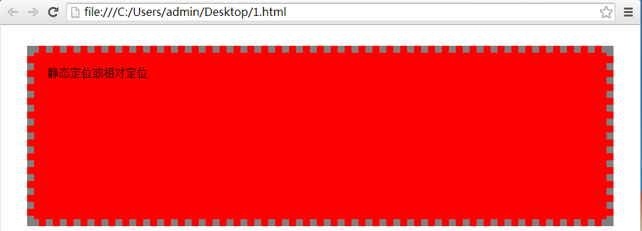
For static positioned elements (i.e. no positioning) with automatic width and relatively positioned elements, the width is calculated by subtracting all horizontal margins of the element from the width of their containing block. , padding, borders, scroll bars. That is, the width of the element's horizontal margins, padding, borders, and scrollbars (if present) are removed from the width of the containing block, and that's what's left. Give an example,
.test1{
height:200px ;
padding:20px;
margin:30px;
border:10px dotted grey;
background:red;
}
Here, .test1 does not set the position attribute, which is the default position:static. Among them, the html code is:
Picture 3
That is, the width of the block is extended to automatically fill the width area of its parent element.
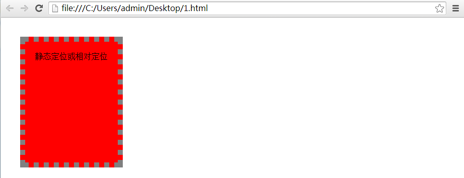
But floated elements and absolutely positioned elements have exactly the opposite effect. They shrink so that they wrap tightly around the content. Assume that .test1 in the example just now is rewritten as:
.test1{
height:200px ;
padding:20px;
margin:30px;
border:10px dotted grey;
background:red;
position:absolute;
}
html remains unchanged, then the result is:
Picture 4
In Figure 1 and Figure 2, we clearly see that in the example of calculating the required area size of an element, the margins are already included in the calculation. But in fact, the adjacent margins of vertical unpositioned elements will be superimposed into the value of one of the larger width margins, not the sum of the two. This means that when calculating the size of the area that actually needs to store an element, it does not start from the edge of the margin. Only the widest margin will take effect, and narrower margins will be superimposed with larger ones. Together. As shown below:
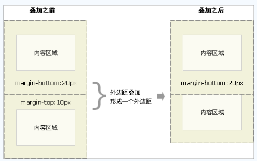
Picture 5
In addition, when the width of an element is set to 100% (that is, the content width of the parent element is 100%), it should not have any margins, padding, or borders. This will only The area where it is placed needs to be larger. This is often ignored by designers and can seriously mess up the layout of the page, causing content to either overflow or make elements wider than they should be. Give an example:
.box{
background:red ;
height:200px;
width:100%;
}
.contain{
background:yellow;
height:220px;
width:300px;
}
The html code is:
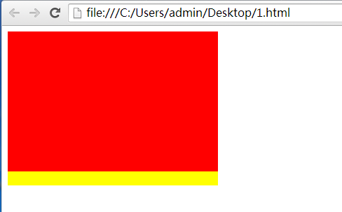
That is to say, without margin and padding, 100% of the content can properly fill the parent element. Now assume that the style of .box is changed to:
.box{
background:red ;
height:200px;
width:100%;
padding:10px;
margin:10px;
}
Keeping the rest unchanged, the result is:
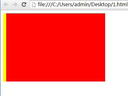
At this time, the elements are misaligned, and only the margin on the left appears. The solution is to avoid adding specific values to the width property in most cases, and only apply margins, padding, and borders.
Four: Summary
This week, I mainly studied the box model and positioning model of HTML. I have a better understanding of the various attributes in the box model and the relationship between the attributes, which will help me use it skillfully in future applications. At the same time, I also learned more about the browser's parsing of CSS.

Hot AI Tools

Undresser.AI Undress
AI-powered app for creating realistic nude photos

AI Clothes Remover
Online AI tool for removing clothes from photos.

Undress AI Tool
Undress images for free

Clothoff.io
AI clothes remover

AI Hentai Generator
Generate AI Hentai for free.

Hot Article

Hot Tools

Notepad++7.3.1
Easy-to-use and free code editor

SublimeText3 Chinese version
Chinese version, very easy to use

Zend Studio 13.0.1
Powerful PHP integrated development environment

Dreamweaver CS6
Visual web development tools

SublimeText3 Mac version
God-level code editing software (SublimeText3)

Hot Topics
 1359
1359
 52
52
 What is the purpose of the <datalist> element?
Mar 21, 2025 pm 12:33 PM
The article discusses the HTML <datalist> element, which enhances forms by providing autocomplete suggestions, improving user experience and reducing errors.Character count: 159
 What is the purpose of the <progress> element?
Mar 21, 2025 pm 12:34 PM
The article discusses the HTML <progress> element, its purpose, styling, and differences from the <meter> element. The main focus is on using <progress> for task completion and <meter> for stati
 What is the purpose of the <meter> element?
Mar 21, 2025 pm 12:35 PM
The article discusses the HTML <meter> element, used for displaying scalar or fractional values within a range, and its common applications in web development. It differentiates <meter> from <progress> and ex
 What is the viewport meta tag? Why is it important for responsive design?
Mar 20, 2025 pm 05:56 PM
The article discusses the viewport meta tag, essential for responsive web design on mobile devices. It explains how proper use ensures optimal content scaling and user interaction, while misuse can lead to design and accessibility issues.
 What is the purpose of the <iframe> tag? What are the security considerations when using it?
Mar 20, 2025 pm 06:05 PM
The article discusses the <iframe> tag's purpose in embedding external content into webpages, its common uses, security risks, and alternatives like object tags and APIs.
 How do I use the HTML5 <time> element to represent dates and times semantically?
Mar 12, 2025 pm 04:05 PM
This article explains the HTML5 <time> element for semantic date/time representation. It emphasizes the importance of the datetime attribute for machine readability (ISO 8601 format) alongside human-readable text, boosting accessibilit
 How do I use HTML5 form validation attributes to validate user input?
Mar 17, 2025 pm 12:27 PM
The article discusses using HTML5 form validation attributes like required, pattern, min, max, and length limits to validate user input directly in the browser.
 What are the best practices for cross-browser compatibility in HTML5?
Mar 17, 2025 pm 12:20 PM
Article discusses best practices for ensuring HTML5 cross-browser compatibility, focusing on feature detection, progressive enhancement, and testing methods.


