 Web Front-end
 HTML Tutorial
 25 application cases of circular elements in web design_HTML/Xhtml_Web page production
25 application cases of circular elements in web design_HTML/Xhtml_Web page production
Today, this article lists examples of circular elements being used very well in web design, showing you beautiful circular buttons, menus, pictures and other details. You will see that if designed correctly, the use of circles can make your website look quite unique and original.
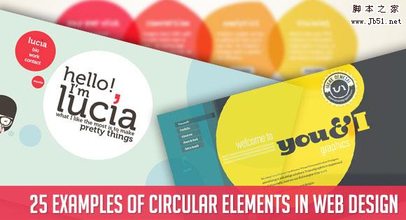
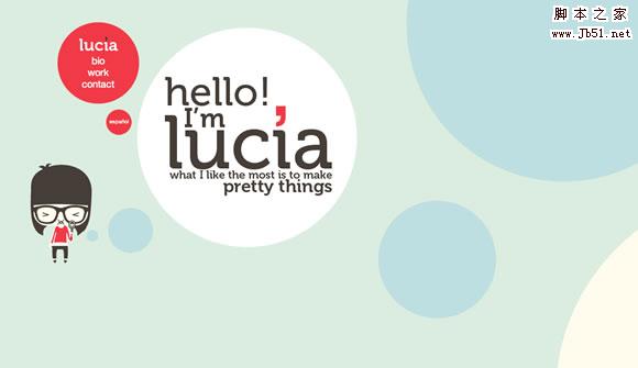
Lucia Soto
Circular elements can also be used as a themed part of the layout.
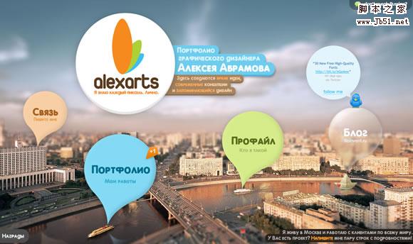
Alexarts
Colorful round elements, very beautiful.
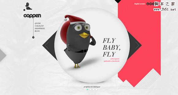
Cappen
Theme images are based on circular outlines.
Teixidó
Elegant and beautiful round elements.
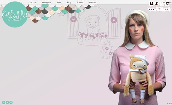
Cat Rabbit
Both the head and tail are decorated with circular elements, which is quite nice.
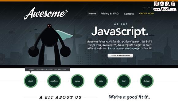
Awesome
Prominent circular navigation buttons.
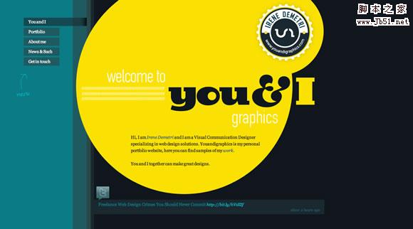
Youandigraphics
Very nice circular elements and navigation.
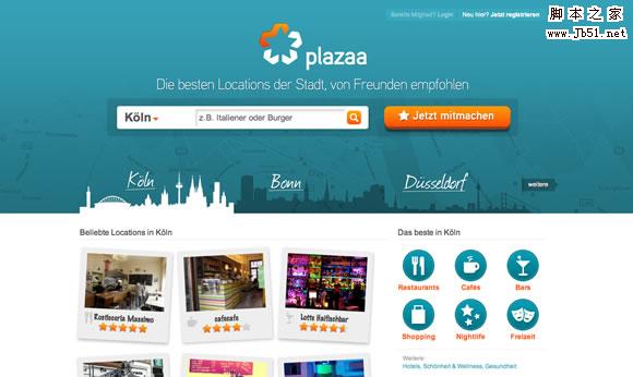
Plazaa
Beautiful circular navigation buttons.
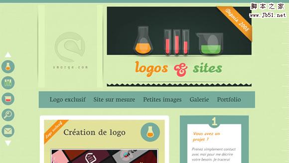
Smorge
Super beautiful round button, I like the design and color matching of the entire page.
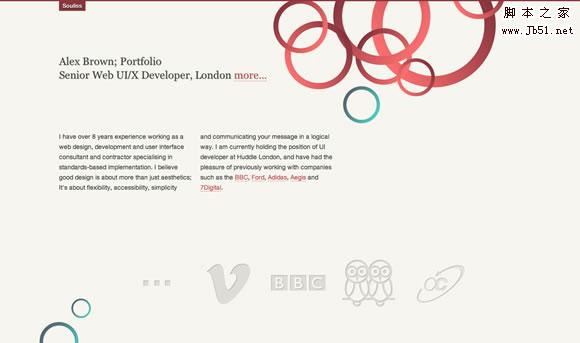
Souliss
Beautiful round elements.
Polecat
Present the team in the form of circular lines.
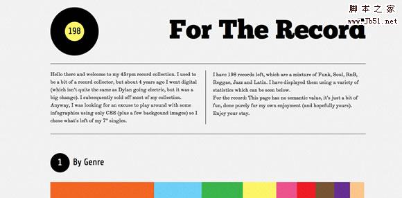
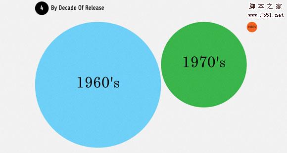
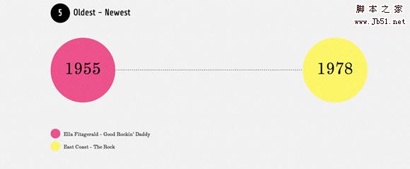
For the Record
Beautiful round elements are part of the design.
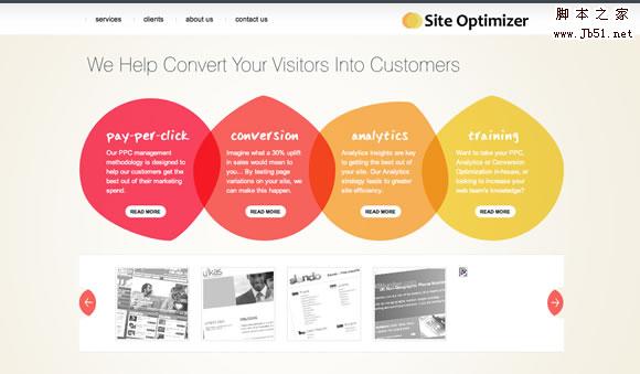
Site Optimizer
It’s not exactly round, but the design is very beautiful, so I’ll share it : )
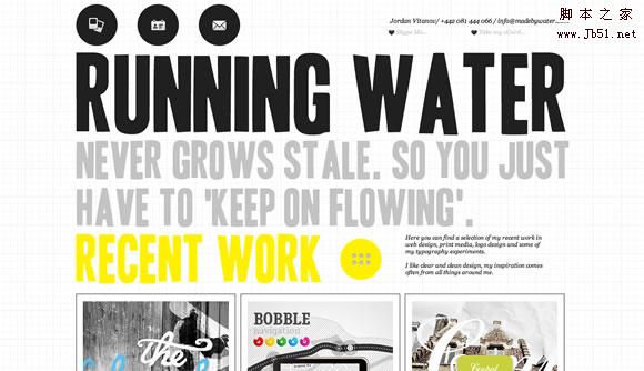
Made by Water
Round icons and buttons make the background and text more harmonious.
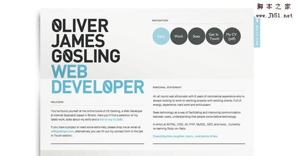
Oliver James Gosling
Beautiful round buttons.
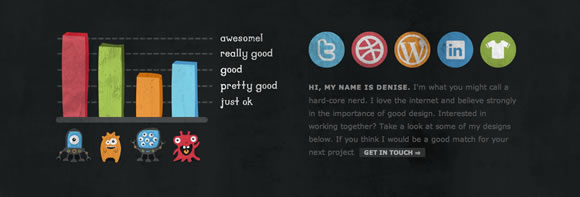
Cornerd
The round social buttons are attractive.
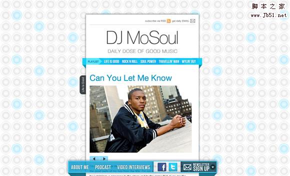
Dj MoSoul
Circular background.
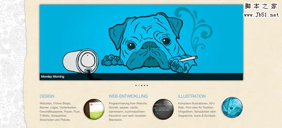
Damngood
Beautiful round elements.
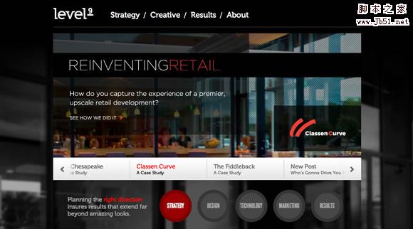
Level9
Circular navigation button.
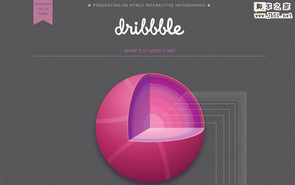
Dribbble by Jamie Brightmore
I think this one needs no introduction : )
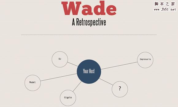
Wade – A Retrospective
The main feature of this layout is the application of circles.
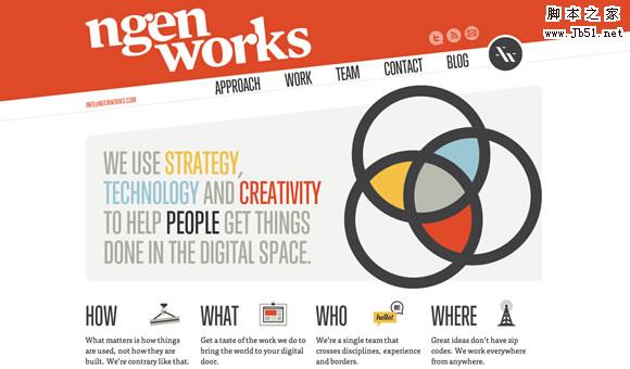
nGen Works
Theme images and social buttons are round.
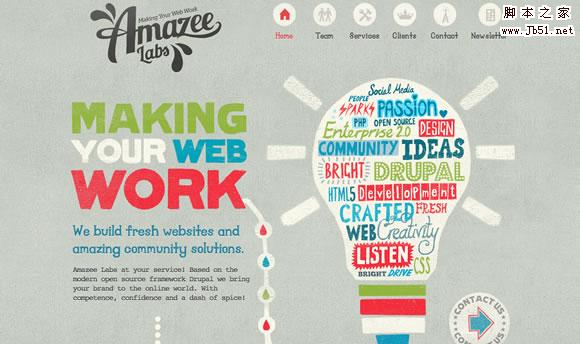
Amazee Labs
Beautiful and elegant menu button.
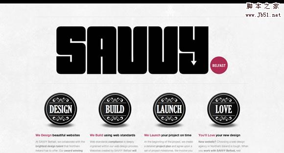
Savvy
Beautiful round elements and fonts.
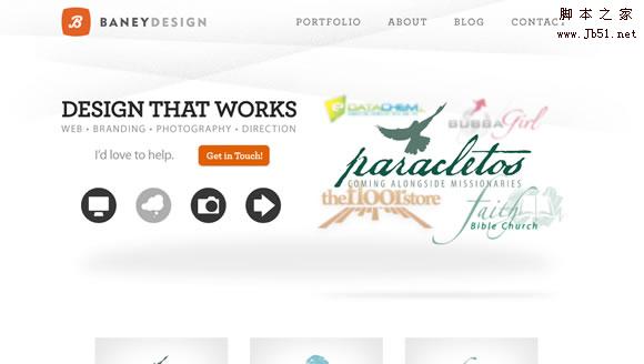
Baney Design
Simple and beautiful circular navigation button.
(Compiled source: Dream Sky Original text from: 25 Examples of Circular Elements in Web Design)

Hot AI Tools

Undresser.AI Undress
AI-powered app for creating realistic nude photos

AI Clothes Remover
Online AI tool for removing clothes from photos.

Undress AI Tool
Undress images for free

Clothoff.io
AI clothes remover

AI Hentai Generator
Generate AI Hentai for free.

Hot Article

Hot Tools

Notepad++7.3.1
Easy-to-use and free code editor

SublimeText3 Chinese version
Chinese version, very easy to use

Zend Studio 13.0.1
Powerful PHP integrated development environment

Dreamweaver CS6
Visual web development tools

SublimeText3 Mac version
God-level code editing software (SublimeText3)

Hot Topics
 1359
1359
 52
52
 Revealing the unique advantages of absolute positioning in web design
Jan 23, 2024 am 08:16 AM
Explore the unique advantages of absolute positioning in web design. In web design, absolute positioning is a commonly used layout method. By using absolute positioning, elements can be placed precisely at specified locations on the web page, and some special layout effects can be easily achieved. This article explores these advantages and illustrates them with specific code examples. Precise positioning of elements Absolute positioning allows precise control of the position of elements on a web page. By specifying the top, right, bottom, and left attributes of the element, the element can be
 Web design skills and practical experience sharing based on CSS3
Sep 08, 2023 pm 07:07 PM
Sharing of web design skills and practical experience based on CSS3 In today's Internet era, web design is becoming more and more important. With the advent of CSS3, designers can now use a variety of stunning effects to engage users. This article will share some web design skills and practical experience based on CSS3, aiming to help readers improve their web design level. 1. Use transition effects. Transition effects can produce smooth animation effects for elements from one state to another. By using the CSS3 transition property, we can
 Study the impact of introducing CSS third-party frameworks on web design
Jan 16, 2024 am 10:32 AM
Exploring the impact of the introduction of third-party frameworks into CSS on web design Introduction: With the rapid development of the Internet, web design has become increasingly important. In order to improve user experience and provide richer functions, developers often need to use third-party frameworks to assist design and development. This article will explore the impact of introducing CSS third-party frameworks on web design and give specific code examples. 1. What is CSS third-party framework? CSS third-party framework is a set of predefined CSS styles and components that can be called directly when building a web page. These frameworks are rich in content,
 How to use CSS Positions layout to design card layout for web pages
Sep 28, 2023 am 08:17 AM
How to use CSSPositions layout to design card layout for web pages. In web design, card layout is a common and popular design method. It divides the content into independent cards, each card contains certain information, and can easily create a neat and layered page effect. In this article, we will introduce how to use CSSPositions layout to design the card layout of a web page, and attach specific code examples. Create the HTML structure First, we need to create the HTML structure to represent the card layout.
 A simple guide: Create a great CSS framework to enhance the professionalism and beauty of your web design
Jan 16, 2024 am 09:02 AM
Five steps to teach you how to create the perfect CSS framework: Make your web design more professional and beautiful Maintaining a professional and beautiful web design is every web designer's dream. And establishing a perfect CSS framework is the key to achieving this goal. The CSS framework is a set of predetermined style sheets and rules that help designers quickly build web page layouts and styles. Today, I will introduce you to a five-step method to help you create a perfect CSS framework. The following are the specific steps: Step 1: Analyze requirements and determine the framework structure at the beginning
 Application fields of element selectors in web design
Jan 13, 2024 am 10:35 AM
The application of element selectors in web design requires specific code examples. In web design, element selectors are a very important CSS selector, which can help us control and adjust the styles of elements in web pages. By flexibly using element selectors, various exquisite web design effects can be achieved. 1. Basic syntax and usage of element selectors The element selector is the simplest type of CSS selector. It selects the corresponding element by specifying the tag name of the HTML element. The basic syntax of the element selector is: tag name {
 What is Dreamweaver
Jun 13, 2023 pm 02:53 PM
Dreamweaver is a web design software launched by Adobe. It provides a visual page editor and also supports manual editing of HTML, CSS and JavaScript codes. It has many features and tools that help users create responsive web pages, apps, and mobile apps with ease.
 What does h5 look like?
Apr 01, 2025 pm 05:29 PM
HTML5 (h5) is the fifth version of HTML, designed to enhance the flexibility and functionality of web development. The main features of h5 include: 1) new semantic tags, such as, et al.; 2) embedded audio and video support, such as, et al.; 3) Canvas drawing API; 4) Geolocation API. These features are implemented through the browser's JavaScript engine, making web pages more dynamic and interactive.


