Folded table row element bug_HTML/Xhtml_Web page production
Let’s take an example: the code is very simple, as follows:
| dd | dds |
| ss | sss |
In this way, a table with two rows and two columns will not display any errors in any browser. But if I add the following css, the situation is different:
It seems that there is going to be a problem, but don’t worry, in fact, you can’t see any problems on the surface at this time, and the page layout will definitely not be messed up,
You can't see anything overlapping.
I never wanted to fool you, although there is no problem on the surface, but now let our ie develop tool come into play, it will tell us the layout What did it bring?


Pay attention to the differences and similarities in the two pictures. Note the blue line circle in the left view Something, the function of this tool is to click on an element on the right side and it will be framed with a wireframe in the web page.
But note that I clicked two different elements twice. The wireframe framed the same place. Sweat, I read it right.
Yes, that is to say, the two tr overlap, but the strange thing is that the elements in tr are rendered completely correctly without affecting any appearance style. Don't think this is safe. The hidden danger is buried at this time.
I actually encountered this problem when making a simulation window. I used a two-row table. The first row is the window title bar, which can be dragged, and the second row is Make the main view, but later I found that the second row of the table covered the first row. Although it looked normal, the title bar was blocked and could not be clicked and dragged.
To fix this phenomenon, Just remove the position in tr
3. From this point of view:
I don’t know if you use some reset when writing css. Anyway, this is what I do, the css in my NetBeans The reset is stored in the template, and there will be a paragraph like this in the header of each css file:
/*
TODO customize this sample style
Syntax recommendation http://www.w3.org/TR/REC-CSS2/
*/
html, body, div, span, applet, object, iframe,
h1, h2, h3, h4, h5, h6, p, blockquote, pre,
a, abbr, acronym, address, big, cite, code,
del, dfn, em, font, img, ins, kbd, q, s, samp,
small, strike, strong, sub, sup, tt, var,
b, u, i, center ,
dl, dt, dd, ol, ul, li,
fieldset, form, label, legend,
table, caption, tbody, tfoot, thead, tr, th, td {
margin : 0;
padding: 0;
border: 0;
outline: 0;
font-size: 12px;
vertical-align: baseline;
background: transparent;
}
body {
line-height: 1;
}
ol, ul {
list-style: none;
}
blockquote, q {
quotes: none;
}
blockquote:before, blockquote:after,
q:before, q:after {
content: none;
}
/* The style when the element gets focus! */
:focus {
outline: 0;
}
/* The style of special text! */
ins {
text-decoration: none;
}
del {
text-decoration: line-through;
}
/* thin line table style*/
table {
border-collapse: collapse ;
border-spacing: 0;
}
Everyone knows that if you want to absolutely position an element, you must first position its parent element, for example, set a position: relative so that the child element can be absolute, and then position top and left.
So I I thought, this is too troublesome, I might as well set position:relative for all elements, and then change position:absolute for absolute positioning. This way, I don’t have to set them one by one, and all elements can be absolutely positioned.
So the problem mentioned in this article comes. We set position:relative for all elements, so there is a problem with the table, so this approach is not advisable, and it will cause some other rendering problems. I remember that I saw prompts in several places saying that this setting cannot be done.
This article is actually about layout, but this problem is indeed a bug in IE, not a layout problem. I will encounter layout next time Let’s talk about layout. By the way, this is really a strange bug.

Hot AI Tools

Undresser.AI Undress
AI-powered app for creating realistic nude photos

AI Clothes Remover
Online AI tool for removing clothes from photos.

Undress AI Tool
Undress images for free

Clothoff.io
AI clothes remover

AI Hentai Generator
Generate AI Hentai for free.

Hot Article

Hot Tools

Notepad++7.3.1
Easy-to-use and free code editor

SublimeText3 Chinese version
Chinese version, very easy to use

Zend Studio 13.0.1
Powerful PHP integrated development environment

Dreamweaver CS6
Visual web development tools

SublimeText3 Mac version
God-level code editing software (SublimeText3)

Hot Topics
 1377
1377
 52
52
 Samsung's 10,000-yuan foldable phone W25 revealed: 5-megapixel under-screen front camera and thinner body
Aug 23, 2024 pm 12:43 PM
According to news on August 23, Samsung is about to launch a new folding mobile phone W25, which is expected to be unveiled at the end of September. It will make corresponding improvements in the under-screen front camera and body thickness. According to reports, Samsung W25, codenamed Q6A, will be equipped with a 5-megapixel under-screen camera, which is an improvement over the 4-megapixel camera of the Galaxy Z Fold series. In addition, the W25’s external-screen front camera and ultra-wide-angle camera are expected to be 10 million and 12 million pixels respectively. In terms of design, the W25 is about 10 mm thick in the folded state, which is about 2 mm thinner than the standard Galaxy Z Fold 6. In terms of screen, the W25 has an external screen of 6.5 inches and an internal screen of 8 inches, while the Galaxy Z Fold6 has an external screen of 6.3 inches and an internal screen of 8 inches.
 Google Pixel 9 Pro Fold phone case exposed: 6.4-inch outer screen, 8.02-inch inner screen
Jun 25, 2024 pm 02:35 PM
According to news on June 25, the source ytechb published a blog post yesterday (June 24), sharing a rendering of the Google Pixel 9 Pro Fold mobile phone case, once again showing the design of the back of this folding screen. According to previous news, Google will release the Pixel 9 series of mobile phones in October this year. In addition to the three phones in the Pixel 9 series, Pixel Fold will also be included in the Pixel 9 series and will be officially named Pixel 9 Pro Fold. The phone case exposed this time comes from accessory manufacturer Torro. The company's UK and US online stores have listed the product phone case and disclosed the design and display size of the phone. The page shows a large number of Pixel 9 Pro Fold phone case renderings
 The biggest shortcoming of foldable screen mobile phones: no core application scenarios
Mar 16, 2024 am 09:04 AM
What we are discussing today is not what a certain product is like, but returning to the topic of "folding screen" itself and exploring the "rationality" of folding screen mobile phones. First, let’s take a look at the market performance of folding screen mobile phones. According to IDC’s latest data report, China’s folding screen mobile phone market will ship approximately 7.007 million units in 2023, a year-on-year increase of 114.5%. Among them, China's foldable screen mobile phone market shipped approximately 2.771 million units in the fourth quarter of 2023, a year-on-year increase of 149.6%. The data does look good, and the growth is also very strong. However, compared with the approximately 270 million smartphone shipments in the Chinese market in 2023, this data is really not enough. In general
 Samsung Galaxy Z Flip 6 model first revealed: narrower bezels, creases still present
Jun 22, 2024 am 03:28 AM
According to news on June 21, foreign media recently released model photos of Samsung Galaxy Z Flip 6 on the Internet. According to the picture, it can be understood that the borders of Samsung Galaxy Z Flip 6 will be further narrowed, which means that the width of the phone may be reduced in the folded state, and it will also provide a more comfortable grip and portability. Moreover, compared with the previous generation ZFlip5, the model of Galaxy ZFlip6 is more square and the camera module on the back is more prominent. It is expected to use a new camera sensor. However, from the front, the creases of the phone are still relatively obvious, but considering that the leaked model is a model phone, there may be some differences with the real phone, so it is for reference only. In terms of performance configuration, Galaxy
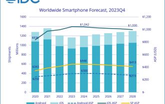
 IDC estimates that global smartphone shipments in 2024 will be 1.2 billion units: 25 million foldable screen units, a year-on-year increase of 37%
Feb 24, 2024 pm 02:20 PM
According to news on February 24, IDC recently released a market research report, predicting that global smartphone shipments will reach 1.2 billion units in 2024, a year-on-year increase of 2.8%, and will then maintain low single-digit growth by 2028. IDC believes that overall shipments in 2024 will still be below pre-pandemic levels, but the global smartphone market has bottomed out and is beginning to show an upward trend in recovery. IDC believes that the two key factors driving the overall market recovery are the equipment refresh cycle and the growth of demand in emerging markets. There are also two main driving forces. IDC estimates that folding screen mobile phone shipments will reach 25 million units in 2024, a year-on-year increase of 37%; the other is that artificial intelligence (AI) has quickly become a part of the discussion on smartphones, triggering
 Do you want to know about word folding?
Mar 19, 2024 pm 07:49 PM
After editing text content in Word, you need to view and check the edited content. If there is a lot of content, it is inconvenient to read it. How to solve this problem? In this case, the word folding method is needed. Let me share the method tutorial with you guys! First, open the Word document on your computer, enter the required content and select it, then click the "Start" option in the menu bar, and then select a style to apply to the text paragraph you just selected. You can refer to the part marked with a red circle in the picture below. 2. Then, the selected text paragraph will change its style and add a small arrow, as shown in the red circle in the picture below: 3. Click the small arrow to freely expand or collapse the previously selected text paragraph, or directly Right click, from
 HTML, CSS and jQuery: Techniques for achieving image folding and expanding effects
Oct 24, 2023 am 11:05 AM
HTML, CSS and jQuery: An introduction to techniques for implementing image folding and expanding special effects. In web design and development, we often need to implement some dynamic special effects to increase the attractiveness and interactivity of the page. Among them, the image folding and unfolding effect is a common but interesting technique. Through this special effect, we can make the image fold or expand under the user's operation to show more content or details. This article will introduce how to use HTML, CSS and jQuery to achieve this effect, with specific code examples. realize thoughts
 Prices keep dropping! Folding screens are becoming more and more popular: sales surge
May 01, 2024 pm 06:31 PM
China's foldable screen mobile phone market showed strong growth momentum in the first quarter of 2024, with brands such as Huawei and Honor occupying a significant share of the market. According to statistics from the International Data Corporation (IDC), China's foldable screen mobile phone shipments reached 1.86 million units in the first quarter of 2024, a year-on-year increase of 83%. This data reflects the rapid growth trend of foldable screen mobile phones in the Chinese market. In the overall smartphone market, foldable screen phones account for approximately 2.7%. In addition, Huawei ranks first with a 44.1% share of China's foldable screen mobile phone market, followed by Honor with a market share of 26.7%. From a broader perspective, IDC predicts that China’s foldable screen mobile phone market shipments will be close to 10 million units in 2024.


