Everyone may be familiar with the select drop-down list form, but the default drop-down list form often makes some websites feel ugly, and it is also difficult to adjust the select style using CSS. Therefore, many websites often use JS to simulate this effect in order to make a select drop-down form that is more in line with the website style.
For example, Tudou, Taobao Mall and Amazon, which we are very familiar with, all use JS to make drop-down list forms.
The result of this is obviously visually unified with the overall style of the website, and the drop-down list style is very beautiful, but it also brings some adverse reactions. Because it is done with JS, you will encounter many unexpected effects. , let’s analyze their respective flaws one by one through the three tester websites:
Potato’s search category selection box makes me feel weird every time I click it: 
1. After clicking, the position of the pop-up list is different from expected. Subconsciously it was a drop-down list, but Tudou gave me a "mid-drop list".
2. I habitually use the up/down keys to select, but the entire page scrolls.
3. In anger, I want to close it. Pressing the ESC key, nothing happens.
4. After disabling JS, it is completely unavailable.
Similarly, Taobao Mall also looks beautiful: 
Except for point 1, everything else is the same as Potato, with accessibility and usability issues.
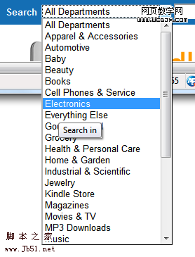
The solution is very simple, just use the native selection box, such as Amazon: 
Why are we discouraged from using custom select boxes in web pages?
Select selection box is a very mature interactive control. Maturity means that users are easy to accept, but maturity also means that all kinds of users are considered carefully and have very rich interaction details. For example: response to keyboard operations such as PgUp/PgDn, Home/End, etc., and the ability to automatically adjust the pop-up direction of drop-down lists in different positions, etc.
Using JS to simulate the selection box requires a lot of work and careful testing. Even if the company is willing to invest, it still cannot implement some features of native controls. For example: in the Amazon selection box above, I pulled the browser very low, and then the drop-down list can extend out of the browser.
For the sake of a little "visual dessert", so many practical details are lost in the interaction, and a lot of front-end programmers' time has to be spent. The result is thankless, which is really bad.
PS: To use a custom selection box, the following conditions must be met:
1. As crazy as Google and willing to spend a lot of time and resources.
2. Be as meticulous as Google. If you want to do it, do it well. If you want to simulate it, simulate it thoroughly.
3. Apply on web app.
Unfortunately, in China, companies as crazy and meticulous as Google or Facebook have not yet appeared.


