
 Web Front-end
HTML Tutorial
More than 40 beautiful web form design examples_HTML/Xhtml_Web page production
Web Front-end
HTML Tutorial
More than 40 beautiful web form design examples_HTML/Xhtml_Web page production
More than 40 beautiful web form design examples_HTML/Xhtml_Web page production

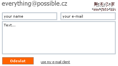
Below we introduce over 40 beautiful web form examples as well as modern solutions and creative thinking related to web form design. Some of them are in flash; nevertheless, in most cases, you can easily Use simple css and (x)html to create the same design.
Web forms are the main way for visitors to communicate with the website owner. Feedback is always important, which is why we make sure web forms are easy to understand and intuitive to use, but even in formal design it plays an effective part in the creative process.
Web forms don’t have to be boring, using CSS or Flash you can make sure they are attractive and effective. Note that you need to come up with something unique and interesting - form symbols, icons, colors, positions or sizes that are often used to achieve interesting design solutions. We have looked for some examples and have found them. Creative, original and unusual web forms.
Below I introduce more than 40 beautiful web form examples as well as modern solutions and creative thinking related to web form design. Some of them are in flash; nevertheless, in most cases , you can easily create the same design using simple css and (x)html.
1. Clean, simple and beautiful solution
Since web forms may be the most important part of the website One of the most important parts you as a designer have to make sure that your visitors can easily understand what information they need to fill in the form fields. Complex and long forms increase the user's cognitive load - they're just harder to process. In context, choosing a simple and clean solution seems like a good approach. However, if the form is to be designed with attention to detail and look good, it makes sense to use some attractive icons.
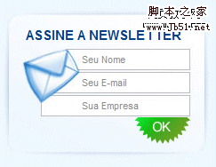
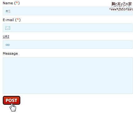
softmail's communication box comes from Brazil. In the form design, it shows a pretty good mail icon integrated with the form. The submit button is clean and functional. This is a creative design.
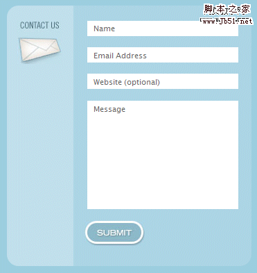
swfir also uses an envelope as a hint.
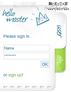
Handwriting is used on katrin wegmann’s website. The eye-catching, eye-catching and playful design perfectly communicates its functionality to the user.
The design of TheWatchMakerProject is impressive. This form is placed to the right of the latest comments.
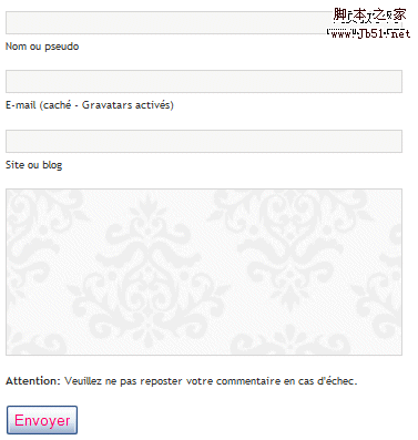
Frexy.comUsed a good and clean solution
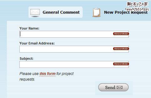
Flingmedia uses a modified contact form that, depending on the visitor's intent (general comments, requests for new projects), the user can select the one that interests him/her Web form.
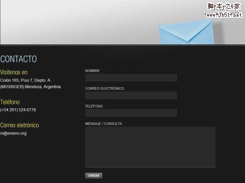
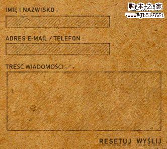
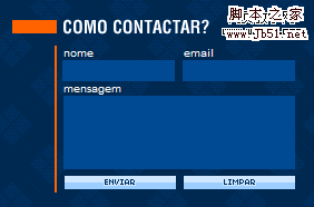
Envero.org - The web form is large and fills the entire width of the layout. Therefore a corresponding font size and input box size are chosen.
2. Creative Solutions
Although web forms are considered sufficient to keep users and website owners connected, some designers often take the risk of creative design in order to prevent visitors from finding the layout boring. Although standard web forms have been in use for several years. Many different cues are used, some interesting examples are summarized below.
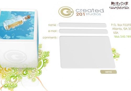
CRreated 201.com Check out this contact form with a very different perspective effect. This effect was created using flash.
Well, this one is definitely different. If you want to contact Edward Pistachio, you first need to solve a puzzle. This approach is not suitable for blogs or business websites. However, it fits perfectly with this conceptual website. Visitors are surprised.

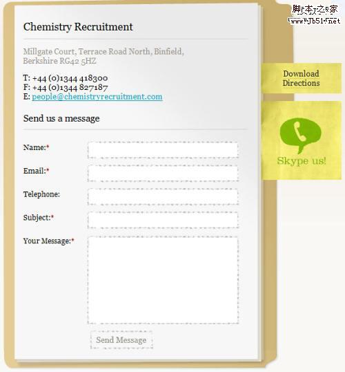
Chemistry Recruitments Used a folder, a few notes and some paper
Alexandru Cohaniuc demonstrates a huge web form using a piece of papyrus and a stamp.
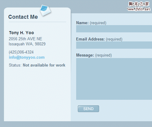
Tony Yoo’s contact form has a contact details on the left hand side.
Qwert City Users can send a postcard to the designer.
wildvuur.com - This web form is fully integrated with the website layout
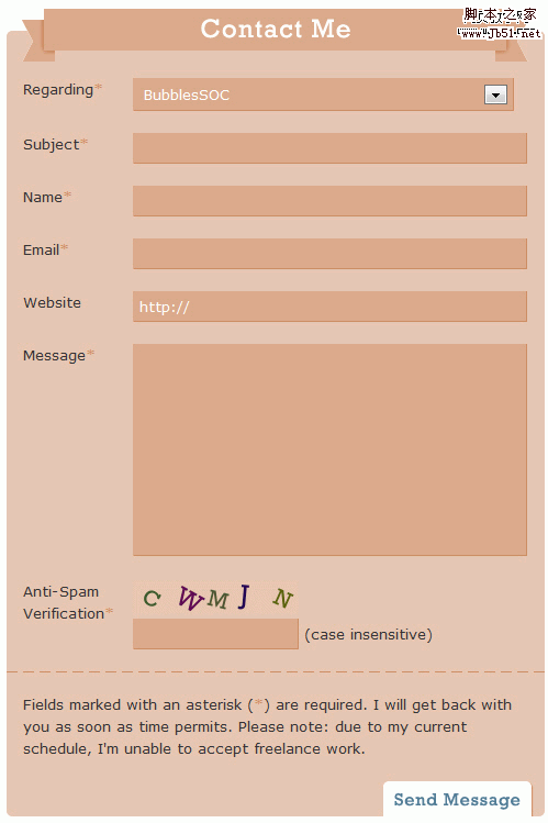
BubblesSochas a A large, very large web form with a top.
3. Use illustrations to brighten forms
When a user clicks on a link to a webpage's illustration, he/she is only one step away from connecting with the website owner. In order to ensure that visitors can actually fill out the form, some designers use attractive text and illustrations to make users feel more comfortable with the form.
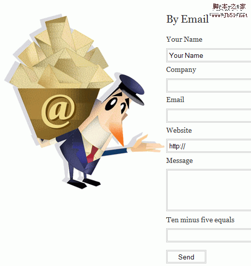
Intuitive Designs tries to impress visitors with a busy postman. Could he handle it?
X-Grafik.skUse a stamp from Slovakia.

Kqoule.comThere is a lovely guy who invites everyone to comment.
Dressfordialogue.com uses a tiny illustration in the upper right part of the form, but even so, sometimes it works well enough.
4. Integrate more functions
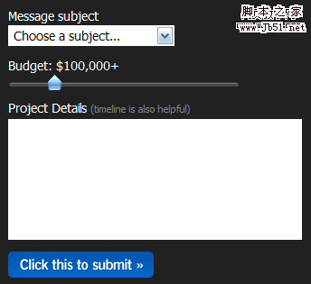
Looking for some creative web forms, we noticed that some new functions were used, which were rare in the past. They were used to provide users with rich text formats. wysiwig-editors and sliders.Editors for text editing, different title levels and images. Sliders are used to define the budget limits for a given project.
InfectedFx has a rather complex web form with prompts, options and buttons. The form also incorporates a WYSIWIG-editor text box area.

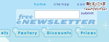
Sidebarcreative.com gives potential clients a sliding bar to limit the project budget.
5. Use icons to convey required information.
From a usability perspective, nothing is more annoying than a web form with long plain text labels and no visual indicator icons. Such forms are boring. It's not attractive and doesn't make the user feel comfortable. You can design the form better, in fact, there are not many required fields. Often icons are used to indicate to users which fields are required.
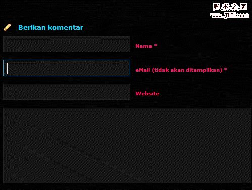
DesignDisease WordPress Theme Use simple symbols to indicate required fields.
Bouctoubou.com has a very simple and basic logo, however, they manage to make the form more interesting.
6. The use of handwriting and grungy style
I once wrote about the use of handwriting and grungy style in modern web design. Such design elements are already used in web forms, as they are unique and convey the personality of the designer. Especially flash-based web design prefers this method.
Redblu provides a newspaper. To get the form, you need to drag the newspaper accordingly.
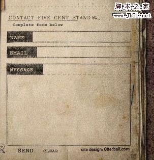
Fivecentstand offers a flash-based solution that is meant to integrate with the entire site. It can be quite difficult for new users.
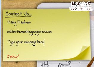
Pointofe.com Use a sticky note as a web form. The font size should probably be increased.
Swiths.com uses an old-school design. A hover effect is also provided.
7. Experimental Solutions
Below you will find some unusually used solutions that can provide a starting point for your designs. Not all of them are good-looking, but there are a few things about them that might further enhance your design thinking.
adorama.comoffers a nice looking and compact solution: a communication box in the sidebar

Different languages - different styles, in Booloob.comThe submit button is placed on the left hand side of the form.
Paregonta.com:Three-dimensional and extremely simple. Colorful and particularly compact form.
Sunmatecushions.com has a really different style and it somehow fits here.
Well, why not? Wallpaper as background on GeekAndHype.com
Revota.com It's black and shadowy, but uses a highlight hover effect when showing the current area.
catydesign is also very dim. What is impressive about this form is the suggested information placed in a suitable place.

MyMileMarker: The form has no width limit. Sometimes horizontal forms work better than vertical forms.

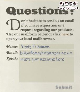
Jaroslav Cerny shows how to mix a web form with an email. This form is no longer online, but it's definitely worth mentioning.
Xyarea.be Unusual and original. It may be the thinnest communication box in the world.


Hot AI Tools

Undresser.AI Undress
AI-powered app for creating realistic nude photos

AI Clothes Remover
Online AI tool for removing clothes from photos.

Undress AI Tool
Undress images for free

Clothoff.io
AI clothes remover

AI Hentai Generator
Generate AI Hentai for free.

Hot Article
Hot Tools

Notepad++7.3.1
Easy-to-use and free code editor

SublimeText3 Chinese version
Chinese version, very easy to use

Zend Studio 13.0.1
Powerful PHP integrated development environment

Dreamweaver CS6
Visual web development tools

SublimeText3 Mac version
God-level code editing software (SublimeText3)
Hot Topics
 1359
1359
 52
52

 Retro trend! HMD and Heineken jointly launch flip phone: transparent shell design
Apr 17, 2024 pm 06:50 PM
Retro trend! HMD and Heineken jointly launch flip phone: transparent shell design
Apr 17, 2024 pm 06:50 PM
According to news on April 17, HMD teamed up with the well-known beer brand Heineken and the creative company Bodega to launch a unique flip phone - The Boring Phone. This phone is not only full of innovation in design, but also returns to nature in terms of functionality, aiming to lead people back to real interpersonal interactions and enjoy the pure time of drinking with friends. Boring mobile phone adopts a unique transparent flip design, showing a simple yet elegant aesthetic. It is equipped with a 2.8-inch QVGA display inside and a 1.77-inch display outside, providing users with a basic visual interaction experience. In terms of photography, although it is only equipped with a 30-megapixel camera, it is enough to handle simple daily tasks.
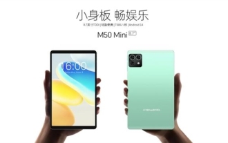
 Starting at 649 yuan, Kubi Cube Xiaoku Tablet 2 Lite is here: 11-inch eye-protecting large screen + 8000mAh large battery
Mar 05, 2024 pm 05:34 PM
Starting at 649 yuan, Kubi Cube Xiaoku Tablet 2 Lite is here: 11-inch eye-protecting large screen + 8000mAh large battery
Mar 05, 2024 pm 05:34 PM
According to news on March 4, Kubi Rubik's Cube will launch the "Xiaoku Tablet 2Lite" tablet computer on March 5, with an initial price of 649 yuan. It is reported that the new tablet is equipped with Unisoc’s T606 processor, which uses a 12nm process and consists of two 1.6GHz ArmCortex-A75 CPUs and six ArmCortex-A55 processors. The screen uses a 10.95-inch IPS eye-protection screen with a resolution of 1280x800 and a brightness as high as 350 nits. In terms of imaging, Xiaoku Tablet 2Lite has a 13-megapixel main camera on the rear and a 5-megapixel selfie lens on the front. It also supports 4G Internet access/calls, Bluetooth 5.0, and Wi-Fi5. In addition, the official claimed that this tablet&l
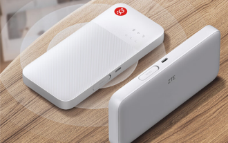 ZTE 5G portable Wi-Fi U50S goes on sale for NT$899 at first launch: top speed 500Mbps
Apr 26, 2024 pm 03:46 PM
ZTE 5G portable Wi-Fi U50S goes on sale for NT$899 at first launch: top speed 500Mbps
Apr 26, 2024 pm 03:46 PM
According to news on April 26, ZTE’s 5G portable Wi-Fi U50S is now officially on sale, starting at 899 yuan. In terms of appearance design, ZTE U50S Portable Wi-Fi is simple and stylish, easy to hold and pack. Its size is 159/73/18mm and is easy to carry, allowing you to enjoy 5G high-speed network anytime and anywhere, achieving an unimpeded mobile office and entertainment experience. ZTE 5G portable Wi-Fi U50S supports the advanced Wi-Fi 6 protocol with a peak rate of up to 1800Mbps. It relies on the Snapdragon X55 high-performance 5G platform to provide users with an extremely fast network experience. Not only does it support the 5G dual-mode SA+NSA network environment and Sub-6GHz frequency band, the measured network speed can even reach an astonishing 500Mbps, which is easily satisfactory.
 Honor Magic V3 debuts AI defocus eye protection technology: effectively alleviates the development of myopia
Jul 18, 2024 am 09:27 AM
Honor Magic V3 debuts AI defocus eye protection technology: effectively alleviates the development of myopia
Jul 18, 2024 am 09:27 AM
According to news on July 12, the Honor Magic V3 series was officially released today, equipped with the new Honor Vision Soothing Oasis eye protection screen. While the screen itself has high specifications and high quality, it also pioneered the introduction of AI active eye protection technology. It is reported that the traditional way to alleviate myopia is "myopia glasses". The power of myopia glasses is evenly distributed to ensure that the central area of sight is imaged on the retina, but the peripheral area is imaged behind the retina. The retina senses that the image is behind, promoting the eye axis direction. grow later, thereby deepening the degree. At present, one of the main ways to alleviate the development of myopia is the "defocus lens". The central area has a normal power, and the peripheral area is adjusted through optical design partitions, so that the image in the peripheral area falls in front of the retina.
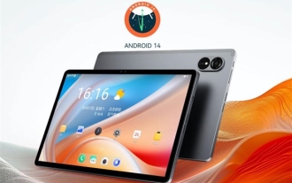
 Teclast M50 Mini tablet is here: 8.7-inch IPS screen, 5000mAh battery
Apr 04, 2024 am 08:31 AM
Teclast M50 Mini tablet is here: 8.7-inch IPS screen, 5000mAh battery
Apr 04, 2024 am 08:31 AM
According to news on April 3, Taipower’s upcoming M50 Mini tablet computer is a device with rich functions and powerful performance. This new 8-inch small tablet is equipped with an 8.7-inch IPS screen, providing users with an excellent visual experience. Its metal body design is not only beautiful but also enhances the durability of the device. In terms of performance, the M50Mini is equipped with the Unisoc T606 eight-core processor, which has two A75 cores and six A55 cores, ensuring a smooth and efficient running experience. At the same time, the tablet is also equipped with a 6GB+128GB storage solution and supports 8GB memory expansion, which meets users’ needs for storage and multi-tasking. In terms of battery life, M50Mini is equipped with a 5000mAh battery and supports Ty
 How to design the end page of ppt to be attractive enough
Mar 20, 2024 pm 12:30 PM
How to design the end page of ppt to be attractive enough
Mar 20, 2024 pm 12:30 PM
At work, ppt is an office software often used by professionals. A complete ppt must have a good ending page. Different professional requirements give different ppt production characteristics. Regarding the production of the end page, how can we design it more attractively? Let’s take a look at how to design the end page of ppt! The design of the ppt end page can be adjusted in terms of text and animation, and you can choose a simple or dazzling style according to your needs. Next, we will focus on how to use innovative expression methods to create a ppt end page that meets the requirements. So let’s start today’s tutorial. 1. For the production of the end page, any text in the picture can be used. The important thing about the end page is that it means that my presentation is over. 2. In addition to these words,
 Huawei Pocket 2's first ultra-cooling three-dimensional cooling system: the overall thermal conductivity area is increased by 80%
Feb 22, 2024 pm 08:04 PM
Huawei Pocket 2's first ultra-cooling three-dimensional cooling system: the overall thermal conductivity area is increased by 80%
Feb 22, 2024 pm 08:04 PM
According to news on February 22, Huawei’s Pocket2 folding flagship officially debuted today. It adopts a smart body design and is available in four colors: Tahitian gray, rococo white, taro purple, and elegant black. According to reports, Huawei Pocket2 is the first ultra-cooling three-dimensional heat dissipation system, the industry's first mid-frame VC+ three-dimensional heat dissipation structure, and uses the industry's highest thermal conductivity graphene material, with an equivalent thermal conductivity of 1800W/m·K, and an 80% increase in the overall thermal conductivity area. Regarding the crease issue that everyone is concerned about, Huawei Pocket 2 is equipped with the industry's first basalt water drop hinge. The screen remains flat after long-term use, and the double-arm lever gear makes it easy to open and close. In terms of communications, Huawei Pocket 2 supports super-powerful Lingxi communications, and is the first small foldable phone to support two-way Beidou satellite messages. Hold
 How to design a simple student course selection system in Java?
Nov 03, 2023 pm 06:10 PM
How to design a simple student course selection system in Java?
Nov 03, 2023 pm 06:10 PM
How to design a simple student course selection system in Java? The student course selection system plays a vital role in university education. The student course selection system not only helps students conveniently choose the courses they are interested in, but also helps the school manage student course selection and course arrangements. This article will introduce how to use Java language to design a simple student course selection system. 1. Demand analysis: First, we need to clarify the basic needs of the student course selection system. We need to implement the following functions: Student login: Students can log in using their own account and password
