 Web Front-end
 HTML Tutorial
 The solution to the web table or div layer being stretched in the web page_HTML/Xhtml_Web page production
The solution to the web table or div layer being stretched in the web page_HTML/Xhtml_Web page production
When we design web pages, we always encounter some unpleasant things. The most common one is to find that the displayed page is stretched after adding content in the background, causing the web page to be extremely unsightly. In the past, everyone basically designed tables, and there were naturally many solutions on the Internet. Nowadays, there are also div css standard designs, and it is rare to see related good methods. Now Xiaoxiang Online has found a good way to prevent tables from being stretched. Summarize it and share it with everyone.
1. Set the image size directly on the web page, such as code:
 . Although this can limit the image size, you need to manually modify the image size before uploading the image, otherwise the uploaded image will be deformed.
2. Use the following code:

This method will automatically scale down to the specified width when calling the image. It will not cause the image to deform and will not burst the table. However, the disadvantage is that if the image is too large, it will not be processed during the image download process. , that is, during the image display process, the image will first be displayed in its original size. At this time, the table will burst and the page will be ugly. Secondly, when the image is fully displayed, the image will automatically shrink again.
3. We can limit the size of the table attributes to prevent it from being stretched. For example, add the code "style="table-layout:fixed;word-wrap:break-word;word-break;break" in

Hot AI Tools

Undresser.AI Undress
AI-powered app for creating realistic nude photos

AI Clothes Remover
Online AI tool for removing clothes from photos.

Undress AI Tool
Undress images for free

Clothoff.io
AI clothes remover

AI Hentai Generator
Generate AI Hentai for free.

Hot Article

Hot Tools

Notepad++7.3.1
Easy-to-use and free code editor

SublimeText3 Chinese version
Chinese version, very easy to use

Zend Studio 13.0.1
Powerful PHP integrated development environment

Dreamweaver CS6
Visual web development tools

SublimeText3 Mac version
God-level code editing software (SublimeText3)

Hot Topics
 Steps to adjust the format of pictures inserted in PPT tables
Mar 26, 2024 pm 04:16 PM
1. Create a new PPT file and name it [PPT Tips] as an example. 2. Double-click [PPT Tips] to open the PPT file. 3. Insert a table with two rows and two columns as an example. 4. Double-click on the border of the table, and the [Design] option will appear on the upper toolbar. 5. Click the [Shading] option and click [Picture]. 6. Click [Picture] to pop up the fill options dialog box with the picture as the background. 7. Find the tray you want to insert in the directory and click OK to insert the picture. 8. Right-click on the table box to bring up the settings dialog box. 9. Click [Format Cells] and check [Tile images as shading]. 10. Set [Center], [Mirror] and other functions you need, and click OK. Note: The default is for pictures to be filled in the table
 Five tips to teach you how to solve the problem of Black Shark phone not turning on!
Mar 24, 2024 pm 12:27 PM
As smartphone technology continues to develop, mobile phones play an increasingly important role in our daily lives. As a flagship phone focusing on gaming performance, the Black Shark phone is highly favored by players. However, sometimes we also face the situation that the Black Shark phone cannot be turned on. At this time, we need to take some measures to solve this problem. Next, let us share five tips to teach you how to solve the problem of Black Shark phone not turning on: Step 1: Check the battery power. First, make sure your Black Shark phone has enough power. It may be because the phone battery is exhausted
 How to solve the problem of automatically saving pictures when publishing on Xiaohongshu? Where is the automatically saved image when posting?
Mar 22, 2024 am 08:06 AM
With the continuous development of social media, Xiaohongshu has become a platform for more and more young people to share their lives and discover beautiful things. Many users are troubled by auto-save issues when posting images. So, how to solve this problem? 1. How to solve the problem of automatically saving pictures when publishing on Xiaohongshu? 1. Clear the cache First, we can try to clear the cache data of Xiaohongshu. The steps are as follows: (1) Open Xiaohongshu and click the "My" button in the lower right corner; (2) On the personal center page, find "Settings" and click it; (3) Scroll down and find the "Clear Cache" option. Click OK. After clearing the cache, re-enter Xiaohongshu and try to post pictures to see if the automatic saving problem is solved. 2. Update the Xiaohongshu version to ensure that your Xiaohongshu
 How to post pictures in TikTok comments? Where is the entrance to the pictures in the comment area?
Mar 21, 2024 pm 09:12 PM
With the popularity of Douyin short videos, user interactions in the comment area have become more colorful. Some users wish to share images in comments to better express their opinions or emotions. So, how to post pictures in TikTok comments? This article will answer this question in detail and provide you with some related tips and precautions. 1. How to post pictures in Douyin comments? 1. Open Douyin: First, you need to open Douyin APP and log in to your account. 2. Find the comment area: When browsing or posting a short video, find the place where you want to comment and click the "Comment" button. 3. Enter your comment content: Enter your comment content in the comment area. 4. Choose to send a picture: In the interface for entering comment content, you will see a "picture" button or a "+" button, click
 How to make a table for sales forecast
Mar 20, 2024 pm 03:06 PM
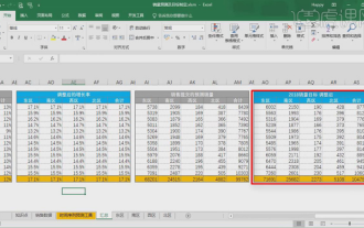
Being able to skillfully make forms is not only a necessary skill for accounting, human resources, and finance. For many sales staff, learning to make forms is also very important. Because the data related to sales is very large and complex, and it cannot be simply recorded in a document to explain the problem. In order to enable more sales staff to be proficient in using Excel to make tables, the editor will introduce the table making issues about sales forecasting. Friends in need should not miss it! 1. Open [Sales Forecast and Target Setting], xlsm, to analyze the data stored in each table. 2. Create a new [Blank Worksheet], select [Cell], and enter [Label Information]. [Drag] downward and [Fill] the month. Enter [Other] data and click [
 How to make ppt pictures appear one by one
Mar 25, 2024 pm 04:00 PM
In PowerPoint, it is a common technique to display pictures one by one, which can be achieved by setting animation effects. This guide details the steps to implement this technique, including basic setup, image insertion, adding animation, and adjusting animation order and timing. Additionally, advanced settings and adjustments are provided, such as using triggers, adjusting animation speed and order, and previewing animation effects. By following these steps and tips, users can easily set up pictures to appear one after another in PowerPoint, thereby enhancing the visual impact of the presentation and grabbing the attention of the audience.
 How to set WPS value to automatically change color according to conditions_Steps to set WPS table value to automatically change color according to condition
Mar 27, 2024 pm 07:30 PM
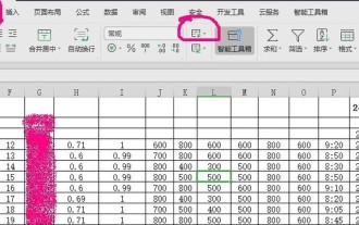
1. Open the worksheet and find the [Start]-[Conditional Formatting] button. 2. Click Column Selection and select the column to which conditional formatting will be added. 3. Click the [Conditional Formatting] button to bring up the option menu. 4. Select [Highlight conditional rules]-[Between]. 5. Fill in the rules: 20, 24, dark green text with dark fill color. 6. After confirmation, the data in the selected column will be colored with corresponding numbers, text, and cell boxes according to the settings. 7. Conditional rules without conflicts can be added repeatedly, but for conflicting rules WPS will replace the previously established conditional rules with the last added rule. 8. Repeatedly add the cell columns after [Between] rules 20-24 and [Less than] 20. 9. If you need to change the rules, you can just clear the rules and then reset the rules.
 How to arrange two pictures side by side in wps document
Mar 20, 2024 pm 04:00 PM
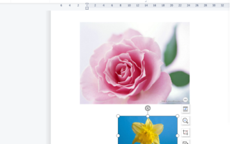
When using WPS office software, we found that not only one form is used, tables and pictures can be added to the text, pictures can also be added to the table, etc. These are all used together to make the content of the entire document look richer. , if you need to insert two pictures into the document and they need to be arranged side by side. Our next course can solve this problem: how to place two pictures side by side in a wps document. 1. First, you need to open the WPS software and find the picture you want to adjust. Left-click the picture and a menu bar will pop up, select "Page Layout". 2. Select "Tight wrapping" in text wrapping. 3. After all the pictures you need are confirmed to be set to "Tight text wrapping", you can drag the pictures to the appropriate position and click on the first picture.


