I am very happy to participate in this potato chip party and have met a few friends~~Unexpectedly, today I have to summarize
I’m very happy to have participated in this potato chip party and met a few friends~~Unexpectedly, today I have to summarize
We discussed a total of three topics at this potato chip meeting:
A. How to make "use
I am glad to participate in the potato chips of this issue, and I met a few friends ~~ Unexpectedly, today I want to summarize it today
I am very happy to have participated in this Potato Chip Party and met a few friends~~Unexpectedly, today I have to summarize
We discussed a total of three topics in this Potato Chip Party :
A. How to make it easier for "users" to identify hyperlinks?
B. Do hyperlinks have to be “underlined”?
C. Is it a button or a link?
1. How to make it easier for “users” to identify hyperlinks?
It feels like a link, but it doesn’t feel like a link at all. We looked at a few examples together.
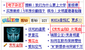
Sina: 
There are red ones with underlining, there are red ones without underlining, and there are blue ones with underlining. Wait
This gives the impression that you can click on anything and there are links everywhere. But the interface aesthetics is very poor.
Yahoo: 
1, 3, and 4 in the picture are all links, but 2 is the text and cannot be linked. At first glance, it is impossible to tell which one is a link and which one is not a link. It suddenly becomes clear when the mouse passes over it.
This method of processing without underlining by default makes the interface very beautiful as a whole, but it makes it more difficult to distinguish. As far as the eye can see, I don’t know what to do.
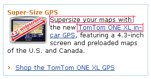
Amazon: 
Amazon’s website links are handled very cleverly. Links are included in the text. Those that cannot be linked are black text, and those that can be linked are underlined in blue. In addition, its categories are not underlined, but everyone agrees that categories do not need to be underlined.
Everyone agrees with Amazon’s approach.
After discussion, we did not reach a very consistent conclusion, but there are some relatively consistent tendencies, such as
Category does not need to be underlined.
To achieve a good distinction between links, the most common way is to use blue and underline.
For a website, if there is no underline, then links and non-links must be distinguished by different colors, and the colors of links should be the same.
#p#
I am glad to participate in the potato chips of this issue, and I met a few friends ~~ Unexpectedly, today I want to summarize it today
2. Do hyperlinks have to be underlined?
When referring to the above analysis, we also discussed the issue of whether links must be underlined. Although no conclusion was reached in the end, a certain consensus was reached. For example, the categories mentioned above do not need to be underlined; a color can be used to distinguish links from non-connections.
Regarding the above two topics, we also mentioned a few points:
Underscores only distinguish between links and non-connections, but there are many ways to distinguish them, such as color. It's just that users have become accustomed to underlines. They have a very deep understanding of underlines and know that they are links at a glance.
The underline appears only after the mouse passes over it. This method of expression is not very intuitive, and you cannot distinguish between links and non-connections at a glance.
You can add ways to distinguish links and non-connections, but this will increase the user's memory burden.
For a website, its links must be displayed in a consistent manner.
3. Is it a button or a link?
Look at the following two examples: 

Is the clickable thing in the article a button or a link?
These two performances mainly serve a prominent role, allowing users to clearly and accurately understand what they mean. But there are two different performances. Which one is better?
The first type of button interrupts the paragraph structure of the text, but the protruding effect of the second type is not so strong, and it is not as good as the first type in terms of driving force.
In addition, both of these ways of expression are quite verbose, and something that has been talked about for a long time can be done with an "add as friend" button.
Finally we came to the conclusion that if it is a short text with a strong imperative nature, you can add a button at the end, which will not only serve the purpose of emphasis, but will not affect the text. Beautiful. Such as an example of Qzone, but I can't find this example, please help me add it.
 How to solve the problem that mysql link reports 10060
 What does it mean to block all cookies?
 How to defend cloud servers against DDoS attacks
 Usage of gettickcount function
 what is nodejs
 How to turn off automatic updates in win10
 close port
 Five reasons why your computer won't turn on
 Popular explanation of what Metaverse XR means


