Markup Language - Printing Style_HTML/Xhtml_Web Page Production
Click here to return to the HTML Tutorial column of the Web Teaching Network. To view CSS tutorials, please click here.
Above: Markup language - CSS styles applied to web pages.
Chapter 11 Printing style
Previously in Chapter 10, we discussed several ways to apply CSS to documents. This chapter is about looking at printing styles, specifying CSS rules specifically for printing pages. With just a few CSS rules, you can
Click here to return to the Script House HTML Tutorial column. To view CSS tutorials, please click here.
Above: Markup language - Web application CSS style .
Chapter 11 Print Styles
Previously in Chapter 10, we discussed several methods of applying CSS to documents. This chapter is about studying print styles and specifying CSS rules specifically for printing pages. Just a few CSS rules, This ensures that structured markup content looks as good when printed on paper as it does when displayed on the screen.
First, let’s take a look at media types and their relationship to providing device-specific CSS.
How to specify the style used when printing?
Before answering this question, you must be familiar with the concept that we can specify the media type (media) for CSS. Declaring the media type will make the style work for a specific media.
For example, if you want to make a link's style sheet exclusive to computer screens, you can add the media attribute to the tag like this:
media="screen" href="screenstyles.css" />
The previous code can ensure that the tag linked to The style will only be used for computer screens. Maybe you want to ask: "In addition to computer screens, what other media can be targeted?" The answer is... there are many choices.
Media Type
In addition to screen used in the above example, there are many media types to choose from. The following are all recognized media types, as defined by W3C in the CSS2.1 standard (available at http:// www.php.cn/found):
all: Applicable to all devices
braille: suitable for braille tactile feedback devices
embossed: suitable for Braille page printers
handeld: suitable for handheld devices (usually with small screens, limited bandwidth)
print: suitable for paginated content, and documents viewed on screen using print preview mode
Projection: Suitable for projection presentations, for example, overhead projectors, please see paginated content (http://www.php.cn/) for more information on paginated media formats
screen: Mainly suitable for color computer screens
speech: Suitable for speech synthesizers. Note: CSS2 has a media type with similar functions called aural. Please refer to the Auditory Style Sheet Appendix (http://www.php.cn/) for more information.
tty: Suitable for media using fixed-width text formats (such as telegraph switches, terminals, or handheld devices with limited display capabilities). Developers should not use pixel length units in tty.
tv: For TV-type devices (low resolution, low color, limited scrolling capabilities, ability to use sound effects).
This chapter will focus on the all, print and screen media types.
#p#
Two methods of specifying media
There are two methods in W3C to specify media types for CSS. One of the methods is demonstrated at the beginning of this chapter, which is to use the tag and the media attribute. Let us compare it. These two methods.
Method A: Media attribute
media="screen" href="screenstyles.css" />
Similar to the earlier example, method A specifies that screenstyles.css should only be used for computer screens. This should avoid the need for printing, projecting, browsing with handheld devices, using screen readers, etc. The rules in screenstyles.css are applied when doing so.
Partial Support
One important thing to note is that strictly supporting all media types is a bit unrealistic. In an ideal world, all devices and browsers should strictly adhere to the specified media types. For example, if you write:
media="handheld" href="screenstyles.css" />
Then you would hope that only handheld devices (such as PDAs, mobile phones, etc.) will apply these styles. Unfortunately, the standard content does not seem to have spread to the world outside the browser at the time of writing this article, so it does not Not every device supports its corresponding media type.
For this reason, we will focus on media types that can be used in practical applications, such as print styles.
Method B: @media or @import
Second specification The method of media type is to combine the @import and @media declarations. For example, when we introduce an external style sheet with @import, we can also specify the media type for it.
Similarly, the @media rule can isolate the target A rule paragraph for a specific media, similar to method A, uses @media to specify a style specifically for printing.
Put it in the or put it outside
In method A, the
In the previous example, by specifying multiple media types, screenandprint.css is used for both screen display and print media, and then the @media rule is used to separate print-specific styles.
After looking at the two methods of specifying media types, let’s take a look at how to actually use them to provide styles for screen display and printing.
#p#
Separate styles for screen display and printing
Suppose we want to provide two CSS for the same document: one for display and the other for printing. Now take my personal website as an example.
I use the tag to reference the main style sheet (styles.css) of the entire website. The content of styles.css is just a simple @import rule to introduce another external style sheet, so that the old Browsers (such as Netscape 4.x) hide style settings.
In the of the page, link to the main style sheet styles.css
At the same time, we also create another style sheet (print.css) specifically for print design. In print.css, I Wrote a style that only applies when the page is printed.
Then, now how to ensure that these CSS will only target their respective How does the appropriate media work? Just add the media attribute to the tag (same as method A).
media="screen" href="/css/styles.css" />
media="print " href="/css/print.css" />
By specifying screen for styles.css, you can ensure that the styles included in styles.css will only be used on the computer screen. Similarly, set the media attribute Setting it to print ensures that the styles contained in print.css are only used when the user prints the page.
Now that the screen and print styles have been separated, let's see which styles are suitable to be placed in the print style sheet.
Design a print style sheet
This style.css may contain rules such as layout, font, positioning, background, etc., but print.css is a blank sheet of paper, waiting for us to customize the styles to be applied when printing.
The key to pay attention to when designing print styles is the media type. Since you are dealing with a piece of paper (rather than a browser window), the pixel length and size are not the best choices.
Specify size in points
In a print style sheet, it is very reasonable to use points to specify the font size. In this print style sheet, first define the base font size for the tag - using "point" units.
body {
font-family: "Times New Roman", serif;
font-size: 12pt;
}
is really too simple, compared to using pixel units, It should be better to imagine how big the 12-point font will be printed. At the same time, we also choose serif fonts, which are more detailed in printing and easier to read.
Hide unnecessary tags to save ink
There may be many page elements on the website that are completely useless in the printed version. Elements such as navigation links, sidebars, forms, and advertising columns are often just wasted when printed. Ink, we can use the display attribute in the print stylesheet to set them not to be displayed. Users often only want to print the content of the page.
For example, if the website starts with #nav, #sidebar, #advertising and #search If you store the navigation bar, sidebar, advertising items and search form separately, you can use the following statement in the print style sheet to hide all these contents:
body {
font-family: "Times New Roman", serif;
font-size: 12pt;
}
#nav, #sidebar, #advertising, #search {
display: none;
}
By setting display:none; in the print style sheet, we can hide these elements in the print result.
Try to hide Eliminating unnecessary elements on the page, you can quickly and easily create a "printer-friendly" version of your website using the same markup code. There is no need to use another reduced template to output an identical website content on the server - - Just need an extra CSS file, specify the print media type, and you're done!
Now it's confirmed again that organizing the markup structure with logical page "paragraphs" makes it easier to design styles in the future. If there is an advertising banner on the page, add it to Specifying an id makes sense because it gives control to the CSS. In this case, it hides it when printing.
Removing background images and colors is also one of the tricks to save ink and make the printed result easier to read. 1.
For example, if you previously specified a background image or color for the tag, you can now remove it like this:
body {
background: none;
}
Of course, you can also use this method to remove the background image and color specified in the screen style of other tags.
#p#
Expose links
There is also a clever trick (unfortunately it only works in browsers that fully support the CSS2 specification), which is to expose link URLs and let them appear as hyperlinks in the print results. After the text.
We can use the :after pseudo-class to write CSS, allowing supported browsers to print out the URL to which it is connected after the hyperlink text. Currently, Mozilla, Safari and Netscape 7.0 all support this function. At the same time, There is no disadvantage for browser users who do not support :after, as they will only see the hyperlink text itself (Eric Meyer, "CSS Design: Going to Print", http://www.php.cn/).
Let us add a new rule to the print stylesheet to highlight the hyperlink URL in the content part:
body {
font-family: "Times New Roman", serif;
font-size: 12pt;
}
#nav, #sidebar, #search {
display: none;
}
#content a:link:after, #content a :visited:after {
content: " (" attr(href) ") ";
}
This rule will Causes the printed page to add the URL after the hyperlink text. The URL will be placed in a set of brackets, leaving a space before and after. This will only affect the #content area of the page. Although it is possible to write a general rule to expose all Hyperlinks, but here we choose to only expose hyperlinks in the content part - excluding links at the top, bottom and other areas.
Again, although this feature is currently supported by only a few browsers, it is Browsers that don't support the :after pseudo-class are completely harmless, they will simply ignore this rule.
Link text
We just did some clever tricks on the link URL, but don’t forget to emphasize the link text in a unique way so that readers can easily identify the included hyperlinks when reading general content.
body {
font-family: "Times New Roman", serif;
font-size: 12pt;
}
#nav, #sidebar, #search {
display : none;
}
a:link, a:visited {
color: blue;
text-decoration: underline;
}
#content a:link:after, #content a:visited:after {
content: " (" attr(href) ") ";
}
Of course, you can also choose any color here. Now I use the default blue and underline it, because most people can see it as a hyperlink at a glance. For black and white printing, you can experiment with a certain gray color, so that Links create enough contrast with regular text.
#p#
Preview printing to save ink
Another tip to save ink is to use the browser's print preview function to try to show how the page will print, rather than actually printing the entire page on paper.
In most browsers In the browser, there is a preview option in the File-Print dialog box, which allows you to check the printing effect of the page. You can take a good look at the effect of the printing style sheet here.
How it looks
Using a print style sheet on my personal website is very similar to the previous example we made together. Can you compare Figures 11-1 and 11-2 to see how I designed the print style sheet? Navigation, sidebar, while exposing linked content, adjusting font and font size to make this article easier to read.

Figure 11-1 SimpleBits viewed in a browser, using screen style sheets
 Figure 11-2 SimpleBits print version
From Figures 11-1 and 11-2, it can be clearly seen that as long as a small CSS document is used, a special version dedicated to printing can be provided for any page. This is any Features that are easy to add to your project and can add to the experience when users try to print your pages.
Next time your boss says, "We need to create a new print-friendly template for the website, and "Exactly the same directory structure", you'll be able to pull this little trick out of your back pocket (or wherever you can fit this book).
If you want to know more design tips for print styles, be sure to read CSS guru Eric Meyer's articles " CSS Design: Going to Print " (http://www.php.cn/) and "Print Different" ( http://www.php.cn/).
Summary
We have briefly discussed the rules that can be included in the print style sheet. Since the media type can be specified to separate all styles for printing and screen display, it is very simple to adjust the details for each media and is easy to maintain and manage. There is no longer a need to create a print-friendly copy of the entire website, as you can use the same markup source code, paired with a print-specific CSS document to accomplish the same functionality.
In the future I hope other devices will support more Multimedia type, if designing CSS styles for specific devices can allow PDAs, mobile phones and screen readers to read the same XHTML normally, our work will be much easier.
media="screen" href="/css/styles.css" />
media="print " href="/css/print.css" />
body {
font-family: "Times New Roman", serif;
font-size: 12pt;
}
body {
font-family: "Times New Roman", serif;
font-size: 12pt;
}
#nav, #sidebar, #advertising, #search {
display: none;
}
body {
background: none;
}
body {
font-family: "Times New Roman", serif;
font-size: 12pt;
}
#nav, #sidebar, #search {
display: none;
}
#content a:link:after, #content a :visited:after {
content: " (" attr(href) ") ";
}
body {
font-family: "Times New Roman", serif;
font-size: 12pt;
}
#nav, #sidebar, #search {
display : none;
}
a:link, a:visited {
color: blue;
text-decoration: underline;
}
#content a:link:after, #content a:visited:after {
content: " (" attr(href) ") ";
}

Hot AI Tools

Undresser.AI Undress
AI-powered app for creating realistic nude photos

AI Clothes Remover
Online AI tool for removing clothes from photos.

Undress AI Tool
Undress images for free

Clothoff.io
AI clothes remover

AI Hentai Generator
Generate AI Hentai for free.

Hot Article

Hot Tools

Notepad++7.3.1
Easy-to-use and free code editor

SublimeText3 Chinese version
Chinese version, very easy to use

Zend Studio 13.0.1
Powerful PHP integrated development environment

Dreamweaver CS6
Visual web development tools

SublimeText3 Mac version
God-level code editing software (SublimeText3)

Hot Topics
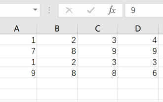 What should I do if the frame line disappears when printing in Excel?
Mar 21, 2024 am 09:50 AM
If when opening a file that needs to be printed, we will find that the table frame line has disappeared for some reason in the print preview. When encountering such a situation, we must deal with it in time. If this also appears in your print file If you have questions like this, then join the editor to learn the following course: What should I do if the frame line disappears when printing a table in Excel? 1. Open a file that needs to be printed, as shown in the figure below. 2. Select all required content areas, as shown in the figure below. 3. Right-click the mouse and select the "Format Cells" option, as shown in the figure below. 4. Click the “Border” option at the top of the window, as shown in the figure below. 5. Select the thin solid line pattern in the line style on the left, as shown in the figure below. 6. Select "Outer Border"
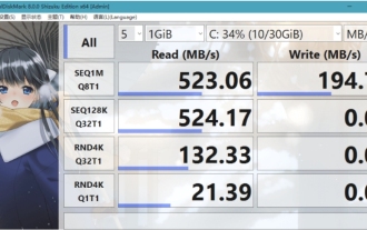 What software is crystaldiskmark? -How to use crystaldiskmark?
Mar 18, 2024 pm 02:58 PM
CrystalDiskMark is a small HDD benchmark tool for hard drives that quickly measures sequential and random read/write speeds. Next, let the editor introduce CrystalDiskMark to you and how to use crystaldiskmark~ 1. Introduction to CrystalDiskMark CrystalDiskMark is a widely used disk performance testing tool used to evaluate the read and write speed and performance of mechanical hard drives and solid-state drives (SSD). Random I/O performance. It is a free Windows application and provides a user-friendly interface and various test modes to evaluate different aspects of hard drive performance and is widely used in hardware reviews
 How to download foobar2000? -How to use foobar2000
Mar 18, 2024 am 10:58 AM
foobar2000 is a software that can listen to music resources at any time. It brings you all kinds of music with lossless sound quality. The enhanced version of the music player allows you to get a more comprehensive and comfortable music experience. Its design concept is to play the advanced audio on the computer The device is transplanted to mobile phones to provide a more convenient and efficient music playback experience. The interface design is simple, clear and easy to use. It adopts a minimalist design style without too many decorations and cumbersome operations to get started quickly. It also supports a variety of skins and Theme, personalize settings according to your own preferences, and create an exclusive music player that supports the playback of multiple audio formats. It also supports the audio gain function to adjust the volume according to your own hearing conditions to avoid hearing damage caused by excessive volume. Next, let me help you
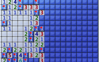 How to mark minesweeper? -How to change the difficulty of Minesweeper?
Mar 18, 2024 pm 06:34 PM
How to mark minesweeper? First, we need to familiarize ourselves with the marking method in Minesweeper. Normally, there are two common marking methods in Minesweeper games: flag marking and question mark marking. The flag mark is used to indicate that there are mines in the block and is a deterministic mark; while the question mark mark indicates that there may be mines in the block, but it is not deterministic. These two marking methods play an important role in the game, helping players to infer which blocks may contain mines, so as to effectively proceed to the next step. Proficient use of these marking methods can improve the player's success rate in the minesweeper game and reduce the risk of stepping on mines. Therefore, when playing the minesweeper game, if the player has mastered the flag mark and question mark mark, when the player is not sure whether there is a mine in a certain square, he can use the question mark mark to mark it.
 How to use Baidu Netdisk app
Mar 27, 2024 pm 06:46 PM
Cloud storage has become an indispensable part of our daily life and work nowadays. As one of the leading cloud storage services in China, Baidu Netdisk has won the favor of a large number of users with its powerful storage functions, efficient transmission speed and convenient operation experience. And whether you want to back up important files, share information, watch videos online, or listen to music, Baidu Cloud Disk can meet your needs. However, many users may not understand the specific use method of Baidu Netdisk app, so this tutorial will introduce in detail how to use Baidu Netdisk app. Users who are still confused can follow this article to learn more. ! How to use Baidu Cloud Network Disk: 1. Installation First, when downloading and installing Baidu Cloud software, please select the custom installation option.
 How to mark multiple locations on Baidu Maps How to mark multiple locations
Mar 15, 2024 pm 04:28 PM
There are many functions above, especially for maps that can mark multiple places. When we know some places, we will definitely use some punctuation functions, so that we can bring you a variety of different aspects. Some of the functions you mark will produce distance differences, that is, you can know how far away they are. Of course, some names and detailed information of the above places will also be displayed. However, many netizens may not be familiar with some of the above. The content information is not very clear, so in order to allow everyone to make better choices in various aspects, today the editor will bring you some choices in various aspects, so friends who are interested in ideas, If you are also interested, come and give it a try. Standard
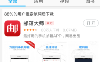 How to use NetEase Mailbox Master
Mar 27, 2024 pm 05:32 PM
NetEase Mailbox, as an email address widely used by Chinese netizens, has always won the trust of users with its stable and efficient services. NetEase Mailbox Master is an email software specially created for mobile phone users. It greatly simplifies the process of sending and receiving emails and makes our email processing more convenient. So how to use NetEase Mailbox Master, and what specific functions it has. Below, the editor of this site will give you a detailed introduction, hoping to help you! First, you can search and download the NetEase Mailbox Master app in the mobile app store. Search for "NetEase Mailbox Master" in App Store or Baidu Mobile Assistant, and then follow the prompts to install it. After the download and installation is completed, we open the NetEase email account and log in. The login interface is as shown below
 BTCC tutorial: How to bind and use MetaMask wallet on BTCC exchange?
Apr 26, 2024 am 09:40 AM
MetaMask (also called Little Fox Wallet in Chinese) is a free and well-received encryption wallet software. Currently, BTCC supports binding to the MetaMask wallet. After binding, you can use the MetaMask wallet to quickly log in, store value, buy coins, etc., and you can also get 20 USDT trial bonus for the first time binding. In the BTCCMetaMask wallet tutorial, we will introduce in detail how to register and use MetaMask, and how to bind and use the Little Fox wallet in BTCC. What is MetaMask wallet? With over 30 million users, MetaMask Little Fox Wallet is one of the most popular cryptocurrency wallets today. It is free to use and can be installed on the network as an extension


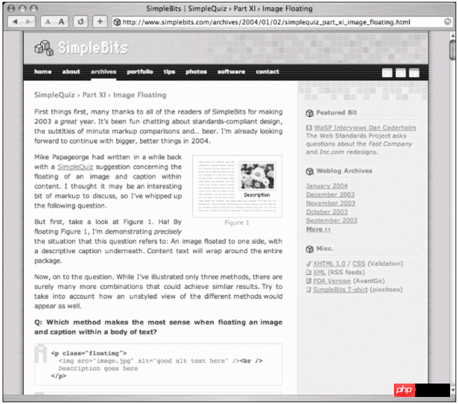
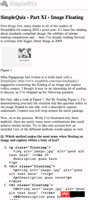 Figure 11-2 SimpleBits print version

