Markup language - CSS layout_HTML/Xhtml_Web page production
Chapter 12 CSS Layout
So far in this book, the main discussion has been about the internal elements of the page, that is, the content, but what about the large structure? For a long time, designers have relied on tables for column layout, often nesting other elements within the tables.
Click here to return to the Script House HTML Tutorial column. To view CSS tutorials, please click here.
Above: Markup language - printing style .
Chapter 12 CSS Layout
So far in this book, we have mainly discussed the internal elements of the page, that is, the content, but what about the large structure? For a long time, designers have relied on tables for column layout, often embedded in tables Set up other tables to achieve just the right spacing and visual effects. Not only are these huge typeset contents slow to download, they are also very laborious to maintain, not to mention that text browsers, screen readers, and small-screen devices simply cannot read them correctly.
In this chapter, four common methods will be used, combined with CSS and structured markup syntax, to create a two-column layout. You will soon find that you don’t need to nest tables, and GIFs for intervals can also be used to create points. Column layout.
Later in the "Technical Extension", we will discuss the problem of the box model of Internet Explorer 5.0 for Windows and how to bypass it. We will also share a simple secret to achieve equal-width columns with CSS. .
#p#
How to make a two-column layout with CSS?
The answer is that there are several methods. In order to get you started and help you understand the differences between two common methods (floating and positioning), we will focus on the four first. In different ways, each of these methods can create a two-column layout with both a header and a footer.
My hope is that you can use this chapter as a guide to start building a website and use this book to your advantage. The methods in other chapters are used to create content.
The four methods we will discuss all apply between the
To give you an idea of the page structure surrounding each method, let's take a rough look at what else needs to be included:
"http://www.w3.org/TR/xhtml1/DTD/xhtml1-transitional.dtd">CSS Layouts
.. .Method demonstration...
In order for you to understand the layout configuration to be achieved, please see Figure 12-1: This This is the column layout we want to complete. Figure 12-1 Frame diagram of the two-column layout
Let’s get started! First, introduce the first method, which uses the float attribute.
#p#
Method A: Floating sidebar
p id="header">
...Header part...
...main part. ..
The above is the source code of the markup that we want to use the CSS float attribute to create a column layout. Use the
tag to divide the page elements into several logical paragraphs, each with a unique ID:
#header: Contains title image, navigation bar, etc.
#sidebar: Contains additional content links and related information
#content: Contains the main text content and is also the focus of the page.
#footer: Contains copyright information, author, auxiliary links, etc.
Separating these page paragraphs allows us to fully control the layout. As long as we specify a few CSS rules, we can immediately complete the two-column layout.
Specify styles for the header and footer
The first step to convert the content structure into a column layout is to add a little background color and a little inner patch to the header and footer, which can make the content stand out more easily.
#header {
padding: 20px;
background: #ccc;
}
#footer {
padding: 20px;
background: #eee;
}
Adding the previous CSS to the structure of method A will make it appear as shown in Figure 12-2. I added some false content to each paragraph.
Figure 12-2 Specifying styles for the header and footer
Of course, in #header and #footer, you can continue to specify appropriate styles for these paragraphs, such as font-family, color, link color, etc. Wait. Now let's create the two-column layout.
The essence of the floating sidebar
method A is that it uses the float attribute to place the #sidebar on either side of the main content
. In this example, place it on the right side of the content, but put it Of course it works to the other side.
The key to floating #sidebar is that in the tag source code, it must appear before the main content
, so that the top of the sidebar will be in line with the main content. Align the top.
Next, add the float attribute to #sidebar, set its width to 30%, and specify the background color:
#header {
padding: 20px;
background: #ccc;
}
#sidebar {
float: right;
width: 30%;
background: #999;
}
#footer {
padding: 20px;
background: #eee;
}
Figure 12-3 is the display effect after adding this CSS. You can see that the sidebar has moved to the right, and the main content flows within the scope of the sidebar.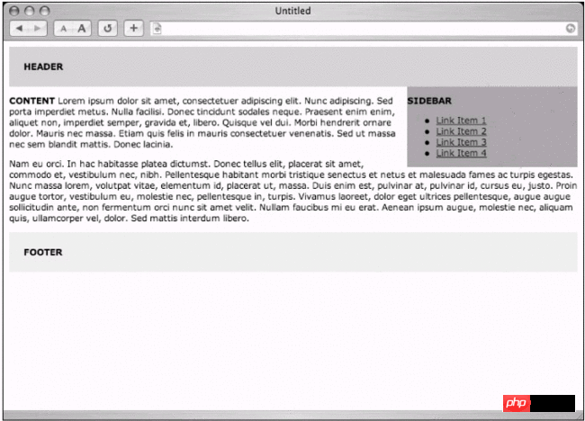
Figure 12-3 Float #sidebar to the right of the main content
Real Column
Look at Figure 12-3. We haven’t really completed the two-column layout. In order to complete this effect, we must take the #content
and specify the right outer patch with the same width as the sidebar. , thus creating space for #sidebar.
The CSS that needs to be added is as simple as:
#header {
padding: 20px;
background: #ccc;
}
#sidebar {
float: right;
width: 30%;
background: #999;
}
#content {
margin-right: 34%;
}
#footer {
clear: right;
padding: 20px;
background: #eee;
}
We will find that the right outer patch size we set for content is 4% larger than #sidebar, so that there is space between the two columns The next bit of space. Figure 12-4 is the effect of viewing it with a browser. You can find that as long as you set the right outer patch for
, you can create the illusion of the second column. 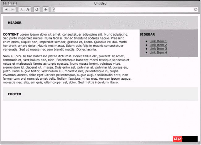
Figure 12-4 Two-column layout
At the same time, you should pay attention to the clear:right rule added to #footer. This rule is very important to ensure that the footer of the page will definitely appear after the sidebar and content area, rather than Affected by the change in the length of the two columns, the footer will avoid any previously appearing float content.
Now that the two-column layout is available, you can continue to add more borders, backgrounds, borders and other elements to make the appearance more attractive.
So far we have set the width in percentages to create a flexible layout (the column width will automatically scale with the user's window width). We can also set the width in pixel units When creating a fixed-width layout, but specifying the size of the inner and outer patches in pixels, you must pay attention to the problem that IE for Windows incorrectly parses the CSS box model. You can find more information and possible solutions in "Box Model Problems" in this chapter.
#p#
Method B: Double float
...header content here...
...main content here...
One of the disadvantages of method A is: in order to float the sidebar, you must put the sidebar in front of the main content within the markup source code, and close the CSS browser, text browser, and screen Readers and other devices that do not support CSS will display (or read) the content of the sidebar before the main content of the page. This is really not rigorous.
We can use the float method and avoid this problem, just swap Mark the main content in the source code and the position of the sidebar
(as shown above), and then use CSS to float them to different sides.
#header {
padding: 20px;
background: #ccc;
}
#content {
float: left;
width: 66%;
}
#sidebar {
float: right;
width: 30%;
background: #999;
}
#footer {
clear: both;
padding: 20px;
background: #eee;
}
By floating the two
in different directions, you can arrange the source code in the most appropriate way (main content in front of the sidebar) while still getting the effect like Figure 12-4.
Avoid both sides
Equally important, you must set the #footerdeclear attribute to both, so that no matter how long the two columns are, the footer is always displayed at the end, and the content order of the tag source code is also improved. .
#p#
Method C: Floating main content
...Header content...
< p id="content">
...main content...
There is another method worth mentioning. You only need to use a float attribute and mark the source code. You can still put the
of the main content before the sidebar.
Just put the
# header {
padding: 20px;
background: #ccc;
}
#content {
float: left;
width: 66% ;
}
#sidebar {
background: #999;
}
#footer {
clear: left;
padding: 20px;
background: #eee;
}
Please note that we don’t need to define the width of the sidebar because it will automatically fill the main content
Use the remaining space (34% in this example).
Tragic background
Figure 12-5 is the result of viewing it with a browser, oh wow! In some common browsers, the background color of the sidebar will appear under the main content area, because the sidebar has not been specified width, so it wants to expand to the same width as the browser window.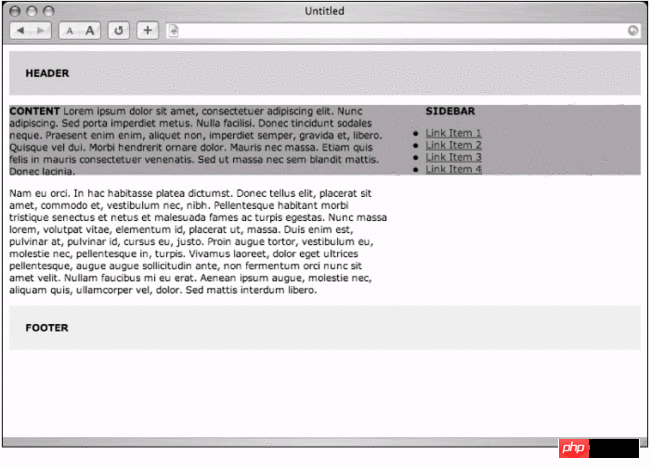
Figure 12-5 Floating content, but the background color of the sidebar shows through
As long as we can add this part to the side This problem can be avoided by adding an outer border with the same width as the content area on the left side of the sidebar. In fact, we will make the outer patch slightly larger to leave a little white space between the two columns.
#header {
padding: 20px;
background: #ccc;
}
#content {
float: left;
width: 66%;
}
#sidebar {
margin-left: 70%;
background: #999;
}
#footer {
clear: left;
padding: 20px;
background: #eee;
}
Simple and plain
Or, if there is no need to use a background color, then there is no need to set a border, Figure 12 -6 is the result after removing the entire #sidebar statement and adding a little right outer patch to the main content
. At this time, the two columns will share the default background color of the page. 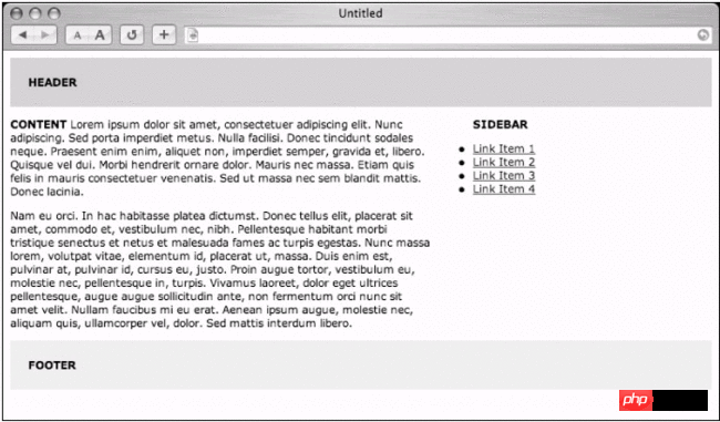
Picture 12-6 The floating content
CSS that does not use background color can be reduced to:
#header {
padding: 20px;
background: #ccc;
}
#content {
float: left;
width: 66%;
margin-right: 6%;
}
#footer {
clear: left;
padding: 20px;
background: #eee;
}
In addition to adding the left outer patch (or omitting the background color), There is an alternative to using a background image to give the columns a background color. I will hint at this little secret later in the "Technique Extension" unit of this chapter.
In addition to using the float attribute, you can also use positioning to create Column layout, let’s look at the last option, method D.
#p#
Method D: Positioning
...Top content...
...main content...
Method D is to use the same markup Source code structure, and then arrange it in the most efficient way
: Place the main content before the sidebar, close the styled browser, the screen reader will receive the main content part first, and then the sidebar , when positioning, the order within the tag source code has no relationship with the position where the page elements appear.
Predictable height
CSS content is somewhat similar to the first three methods, the first difference is the pixel height specified for the header, we need to be able to predict the height in order to position the sidebar later.
Here A number is randomly selected, and this needs to be adjusted according to the content used at the top of the page, such as logo, navigation bar, search form, etc.
#header {
height: 40px;
background: #ccc;
}
#footer {
padding: 20px;
background: #eee;
}
Leave space for each column Lower space
Next, you need to set the right outer patch for the #content
. Just like the previous methods, this can leave space for the right sidebar. Later, we will use the absolute positioning method (not floating )Put the right sidebar in.
#header {
height: 40px;
background: #ccc;
}
#content {
margin-right: 34%;
}
#footer {
padding: 20px;
background: #eee;
}
Put it into the sidebar
Finally, you need to use absolute positioning to put the #sidebar
within the boundary of #content, and you must also remove the text that the browser adds around the page. Default boundaries, so that the positioning coordinates will be consistent across all browsers.
body {
margin: 0;
padding: 0;
}
#header {
height: 40px;
background: #ccc;
}
#content {
margin-right: 34%;
}
#sidebar {
position: absolute;
top: 40px;
right: 0;
width: 30%;
background: #999;
}
#footer {
padding: 20px;
background: #eee;
}
After specifying position:absolute, #sidebar can be accurately placed at the desired position using top and right coordinates (Figure 12-7).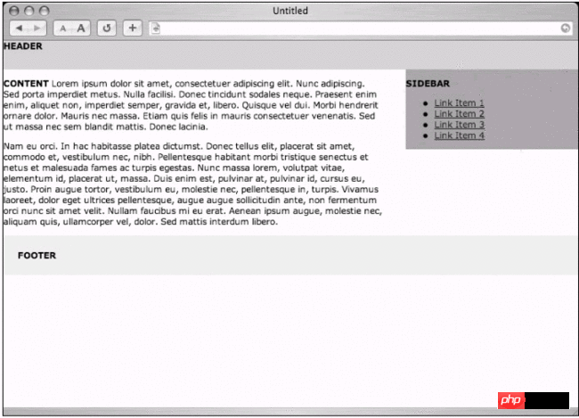
Figure 12-7 Two-column layout effect made with positioning
We It describes "Place the
#sidebar at a position 40 pixels from the top edge of the browser window and 0 pixels from the right edge." In addition, you can also use bottom and left to specify coordinates.
Footer issue
When using the previous method to float columns, you can use the clear attribute to ensure that the footer spans the width of the entire browser window and is not affected by the length of the main content and sidebar.
When positioning , the document flow of the sidebar is independent of the entire page, so as long as the sidebar is longer than the content, it will cover the footer of the page. (Figure 12-8) 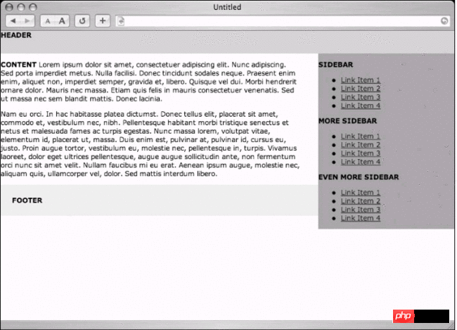
Figure 12 -8 The sidebar overlaps with the footer
One of my common solutions to this problem is to specify the same outer right patch as the main content for the footer, so that the sidebar can extend beyond the footer.
To use this method, the CSS needs to be adjusted like this:
body {
margin: 0;
padding: 0;
}
#header {
height: 40px;
background: #ccc;
}
#content {
margin-right: 34%;
}
#sidebar {
position: absolute;
top: 40px;
right: 0;
width: 30%;
background: #999;
}
#footer {
margin-right: 34%;
padding: 20px;
background: #eee;
}
This solution looks a bit strange on a page with short content and long sidebar, but it does work. The result can be seen in Figure 12- 9. Demonstrates the sidebar avoiding the footer of the page.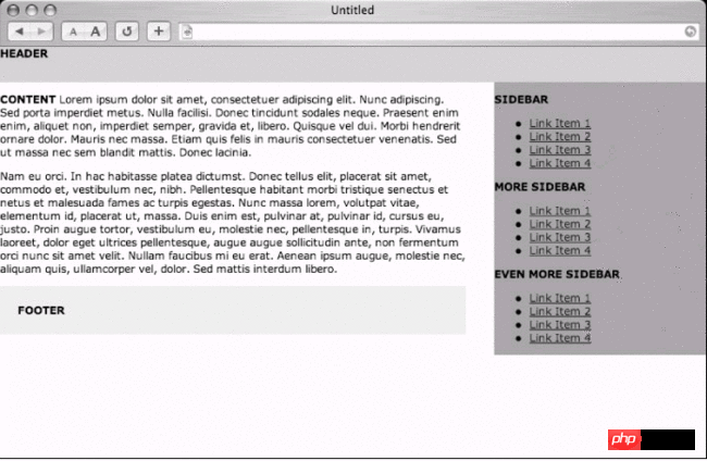
Figure 12-9 The footer of the page with the same outer patch and main content
#p#
Three people
What should I do if I want to make a three-column layout? No problem, and it is easy to add when using absolute positioning. You only need to add the main content and the left outer patch, which is large enough to accommodate the third column. Yes.
Another sidebar can be placed anywhere within the markup source code, because absolute positioning will need to be used again for layout.
Suppose you add a second sidebar and name it #sidecolumn , then use the following CSS to make room for it, and then put it in.
body {
margin: 0;
padding: 0;
}
#header {
height: 40px;
background: #ccc;
}
#content {
margin-right: 24%;
margin-left: 24%;
}
# sidecolumn {
position: absolute;
top: 40px;
left: 0;
width: 20%;
background: #999;
}
#sidebar {
position: absolute;
top: 40px;
right: 0;
width: 20%;
background: #999;
}
#footer {
margin-right : 24%;
margin-left: 24%;
padding: 20px;
background: #eee;
}
The part just completed is to leave the left outer patch in the main content and footer area (to avoid overlap), just like the right sidebar before, then put the new #sidecolumn in with absolute positioning, and place it on the upper edge of the distance 40 pixels, 0 pixels from the left edge.
Did you notice that we modified the width slightly to accommodate the third column? Since we are using percentages, this layout will scale with the width of the browser, or it can be Specify the pixel width of any column to fix the layout width.
Figure 12-10 is the effect of viewing this example with a browser, a flexible three-column layout completed with CSS absolute positioning.
Figure 12-10 Flexible three-column layout using positioning method
#p#
Summary
In this chapter we have briefly studied the effects that can be achieved by planning layout with CSS. The purpose of this chapter is to provide you with a basis for your play, so it demonstrates two main methods: floating and positioning.
I hope You can continue to experiment with CSS layout techniques in depth, remove nested tables within the page, and replace them with more flexible and structured markup syntax that can be read by browsers and devices.
If you want to know more about CSS layout For layout information, then be sure to check out these resources:
"The Layout Reservoir" (http://www.php.cn/): This is an excellent example of using absolute positioning to create multi-column layout.
"From Table Hacks to CSS Layout: A Web Designer's Journey" (http://www.php.cn/): An excellent tutorial written by Jeffrey Zeldman that records the steps required to create a two-column layout.
"CSS Layout Technoques: For Fun and Profit"(http://www.php.cn/): Eric Costello's various CSS layout resources.
"Little Boxes" (http://www.php.cn/): A beautiful interface for many CSS layout examples written by Owen Briggs.
"CSS Zen Garden" (http://www.php.cn/): "Demonstrates what visual effects can be achieved with CSS-based design." The "Garden" cultivated by Dave Shea displays the latest CSS contributed by readers in a single XHTML document. Design (including layout of course). This is an amazing website where you can see the ultimate layout capabilities of CSS.
Technique Extension
Now that we've gone through the basics of building a basic CSS layout, it's time to discuss Internet Explorer 5 and 5.5 for Windows, and their unfortunate problem with incorrectly parsing the CSS box model. I'll also share a tutorial on how to use the platform later. The secret technique of laying out background images to achieve a equal-height column layout.
Box model problem
At the beginning of this chapter, we discussed how to create a multi-column CSS layout. Only use the width attribute to define the width of each column. When you start adding patches and borders to these columns, things become It’s a bit complicated. Why?
Unfortunately, Internet Explorer 5 for Windows cannot correctly calculate the width of the outsourcing element when adding internal and external patches and borders.
For example, except IE5 for Windows, all Browsers that support CSS1 will calculate the width of the outsourcing element as the sum of the width, inner patch, and border. This is the way W3C hopes that all browsers will handle the CSS box model.
However, IE5 for Windows will add the border and inner patch. Patch is counted within the specified width, confused? Don't worry, it will help you to look at the problem directly.
Seeing is believing
Compare Figures 12-11 and 12-12. Figure 12-11 is a 200-pixel wide element with 10-pixel inner patches on both sides and a 5-pixel border. The values in the horizontal part are all Adding them up, you can know that the actual width is 230 pixels.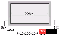 Figure 12-11 The correct calculation result of the box model
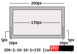 Figure 12-12 IE5 for Windows incorrect inner patch, border, width calculation The result
This is the box model that conforms to the design: the width attribute always defines the content range of the element, and the inner patch and border will be added to this value.
Therefore, if you define the width of the sidebar to be 200 pixels and then add padding and borders, the CSS declaration is as follows:
#sidebar {
width: 200px;
padding: 10px;
border: 5px solid black;
}
Set the width to 200 pixels, but the sidebar actually requires 230 pixels of space, except for IE5 for Windows. IE5 For Windows, the sidebar will occupy a total of 200 pixels, including the inner patch and border.
Figure 12-12 shows that when the width attribute is specified as 200 pixels, the border and inner patch will occupy the content space. Rather than outside the content space.
#p#
Swinging Width
We are against specifying borders for elements. The reason for the internal patch is that the actual width will vary depending on the user's browser. Even today, millions of users using IE5.x will still see Obviously deviated design results. At the same time, there is an important point that must be remembered: at the time of writing this article, there are still too many people using IE5 for us to ignore this problem.
So what should we do? Well, fortunately There is a trick that fixes this problem. This trick provides two different widths, one for IE5 for Windows and one for other browsers to get the correct box model.
Box Model Hack
The kind Tantek Celik wrote the Box Model Hack (http://www.php.cn/) so that we can provide two different widths: one is adjusted and will only be used by Window Internet Explorer 5, The other is used by all other browsers.
Through the CSS parsing bugs only available in IE5 and IE5.5, you can specify a slightly larger width (to accommodate borders and inner patches), and then override this value with the actual width , so that other browsers can display the correct results.
Source Code Example
For example, if we want to set the content area width of the sidebar to 200 pixels wide, plus a 10 pixel inner patch and a 5 pixel border, then our CSS will look like:
#sidebar {
width: 200px;
padding: 10px;
border: 5px solid black;
}
For IE5 for Windows , you need to specify the width as 230 pixels (plus the width of the inner patch and border on both sides), and then overwrite it with 200 pixels, so that browsers that comply with the standard can get the correct width.
#sidebar {
padding: 10px;
border: 5px solid black;
width: 230px; /* for IE5/Win */
voice-family: ""}"";
voice-family: inherit;
width: 200px; /* actual value */
}
Note that the IE5 for Windows value appears first, followed by several rules that make IE5 for Windows think that the declaration has ended. Here we use the voice-family attribute because it will not change if the browser recognizes it. The visual effect, and finally specifying the actual width, overrides the initial width rule and the second width rule will be ignored by IE5 for Windows.
The result should look exactly the same on IE5 for Windows and all other CSS2-compatible browsers. Without this hack, users of IE5 for Windows would see column widths that are thinner than designed.
Opera-friendly
For CSS2-compatible browsers that also have IE5 for Windows parsing errors, we must add an additional statement after each use of the box model patch. This rule called "Opera-friendly" will Make all standards-compliant browsers free from parsing bugs and ensure they display the expected width.
#sidebar {
padding: 10px;
border: 5px solid black;
width: 230px; /* for IE5/Win */
voice-family: ""} "";
voice-family: inherit;
width: 200px; /* actual value */
}
html>body #sidebar {
width: 200px;
}
With this rule, you can completely bypass the problem of IE5 for Windows incorrectly parsing the CSS box model, so that everyone can see the correct The effect.
#p#
More than Width
Here we use the "Box Model Hack" to achieve the same display width, but this Hack can actually come in handy whenever you want to provide different CSS content for IE5 for Windows. Any Hack must be used with caution, and only in real Only use it when needed. It's a good idea to remember where the "box model hack" is used so that you can easily remove it in the future.
At the time of writing this article, there are still millions of Internet users still using IE5 for Windows, so This patch is indispensable.
The following "disguised field" originally came from the January 2004 issue of A List Apart magazine (http://www.php.cn/).
Disguised Column
Regarding the design of my personal website, the most common question I am asked is:
"How do you make the background color of the right column extend all the way to the bottom of the entire page?"
Actually It's a simple concept, really. And it applies to every layout method described at the beginning of this chapter.
Vertical Stretch
One of the most frustrating properties of CSS is that elements will only stretch vertically as long as they really need to be. This means that if you put a 200-pixel-high image inside a
, then < p> will only extend 200 pixels on the page.
This can become an interesting dilemma when you cut page paragraphs with
and then complete a multi-column layout with CSS using the method at the beginning of this chapter. One column may be longer than the others (Figure 12-13). When you want to choose a unique background color for each column, depending on the amount of content, it may be difficult to make two columns of the same length.
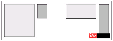 Figure 12-13 Fields with different lengths
There are several ways to make the appendix look the same length, regardless of the content contained in the field. I am going to share my solution (applicable to absolute positioning layout method), and this method is really inexplicably...simple.
Cheating
This unspeakably simple secret is to use a vertically arranged background image to create the illusion of colored columns. In SimpleBits (http://www.php.cn/), I used something similar to Figure 12-14 Background image (ratios modified for demonstration purposes): Decorative stripes on the left, leaving a wide empty space in the middle for the main content, followed by a 1 pixel border, then a light brown area of the right sidebar, followed by the inverse Decorative stripes.
Figure 12-14 tile.gif 2-pixel high background image, with column width pre-allocated.
The entire image is only a few pixels high, but after vertical tiles, It can create colored columns all the way to the end, no matter how long the column content is.
CSS content
I added this CSS rule for the
background: #ccc url(tile.gif) repeat-y 50% 0;
This will set the background color of the entire page to gray and only tile the image vertically (repeat-y), the following 50% 0 represents the positioning of the background image: in this example, it is 50% from the left edge of the browser window (centering the image), and close to the upper edge.
Column positioning
After placing the background image, I put my positioning layout on top and specified inner and outer patches for the left and right columns to ensure that they would be aligned in the correct position: that is, in the false columns created by the background image. (Figure 12-15).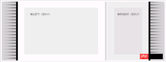
Figure 12-15 Colored columns created by tiled background images
There is an important point that must be noted: if a column specifies a border, the inner and outer patches If so, you can still use Tantek Celik's Box Model Hack to fix the box model problem for IE5 for Windows (see "Box Model Problem" earlier in this chapter).
Or, if you can only use outer patches, avoid borders and inner patches If so, there is no need to add a box model Hack. At the same time, if the content of the field is simply placed on the tile background image (displayed transparently), then it should be very simple to avoid using Hack.
As long as it works
Although I used absolute positioning to create a two-column layout on my website, you can achieve just as good results using the other methods mentioned at the beginning of this chapter. The same idea still applies: flat Lay the background image, and then float a column so that it covers the simulated column background.
This is a simple concept, but it can solve one of the frustrations designers often encounter when building CSS layouts.
Conclusion
I hope this chapter can help you start exploring the exciting world of CSS layout. At the beginning of this chapter we saw four ways to build layouts, three of which used the float attribute, and one of which used absolute positioning. Sure. Check out the additional resources I've listed for more layout tips and demonstrations.
We also discussed the importance of the box model hack when creating columns with borders and inner patches to achieve these effects. The performance is consistent on IE5 for Windows and other browsers.
Finally, I shared a useful trick that allows you to make equal height columns when designing CSS layout. This is considered by some to be very basic, but Achieve design goals that are often frustrating. Just a small tile background image can be done, allowing you to get a column that can reach the bottom of the page (no matter how long the content is).
I am more accustomed to using multiple floats For layout, it’s up to personal preference. There is no need to force which layout method to use. Even if you use table for layout, no one will say anything if you think it’s cool... Haha, just kidding

Hot AI Tools

Undresser.AI Undress
AI-powered app for creating realistic nude photos

AI Clothes Remover
Online AI tool for removing clothes from photos.

Undress AI Tool
Undress images for free

Clothoff.io
AI clothes remover

AI Hentai Generator
Generate AI Hentai for free.

Hot Article

Hot Tools

Notepad++7.3.1
Easy-to-use and free code editor

SublimeText3 Chinese version
Chinese version, very easy to use

Zend Studio 13.0.1
Powerful PHP integrated development environment

Dreamweaver CS6
Visual web development tools

SublimeText3 Mac version
God-level code editing software (SublimeText3)

Hot Topics
 What does placeholder mean in vue
May 07, 2024 am 09:57 AM
In Vue.js, the placeholder attribute specifies the placeholder text of the input element, which is displayed when the user has not entered content, provides input tips or examples, and improves form accessibility. Its usage is to set the placeholder attribute on the input element and customize the appearance using CSS. Best practices include being relevant to the input, being short and clear, avoiding default text, and considering accessibility.
 The secret of hatching mobile dragon eggs is revealed (step by step to teach you how to successfully hatch mobile dragon eggs)
May 04, 2024 pm 06:01 PM
Mobile games have become an integral part of people's lives with the development of technology. It has attracted the attention of many players with its cute dragon egg image and interesting hatching process, and one of the games that has attracted much attention is the mobile version of Dragon Egg. To help players better cultivate and grow their own dragons in the game, this article will introduce to you how to hatch dragon eggs in the mobile version. 1. Choose the appropriate type of dragon egg. Players need to carefully choose the type of dragon egg that they like and suit themselves, based on the different types of dragon egg attributes and abilities provided in the game. 2. Upgrade the level of the incubation machine. Players need to improve the level of the incubation machine by completing tasks and collecting props. The level of the incubation machine determines the hatching speed and hatching success rate. 3. Collect the resources required for hatching. Players need to be in the game
 How to set font size on mobile phone (easily adjust font size on mobile phone)
May 07, 2024 pm 03:34 PM
Setting font size has become an important personalization requirement as mobile phones become an important tool in people's daily lives. In order to meet the needs of different users, this article will introduce how to improve the mobile phone use experience and adjust the font size of the mobile phone through simple operations. Why do you need to adjust the font size of your mobile phone - Adjusting the font size can make the text clearer and easier to read - Suitable for the reading needs of users of different ages - Convenient for users with poor vision to use the font size setting function of the mobile phone system - How to enter the system settings interface - In Find and enter the "Display" option in the settings interface - find the "Font Size" option and adjust it. Adjust the font size with a third-party application - download and install an application that supports font size adjustment - open the application and enter the relevant settings interface - according to the individual
 How to choose a mobile phone screen protector to protect your mobile phone screen (several key points and tips for purchasing mobile phone screen protectors)
May 07, 2024 pm 05:55 PM
Mobile phone film has become one of the indispensable accessories with the popularity of smartphones. To extend its service life, choose a suitable mobile phone film to protect the mobile phone screen. To help readers choose the most suitable mobile phone film for themselves, this article will introduce several key points and techniques for purchasing mobile phone film. Understand the materials and types of mobile phone films: PET film, TPU, etc. Mobile phone films are made of a variety of materials, including tempered glass. PET film is relatively soft, tempered glass film has good scratch resistance, and TPU has good shock-proof performance. It can be decided based on personal preference and needs when choosing. Consider the degree of screen protection. Different types of mobile phone films have different degrees of screen protection. PET film mainly plays an anti-scratch role, while tempered glass film has better drop resistance. You can choose to have better
 What does span mean in js
May 06, 2024 am 11:42 AM
The span tag can add styles, attributes, or behaviors to text. It is used to: add styles, such as color and font size. Set attributes such as id, class, etc. Associated behaviors such as clicks, hovers, etc. Mark text for further processing or citation.
 What does rem mean in js
May 06, 2024 am 11:30 AM
REM in CSS is a relative unit relative to the font size of the root element (html). It has the following characteristics: relative to the root element font size, not affected by the parent element. When the root element's font size changes, elements using REM will adjust accordingly. Can be used with any CSS property. Advantages of using REM include: Responsiveness: Keep text readable on different devices and screen sizes. Consistency: Make sure font sizes are consistent throughout your website. Scalability: Easily change the global font size by adjusting the root element font size.
 How to introduce images into vue
May 02, 2024 pm 10:48 PM
There are five ways to introduce images in Vue: through URL, require function, static file, v-bind directive and CSS background image. Dynamic images can be handled in Vue's computed properties or listeners, and bundled tools can be used to optimize image loading. Make sure the path is correct otherwise a loading error will appear.
 What is node in js
May 07, 2024 pm 09:06 PM
Nodes are entities in the JavaScript DOM that represent HTML elements. They represent a specific element in the page and can be used to access and manipulate that element. Common node types include element nodes, text nodes, comment nodes, and document nodes. Through DOM methods such as getElementById(), you can access nodes and operate on them, including modifying properties, adding/removing child nodes, inserting/replacing nodes, and cloning nodes. Node traversal helps navigate within the DOM structure. Nodes are useful for dynamically creating page content, event handling, animation, and data binding.


