
 Web Front-end
HTML Tutorial
Markup language - specifying CSS styles for text_HTML/Xhtml_Web page production
Web Front-end
HTML Tutorial
Markup language - specifying CSS styles for text_HTML/Xhtml_Web page production
Markup language - specifying CSS styles for text_HTML/Xhtml_Web page production

Chapter 13 Specify styles for text
I think it would be a good idea to devote a chapter to discussing the use of CSS to set text styles. Generally, dealing with text content is probably the place where CSS is used the most, even if it does not fully comply with the standards.
Click here to return to the Script House HTML Tutorial column. To view CSS tutorials, please click here. . Kerning (also known as letter spacing)
Above: Markup language - CSS layout.
Chapter 13 Specify styles for text
I think it would be a good idea to use a chapter to discuss how to use CSS to set text styles. Generally, processing text content is probably the place where CSS is most used, even for websites that do not fully comply with standards. The same is true. Removing the repeated tags in web pages was (and is) very attractive to designers, and it is not difficult to see the huge advantage of using CSS to control text typography, which is to further separate content and presentation. .
We know from many previous examples that CSS can handle many situations, and setting text styles is the easiest way to add design elements even to the most basic web pages. At the same time, using CSS to add styles to text It also allows us to avoid adding unnecessary images to the page.
In this chapter, we will see how CSS can take a boring and ordinary text to another level (with new colors, sizes and fonts) .
How to make hypertext look cooler?
Specifying text styles is one of the best jobs of CSS, even in the face of slightly old browsers that do not fully support CSS advanced features. In the past, design Writers and developers may want to design text to achieve effects other than size and boldness, creating web pages that are intolerable and difficult to use by today's standards (have you ever seen a web page where text is mostly represented by images? But you And I happen to be using a text browser...)
In order to provide you with some alternatives to using images and answer the above question, in this chapter, I will start with a piece of text that has not yet been styled. , and gradually add various CSS rules to it to make it an eye-catching design.
The ever-changing Times
starts by looking at the text to be processed in the browser's default font. In my case, the default font is 16-pixel Times. And using the Safari browser on Mac OS X, Because of this, the text you see will be drawn in an anti-aliased manner. If you are using Windows XP and enable ClearType, you can also see a similar effect.
Times (or the variant Times New Roman) is Many browsers have a default font, however, this can easily be changed by users to their own preferred font, so you certainly cannot rely on this default.
Figure 1301 shows the font we used in this chapter that has not yet been added The text content of the style: a simple title marked with , followed by three paragraphs of home decoration tips.
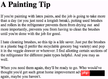
Figure 13-1 The default effect of the browser displaying the title and text
Changing line height
One of the simplest and most effective text style effects is the line-height attribute. Adding some extra space between each line of text can make the text paragraph easier to read and more attractive. It can also bring wonderful effects to your page.
Just add the following CSS rule to the tag to complete this trick. Of course, you can also add this rule to other tags, for example, you only want to Change the line height of
body {
line-height: 1.5em;
}
The meaning of this code is: The line height of text on the page should be 1.5 times the height of the text. I like to use em units when specifying line-height because they change with font size.
Figure 13-2 shows adding line The effect after -height.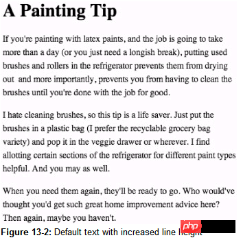
Figure 13-2 The effect after adding the line height to the default text
It already looks great, a small line-height can do it The effect is really amazing.
#p#
It’s all in the family
Of course, we can also change the font, but it should be noted that it may be restricted by the fonts installed on the user’s system.
Then use the font-family attribute as an instance and add a set of fonts that you want to use fonts. The concept here is: specify a list of fonts, separated by commas, and arranged in the order you want to use. If the user does not install the first font in the list, the browser will choose the second font. , and so on.
body {
font-family: Georgia, Times, serif;
line-height: 1.5em;
}
In the previous example, what is required is to "modify all text with the Georgia font. If the user has not installed Georgia, use Times instead. If the user has not installed Times, use the default serif font."
Picture 13-3 shows the effect of the example plus font-family. 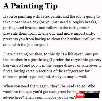
Figure 13-3 The effect of the example displayed in the Georgia font.
Fonts whose names contain spaces
If you want to specify a font whose name contains spaces (for example, Lucida Grande), you must enclose the entire font name in quotation marks.
In the following example, Lucida Grande (the famous Macintosh font) as the font you want to use, and specify Trebuchet MS (a well-known Windows font) as the second candidate, plus a catch-all sans-serif. If the first two fonts are not installed, choose Use the default sans-serif font.
body {
font-family: "Lucida Grande", "Trebuchet MS", sans-serif;
line-height: 1.5em;
}
Kerning is a term used to describe text spacing in the printing industry. Its synonymous CSS property is letter-spacing. Next, let’s spice up the title of the example by using the letter-spacing attribute on the tag.
After applying letter-spacing to the tag, you can make the title more attractive Notice that you don’t have to open an image editor to start creating image text.
First, let’s add a negative value to the letter-spacing property to compress the text of the title:
h1 {
letter -spacing: -2px;
}
The modification results can be seen in Figure 13-4.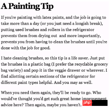
Figure 13-4 adds
It is worth adding letter-spacing
for negative numbers or try adding letter-spacing for positive numbers and also change the title to italics using the font-style attribute:
h1 {
letter-spacing: 4px;
font-style: italic;
}
h1 {
letter-spacing: 4px;
font-style: italic;
}
Figure 13-5 is the effect after modification according to the above. The text has become very eye-catching, hasn’t it? It’s a wise move not to make the text spacing too exaggerated, because this can easily make the text difficult to read. Once the content is difficult to read, who will care about it? Isn’t it attractive? You think so!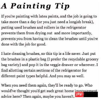
Figure 13-5 Use positive letter-spacing values and apply italics
#p#
Capitalizing the first word
Capitalizing the first word is very common in the printing industry. It can add a gorgeous and elegant effect to a paragraph, and this effect can be achieved without using an image, just CSS.
First, we must add a "style anchor" to the markup source code so that we have a way to call the first letter of the first paragraph. We wrap the "I" in a set of tags and assign it class= drop, if we can reuse the capitalization effect on the page or the entire website.
If you're painting with latex paints, and the job...
In some modern browsers that fully support the CSS2 specification, we can use the: first-letter pseudo-class setting Paragraph first word effect without having to add an extra tag, although semantically great, unfortunately many browsers do not support this effect.
Now we have complete control over the "I" of the first paragraph Let’s add CSS declarations to enlarge the font and float it to the left (so that no other text surrounds it). We’ll also add a decorative background and border.
.drop {
float: left;
font-size: 400%;
line-height: 1em;
margin: 4px 10px 10px 0;
padding : 4px 10px;
border: 2px solid #ccc;
background: #eee;
}
Combined with all the styles we have added to the sample content now, Figure 13- 6 is the effect of the browser displaying the first word capitalized. It does not use pictures at all, and only relies on simple CSS and markup syntax. 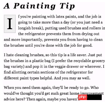
Figure 13-6 The effect of capitalizing the first word made with CSS.
Text alignment
is also inspired by the printing industry. We can use the text-align attribute to apply left and right alignment effects to text. After left and right alignment, the text will increase the distance between words, making the width of each line the same length, creating Create tight, well-defined column effects.
body {
font-family: Georgia, Times, serif;
line-height: 1.5em;
text-align: justify;
}
Figure 13-7 is the text as an example, now aligned left and right!
Figure 13-7 The effect of text aligned left and right with the text-align attribute
Note that the text content is arranged in a straight line on the left and right sides. Other possible settings for the text-align attribute are: left, right, center.
For example, we can also set the value for
The text-align attribute is applied to the tag, centering the title of the example.
h1 {
letter-spacing: 4px;
font-style: italic; align: center;
}
Figure 13-8 is the effect after the title is centered.
h1 {
letter-spacing: 4px;
font-style: italic; align: center;
}
Figure 13-8 Use the textalign attribute to change < h1>Centered #p#
Transform text
#p#
Transform text
has a text-transform attribute that converts the case of the text content, regardless of the case of the marked content. For example, the title is marked with the following writing:
A Painting Tip
As long as you use the text-transform attribute in CSS, you can convert the entire title to uppercase (if you want, you can also convert it to uppercase) lowercase), without having to modify the content of the markup source code, in addition to the previously added style for the
tag, the CSS rule to change the title to all uppercase is as simple as:
letter-spacing: 4px;The result is like 13-9. You don’t have to fight with the markup source code. Just change the CSS and you can change the case usage of certain tags on the page (or even the entire website). .
font-style: italic;
text-align: center;
text-transform: uppercase;
}
Figure 13-9 Use CSS to make the title uppercase
Small Caps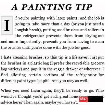 Most browsers support the font-variant attribute, which allows us to modify the content in small caps (that is, display the content in uppercase text of different sizes).
Let us add font to the title of the example -variant attribute:
letter-spacing: 4px;Figure 13-10 shows the effect of using small caps for the title: This is another way to imitate the printing industry using markup syntax and CSS.
text-align: center;
font-variant: small-caps;
}
Figure 13-10 Title using small caps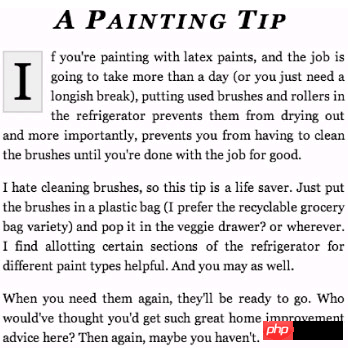 #p#
The indentation of the first line of the paragraph
#p#
The indentation of the first line of the paragraph
is once again in line with the printing industry (gosh, can you see the trend here?), we can use the text-indent attribute to indent the first line of the paragraph. If you add a positive value, will indent the text by the specified amount.
By indenting each paragraph in the example by 3em, or the maximum width that can be occupied by 3 characters. I am going to remove the capitalization of the first word so that it does not overlap with the first word. The indentation effect of the first line of a paragraph fights.
The CSS required to indent the first line of all
is like this:
p {
text-indent: 3em;
}
Figure 13-11 shows the modification effect, you can see the first line of each text They are all indented by the value we set. We choose to use the em unit because in this way the indentation length will be proportional to the font size. When the user decides to enlarge or reduce the font, this method can show its benefits. .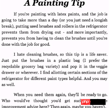
Figure 13-11 The effect of using the text-indent attribute to indent the first line of a paragraph
Summary
After discussing several CSS properties for specifying styles for text, I hope you can understand that most of the time, you don’t need to rely on drawing tools to create good effects. Usually you just need to add a little style to the markup source code. Enough, sometimes it can achieve great results.
Of course, some situations may require text to be turned into pictures, such as the company's logo, or special fonts that need to be used when making certain page elements, anything. The key to everything is balance, try to specify the style with CSS first, so that your markup source code will be cleaner and easier to use.
CSS provides methods to modify text and add style control, and the results will be good Surprisingly, this can be a great design tool, allowing you to continue to maintain short and flexible markup source code.

Hot AI Tools

Undresser.AI Undress
AI-powered app for creating realistic nude photos

AI Clothes Remover
Online AI tool for removing clothes from photos.

Undress AI Tool
Undress images for free

Clothoff.io
AI clothes remover

AI Hentai Generator
Generate AI Hentai for free.

Hot Article
Hot Tools

Notepad++7.3.1
Easy-to-use and free code editor

SublimeText3 Chinese version
Chinese version, very easy to use

Zend Studio 13.0.1
Powerful PHP integrated development environment

Dreamweaver CS6
Visual web development tools

SublimeText3 Mac version
God-level code editing software (SublimeText3)
Hot Topics


 What does placeholder mean in vue
May 07, 2024 am 09:57 AM
What does placeholder mean in vue
May 07, 2024 am 09:57 AM
In Vue.js, the placeholder attribute specifies the placeholder text of the input element, which is displayed when the user has not entered content, provides input tips or examples, and improves form accessibility. Its usage is to set the placeholder attribute on the input element and customize the appearance using CSS. Best practices include being relevant to the input, being short and clear, avoiding default text, and considering accessibility.
 The screen is good for playing games. Brief analysis of iQOO Neo9S Pro+ screen
Jul 19, 2024 pm 03:53 PM
The screen is good for playing games. Brief analysis of iQOO Neo9S Pro+ screen
Jul 19, 2024 pm 03:53 PM
In today's smartphone market, screen quality has become one of the key indicators to measure the overall performance of a mobile phone. iQOO's Neo series has always been committed to providing users with excellent gaming experience and visual enjoyment. The latest product iQOO Neo9SPro+ uses a "Three Good Eye Protection Gaming Screen". Next, let's take a look at the quality of this screen. How brilliant. iQOO Neo9S Pro+ is equipped with a 1.5 KOLED e-sports direct screen, which supports flagship LTPO adaptive refresh rate from 1Hz to 144Hz, which means that it can achieve ultra-low power standby state when displaying static content, and it can also be intelligent during gaming. Switch to dynamic high from 90Hz to 144Hz
 What is node in js
May 07, 2024 pm 09:06 PM
What is node in js
May 07, 2024 pm 09:06 PM
Nodes are entities in the JavaScript DOM that represent HTML elements. They represent a specific element in the page and can be used to access and manipulate that element. Common node types include element nodes, text nodes, comment nodes, and document nodes. Through DOM methods such as getElementById(), you can access nodes and operate on them, including modifying properties, adding/removing child nodes, inserting/replacing nodes, and cloning nodes. Node traversal helps navigate within the DOM structure. Nodes are useful for dynamically creating page content, event handling, animation, and data binding.
 OPPO Find X7 is a masterpiece! Capture your every moment with images
Aug 07, 2024 pm 07:19 PM
OPPO Find X7 is a masterpiece! Capture your every moment with images
Aug 07, 2024 pm 07:19 PM
In this fast-paced era, OPPO Find X7 can use its imaging power to let us savor every beautiful moment in life. Whether it's magnificent mountains, rivers, lakes, or seas, warm family gatherings, or encounters and surprises on the street, it can help you record them with "unparalleled" picture quality. From the outside, the camera Deco design of Find It looks very recognizable and has a high-end feel. The inside is also unique, starting with the basic hardware configuration. FindX7 maintains the previous
 What language is the browser plug-in written in?
May 08, 2024 pm 09:36 PM
What language is the browser plug-in written in?
May 08, 2024 pm 09:36 PM
Browser plug-ins are usually written in the following languages: Front-end languages: JavaScript, HTML, CSS Back-end languages: C++, Rust, WebAssembly Other languages: Python, Java
 How to set unknown attributes in vscode vscode method to set unknown attributes
May 09, 2024 pm 02:43 PM
How to set unknown attributes in vscode vscode method to set unknown attributes
May 09, 2024 pm 02:43 PM
1. First, open the settings icon in the lower left corner and click the settings option. 2. Then, find the CSS column in the jumped window. 3. Finally, change the drop-down option in the unknownproperties menu to the error button.
 What should I do if the font prompt when installing Win10 is invalid? What to do if Win10 is not a valid font?
Jun 25, 2024 pm 10:36 PM
What should I do if the font prompt when installing Win10 is invalid? What to do if Win10 is not a valid font?
Jun 25, 2024 pm 10:36 PM
In order to make the system fonts or when printing word or using PS drawing more beautiful and unique, we can achieve the goal by adding new fonts to the system. After installing fonts, you can also make your system more beautiful. Although installing fonts is simple, many users have encountered installation failures. For example, a user recently reported to the editor that the installation of a new font in the win10 system failed and prompted "not a valid font". If you encounter this problem, we can fix it as follows. The solution is as follows: Method 1: 1. Use the "win+R" shortcut key to start running, enter "service.msc", click &
 Can less files in vue introduce data?
May 07, 2024 pm 12:06 PM
Can less files in vue introduce data?
May 07, 2024 pm 12:06 PM
Yes, Less files in Vue can introduce data through CSS variables and Less mixins: create a JSON file containing data. Import JSON files using the @import rule. Access JSON data using CSS variables or Less mixins.
