Rules for registration form design_HTML/Xhtml_Web page production
Since I agreed to write my thoughts after reading it, let me talk about something related to registration from my perspective. I will first decompose the skeleton of the entire material, and then talk about my current feelings based on the viewpoints.
Registration is actually a bit boring task. The point mentioned in "Patterns for Sign Up &Ramp Up" is:
Give the user good reasons to join
At first glance it seems a bit like marketing. The essence of things remains unchanged, but people’s emotions can be reversed - give users good reasons to join register;
Make the sign-up process feel effortless
Changing the boring and boring feeling is what we need to do: make the form or the entire registration process easy and effortless;
Don't leave new users hanging
The significance of this point of view in the entire material focuses on ways to increase activity - users do not complete the mission after completing the registration, understand the community Something new has just begun;
Accelerate initial connection-making
If activity kicks off from the previous point, then here is how to enable users to start living in the community and establish connections, such as through the information they have previously posted. Come and connect with your friends, and truly experience the feeling of having close friends across the sea, and feeling like you are neighbors across the world.
The skeleton structure of the entire article is a step-by-step behavioral guidance. It provides detailed annotations and guidance for the initial guidance of introducing members to Facebook and maintaining an active community. You can refer to the manual. After reading, focus on the summary of the work and sort out a few rules for the registration form:
-
When the form structure requires multiple steps, it is important to provide clear navigation
Use a progress ruler to tell users their current position and overall steps
Emphasize the logical connections among several steps, such as marking: step1, step2, step3
Explain the steps with meaningful pictures or ICONs or even titles
Use simple language or the second person to describe actions
Logical steps are best limited to 3 steps
Prompts for user registration behavior
-
Tips should appear where help is needed or where there is a connection between actions.
Encouragement to users should be reflected in the process, such as prompting a tick icon for each completed input item.
Try to avoid pop-up warning reminders
ICON's error message avoids using warning expressions to make users feel frustrated.
Simple and easy-to-recognize ICONs to mark prompts, success, and error styles
If there is an error when submitting the form, it is best to display an error reminder at the head of the entire form to guide the user to make corrections.
These general rules for form design are also covered in the full explanation of forms by LukeW from Yahoo in the United States. They are the most commonly used. I will summarize them for students’ reference. There are still many guides on activity that can be explored in depth. point. It is not listed here and will be left for subsequent decomposition.

Hot AI Tools

Undresser.AI Undress
AI-powered app for creating realistic nude photos

AI Clothes Remover
Online AI tool for removing clothes from photos.

Undress AI Tool
Undress images for free

Clothoff.io
AI clothes remover

AI Hentai Generator
Generate AI Hentai for free.

Hot Article

Hot Tools

Notepad++7.3.1
Easy-to-use and free code editor

SublimeText3 Chinese version
Chinese version, very easy to use

Zend Studio 13.0.1
Powerful PHP integrated development environment

Dreamweaver CS6
Visual web development tools

SublimeText3 Mac version
God-level code editing software (SublimeText3)

Hot Topics
 1386
1386
 52
52
 Steps to upgrade to the latest version of WeChat (Easily master the upgrade method to the latest version of WeChat)
Jun 01, 2024 pm 10:24 PM
WeChat is one of the social media platforms in China that continuously launches new versions to provide a better user experience. Upgrading WeChat to the latest version is very important to keep in touch with family and colleagues, to stay in touch with friends, and to keep abreast of the latest developments. 1. Understand the features and improvements of the latest version. It is very important to understand the features and improvements of the latest version before upgrading WeChat. For performance improvements and bug fixes, you can learn about the various new features brought by the new version by checking the update notes on the WeChat official website or app store. 2. Check the current WeChat version We need to check the WeChat version currently installed on the mobile phone before upgrading WeChat. Click to open the WeChat application "Me" and then select the menu "About" where you can see the current WeChat version number. 3. Open the app
 This Apple ID is not yet in use in the iTunes Store: Fix
Jun 10, 2024 pm 05:42 PM
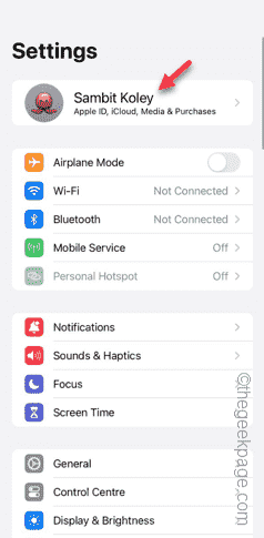
When logging into iTunesStore using AppleID, this error saying "This AppleID has not been used in iTunesStore" may be thrown on the screen. There are no error messages to worry about, you can fix them by following these solution sets. Fix 1 – Change Shipping Address The main reason why this prompt appears in iTunes Store is that you don’t have the correct address in your AppleID profile. Step 1 – First, open iPhone Settings on your iPhone. Step 2 – AppleID should be on top of all other settings. So, open it. Step 3 – Once there, open the “Payment & Shipping” option. Step 4 – Verify your access using Face ID. step
 Shazam app not working in iPhone: Fix
Jun 08, 2024 pm 12:36 PM
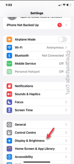
Having issues with the Shazam app on iPhone? Shazam helps you find songs by listening to them. However, if Shazam isn't working properly or doesn't recognize the song, you'll have to troubleshoot it manually. Repairing the Shazam app won't take long. So, without wasting any more time, follow the steps below to resolve issues with Shazam app. Fix 1 – Disable Bold Text Feature Bold text on iPhone may be the reason why Shazam is not working properly. Step 1 – You can only do this from your iPhone settings. So, open it. Step 2 – Next, open the “Display & Brightness” settings there. Step 3 – If you find that “Bold Text” is enabled
 iPhone screenshots not working: How to fix it
May 03, 2024 pm 09:16 PM
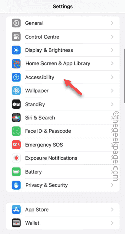
Screenshot feature not working on your iPhone? Taking a screenshot is very easy as you just need to hold down the Volume Up button and the Power button at the same time to grab your phone screen. However, there are other ways to capture frames on the device. Fix 1 – Using Assistive Touch Take a screenshot using the Assistive Touch feature. Step 1 – Go to your phone settings. Step 2 – Next, tap to open Accessibility settings. Step 3 – Open Touch settings. Step 4 – Next, open the Assistive Touch settings. Step 5 – Turn on Assistive Touch on your phone. Step 6 – Open “Customize Top Menu” to access it. Step 7 – Now you just need to link any of these functions to your screen capture. So click on the first
 Clock app missing in iPhone: How to fix it
May 03, 2024 pm 09:19 PM
Is the clock app missing from your phone? The date and time will still appear on your iPhone's status bar. However, without the Clock app, you won’t be able to use world clock, stopwatch, alarm clock, and many other features. Therefore, fixing missing clock app should be at the top of your to-do list. These solutions can help you resolve this issue. Fix 1 – Place the Clock App If you mistakenly removed the Clock app from your home screen, you can put the Clock app back in its place. Step 1 – Unlock your iPhone and start swiping to the left until you reach the App Library page. Step 2 – Next, search for “clock” in the search box. Step 3 – When you see “Clock” below in the search results, press and hold it and
 Slow Cellular Data Internet Speeds on iPhone: Fixes
May 03, 2024 pm 09:01 PM
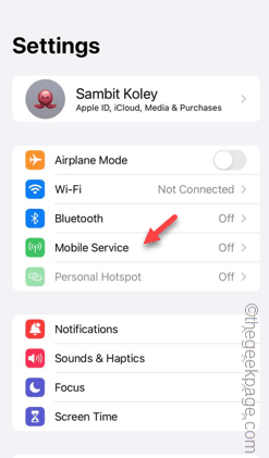
Facing lag, slow mobile data connection on iPhone? Typically, the strength of cellular internet on your phone depends on several factors such as region, cellular network type, roaming type, etc. There are some things you can do to get a faster, more reliable cellular Internet connection. Fix 1 – Force Restart iPhone Sometimes, force restarting your device just resets a lot of things, including the cellular connection. Step 1 – Just press the volume up key once and release. Next, press the Volume Down key and release it again. Step 2 – The next part of the process is to hold the button on the right side. Let the iPhone finish restarting. Enable cellular data and check network speed. Check again Fix 2 – Change data mode While 5G offers better network speeds, it works better when the signal is weaker
 ZTE 5G portable Wi-Fi U50S goes on sale for NT$899 at first launch: top speed 500Mbps
Apr 26, 2024 pm 03:46 PM
According to news on April 26, ZTE’s 5G portable Wi-Fi U50S is now officially on sale, starting at 899 yuan. In terms of appearance design, ZTE U50S Portable Wi-Fi is simple and stylish, easy to hold and pack. Its size is 159/73/18mm and is easy to carry, allowing you to enjoy 5G high-speed network anytime and anywhere, achieving an unimpeded mobile office and entertainment experience. ZTE 5G portable Wi-Fi U50S supports the advanced Wi-Fi 6 protocol with a peak rate of up to 1800Mbps. It relies on the Snapdragon X55 high-performance 5G platform to provide users with an extremely fast network experience. Not only does it support the 5G dual-mode SA+NSA network environment and Sub-6GHz frequency band, the measured network speed can even reach an astonishing 500Mbps, which is easily satisfactory.
 Can't allow access to camera and microphone in iPhone
Apr 23, 2024 am 11:13 AM
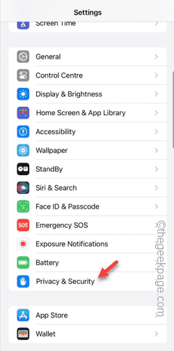
Are you getting "Unable to allow access to camera and microphone" when trying to use the app? Typically, you grant camera and microphone permissions to specific people on a need-to-provide basis. However, if you deny permission, the camera and microphone will not work and will display this error message instead. Solving this problem is very basic and you can do it in a minute or two. Fix 1 – Provide Camera, Microphone Permissions You can provide the necessary camera and microphone permissions directly in settings. Step 1 – Go to the Settings tab. Step 2 – Open the Privacy & Security panel. Step 3 – Turn on the “Camera” permission there. Step 4 – Inside, you will find a list of apps that have requested permission for your phone’s camera. Step 5 – Open the “Camera” of the specified app


