 Web Front-end
 JS Tutorial
 Three ways to detect iPhone/iPad device orientation_javascript skills
Three ways to detect iPhone/iPad device orientation_javascript skills
Use meta tag "viewport"
The viewport tag contains the following attributes: 
In order to automatically detect and adapt to the screen width, device-with should be used instead Instead of setting a fixed value, in order to prevent the user from scaling the interface beyond the screen, you need to set maximum-scale,
Use javascript script
The following script detects the orientation and adjusts the orientation by detecting the screen width:
Above The script can be placed in the head section
Use CSS
Use CSS media query:

Hot AI Tools

Undresser.AI Undress
AI-powered app for creating realistic nude photos

AI Clothes Remover
Online AI tool for removing clothes from photos.

Undress AI Tool
Undress images for free

Clothoff.io
AI clothes remover

Video Face Swap
Swap faces in any video effortlessly with our completely free AI face swap tool!

Hot Article

Hot Tools

Notepad++7.3.1
Easy-to-use and free code editor

SublimeText3 Chinese version
Chinese version, very easy to use

Zend Studio 13.0.1
Powerful PHP integrated development environment

Dreamweaver CS6
Visual web development tools

SublimeText3 Mac version
God-level code editing software (SublimeText3)

Hot Topics
 1664
1664
 14
14
 1423
1423
 52
52
 1317
1317
 25
25
 1268
1268
 29
29
 1246
1246
 24
24
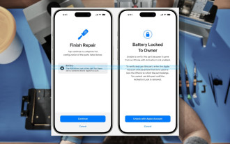
 iPhone parts Activation Lock spotted in iOS 18 RC — may be Apple\'s latest blow to right to repair sold under the guise of user protection
Sep 14, 2024 am 06:29 AM
Earlier this year, Apple announced that it would be expanding its Activation Lock feature to iPhone components. This effectively links individual iPhone components, like the battery, display, FaceID assembly, and camera hardware to an iCloud account,
 iPhone parts Activation Lock may be Apple\'s latest blow to right to repair sold under the guise of user protection
Sep 13, 2024 pm 06:17 PM
Earlier this year, Apple announced that it would be expanding its Activation Lock feature to iPhone components. This effectively links individual iPhone components, like the battery, display, FaceID assembly, and camera hardware to an iCloud account,
 Multiple iPhone 16 Pro users report touchscreen freezing issues, possibly linked to palm rejection sensitivity
Sep 23, 2024 pm 06:18 PM
If you've already gotten your hands on a device from the Apple's iPhone 16 lineup — more specifically, the 16 Pro/Pro Max — chances are you've recently faced some kind of issue with the touchscreen. The silver lining is that you're not alone—reports
 How to solve the problem of 'Undefined array key 'sign'' error when calling Alipay EasySDK using PHP?
Mar 31, 2025 pm 11:51 PM
Problem Description When calling Alipay EasySDK using PHP, after filling in the parameters according to the official code, an error message was reported during operation: "Undefined...
 Gate.io trading platform official app download and installation address
Feb 13, 2025 pm 07:33 PM
This article details the steps to register and download the latest app on the official website of Gate.io. First, the registration process is introduced, including filling in the registration information, verifying the email/mobile phone number, and completing the registration. Secondly, it explains how to download the Gate.io App on iOS devices and Android devices. Finally, security tips are emphasized, such as verifying the authenticity of the official website, enabling two-step verification, and being alert to phishing risks to ensure the safety of user accounts and assets.
 Multi-party certification: iPhone 17 standard version will support high refresh rate! For the first time in history!
Apr 13, 2025 pm 11:15 PM
Apple's iPhone 17 may usher in a major upgrade to cope with the impact of strong competitors such as Huawei and Xiaomi in China. According to the digital blogger @Digital Chat Station, the standard version of iPhone 17 is expected to be equipped with a high refresh rate screen for the first time, significantly improving the user experience. This move marks the fact that Apple has finally delegated high refresh rate technology to the standard version after five years. At present, the iPhone 16 is the only flagship phone with a 60Hz screen in the 6,000 yuan price range, and it seems a bit behind. Although the standard version of the iPhone 17 will have a high refresh rate screen, there are still differences compared to the Pro version, such as the bezel design still does not achieve the ultra-narrow bezel effect of the Pro version. What is more worth noting is that the iPhone 17 Pro series will adopt a brand new and more
 Anbi app official download v2.96.2 latest version installation Anbi official Android version
Mar 04, 2025 pm 01:06 PM
Binance App official installation steps: Android needs to visit the official website to find the download link, choose the Android version to download and install; iOS search for "Binance" on the App Store. All should pay attention to the agreement through official channels.
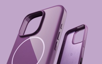
 Beats adds phone cases to its lineup: unveils a MagSafe case for the iPhone 16 series
Sep 11, 2024 pm 03:33 PM
Beats is known for launching audio products such as Bluetooth speakers and headphones, but in what can best be described as a surprise, the Apple-owned company has branched into making phone cases, starting with the iPhone 16 series. The Beats iPhone


