 Web Front-end
 JS Tutorial
 The menu written in jquery slides from left to right and appears_jquery
The menu written in jquery slides from left to right and appears_jquery
Recently, I happened to be researching the production of microsites, and I read a lot of information about WeChat 3 platform development tutorials. There are almost no such introductions, but they are all third-party platforms that provide templates for making microsites. Later, I am very grateful to Liu Feng Blog The last article I wrote to explain the microsite,
“What is a microsite?
Microsites are old wine in new bottles. They have been deified by some marketing people, so much so that many developers I’m asking what a microsite is and how to develop a microsite. A microsite is essentially a mobile website (Web APP) that uses the WeChat browser as the entrance and is compatible with the technologies and technologies used to develop microsites such as Android, iOS, and WP. Developing ordinary websites is based on HTML (HTML5), CSS, Javascript, etc., so developers with experience in ordinary website development are fully capable of developing microsites
PS: What will beginners see in the future. New terms starting with "微", such as: micro mall, micro customer service, micro statistics, it is not difficult to understand if you just remove the word "微" or think of "微" as "based on WeChat",
Most of them involve the writing method of html5, so it is easy to understand. . . There is also a reference to the case in "WeChat Business Bao". I wrote a demo of the navigation in it. It feels very easy to understand. The interface renderings below 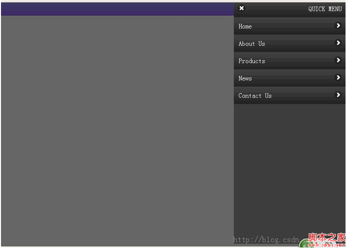
because it is used Written by jq, you need to quote the library file. The online cdn address is used here:
Then write the html navigation structure

Hot AI Tools

Undresser.AI Undress
AI-powered app for creating realistic nude photos

AI Clothes Remover
Online AI tool for removing clothes from photos.

Undress AI Tool
Undress images for free

Clothoff.io
AI clothes remover

Video Face Swap
Swap faces in any video effortlessly with our completely free AI face swap tool!

Hot Article

Hot Tools

Notepad++7.3.1
Easy-to-use and free code editor

SublimeText3 Chinese version
Chinese version, very easy to use

Zend Studio 13.0.1
Powerful PHP integrated development environment

Dreamweaver CS6
Visual web development tools

SublimeText3 Mac version
God-level code editing software (SublimeText3)

Hot Topics
 1655
1655
 14
14
 1413
1413
 52
52
 1306
1306
 25
25
 1252
1252
 29
29
 1226
1226
 24
24
 Windows 11: The easy way to import and export start layouts
Aug 22, 2023 am 10:13 AM
In Windows 11, the Start menu has been redesigned and features a simplified set of apps arranged in a grid of pages, unlike its predecessor, which had folders, apps, and apps on the Start menu. Group. You can customize the Start menu layout and import and export it to other Windows devices to personalize it to your liking. In this guide, we’ll discuss step-by-step instructions for importing Start Layout to customize the default layout on Windows 11. What is Import-StartLayout in Windows 11? Import Start Layout is a cmdlet used in Windows 10 and earlier versions to import customizations for the Start menu into
 How to Default 'Show More Options' in Windows 11's Right-Click Menu
Jul 10, 2023 pm 12:33 PM
One of the most annoying changes that we users never want is the inclusion of "Show more options" in the right-click context menu. However, you can remove it and get back the classic context menu in Windows 11. No more multiple clicks and looking for these ZIP shortcuts in context menus. Follow this guide to return to a full-blown right-click context menu on Windows 11. Fix 1 – Manually adjust the CLSID This is the only manual method on our list. You will adjust specific keys or values in Registry Editor to resolve this issue. NOTE – Registry edits like this are very safe and will work without any issues. Therefore, you should create a registry backup before trying this on your system. Step 1 – Try it
 What should I do if my mobile phone screen is hard to slide and dry?
Dec 04, 2023 pm 03:51 PM
Solutions for mobile phone screens that are difficult to slide and dry: 1. Humidify the screen; 2. Clean the screen regularly; 3. Increase the sliding strength of your fingers; 4. Use mobile phone screen protectors; 5. Replace protective covers; 6. Keep hands moist; 7. , handle it cleanly when applying the film; 8. Use lubricant; 9. Use gloves; 10. Adjust the screen brightness; 11. Replace the mobile phone. Detailed introduction: 1. Humidify the screen, place a humidifier next to the screen or spray some water to increase the humidity in the air, thereby reducing the dryness of the screen; 2. Clean the screen regularly, use professional screen cleaner, etc.
 How to remove the 'Open in Windows Terminal' option from the right-click context menu in Windows 11
Apr 13, 2023 pm 06:28 PM
By default, the Windows 11 right-click context menu has an option called Open in Windows Terminal. This is a very useful feature that allows users to open Windows Terminal at a specific location. For example, if you right-click on a folder and select the "Open in Windows Terminal" option, Windows Terminal will launch and set that specific location as its current working directory. Although this is an awesome feature, not everyone finds a use for this feature. Some users may simply not want this option in their right-click context menu and want to remove it to tidy up their right-click context menu.
 Implementation steps of implementing menu navigation bar with shadow effect using pure CSS
Oct 16, 2023 am 08:27 AM
The steps to implement a menu navigation bar with shadow effect using pure CSS require specific code examples. In web design, the menu navigation bar is a very common element. By adding a shadow effect to the menu navigation bar, you can not only increase its aesthetics, but also improve the user experience. In this article, we will use pure CSS to implement a menu navigation bar with a shadow effect, and provide specific code examples for reference. The implementation steps are as follows: Create HTML structure First, we need to create a basic HTML structure to accommodate the menu navigation bar. by
 How to disable the Show more options menu in Windows 11
Apr 13, 2023 pm 08:10 PM
More and more people are experiencing the new and improved Microsoft operating system, but it seems that some of them still prefer the old-school design. There's no doubt that the new context menu brings impressive consistency to Windows 11. If we consider Windows 10, the fact that each application has its own context menu element creates serious confusion for some people. From the Windows 11 transparent taskbar to the rounded corners, this operating system is a masterpiece. In this matter, users across the globe are interested to know how to quickly disable Windows 11 Show More Options menu. The process is pretty simple, so if you're in the same boat, make sure you check it out completely
 How to edit messages on iPhone
Dec 18, 2023 pm 02:13 PM
The native Messages app on iPhone lets you easily edit sent texts. This way, you can correct your mistakes, punctuation, and even autocorrect wrong phrases/words that may have been applied to your text. In this article, we will learn how to edit messages on iPhone. How to Edit Messages on iPhone Required: iPhone running iOS16 or later. You can only edit iMessage text on the Messages app, and then only within 15 minutes of sending the original text. Non-iMessage text is not supported, so they cannot be retrieved or edited. Launch the Messages app on your iPhone. In Messages, select the conversation from which you want to edit the message
 How to use JavaScript to achieve the up and down sliding switching effect of images and add fade-in and fade-out animations?
Oct 20, 2023 am 11:19 AM
How can JavaScript achieve the up and down sliding switching effect of images and add fade-in and fade-out animations? In web development, it is often necessary to achieve image switching effects. You can use JavaScript to achieve up and down sliding switching, and add fade-in and fade-out animation effects. Let’s take a closer look. First, we need a container that contains multiple images. We can use div tags in HTML to host images. For example, we create a div with the id "image-container" to


