

raphael.js draws China map map drawing method_javascript skills

A map of China is used in a recent data statistics project, which is to dynamically display the statistical data of a certain province and region in a certain time period on the map. We don’t need flash, we just rely on raphael.js and SVG images. Complete the interactive operation of the map. In this article, I will share with you how to use js to complete map interaction. 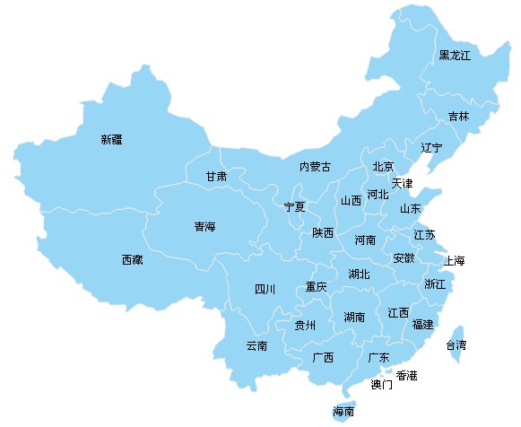
Let’s briefly introduce raphael.js. raphael.js is a small javascript library that can draw various vector graphics, various charts, image cropping, rotation, motion animation and other functions on web pages. In addition, raphael.js is also cross-browser compatible, and it is also compatible with the old IE6. The official website address of raphael.js: http://raphaeljs.com/
Preparation
We need to prepare a vector map. You can find a vector map from the Internet, or use illustrator to draw a vector map, and then export it to a file in SVG format. This file can be opened on a browser and then the content inside is extracted. path path information (coordinates starting with M). And prepare the map path information according to the format of chimamapPath.js.
var china = [];
function paintMap(R) {
var attr = {
"fill": "#97d6f5",
"stroke": "#eee",
"stroke-width": 1,
"stroke-linejoin": "round"
};
china.aomen = {
name: "Macau",
path: R.path("M413.032,. ........Omit some... ,414.183z").attr(attr)
}
china.hk = {
//Format is the same as above
};
}
The above is how we encapsulate the prepared map path information into the () function, and save the file name as chinamapPath.js for later calling.
HTML
First load the raphael.js library file and chimamapPath.js path information file in the head section.
Then place div#map in the body where the map needs to be placed.
JAVASCRIPT
First we call the map in the page, the method is as follows:
window.onload = function () {
//Draw the map
var R = Raphael("map", 600, 500);//Load the map into the div with id map , and set the area to 600x500px size.
paintMap(R);
}
At this time, when we open it with a browser, the loaded map will be displayed. Next, we need to add province names to the corresponding province areas in the map, and a color-changing animation effect when the mouse slides over each province block.
window.onload = function () {
var R = Raphael("map", 600, 500);
//Call the map drawing method
paintMap(R);
var textAttr = {
"fill": "#000",
"font-size": "12px",
"cursor": "pointer"
};
{
//Get the center coordinates of the current graphic
var xx = st.getBBox().x (st.getBBox().width / 2);
var yy = st.getBBox( ).y (st.getBBox().height / 2);
]['name']).attr(textAttr);
st[0].onmouseover = function () {//Mouse slide to
st.animate({fill: st.color, stroke : "#eee"}, 500);
.onmouseout = function () {// The mouse leaves
St.animate ({Fill: "#97d6F5", Stroke: "#eee"}, 500);
China [State] ['Text']. );
R.safari(); 🎜>
The methods provided by raphael are used in the above code: getColor, getBBox, animate, toFront, etc. These instructions can be found in the raphael documentation and will not be described in this article.
In addition, due to the size of the map, some province names are not displayed appropriately in the map, and the offset needs to be corrected so that they look more comfortable.
Copy code
The code is as follows:
window.onload = function () {
var R = Raphael("map", 600, 500);
...
for (var state in china) {
...
(function (st, state) {
....
switch (china[state]['name']) {
case "江苏":
xx += 5;
yy -= 10;
break;
case "河北":
xx -= 10;
yy += 20;
break;
case "天津":
xx += 10;
yy += 10;
break;
case "上海":
xx += 10;
break;
case "广东":
yy -= 10;
break;
case "澳门":
yy += 10;
break;
case "香港":
xx += 20;
yy += 5;
break;
case "甘肃":
xx -= 40;
yy -= 30;
break;
case "陕西":
xx += 5;
yy += 10;
break;
case "内蒙古":
xx -= 15;
yy += 65;
break;
default:
}
...
})(china[state]['path'], state);
}
}

Hot AI Tools

Undresser.AI Undress
AI-powered app for creating realistic nude photos

AI Clothes Remover
Online AI tool for removing clothes from photos.

Undress AI Tool
Undress images for free

Clothoff.io
AI clothes remover

AI Hentai Generator
Generate AI Hentai for free.

Hot Article
Hot Tools

Notepad++7.3.1
Easy-to-use and free code editor

SublimeText3 Chinese version
Chinese version, very easy to use

Zend Studio 13.0.1
Powerful PHP integrated development environment

Dreamweaver CS6
Visual web development tools

SublimeText3 Mac version
God-level code editing software (SublimeText3)
Hot Topics
 1378
1378
 52
52

 How do I create and publish my own JavaScript libraries?
Mar 18, 2025 pm 03:12 PM
How do I create and publish my own JavaScript libraries?
Mar 18, 2025 pm 03:12 PM
Article discusses creating, publishing, and maintaining JavaScript libraries, focusing on planning, development, testing, documentation, and promotion strategies.
 How do I optimize JavaScript code for performance in the browser?
Mar 18, 2025 pm 03:14 PM
How do I optimize JavaScript code for performance in the browser?
Mar 18, 2025 pm 03:14 PM
The article discusses strategies for optimizing JavaScript performance in browsers, focusing on reducing execution time and minimizing impact on page load speed.
 What should I do if I encounter garbled code printing for front-end thermal paper receipts?
Apr 04, 2025 pm 02:42 PM
What should I do if I encounter garbled code printing for front-end thermal paper receipts?
Apr 04, 2025 pm 02:42 PM
Frequently Asked Questions and Solutions for Front-end Thermal Paper Ticket Printing In Front-end Development, Ticket Printing is a common requirement. However, many developers are implementing...
 How do I debug JavaScript code effectively using browser developer tools?
Mar 18, 2025 pm 03:16 PM
How do I debug JavaScript code effectively using browser developer tools?
Mar 18, 2025 pm 03:16 PM
The article discusses effective JavaScript debugging using browser developer tools, focusing on setting breakpoints, using the console, and analyzing performance.
 Who gets paid more Python or JavaScript?
Apr 04, 2025 am 12:09 AM
Who gets paid more Python or JavaScript?
Apr 04, 2025 am 12:09 AM
There is no absolute salary for Python and JavaScript developers, depending on skills and industry needs. 1. Python may be paid more in data science and machine learning. 2. JavaScript has great demand in front-end and full-stack development, and its salary is also considerable. 3. Influencing factors include experience, geographical location, company size and specific skills.
 How do I use source maps to debug minified JavaScript code?
Mar 18, 2025 pm 03:17 PM
How do I use source maps to debug minified JavaScript code?
Mar 18, 2025 pm 03:17 PM
The article explains how to use source maps to debug minified JavaScript by mapping it back to the original code. It discusses enabling source maps, setting breakpoints, and using tools like Chrome DevTools and Webpack.
 Getting Started With Chart.js: Pie, Doughnut, and Bubble Charts
Mar 15, 2025 am 09:19 AM
Getting Started With Chart.js: Pie, Doughnut, and Bubble Charts
Mar 15, 2025 am 09:19 AM
This tutorial will explain how to create pie, ring, and bubble charts using Chart.js. Previously, we have learned four chart types of Chart.js: line chart and bar chart (tutorial 2), as well as radar chart and polar region chart (tutorial 3). Create pie and ring charts Pie charts and ring charts are ideal for showing the proportions of a whole that is divided into different parts. For example, a pie chart can be used to show the percentage of male lions, female lions and young lions in a safari, or the percentage of votes that different candidates receive in the election. Pie charts are only suitable for comparing single parameters or datasets. It should be noted that the pie chart cannot draw entities with zero value because the angle of the fan in the pie chart depends on the numerical size of the data point. This means any entity with zero proportion
 The difference in console.log output result: Why are the two calls different?
Apr 04, 2025 pm 05:12 PM
The difference in console.log output result: Why are the two calls different?
Apr 04, 2025 pm 05:12 PM
In-depth discussion of the root causes of the difference in console.log output. This article will analyze the differences in the output results of console.log function in a piece of code and explain the reasons behind it. �...
