用Python制作在地图上模拟瘟疫扩散的Gif图
受杰森的《Almost Looks Like Work》启发,我来展示一些病毒传播模型。需要注意的是这个模型并不反映现实情况,因此不要误以为是西非可怕的传染病。相反,它更应该被看做是某种虚构的僵尸爆发现象。那么,让我们进入主题。

这就是SIR模型,其中字母S、I和R反映的是在僵尸疫情中,个体可能处于的不同状态。
- S 代表易感群体,即健康个体中潜在的可能转变的数量。
- I 代表染病群体,即僵尸数量。
- R 代表移除量,即因死亡而退出游戏的僵尸数量,或者感染后又转回人类的数量。但对与僵尸不存在治愈者,所以我们就不要自我愚弄了(如果要把SIR模型应用到流感传染中,还是有治愈者的)。
- 至于β(beta)和γ(gamma):
- β(beta)表示疾病的传染性程度,只要被咬就会感染。
- γ(gamma)表示从僵尸走向死亡的速率,取决于僵尸猎人的平均工作速率,当然,这不是一个完美的模型,请对我保持耐心。
- S′=?βIS告诉我们健康者变成僵尸的速率,S′是对时间的导数。
- I′=βIS?γI告诉我们感染者是如何增加的,以及行尸进入移除态速率(双关语)。
- R′=γI只是加上(gamma I),这一项在前面的等式中是负的。
上面的模型没有考虑S/I/R的空间分布,下面来修正一下!
一种方法是把瑞典和北欧国家分割成网格,每个单元可以感染邻近单元,描述如下:
其中对于单元,和是它周围的四个单元。(不要因为对角单元而脑疲劳,我们需要我们的大脑不被吃掉)。
初始化一些东东。
import numpy as np
import math
import matplotlib.pyplot as plt
%matplotlib inline
from matplotlib import rcParams
import matplotlib.image as mpimg
rcParams['font.family'] = 'serif'
rcParams['font.size'] = 16
rcParams['figure.figsize'] = 12, 8
from PIL import Image
适当的beta和gamma值就能够摧毁大半江山
beta = 0.010
gamma = 1
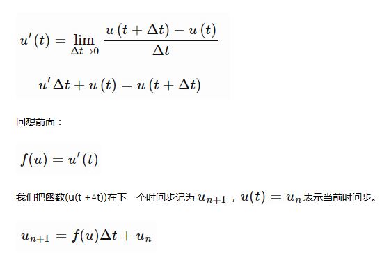
还记得导数的定义么?当导数已知,假设Δt很小的情况下,经过重新整理,它可以用来近似预测函数的下一个取值,我们已经声明过u′(t)。

这种方法叫做欧拉法,代码如下:
def euler_step(u, f, dt):
  return u + dt * f(u)
我们需要函数f(u)。友好的numpy提供了简洁的数组操作。我可能会在另一篇文章中回顾它,因为它们太强大了,需要更多的解释,但现在这样就能达到效果:
def f(u):
  S = u[0]
  I = u[1]
  R = u[2]

  new = np.array([-beta*(S[1:-1, 1:-1]*I[1:-1, 1:-1] +
              S[0:-2, 1:-1]*I[0:-2, 1:-1] +
              S[2:, 1:-1]*I[2:, 1:-1] +
              S[1:-1, 0:-2]*I[1:-1, 0:-2] +
              S[1:-1, 2:]*I[1:-1, 2:]),
           beta*(S[1:-1, 1:-1]*I[1:-1, 1:-1] +
              S[0:-2, 1:-1]*I[0:-2, 1:-1] +
              S[2:, 1:-1]*I[2:, 1:-1] +
              S[1:-1, 0:-2]*I[1:-1, 0:-2] +
              S[1:-1, 2:]*I[1:-1, 2:]) - gamma*I[1:-1, 1:-1],
           gamma*I[1:-1, 1:-1]
          ])

  padding = np.zeros_like(u)
  padding[:,1:-1,1:-1] = new
  padding[0][padding[0] < 0] = 0
  padding[0][padding[0] > 255] = 255
  padding[1][padding[1] < 0] = 0
  padding[1][padding[1] > 255] = 255
  padding[2][padding[2] < 0] = 0
  padding[2][padding[2] > 255] = 255

  return padding
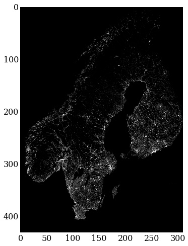
导入北欧国家的人口密度图并进行下采样,以便较快地得到结果
from PIL import Image
img = Image.open('popdens2.png')
img = img.resize((img.size[0]/2,img.size[1]/2))
img = 255 - np.asarray(img)
imgplot = plt.imshow(img)
imgplot.set_interpolation('nearest')

北欧国家的人口密度图(未包含丹麦)
S矩阵,也就是易感个体,应该近似于人口密度。感染者初始值是0,我们把斯德哥尔摩作为第一感染源。
S_0 = img[:,:,1]
I_0 = np.zeros_like(S_0)
I_0[309,170] = 1 # patient zero
因为还没人死亡,所以把矩阵也置为0.
R_0 = np.zeros_like(S_0)
接着初始化模拟时长等。
T = 900             # final time
dt = 1             # time increment
N = int(T/dt) + 1        # number of time-steps
t = np.linspace(0.0, T, N)   # time discretization

# initialize the array containing the solution for each time-step
u = np.empty((N, 3, S_0.shape[0], S_0.shape[1]))
u[0][0] = S_0
u[0][1] = I_0
u[0][2] = R_0
我们需要自定义一个颜色表,这样才能将感染矩阵显示在地图上。
import matplotlib.cm as cm
theCM = cm.get_cmap("Reds")
theCM._init()
alphas = np.abs(np.linspace(0, 1, theCM.N))
theCM._lut[:-3,-1] = alphas
下面坐下来欣赏吧…
for n in range(N-1):
  u[n+1] = euler_step(u[n], f, dt)
让我们再做一下图像渲染,把它做成gif,每个人都喜欢gifs!
from images2gif import writeGif

keyFrames = []
frames = 60.0

for i in range(0, N-1, int(N/frames)):
  imgplot = plt.imshow(img, vmin=0, vmax=255)
  imgplot.set_interpolation("nearest")
  imgplot = plt.imshow(u[i][1], vmin=0, cmap=theCM)
  imgplot.set_interpolation("nearest")
  filename = "outbreak" + str(i) + ".png"
  plt.savefig(filename)
  keyFrames.append(filename)

images = [Image.open(fn) for fn in keyFrames]
gifFilename = "outbreak.gif"
writeGif(gifFilename, images, duration=0.3)
plt.clf()

Hot AI Tools

Undresser.AI Undress
AI-powered app for creating realistic nude photos

AI Clothes Remover
Online AI tool for removing clothes from photos.

Undress AI Tool
Undress images for free

Clothoff.io
AI clothes remover

AI Hentai Generator
Generate AI Hentai for free.

Hot Article

Hot Tools

Notepad++7.3.1
Easy-to-use and free code editor

SublimeText3 Chinese version
Chinese version, very easy to use

Zend Studio 13.0.1
Powerful PHP integrated development environment

Dreamweaver CS6
Visual web development tools

SublimeText3 Mac version
God-level code editing software (SublimeText3)

Hot Topics
 What should I do if the '__builtin__' module is not found when loading the Pickle file in Python 3.6?
Apr 02, 2025 am 07:12 AM
Error loading Pickle file in Python 3.6 environment: ModuleNotFoundError:Nomodulenamed...
 Is Debian Strings compatible with multiple browsers
Apr 02, 2025 am 08:30 AM
"DebianStrings" is not a standard term, and its specific meaning is still unclear. This article cannot directly comment on its browser compatibility. However, if "DebianStrings" refers to a web application running on a Debian system, its browser compatibility depends on the technical architecture of the application itself. Most modern web applications are committed to cross-browser compatibility. This relies on following web standards and using well-compatible front-end technologies (such as HTML, CSS, JavaScript) and back-end technologies (such as PHP, Python, Node.js, etc.). To ensure that the application is compatible with multiple browsers, developers often need to conduct cross-browser testing and use responsiveness
 Is the conversion speed fast when converting XML to PDF on mobile phone?
Apr 02, 2025 pm 10:09 PM
The speed of mobile XML to PDF depends on the following factors: the complexity of XML structure. Mobile hardware configuration conversion method (library, algorithm) code quality optimization methods (select efficient libraries, optimize algorithms, cache data, and utilize multi-threading). Overall, there is no absolute answer and it needs to be optimized according to the specific situation.
 Does XML modification require programming?
Apr 02, 2025 pm 06:51 PM
Modifying XML content requires programming, because it requires accurate finding of the target nodes to add, delete, modify and check. The programming language has corresponding libraries to process XML and provides APIs to perform safe, efficient and controllable operations like operating databases.
 Is there any mobile app that can convert XML into PDF?
Apr 02, 2025 pm 08:54 PM
An application that converts XML directly to PDF cannot be found because they are two fundamentally different formats. XML is used to store data, while PDF is used to display documents. To complete the transformation, you can use programming languages and libraries such as Python and ReportLab to parse XML data and generate PDF documents.
 How to modify comment content in XML
Apr 02, 2025 pm 06:15 PM
For small XML files, you can directly replace the annotation content with a text editor; for large files, it is recommended to use the XML parser to modify it to ensure efficiency and accuracy. Be careful when deleting XML comments, keeping comments usually helps code understanding and maintenance. Advanced tips provide Python sample code to modify comments using XML parser, but the specific implementation needs to be adjusted according to the XML library used. Pay attention to encoding issues when modifying XML files. It is recommended to use UTF-8 encoding and specify the encoding format.
 What is the process of converting XML into images?
Apr 02, 2025 pm 08:24 PM
To convert XML images, you need to determine the XML data structure first, then select a suitable graphical library (such as Python's matplotlib) and method, select a visualization strategy based on the data structure, consider the data volume and image format, perform batch processing or use efficient libraries, and finally save it as PNG, JPEG, or SVG according to the needs.
 How to open xml format
Apr 02, 2025 pm 09:00 PM
Use most text editors to open XML files; if you need a more intuitive tree display, you can use an XML editor, such as Oxygen XML Editor or XMLSpy; if you process XML data in a program, you need to use a programming language (such as Python) and XML libraries (such as xml.etree.ElementTree) to parse.


