
 Web Front-end
JS Tutorial
Bootstrap form component tutorial detailed explanation_javascript skills
Web Front-end
JS Tutorial
Bootstrap form component tutorial detailed explanation_javascript skills
Bootstrap form component tutorial detailed explanation_javascript skills

Common elements of forms mainly include: text input box, drop-down selection box, radio button, check box, text field, button, etc. Here are the different bootstrap versions:
LESS: forms.less
SASS: _forms.scss
Bootstrap only customizes the fieldset, legend, and label tags in the form
1 2 3 4 5 6 7 8 9 10 11 12 13 14 15 16 17 18 19 20 21 22 |
|
In addition to these elements, there are also input, select, textarea and other elements. In the bootstrap framework, the effect is achieved by customizing a class name .form-control
1. The width becomes 100%;
2. Set a light gray (#ccc) border
3. Rounded corners with 4px
4. Set the shadow effect, and when the element gets focus, the shadow and border effects will change
5. Set the color of the placeholder to #999
Inline form
If you want to add a label before the input, it will cause the input to wrap in another line. If you have to add such a label and don’t want the input to wrap, you need to put the label in the container.form-group. For example:
1 2 3 4 5 6 |
|
The effect is as follows:
To achieve the inline form effect, just add the class name .form-inline to the form element. Implementation principle:
Set the form control as an inline block element (display: inline-block) to display the form control in one line.
Example:
1 2 3 4 5 6 7 8 9 10 11 12 13 14 15 16 17 18 |
|
The effect is as follows:
Seeing the effect in the above picture, have you noticed that there is a label in the code, and it is not placed in the container.form-group, and the input does not wrap into new lines. What is even more strange is that the content of the label is not displayed! In fact, if you look closely at the label label, the class name .sr-only is added, which hides the label. Let’s take a look at its source code:
1 2 3 4 5 6 7 8 9 10 |
|
Now that the label tag is added, and the .sr-only class name is added to hide the label, is it unnecessary? ? ? But this is exactly one of the advantages of the bootstrap framework. If the label is not set for the input control, the screen reader will not be able to recognize it correctly. At the same time, certain considerations have been made for people with disabilities
Horizontal form
To achieve the horizontal form effect in bootstrap, the following two conditions must be met:
1. Use the class name .form-horizontal
on the form element
2. Grid system with bootstrap framework (Details: Detailed explanation of Bootstrap grid system)
Using the class name .form-horizontal in the form element mainly has the following functions:
1. Set padding and margin values of form controls
2. Change the expression of .from-group, similar to row in the grid system
css source code:
1 2 3 4 5 6 7 8 9 10 11 12 13 14 15 16 17 18 19 20 21 22 23 24 25 26 27 28 29 |
|
Example:
1 2 3 4 5 6 7 8 9 10 11 12 13 14 15 16 17 18 19 20 21 22 23 24 25 26 |
|
The effect is as follows:

Single line input box
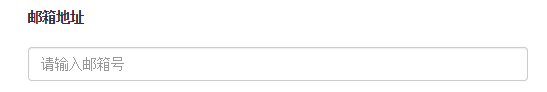
When using input in bootstrap, you must also add the type type. If the type type is not specified, you will not be able to get the correct style, because the bootstrap framework defines the style in the form of input[type="?"], such as : text type, corresponding to input[type="text"]
In order to make the control look good in various form styles, you need to add the class name .form-control
1 2 3 4 5 |
|
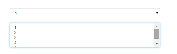
Drop-down selection box select
Multiple row selection sets the value of the multiple attribute to multiple
1 2 3 4 5 6 7 8 9 10 11 12 13 14 15 16 17 18 19 20 |
|
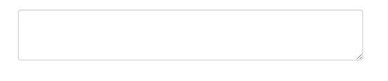
Text area textarea
The text area is used in the same way as the original one. Setting rows can define its height, and setting cols can define its width. If the class name .form-control is added to the textarea element, there is no need to set the cols attribute, because the .form in the bootstrap framework The target space width of -control style is 100% or auto
1 2 3 4 5 |
|
复选框checkbox和单选框radio
checkbox和radio与label标签配合使用会出现一些小问题(如对齐问题)
1 2 3 4 5 6 7 8 9 10 11 12 13 14 15 16 17 |
|
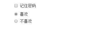
1、不管是checkbox还是radio都使用label包起来了
2、checkbox连同label标签放在一个名为.checkbox的容器内
3、radio连同label标签放在一个名为.radio的容器内,bootstrap主要借助.checkbox和.radio样式来处理复选框、单选按钮与标签的对齐方式
1 2 3 4 5 6 7 8 9 10 11 12 13 14 15 16 17 18 19 20 21 22 23 24 25 |
|
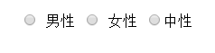
复选框和单选按钮水平排列
1、如果checkbox需要水平排列,只需要在label标签上添加类名.checkbox-inline
2、如果radio需要水平排列,只需在label标签上添加类名.radion-inline
下面是css源码:
1 2 3 4 5 6 7 8 9 10 11 12 13 14 15 16 17 18 19 20 21 22 23 24 25 |
|
表单控件状态
1、焦点状态:
焦点状态是通过伪类:focus来实现的,bootstrap表单控件中的焦点状态删除了outline的默认样式,重新添加阴影效果,下面是
css源码:
1 2 3 4 5 6 |
|
从源码中可以看出,要让控件在焦点状态下有上面的样式效果需要给控件添加类名.form-control
1 2 3 4 5 6 7 8 9 10 |
|
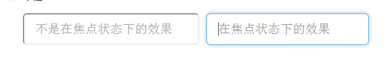
file、radio、checkbox控件在焦点状态下的效果也与普通的input控件不太一样,下面是源码
1 2 3 4 5 6 7 |
|
2、禁用状态:
在相应得表单控件上添加属性disabled即可,下面是css源码:
1 2 3 4 5 6 7 8 9 10 11 12 13 14 15 16 17 18 19 20 21 |
|
例子:
1 |
|
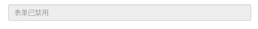
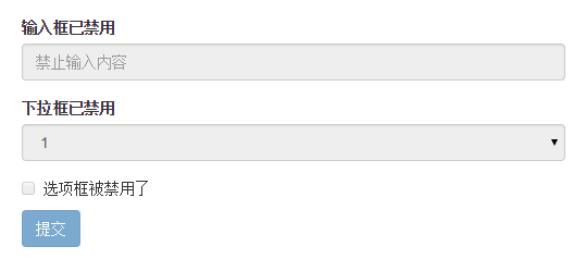
如果fieldset设置了disabled属性,整个域都会处于被禁用状态
例子:
1 2 3 4 5 6 7 8 9 10 11 12 13 14 15 16 17 18 19 20 21 22 23 |
|
效果如下:(鼠标移上去的时候出现禁用的图标,这里是直接截的图看不到这个效果)
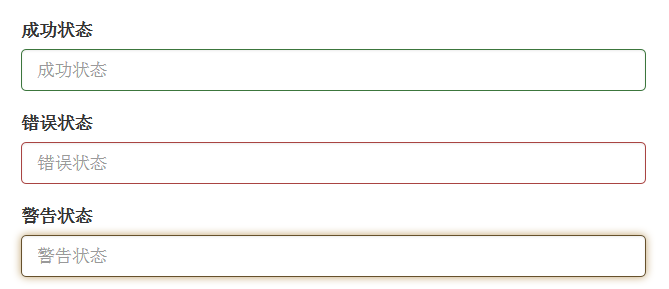
3、验证状态
bootstrap提供下面这几种效果:
1、.has-warning:警告状态 黄色
2、 .has-error :错误状态 红色
3、 .has-success:成功状态 绿色
使用的时候只需在form-group容器上对应添加状态类名,三种状态下效果都是一样的,只是颜色不一样而已
例子:
1 2 3 4 5 6 7 8 9 10 11 12 13 14 |
|
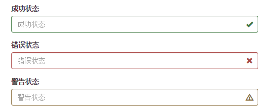
效果如下:
有时候,在表单验证的时不同的状态会提供不同的icon,如果要在对应的状态下显示icon出来,只需要在对应的状态下添加类名.has-feedback ,注意它要和.has-error,.has-success,.has-warning一起使用。
bootstrap的小图标都是使用@font-face来制作的。如:
1 |
|
例子:
1 2 3 4 5 6 7 8 9 10 11 12 13 14 15 16 17 |
|
效果如下:
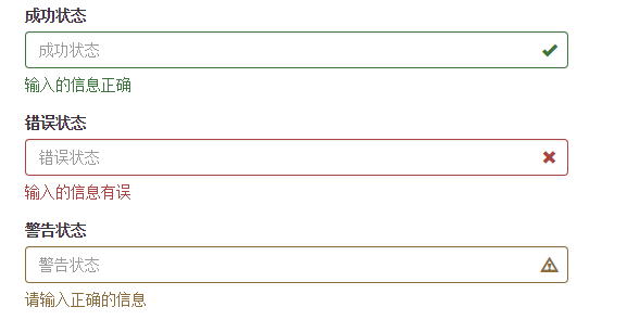
表单提示信息
一般在制作表单验证时,需要提供不同的提示信息,在bootstrap框架中使用.help-block,将提示信息以块状显示,并且显示在控件底部
下面是css源码:
1 2 3 4 5 6 |
|
例子:
1 2 3 4 5 6 7 8 9 10 11 12 13 14 15 16 17 18 19 20 |
|
效果如下:
如果不想为bootstrap.css增加自己的代码,而且设计又有这种需要,可以借助bootstrap的网格系统,例如:
1 2 3 4 5 6 7 8 9 10 11 |
|
以上所述是小编给大家介绍的Bootstrap表单组件的相关内容,希望对大家有所帮助!

Hot AI Tools

Undresser.AI Undress
AI-powered app for creating realistic nude photos

AI Clothes Remover
Online AI tool for removing clothes from photos.

Undress AI Tool
Undress images for free

Clothoff.io
AI clothes remover

AI Hentai Generator
Generate AI Hentai for free.
Hot Article
Hot Tools

Notepad++7.3.1
Easy-to-use and free code editor

SublimeText3 Chinese version
Chinese version, very easy to use

Zend Studio 13.0.1
Powerful PHP integrated development environment

Dreamweaver CS6
Visual web development tools

SublimeText3 Mac version
God-level code editing software (SublimeText3)
Hot Topics
 1384
1384
 52
52

 What should I do if I encounter garbled code printing for front-end thermal paper receipts?
Apr 04, 2025 pm 02:42 PM
What should I do if I encounter garbled code printing for front-end thermal paper receipts?
Apr 04, 2025 pm 02:42 PM
Frequently Asked Questions and Solutions for Front-end Thermal Paper Ticket Printing In Front-end Development, Ticket Printing is a common requirement. However, many developers are implementing...
 Who gets paid more Python or JavaScript?
Apr 04, 2025 am 12:09 AM
Who gets paid more Python or JavaScript?
Apr 04, 2025 am 12:09 AM
There is no absolute salary for Python and JavaScript developers, depending on skills and industry needs. 1. Python may be paid more in data science and machine learning. 2. JavaScript has great demand in front-end and full-stack development, and its salary is also considerable. 3. Influencing factors include experience, geographical location, company size and specific skills.
 How to merge array elements with the same ID into one object using JavaScript?
Apr 04, 2025 pm 05:09 PM
How to merge array elements with the same ID into one object using JavaScript?
Apr 04, 2025 pm 05:09 PM
How to merge array elements with the same ID into one object in JavaScript? When processing data, we often encounter the need to have the same ID...
 Demystifying JavaScript: What It Does and Why It Matters
Apr 09, 2025 am 12:07 AM
Demystifying JavaScript: What It Does and Why It Matters
Apr 09, 2025 am 12:07 AM
JavaScript is the cornerstone of modern web development, and its main functions include event-driven programming, dynamic content generation and asynchronous programming. 1) Event-driven programming allows web pages to change dynamically according to user operations. 2) Dynamic content generation allows page content to be adjusted according to conditions. 3) Asynchronous programming ensures that the user interface is not blocked. JavaScript is widely used in web interaction, single-page application and server-side development, greatly improving the flexibility of user experience and cross-platform development.
 The difference in console.log output result: Why are the two calls different?
Apr 04, 2025 pm 05:12 PM
The difference in console.log output result: Why are the two calls different?
Apr 04, 2025 pm 05:12 PM
In-depth discussion of the root causes of the difference in console.log output. This article will analyze the differences in the output results of console.log function in a piece of code and explain the reasons behind it. �...
 TypeScript for Beginners, Part 2: Basic Data Types
Mar 19, 2025 am 09:10 AM
TypeScript for Beginners, Part 2: Basic Data Types
Mar 19, 2025 am 09:10 AM
Once you have mastered the entry-level TypeScript tutorial, you should be able to write your own code in an IDE that supports TypeScript and compile it into JavaScript. This tutorial will dive into various data types in TypeScript. JavaScript has seven data types: Null, Undefined, Boolean, Number, String, Symbol (introduced by ES6) and Object. TypeScript defines more types on this basis, and this tutorial will cover all of them in detail. Null data type Like JavaScript, null in TypeScript
 How to achieve parallax scrolling and element animation effects, like Shiseido's official website?
or:
How can we achieve the animation effect accompanied by page scrolling like Shiseido's official website?
Apr 04, 2025 pm 05:36 PM
How to achieve parallax scrolling and element animation effects, like Shiseido's official website?
or:
How can we achieve the animation effect accompanied by page scrolling like Shiseido's official website?
Apr 04, 2025 pm 05:36 PM
Discussion on the realization of parallax scrolling and element animation effects in this article will explore how to achieve similar to Shiseido official website (https://www.shiseido.co.jp/sb/wonderland/)...
 Can PowerPoint run JavaScript?
Apr 01, 2025 pm 05:17 PM
Can PowerPoint run JavaScript?
Apr 01, 2025 pm 05:17 PM
JavaScript can be run in PowerPoint, and can be implemented by calling external JavaScript files or embedding HTML files through VBA. 1. To use VBA to call JavaScript files, you need to enable macros and have VBA programming knowledge. 2. Embed HTML files containing JavaScript, which are simple and easy to use but are subject to security restrictions. Advantages include extended functions and flexibility, while disadvantages involve security, compatibility and complexity. In practice, attention should be paid to security, compatibility, performance and user experience.
