 Web Front-end
 JS Tutorial
 Bootstrap modal box (Modal) plug-in that you must learn every day_javascript skills
Bootstrap modal box (Modal) plug-in that you must learn every day_javascript skills
In this lesson we will mainly learn about the modal box plug-in in Bootstrap, which is a very common pop-up function plug-in for interactive websites.
1. Basic usage
Using a modal box pop-up component requires three layers of div container elements, namely modal (modal declaration layer),
dialog (window declaration layer), content (content layer). Within the content layer, there are three layers, namely header, body, and footer.
//Basic example
<!-- 模态声明,show 表示显示 -->
<div class="modal show" tabindex="-1">
<!-- 窗口声明 -->
<div class="modal-dialog">
<!-- 内容声明 -->
<div class="modal-content">
<!-- 头部 -->
<div class="modal-header">
<button type="button" class="close"
data-dismiss="modal">
<span>×</span>
</button>
<h4 class="modal-title">会员登录</h4>
</div>
<!-- 主体 -->
<div class="modal-body">
<p>
暂时无法登录会员
</p>
</div>
<!-- 注脚 -->
<div class="modal-footer">
<button type="button" class="btn btn-default">
注册
</button>
<button type="button" class="btn btn-primary">
登录
</button>
</div>
</div>
</div>
</div>
If you want the modal box to hide automatically and then pop up the window by clicking the button, you need to do the following.
//模态框去掉 show,增加一个 id

<div class="modal" id="myModal">
//点击触发模态框显示

<button class="btn btn-primary btn-lg" data-toggle="modal" data-target="#myModal">
  点击弹窗
</button>
//弹窗的大小有三种,默认情况下是正常,还有 lg(大)和 sm(小)

<div class="modal-dialog modal-lg">
<div class="modal-dialog sm-lg">
//可设置淡入淡出效果

<div class="modal fade" id="myModal">
//在主体部分使用栅格系统中的流体


<!-- 主体 -->
<div class="modal-body">
  <div class="container-fluid">
    <div class="row">
      <div class="col-md-4">
        1
      </div>
      <div class="col-md-4">
        1
      </div>
      <div class="col-md-4">
        1
      </div>
    </div>
  </div>
</div>
2. Instructions for use
After the basic usage introduction, let’s take a look at the various important uses of the plug-in. All plug-ins are based on JavaScript/jQuery. Then, there are four elements: usage, parameters, methods and events.
1. Usage
The first type: You can pass the data attribute
//data-toggle

data-toggle="modal" data-target="#myModal"
data-toggle indicates trigger type
data-target represents the triggered node
If instead of using
Replace. Of course, we recommend using data-target. In addition to the two declared attributes data-toggle and data-target, there are some available options.
2. Parameters
The effect can be controlled by setting the data-* attribute declaration on the HTML element.

//空白背景且点击不关闭

data-backdrop="false"
//按下 esc 不关闭

data-keyboard="false"
//初始化隐藏,如果是按钮点击触发,第一次点击则无法显示,第二次显示。

data-show="false"
//加载一次 index.html 到容器内

href="index.html"
Of course, it can also be set directly in JavaScript.

//通过 jQuery 方式声明

$('#myModal').modal({
  show : true,
  backdrop : false,
  keyboard : false,
  remote : 'index.html',
});
3. Method
If the pop-up window is not displayed by default, then how can the pop-up window be displayed by clicking before and after?

//点击显示弹窗

$('#btn').on('click', function() {
  $('#myModal').modal('show');
});
4. Event
The modal box supports 4 types of time, corresponding to before popping up, after popping up, before closing and after closing.

$('#myModal').on('show.bs.modal', function() {
  alert('在 show 方法调用时立即触发!');
});

$('#myModal').on('shown.bs.modal', function() {
  alert('在模态框显示完毕后触发!');
});

$('#myModal').on('hide.bs.modal', function() {
  alert('在 hide 方法调用时立即触发!');
});

$('#myModal').on('hiden.bs.modal', function() {
  alert('在模态框显示完毕后触发!');
});

$('#myModal').on('loaded.bs.modal', function() {
  alert('远程数据加载完毕后触发!');
});
The above is the entire content of this article, I hope it will be helpful to everyone’s study.

Hot AI Tools

Undresser.AI Undress
AI-powered app for creating realistic nude photos

AI Clothes Remover
Online AI tool for removing clothes from photos.

Undress AI Tool
Undress images for free

Clothoff.io
AI clothes remover

AI Hentai Generator
Generate AI Hentai for free.

Hot Article

Hot Tools

Notepad++7.3.1
Easy-to-use and free code editor

SublimeText3 Chinese version
Chinese version, very easy to use

Zend Studio 13.0.1
Powerful PHP integrated development environment

Dreamweaver CS6
Visual web development tools

SublimeText3 Mac version
God-level code editing software (SublimeText3)

Hot Topics
 What is the Chrome plug-in extension installation directory?
Mar 08, 2024 am 08:55 AM
What is the Chrome plug-in extension installation directory? Under normal circumstances, the default installation directory of Chrome plug-in extensions is as follows: 1. The default installation directory location of chrome plug-ins in windowsxp: C:\DocumentsandSettings\username\LocalSettings\ApplicationData\Google\Chrome\UserData\Default\Extensions2. chrome in windows7 The default installation directory location of the plug-in: C:\Users\username\AppData\Local\Google\Chrome\User
 How to introduce bootstrap into Eclipse
Apr 05, 2024 am 02:30 AM
Introduce Bootstrap in Eclipse in five steps: Download the Bootstrap file and unzip it. Import the Bootstrap folder into the project. Add Bootstrap dependency. Load Bootstrap CSS and JS in HTML files. Start using Bootstrap to enhance your user interface.
 Share three solutions to why Edge browser does not support this plug-in
Mar 13, 2024 pm 04:34 PM
When users use the Edge browser, they may add some plug-ins to meet more of their needs. But when adding a plug-in, it shows that this plug-in is not supported. How to solve this problem? Today, the editor will share with you three solutions. Come and try it. Method 1: Try using another browser. Method 2: The Flash Player on the browser may be out of date or missing, causing the plug-in to be unsupported. You can download the latest version from the official website. Method 3: Press the "Ctrl+Shift+Delete" keys at the same time. Click "Clear Data" and reopen the browser.
 750,000 rounds of one-on-one battle between large models, GPT-4 won the championship, and Llama 3 ranked fifth
Apr 23, 2024 pm 03:28 PM
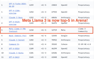
Regarding Llama3, new test results have been released - the large model evaluation community LMSYS released a large model ranking list. Llama3 ranked fifth, and tied for first place with GPT-4 in the English category. The picture is different from other benchmarks. This list is based on one-on-one battles between models, and the evaluators from all over the network make their own propositions and scores. In the end, Llama3 ranked fifth on the list, followed by three different versions of GPT-4 and Claude3 Super Cup Opus. In the English single list, Llama3 overtook Claude and tied with GPT-4. Regarding this result, Meta’s chief scientist LeCun was very happy and forwarded the tweet and
 How to read the bootstrap mediation effect test results in stata
Apr 05, 2024 am 01:48 AM
Interpretation steps of Bootstrap mediation effect test in Stata: Check the sign of the coefficient: Determine the positive or negative direction of the mediation effect. Test p value: less than 0.05 indicates that the mediating effect is significant. Check the confidence interval: not containing zero indicates that the mediation effect is significant. Comparing the median p-value: less than 0.05 further supports the significance of the mediation effect.
 How to introduce idea into bootstrap
Apr 05, 2024 am 02:33 AM
Steps to introduce Bootstrap in IntelliJ IDEA: Create a new project and select "Web Application". Add "Bootstrap" Maven dependency. Create an HTML file and add Bootstrap references. Replace with the actual path to the Bootstrap CSS file. Run the HTML file to use Bootstrap styles. Tip: Use a CDN to import Bootstrap or customize HTML file templates.
 How to use bootstrap to test mediation effects
Apr 05, 2024 am 03:57 AM
The Bootstrap test uses resampling technology to evaluate the reliability of the statistical test and is used to prove the significance of the mediation effect: first, calculate the confidence interval of the direct effect, indirect effect and mediation effect; secondly, calculate the significance of the mediation type according to the Baron and Kenny or Sobel method. significance; and finally estimate the confidence interval for the natural indirect effect.
 How to read the results of bootstrap mediation test
Apr 05, 2024 am 03:30 AM
The Bootstrap mediation test evaluates the mediation effect by resampling the data multiple times: Indirect effect confidence interval: indicates the estimated range of the mediation effect. If the interval does not contain zero, the effect is significant. p-value: Evaluates the probability that the confidence interval does not contain zero, with values less than 0.05 indicating significant. Sample size: The number of data samples used for analysis. Bootstrap subsampling times: the number of repeated samplings (500-2000 times). If the confidence interval does not contain zero and the p-value is less than 0.05, the mediation effect is significant, indicating that the mediating variable explains the relationship between the independent and dependent variables.


