
 Web Front-end
JS Tutorial
Bootstrap must learn pop-up box (Popover) plug-in every day_javascript skills
Web Front-end
JS Tutorial
Bootstrap must learn pop-up box (Popover) plug-in every day_javascript skills
Bootstrap must learn pop-up box (Popover) plug-in every day_javascript skills

The Bootstrap pop-up box plug-in provides an extended view. The pop-up box (Popover) plug-in generates content and markup according to requirements. By default, the pop-up box (popover) is placed behind their triggering elements.
Popover is similar to Tooltip, providing an expanded view. To activate the popover, users simply hover over the element. The content of the popup box can be filled entirely using the Bootstrap Data API. This method relies on tooltips.
If you want to reference the functionality of this plugin separately, then you need to reference popover.js, which depends on the Tooltip plugin. Alternatively, as mentioned in the chapter Bootstrap Plugin Overview, you can reference bootstrap.js or a minified version of bootstrap.min.js.
1. Usage
Popover plug-in Generates content and markup according to requirements. By default, popovers are placed behind their triggering elements. You can add a popover in the following two ways:
Via data attribute: To add a popover, just add data-toggle="popover" to an anchor/button tag. The title of the anchor is the text of the popover. By default, the plugin places the popover at the top.
<a href="#" data-toggle="popover" title="Example popover">
 请悬停在我的上面
</a>
Via JavaScript: Enable popover via JavaScript:
$('#identifier').popover(options)
The Popover plug-in is not a pure CSS plug-in like the drop-down menu and other plug-ins discussed before. To use the plugin, you must activate it using jquery (read javascript). Use the following script to enable all popovers on the page:
$(function () { $("[data-toggle='popover']").popover(); });
2. Examples
The pop-up box means clicking an element to pop up a container containing title and content.
//基本用法

<button class="btn btn-lg btn-danger"
 type="button"
 data-toggle="popover"
 title="弹出框"
 data-content="这是一个弹出框插件">
 点击弹出/隐藏弹出框
</button>

//JavaScript 初始化

$('button').popover();
The pop-up box plug-in has many attributes to configure the display of prompts, as follows:
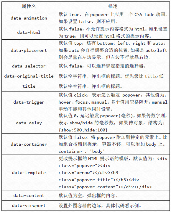
$('button').popover({
 container : 'body',
 viewport : {
 selector : '#view',
 padding : 10,
 }
}); There are four methods executed through JavaScript.
//显示
$('button').popover('show');
//隐藏
$('button').popover('hide');
//反转显示和隐藏
$('button').popover('toggle');
//隐藏并销毁
$('button').popover('destroy');
There are four types of events in the Popover plug-in:
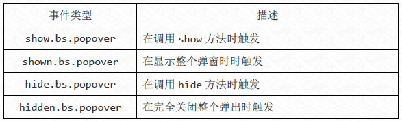
//事件,其他雷同

$('button').on('show.bs.tab', function() {
 alert('调用 show 方法时触发!');
});
The above is the entire content of this article. I hope it will be helpful for everyone to learn the Bootstrap pop-up box plug-in.

Hot AI Tools

Undresser.AI Undress
AI-powered app for creating realistic nude photos

AI Clothes Remover
Online AI tool for removing clothes from photos.

Undress AI Tool
Undress images for free

Clothoff.io
AI clothes remover

AI Hentai Generator
Generate AI Hentai for free.

Hot Article
Hot Tools

Notepad++7.3.1
Easy-to-use and free code editor

SublimeText3 Chinese version
Chinese version, very easy to use

Zend Studio 13.0.1
Powerful PHP integrated development environment

Dreamweaver CS6
Visual web development tools

SublimeText3 Mac version
God-level code editing software (SublimeText3)
Hot Topics
 1385
1385
 52
52

 How to get the bootstrap search bar
Apr 07, 2025 pm 03:33 PM
How to get the bootstrap search bar
Apr 07, 2025 pm 03:33 PM
How to use Bootstrap to get the value of the search bar: Determines the ID or name of the search bar. Use JavaScript to get DOM elements. Gets the value of the element. Perform the required actions.
 How to use bootstrap in vue
Apr 07, 2025 pm 11:33 PM
How to use bootstrap in vue
Apr 07, 2025 pm 11:33 PM
Using Bootstrap in Vue.js is divided into five steps: Install Bootstrap. Import Bootstrap in main.js. Use the Bootstrap component directly in the template. Optional: Custom style. Optional: Use plug-ins.
 How to write split lines on bootstrap
Apr 07, 2025 pm 03:12 PM
How to write split lines on bootstrap
Apr 07, 2025 pm 03:12 PM
There are two ways to create a Bootstrap split line: using the tag, which creates a horizontal split line. Use the CSS border property to create custom style split lines.
 How to do vertical centering of bootstrap
Apr 07, 2025 pm 03:21 PM
How to do vertical centering of bootstrap
Apr 07, 2025 pm 03:21 PM
Use Bootstrap to implement vertical centering: flexbox method: Use the d-flex, justify-content-center, and align-items-center classes to place elements in the flexbox container. align-items-center class method: For browsers that do not support flexbox, use the align-items-center class, provided that the parent element has a defined height.
 How to resize bootstrap
Apr 07, 2025 pm 03:18 PM
How to resize bootstrap
Apr 07, 2025 pm 03:18 PM
To adjust the size of elements in Bootstrap, you can use the dimension class, which includes: adjusting width: .col-, .w-, .mw-adjust height: .h-, .min-h-, .max-h-
 How to set up the framework for bootstrap
Apr 07, 2025 pm 03:27 PM
How to set up the framework for bootstrap
Apr 07, 2025 pm 03:27 PM
To set up the Bootstrap framework, you need to follow these steps: 1. Reference the Bootstrap file via CDN; 2. Download and host the file on your own server; 3. Include the Bootstrap file in HTML; 4. Compile Sass/Less as needed; 5. Import a custom file (optional). Once setup is complete, you can use Bootstrap's grid systems, components, and styles to create responsive websites and applications.
 How to insert pictures on bootstrap
Apr 07, 2025 pm 03:30 PM
How to insert pictures on bootstrap
Apr 07, 2025 pm 03:30 PM
There are several ways to insert images in Bootstrap: insert images directly, using the HTML img tag. With the Bootstrap image component, you can provide responsive images and more styles. Set the image size, use the img-fluid class to make the image adaptable. Set the border, using the img-bordered class. Set the rounded corners and use the img-rounded class. Set the shadow, use the shadow class. Resize and position the image, using CSS style. Using the background image, use the background-image CSS property.
 What to do if the Bootstrap Table uses AJAX to get data garbled
Apr 07, 2025 am 11:54 AM
What to do if the Bootstrap Table uses AJAX to get data garbled
Apr 07, 2025 am 11:54 AM
Solutions to the garbled code of Bootstrap Table when using AJAX to obtain data from the server: 1. Set the correct character encoding of the server-side code (such as UTF-8). 2. Set the request header in the AJAX request and specify the accepted character encoding (Accept-Charset). 3. Use the "unescape" converter of the Bootstrap Table to decode the escaped HTML entity into original characters.
