Bootstrap, from Twitter, is currently the most popular front-end framework. Bootstrap is based on HTML, CSS, and JAVASCRIPT. It is simple and flexible, making web development faster.
Learning points:
1. Auxiliary group class
2. Responsive tools
In this lesson, we mainly learn about Bootstrap’s auxiliary classes and responsive tools. The auxiliary classes provide a set of classes to assist in page design, while the responsive tools use media queries to display or hide certain content.
1. Auxiliary class
Bootstrap provides some small auxiliary group styles in layout, used for setting text color and background color, displaying close icons, etc.
1. Scenario text color
样式列表
样式名 描述
text-muted 柔和灰
text-primary 主要蓝
text-success 成功绿
text-info 信息蓝
text-warning 警告黄
text-danger 危险红
//各种色调的字体
<p class="text-muted">Bootstrap 视频教程</p>
<p class="text-primary">Bootstrap 视频教程</p>
<p class="text-success">Bootstrap 视频教程</p>
<p class="text-info">Bootstrap 视频教程</p>
<p class="text-warning">Bootstrap 视频教程</p>
<p class="text-danger">Bootstrap 视频教程</p>
2. Scene background color
样式列表

样式名 描述
bg-primary 主要蓝
bg-success 成功绿
bg-info 信息蓝
bg-warning 警告黄
bg-danger 危险红
//各种色调的背景
<p class="bg-primary">Bootstrap 视频教程</p>
<p class="bg-success">Bootstrap 视频教程</p>
<p class="bg-info">Bootstrap 视频教程</p>
<p class="bg-warning">Bootstrap 视频教程</p>
<p class="bg-danger">Bootstrap 视频教程</p>
3.Close button
<button type="button" class="close">×</button>
4. Triangle symbol
<span class="caret"></span>
5. Quick float
<div class="pull-left">左边</div>
<div class="pull-right">右边</div>
Note: This float is actually float, but !important is used to strengthen the priority.
6. Block-level centering
<div class="center-block">居中</div>
Note: is margin:x auto; and display:block; is set.
7. Clean up floats
<div class="clearfix"></div>
Note: This div can be placed in front of the floating block that needs to be cleaned.
8. Show and hide
<div class="show">show</div>
<div class="hidden">hidden</div>
2. Responsive Tools
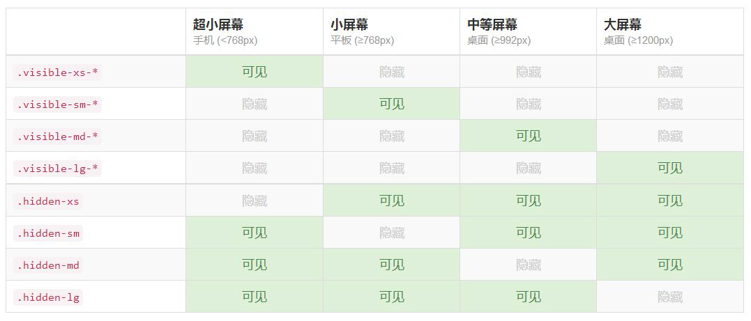
When media querying, sometimes it is necessary to show and hide some content for different screen sizes. Responsive tool classes provide this solution.

//超小屏幕激活显示
<div class="visible-xs-block a">Bootstrap</div>
//超小屏幕激活隐藏
<div class="hidden-xs a">Bootstrap</div>
Note: There are three variations for the displayed content: block, inline-block, and inline.
The above is the content related to the auxiliary group classes and responsive tools of the BootStrap component introduced by the editor. I hope it will be helpful to everyone!


