

The Basics of CSS Positioning: A Practical Guide

Today you will learn the essentials of CSS positioning.
CSS positioning is a fundamental concept in web development that allows you to control the layout and placement of elements on your web pages.
In this guide, we'll explore the five main positioning types in CSS: static, relative, absolute, fixed, and sticky.
On my webite: antondevtips.com I already have blogs about CSS.
Subscribe as more are coming.
Static Positioning
Static positioning is the default positioning for all HTML elements.
When an element is positioned statically, it is placed in the normal document flow, and its position is determined by the HTML structure and any margin or padding applied.
<!DOCTYPE html>
<html lang="en">
<head>
    <style>
        * {
            text-align: center;
        }

        .static-box {
            width: 100px;
            height: 100px;
            background-color: lightblue;
            margin-bottom: 10px;
        }
    </style>
</head>
<body>
    <div class="static-box">Box 1</div>
    <div class="static-box">Box 2</div>
    <div class="static-box">Box 3</div>
</body>
</html>

Relative Positioning
Relative positioning allows you to offset an element from its original position in the normal document flow.
The offset does not affect the position of other elements, and space originally occupied by the element is preserved.
The element can be moved using the top, right, bottom, and left properties.
<!DOCTYPE html>
<html lang="en">
<head>
    <style>
        .relative-box {
            display: inline-block;
            width: 100px;
            height: 100px;
            background-color: lightgreen;
            margin-bottom: 10px;
        }

        .box-2 {
            position: relative;
            top: 50px;
            left: 50px;
            background-color: coral;
        }
    </style>
</head>
<body>
    <div class="relative-box">Box 1</div>
    <div class="relative-box box-2">Box 2</div>
    <div class="relative-box">Box 3</div>
</body>
</html>

In this example, a "Box 2" element has a relative position and is moved by 50 px from the top and left corner of its original position.
As you can see, "Box 2" doesn't take space from the "Box 3" and space for the "Box 2" is preserved despite its position being updated.
Absolute Positioning
Absolute positioning removes an element from the normal document flow, and no space is created for the element in the page layout.
The element is positioned relative to its closest positioned ancestor.
If no such ancestor exists, it is positioned relative to the initial containing block (usually the viewport).
<!DOCTYPE html>
<html lang="en">
<head>
    <style>
        * {
            text-align: center;
        }

        .relative-container {
            position: relative;
            width: 200px;
            height: 200px;
            background-color: lightgray;
        }

        .absolute-box {
            position: absolute;
            top: 30px;
            left: 30px;
            width: 100px;
            height: 100px;
            background-color: lightcoral;
        }

        .absolute-outside-box {
            position: absolute;
            top: 230px;
            left: 110px;
            width: 100px;
            height: 100px;
            background-color: bisque;
        }
    </style>
</head>
<body>
    <div class="relative-container">
        <div class="absolute-box">Absolute inside</div>
    </div>
    <div class="absolute-outside-box">Absolute outside</div>
</body>
</html>
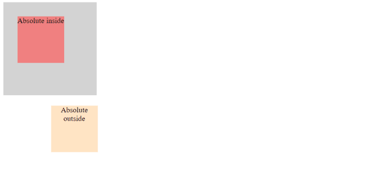
Here, you can see two elements with absolute position: one inside a container and the other on the root body level.
The inner box is positioned according to its relative element, and the outer is positioned within a viewport.
Fixed Positioning
Fixed positioning removes an element from the normal document flow, and no space is created for the element in the page layout.
The element is positioned relative to the viewport, which means it stays in the same position even when the page is scrolled.
This is useful for creating fixed headers, footers, or sidebars.
<!DOCTYPE html>
<html lang="en">
<head>
    <style>
        .content-1 {
            height: 700px;
            background-color: burlywood;
        }

        .content-2 {
            height: 700px;
            background-color: darkseagreen;
        }

        .content-3 {
            height: 700px;
            background-color: lavender;
        }

        .fixed-box {
            position: fixed;
            bottom: 0;
            width: 100%;
            height: 50px;
            background-color: lightseagreen;
            color: white;
            text-align: center;
            line-height: 50px;
        }
    </style>
</head>
<body>
    <div class="content-1">Content 1</div>
    <div class="content-2">Content 2</div>
    <div class="content-3">Content 3</div>
    <div class="fixed-box">Fixed Footer</div>
</body>
</html>
In this example, you can see a fixed footer put on the bottom of the web page.

When you scroll down, the content is scrolled but the footer remains visible regardless of the scroll position.


Sticky Positioning
Sticky positioning is a hybrid between relative and fixed positioning.
An element with sticky position behaves like a relatively positioned element until it crosses a specified threshold (top, right, bottom, or left), at which point it becomes fixed within its containing block.
<!DOCTYPE html>
<html lang="en">
<head>
    <style>
        * {
            text-align: center;
        }

        .sticky-header-1 {
            position: sticky;
            top: 0;
            width: 100%;
            height: 50px;
            background-color: darkgray;
            text-align: center;
            line-height: 50px;
        }

        .sticky-header-2 {
            position: sticky;
            top: 0;
            width: 100%;
            height: 50px;
            background-color: darkslateblue;
            text-align: center;
            line-height: 50px;
        }

        .sticky-header-3 {
            position: sticky;
            top: 0;
            width: 100%;
            height: 50px;
            background-color: mediumvioletred;
            text-align: center;
            line-height: 50px;
        }

        .content-1 {
            height: 700px;
            background-color: lightgray;
        }

        .content-2 {
            height: 700px;
            background-color: lightblue;
        }

        .content-3 {
            height: 700px;
            background-color: lightpink;
        }
    </style>
</head>
<body>
    <div class="sticky-header-1">Sticky Header 1</div>
    <div class="content-1">Content 1</div>

    <div class="sticky-header-2">Sticky Header 2</div>
    <div class="content-2">Content 2</div>

    <div class="sticky-header-3">Sticky Header 3</div>
    <div class="content-3">Content 3</div>
</body>
</html>
In this example, you can see a sticky header put on the top of the web page.

The difference between fixed and sticky HTML element you can see while scrolling down the page.
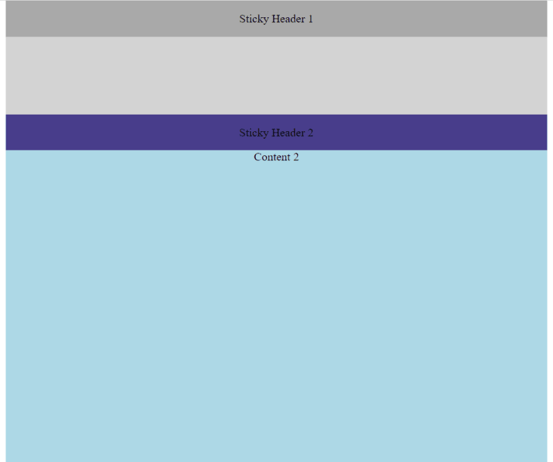
After you reach the second sticky header, the first one disappears from the screen:

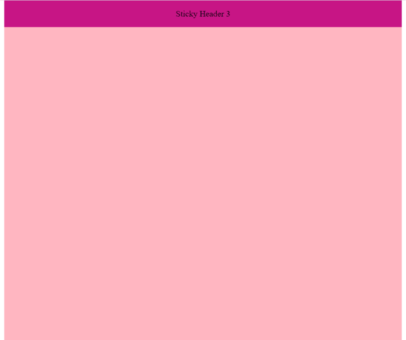
The same applies to the third sticky header:
Hope you find this blog post useful. Happy coding!
On my webite: antondevtips.com I already have blogs about CSS.
Subscribe as more are coming.
The above is the detailed content of The Basics of CSS Positioning: A Practical Guide. For more information, please follow other related articles on the PHP Chinese website!

Hot AI Tools

Undresser.AI Undress
AI-powered app for creating realistic nude photos

AI Clothes Remover
Online AI tool for removing clothes from photos.

Undress AI Tool
Undress images for free

Clothoff.io
AI clothes remover

AI Hentai Generator
Generate AI Hentai for free.

Hot Article
Hot Tools

Notepad++7.3.1
Easy-to-use and free code editor

SublimeText3 Chinese version
Chinese version, very easy to use

Zend Studio 13.0.1
Powerful PHP integrated development environment

Dreamweaver CS6
Visual web development tools

SublimeText3 Mac version
God-level code editing software (SublimeText3)
Hot Topics
 1377
1377
 52
52

 Working With GraphQL Caching
Mar 19, 2025 am 09:36 AM
Working With GraphQL Caching
Mar 19, 2025 am 09:36 AM
If you’ve recently started working with GraphQL, or reviewed its pros and cons, you’ve no doubt heard things like “GraphQL doesn’t support caching” or
 Making Your First Custom Svelte Transition
Mar 15, 2025 am 11:08 AM
Making Your First Custom Svelte Transition
Mar 15, 2025 am 11:08 AM
The Svelte transition API provides a way to animate components when they enter or leave the document, including custom Svelte transitions.
 Building an Ethereum app using Redwood.js and Fauna
Mar 28, 2025 am 09:18 AM
Building an Ethereum app using Redwood.js and Fauna
Mar 28, 2025 am 09:18 AM
With the recent climb of Bitcoin’s price over 20k $USD, and to it recently breaking 30k, I thought it’s worth taking a deep dive back into creating Ethereum
 Show, Don't Tell
Mar 16, 2025 am 11:49 AM
Show, Don't Tell
Mar 16, 2025 am 11:49 AM
How much time do you spend designing the content presentation for your websites? When you write a new blog post or create a new page, are you thinking about
 How do you use CSS to create text effects, such as text shadows and gradients?
Mar 14, 2025 am 11:10 AM
How do you use CSS to create text effects, such as text shadows and gradients?
Mar 14, 2025 am 11:10 AM
The article discusses using CSS for text effects like shadows and gradients, optimizing them for performance, and enhancing user experience. It also lists resources for beginners.(159 characters)
 Creating Your Own Bragdoc With Eleventy
Mar 18, 2025 am 11:23 AM
Creating Your Own Bragdoc With Eleventy
Mar 18, 2025 am 11:23 AM
No matter what stage you’re at as a developer, the tasks we complete—whether big or small—make a huge impact in our personal and professional growth.
 What the Heck Are npm Commands?
Mar 15, 2025 am 11:36 AM
What the Heck Are npm Commands?
Mar 15, 2025 am 11:36 AM
npm commands run various tasks for you, either as a one-off or a continuously running process for things like starting a server or compiling code.
 A bit on ci/cd
Apr 02, 2025 pm 06:21 PM
A bit on ci/cd
Apr 02, 2025 pm 06:21 PM
I'd say "website" fits better than "mobile app" but I like this framing from Max Lynch:
