Effortless Theme Toggling in Angular Standalone Apps with PrimeNG
Jul 17, 2024 am 11:26 AM
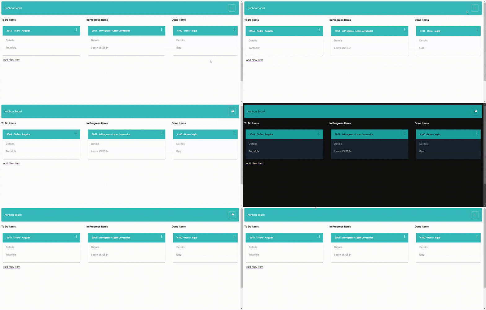
As I delved into PrimeNG and PrimeFlex for my recent Angular 17 standalone app with SSR, one aspect truly stood out: built-in themes. Unlike Material UI, PrimeNG offers a delightful selection of pre-built themes that you can easily configure within your application.
But the real cherry on top? Setting up a theme switcher to empower users to personalize their experience is a breeze with just a few lines of code. Let’s dive in!
Priming Your App for Themes:
Installation: Get started by installing PrimeNG using npm or yarn.
npm install primeng --save
Include Styles in angular.json:
Ensure your angular.json file includes the necessary styles. Below is my folder structure and its inclusion in angular.json.

In each stylesheet, I imported built-in PrimeNG Themes from resources.
 //angular.json
 "styles": [
              "src/styles.css",
              {
                "input": "src/app/styles/lara-dark-teal.scss",
                "bundleName": "lara-dark-teal",
                "inject": false
              },
              {
                "input": "src/app/styles/lara-light-teal.scss",
                "bundleName": "lara-light-teal",
                "inject": false
              }
            ],
This configuration guarantees the stylesheets are bundled into your final dist folder during build time.
- Setting the Default Theme (index.html):
Include Stylesheet: In your index.html file, incorporate the stylesheet for your chosen default theme and assign it an ID for service access:
<!doctype html>
<html lang="en">

<head>
  <meta charset="utf-8">
  <title>Theme Switcher</title>
  <base href="/">
  <meta name="viewport" content="width=device-width, initial-scale=1">
  <link rel="icon" type="image/x-icon" href="favicon.ico">
  <link id="app-theme" rel="stylesheet" type="text/css" href="lara-light-teal.css">

  <link rel="stylesheet" href="https://unpkg.com/primeflex@latest/primeflex.css">
</head>

<body class="">
  <app-root></app-root>
</body>
</html>
- Dynamic Theme Switching with a Service:
Create a Theme Service: Construct a service to manage theme changes. Inject it into your root component for application-wide accessibility:
//themes.service.ts
import { Inject, Injectable } from '@angular/core';
import { DOCUMENT } from '@angular/common';

@Injectable({
    providedIn: 'root',
})
export class ThemeService {

    constructor(@Inject(DOCUMENT) private document: Document) {}

    switchTheme(theme: string) {

        let themeLink = this.document.getElementById('app-theme') as HTMLLinkElement;

        if (themeLink) {
            themeLink.href = theme + '.css';
        }
    }
}
- Using the service inside Component:
Inject Service and Document: Within your component, inject the ThemeService and the Document object:
  constructor(private themeService: ThemeService) {

  }
  checked: boolean = false;

  changeTheme() {
    let theme = (this.checked) ? "lara-dark-teal" : "lara-light-teal"
    this.themeService.switchTheme(theme);

  }

}
Template with p-toggle: Utilize the p-toggle component from PrimeNG to render the toggle button. Bind its state to a boolean variable (checked) and trigger the changeTheme() method on click. Employ pi-icons (PrimeNG icons) for visual appeal.
<p-toolbar styleClass="bg-primary shadow-2  opacity-80">

    <div class="flex-grow">
        My Theme Switcher
    </div>
    <p-toggleButton styleClass="bg-primary shadow-2 text-white" [(ngModel)]="checked" onIcon="pi pi-sun"
        offIcon="pi pi-moon" (click)="changeTheme()" />

</p-toolbar>
Separation of Concerns: The service concentrates on theme management, keeping your component clean and focused.
Enhanced Readability: The code is well-structured and easy to comprehend for developers of all levels.
Developer Delight: PrimeNG streamlines the process, empowering you to craft a seamless theme-switching experience in your Angular 17 application.
The above is the detailed content of Effortless Theme Toggling in Angular Standalone Apps with PrimeNG. For more information, please follow other related articles on the PHP Chinese website!

Hot Article

Hot tools Tags

Hot Article

Hot Article Tags

Notepad++7.3.1
Easy-to-use and free code editor

SublimeText3 Chinese version
Chinese version, very easy to use

Zend Studio 13.0.1
Powerful PHP integrated development environment

Dreamweaver CS6
Visual web development tools

SublimeText3 Mac version
God-level code editing software (SublimeText3)

Hot Topics
 Replace String Characters in JavaScript
Mar 11, 2025 am 12:07 AM
Replace String Characters in JavaScript
 HTTP Debugging with Node and http-console
Mar 01, 2025 am 01:37 AM
HTTP Debugging with Node and http-console
 Custom Google Search API Setup Tutorial
Mar 04, 2025 am 01:06 AM
Custom Google Search API Setup Tutorial


