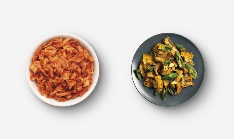

Recently, we faced the challenge of creating photorealistic shadows for the new project we are doing with Little Thai. After extensive research, we found that there wasn’t much information available. We set out to develop our own technique using the drop-shadow command in CSS, and the results have been spectacular. Today we want to share with the community how we achieved it, so that everyone can benefit from this advancement.
The requirements for this part of the development were clear; we needed photorealistic shadows for the products in the Little Thai store. Why? The idea was to create a digital showcase so that users could buy the products this company offers. The proposal idea was to show the products with a top-view perspective as if they were placed on a table. To make it more realistic, we needed these ingredients to have photorealistic shadows. At this point, there were two options. On the one hand, it could be done with Photoshop. This video explains how to do it that way. On the other hand, it could be done with CSS using the new drop-shadow command.
This was a challenge because, as we mentioned, there wasn’t information on how to make realistic shadows in Photoshop. However, this saved us from editing the dozens of products in the store in Photoshop and, moreover, not having to edit each time a new product was added. How was it done then?
The drop-shadow command in CSS is a powerful tool for adding shadows to graphic elements. However, its use is not always straightforward when seeking a photorealistic effect. Our solution is based on applying multiple shadows with different parameters to achieve a deeper and more realistic effect.
Here is the CSS code we used to create the photorealistic shadows:
filter: drop-shadow(17px 17px 13px rgba(0, 0, 0, 0.3)) drop-shadow(7px 7px 4.5px rgba(0, 0, 0, 0.3));
First drop-shadow: 17px 17px 13px rgba(0, 0, 0, 0.3): This shadow is the largest and most diffuse. The parameters indicate a shadow displaced 17px both on the X and Y axes, with a blur of 13px and an opacity of 30%.
Second drop-shadow: 7px 7px 4.5px rgba(0, 0, 0, 0.3): This shadow is smaller and less diffuse than the first. The parameters indicate a shadow displaced 7px both on the X and Y axes, with a blur of 4.5px and an opacity of 30%.
The combination of these two shadows creates a sense of depth and realism that is difficult to achieve with a single shadow.
Visual Example Here is a visual example of how the final result looks using our photorealistic shadow technique:
It is important to highlight two points:
— The shadow works best on a soft gray tone rather than pure white.
— In this case, the shadows are designed for the top-view perspective. In other photographic angles, it will not work well.
This technique can be used in a variety of contexts, from product images in online stores to graphic elements on corporate websites. The ability to create realistic shadows can significantly improve the visual appearance and perceived quality of a project.
You can find the online generator in MandarinaWebs Website
We are very excited to share this technique with the developer and designer community. We believe it can be a valuable tool for any professional looking to enhance the aesthetics of their web projects. We would love to hear your feedback and see how you apply this technique in your own work.
The above is the detailed content of Photorealistic Shadows in CSS with Drop-Shadow. For more information, please follow other related articles on the PHP Chinese website!
 Check the occupied port status in windows
 What are the parameters of marquee?
 Detailed explanation of linux dd command
 orientdb
 How to solve the problem that tomcat cannot display the page
 ChatGPT registration
 How to take screenshots on Huawei mobile phones
 Introduction to software development tools
 What are the office software


