

Flexbox, short for the Flexible Box Layout Module, is a powerful layout module in CSS that provides an efficient way to arrange and distribute space among items in a container, even when their size is unknown or dynamic. It is designed for one-dimensional layouts, meaning it works well for aligning items either in a row (horizontally) or a column (vertically).
Flexbox can be activated simply by using display: flex to your div container. This is create a main axis(horizontal rows) and a cross axis(vertical column) by default which are invisible until you add something to display.
<div class="container">
    <div class="item">1</div>
    <div class="item">2</div>
    <div class="item">3</div>
</div>
.container {
    display: flex;
}

For changing the flow of these axes — flex-direction and by default,
this is set to row
.container {
    display: flex;
    flex-direction: column;
}

To align the elements on the main axis, we use justify-contentproperty.By default, this is set to flex-start and items appear together at the beginning of the main axis.
.container {
    display: flex;
    justify-content: flex-start;
}

The default value of align-items is stretch which makes items stretch to fill the container on the cross-axis.
.container {
    display: flex;
    align-items: stretch;
}

The gap property controls the spacing between items, applying instant spacing between everything.
.container {
    display: flex;
    gap: 30px;
}

You can use flex-wrap: wrap` to let them gracefully flow onto new lines.
css
.container {
display: flex;
flex-wrap: wrap;
}
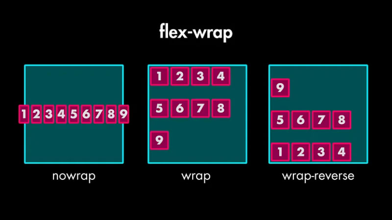
If you set flex-wrap to wrap, you unlock a new property — align-content` which lets you control the spacing of those wrapped lines.

You can use the align-self tool for overriding the align-items setting on the container, but just for a specific item.
.item:nth-child(3) {
    align-self: center;
}

It controls how much extra space an item should take up compared to its siblings.
.item:nth-child(1) {
    flex-grow: 0; // default value
}
.item:nth-child(2) {
    flex-grow: 1;
}
.item:nth-child(3) {
    flex-grow: 2;
}

It controls how much an item will shrink when there's not enough space.
.item:nth-child(1) {
    flex-shrink: 0;
}
.item:nth-child(6) {
    flex-shrink: 0;
}

This sets the initial size of an item before extra space is distributed.
.item:nth-child(4) {
    flex-basis: 50%;
}

Instead of writing flex-grow, flex-shrink, and flex-basis separately, you can use the super convenient flex shorthand property.
.item:nth-child(4) {
    flex: 1 0 0;
}
In this case, it sets flex-grow to 1, flex-shrink to 0, and flex-basis to 0.
we have the order property, which changes the visual order of the items. It takes a number, and lower numbers appear first.
.item:nth-child(1) {
    order: 1;
}
.item:nth-child(6) {
    order: -1;
}

Here is a Flex Box CheatSheet
The above is the detailed content of Flexbox Cheatsheet : Learn in Easy Way. For more information, please follow other related articles on the PHP Chinese website!


![[Web front-end] Node.js quick start](https://img.php.cn/upload/course/000/000/067/662b5d34ba7c0227.png)


