7 Things That Would Make Apple CarPlay Better
Quick Links
- CarPlay Mode for Older Vehicles
- A “Driving Stats” App
- Improved and Customizable Notifications
- Improvements to Apple Maps
- Better Apple Music Controls
- Better Internet Radio
- A Better Siri (Coming Soon)
CarPlay is one of those modern conveniences that, after you’ve come to rely on it, would be hard to live without. But Apple’s auto experience isn’t perfect, yet. Here’s how CarPlay could be better for everyone.
1 CarPlay Mode for Older Vehicles
Not everyone has a car that supports CarPlay, and even though it’s possible to add CarPlay to a vehicle this means paying the manufacturer’s unlock fee or replacing your car’s head unit. Not everyone can afford to go that route. It’s a lot cheaper to buy an iPhone mount than it is to overhaul the entertainment system.
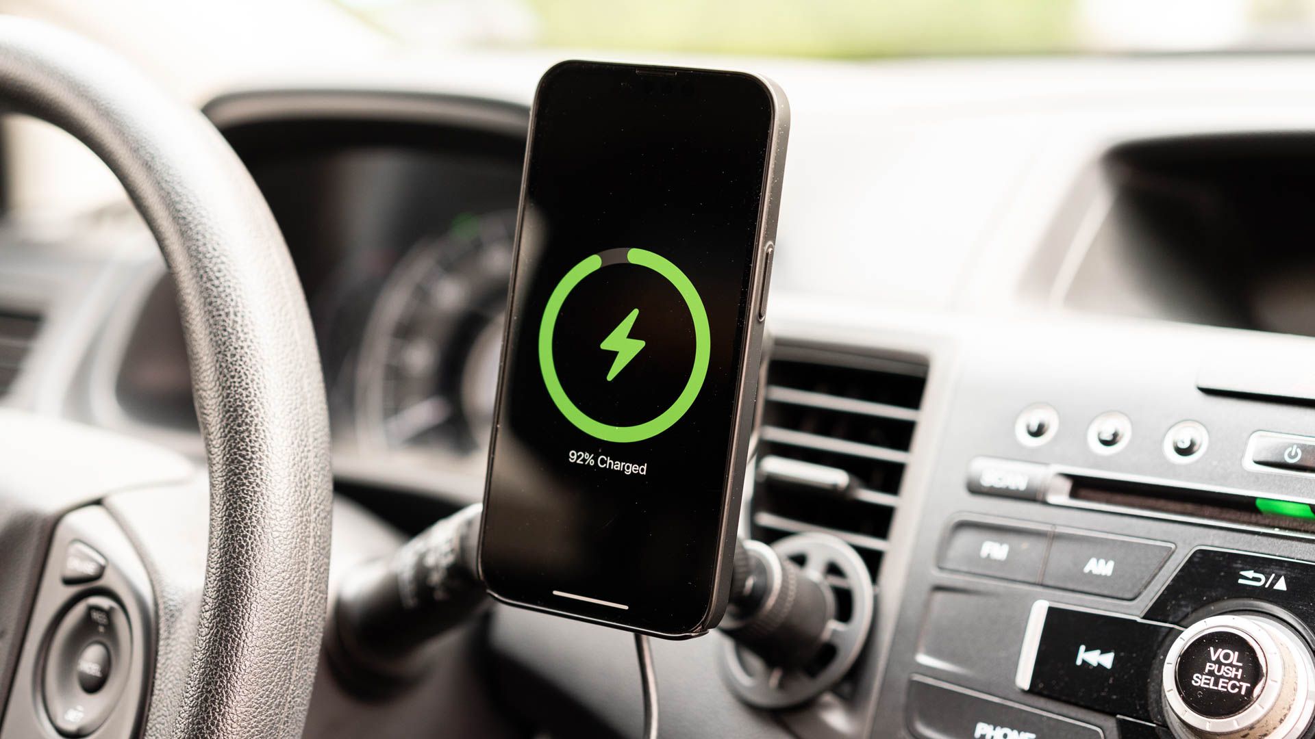
So why doesn’t Apple introduce “CarPlay Mode” for older vehicles? This could mirror the existing CarPlay interface, making it possible to use CarPlay directly on your iPhone rather than through a display on the center console. A major benefit to CarPlay is its simplified interface, with large buttons, minimal distractions, and quick access to common apps like maps, Messages, and entertainment.
You’d probably have to trigger the mode manually from Control Center. Savvy drivers could build an automation in Shortcuts that triggers the interface whenever the iPhone connects to a specific Bluetooth device (your old car is more likely to have wireless audio than Apple CarPlay or Android Auto, after all).
2 A “Driving Stats” App
Your iPhone has access to all sorts of information at any given time, including direction of travel, precise location and the name of the area you’re currently driving through, current elevation, and some approximation of your speed based on GPS data.
I’d love to see a simple, at-a-glance app that summarizes this information on a single screen. While driving around, you can ask Siri “Where am I?” and the assistant will give you an answer. In my car, I have to physically reach out to the touchscreen and hold a button to trigger Siri. I’d rather just glance at the screen instead.
A GPS speedometer would probably be more accurate than the one on your dashboard since your car’s speedometer is prone to mechanical errors (and often reports that you’re traveling faster than you really are). Navigation systems calculate speed based on how long it takes you to travel between two points, making them a more trustworthy indicator of actual speed.
GPS speedometers are available on the App Store, and some navigation apps, such as Google Maps, already include this feature. Your iPhone has a compass app that includes your elevation and bearing. Maps knows exactly where you are. A “Driving Stats” app could simply put this information into an interface that is easy to read at a glance.
3 Improved and Customizable Notifications
This could be a result of the low-resolution display on the older model of Volkswagen Golf that I drive, but CarPlay notifications don’t work quite how I’d like them to. Turn-by-turn directions appear at the bottom of the screen, frequently obscuring the “Home” button, scroll buttons in Maps, and even media controls.
They hang around long enough to be annoying, and there’s no way for me to move where they appear. I can’t “flick” them away since touching them opens the relevant app. This applies to other alerts, like “left behind” notifications sent by Find My or incoming Messages (which don’t actually display the message text).
The irony is that there’s very little happening at the top of the screen. The issue could be resolved with a toggle to move these elsewhere. I’d also like to see a setting that gives me an audio alert for notifications, even when my iPhone is on silent (it’s always on silent). If you miss the small pop-up while driving (and you should, because your eyes should be on the road) you’re none the wiser.
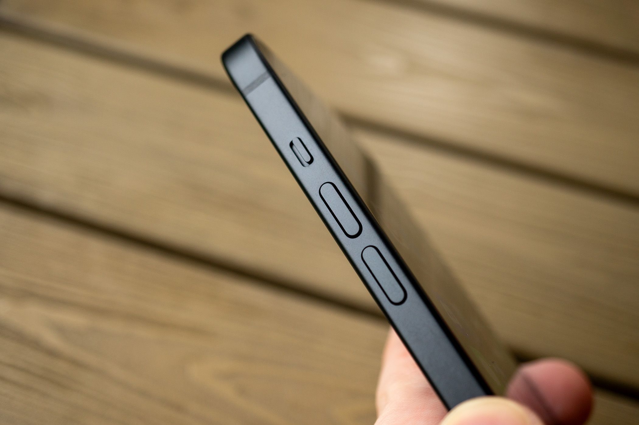
If you have an iPhone 15 or later that lacks the physical mute toggle, Apple has added a “Set Silent Mode” trigger in Shortcuts. You could use this to create a Shortcut that toggles mute, then create an Automation that uses connecting to CarPlay as the trigger. The rest of us have to remember to switch modes physically.
4 Improvements to Apple Maps
I use Apple Maps for navigation, but I have Google Maps and Waze installed as backup. I like the look of Apple’s navigation app, I have my favorite places saved, I keep an offline download for navigating my way out of rural areas, and accuracy is great for the part of Australia in which I live.
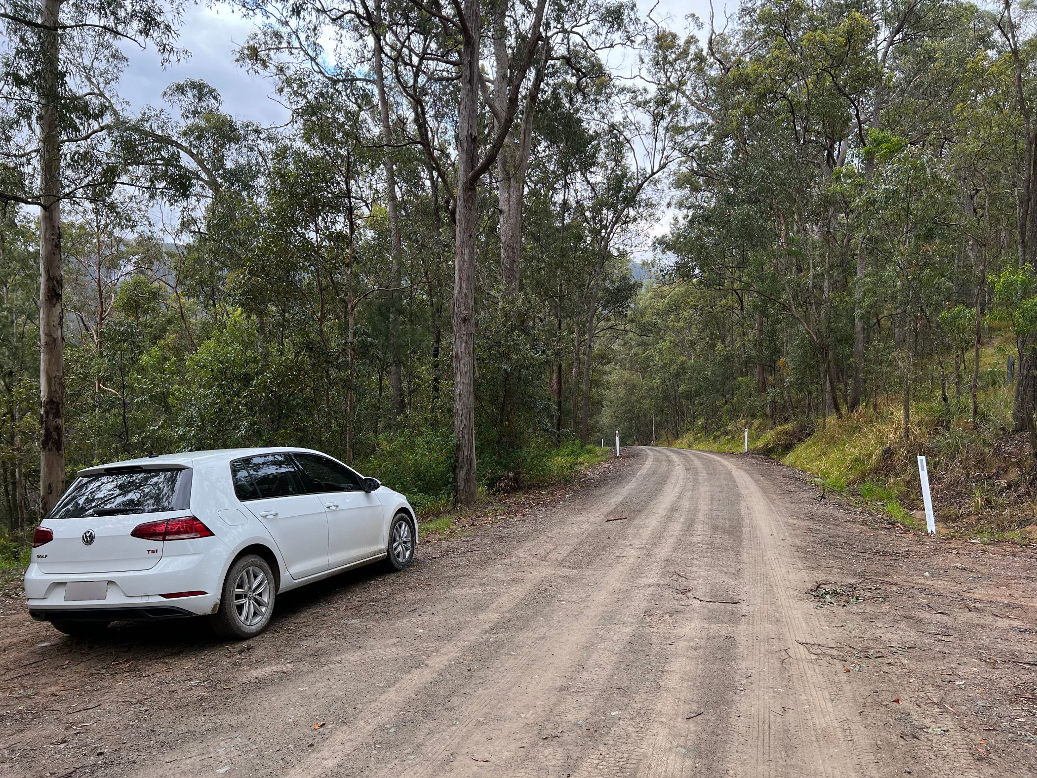
I find that Apple Maps has more up-to-date and detailed Street View imagery compared with Google, which makes it great for planning trips and scouting out destinations before I get in the car. Siri’s route suggestions are genuinely useful since I’m a creature of habit. But Maps could do with some improvements.
I’d love to see my current speed displayed alongside the current speed limit, which is a feature that Google now offers in its navigation app. But arguably the biggest change Apple should make is more detailed upcoming driving instructions.
I want to know that I need to cross two lanes of traffic to get into the right-turn lane before I’ve completed merging. Sometimes, Maps will put the next instruction directly beneath the current one when it thinks it’s necessary. I’d love an option to always display what’s coming up next since I’ve been caught out too many times.
The beauty of modern navigation systems is that they quickly course-correct and get you back on track, but I’d still rather have a bit more transparency. Zooming out on the Maps view can provide some help here, but I’d rather not be squinting at the map or scrolling around on the touchscreen when I’m supposed to be paying attention to the road.
5 Better Apple Music Controls
As an Apple Music subscriber, I’m mostly satisfied with how the service integrates with CarPlay. The limited interface means that you can’t do too much while you’re supposed to be concentrating on the road, but sometimes it feels a little too restrictive.
I can’t add a song to my most recent playlist from the Now Playing screen, for example. This could be a two-tap operation or a Siri command, but Apple said no. Similarly, I can tap on the album for the song that’s currently playing to see the full song list, but I can’t tap on the artist.
Despite this, I can navigate to the “Library” tab and scroll through every artist in my collection, select individual albums, and then see a song list. It’s a bizarre choice that makes picking another album more difficult than it should be.
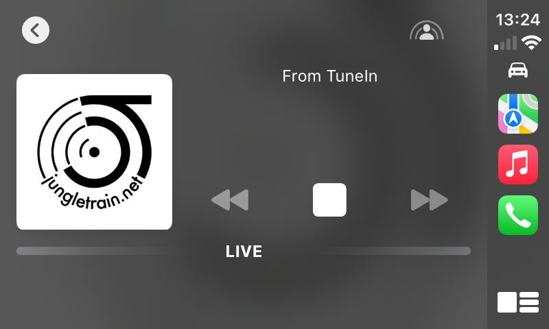
The Now Playing screen could also use some work. Why can’t I see the usual Apple Music tabs at the top of the screen, so I don’t have to tap “Back” to close Now Playing and then select the tab I want? Why can't I scrub through songs using the progress bar (the same is true in Apple’s Podcasts app)?
6 Better Internet Radio
Apple Music provides access to a lot of internet radio stations, some of them free, others through the included premium TuneIn service. Unfortunately, access to these stations within Apple Music is shockingly bad. I can’t find a way to “pin” a radio station so that I can easily access it in the car.
The best I’ve come up with so far is to listen to that station so that it appears in my “recently listened to” list. This means that I can tap on it when I’m in the car to bring it up. There’s no other way to quickly recall a station. You can flick through some stations using the “Browse” tab, but this is by no means exhaustive.
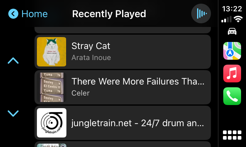
Anything would be better than the current situation. Apple made a brand new app just for classical music, so maybe it’s time for a separate internet radio app too.
7 A Better Siri (Coming Soon)
Siri is the safest way to interact with your iPhone when using CarPlay since it doesn’t involve taking your eyes off the road or touching a screen. Unfortunately, Siri is still pretty bad in iOS 17.
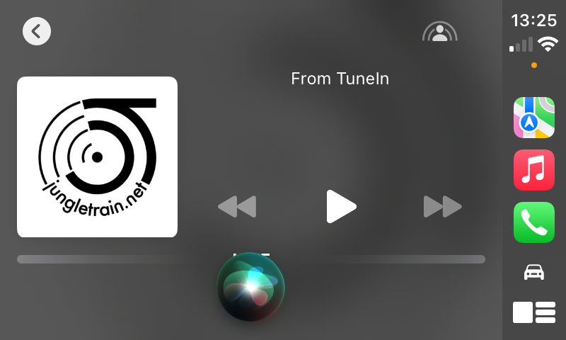
The good news is that Apple will be making some big improvements to Siri with the arrival of Apple Intelligence in iOS 18. The bad news is that not all iPhone owners will get access to Apple Intelligence. You’ll need an iPhone 15 Pro at least to get access to the new assistant.
The good news is that when you eventually upgrade your device, things will be appreciably better, and that should trickle down to the CarPlay experience too.
I wouldn’t buy a car without CarPlay again. The good news is that most cars that support CarPlay also support Android Auto. This is ideal if you happen to share a car with someone who doesn’t have an iPhone.
Like CarPlay, Google’s in-car experience is solid but Android Auto could use some work too.
Your changes have been saved
Email Is sent
Please verify your email address.
Send confirmation emailYou’ve reached your account maximum for followed topics.
Manage Your List Follow Followed Follow with Notifications Follow UnfollowThe above is the detailed content of 7 Things That Would Make Apple CarPlay Better. For more information, please follow other related articles on the PHP Chinese website!

Hot AI Tools

Undresser.AI Undress
AI-powered app for creating realistic nude photos

AI Clothes Remover
Online AI tool for removing clothes from photos.

Undress AI Tool
Undress images for free

Clothoff.io
AI clothes remover

Video Face Swap
Swap faces in any video effortlessly with our completely free AI face swap tool!

Hot Article

Hot Tools

Notepad++7.3.1
Easy-to-use and free code editor

SublimeText3 Chinese version
Chinese version, very easy to use

Zend Studio 13.0.1
Powerful PHP integrated development environment

Dreamweaver CS6
Visual web development tools

SublimeText3 Mac version
God-level code editing software (SublimeText3)

Hot Topics
 1664
1664
 14
14
 1421
1421
 52
52
 1315
1315
 25
25
 1266
1266
 29
29
 1239
1239
 24
24
 We Don't Need Slimmer Phones, But You Might Want One Anyway
Apr 13, 2025 am 03:01 AM
Ultra-thin phones: Amazing design or risky? Samsung and Apple are about to release ultra-thin flagship phones Samsung Galaxy S25 Edge and Apple iPhone 17 Air are about to be released, and its ultra-thin design has sparked heated discussions. While many fans are concerned about their design compromises, ultra-thin phones still have some attractive advantages. Ultra-thin design: how much does it cost? First of all, these devices are expensive. Ultra-thin design requires custom parts and improved manufacturing processes, greatly increasing costs and ultimately passing them on to consumers. While prices may change at any time, reliable news shows that the iPhone 17 Air may be priced the same as the $899 iPhone Plus, or even likely to completely replace the latter; while the S25 Edge
 Don't Like the Latest Apple Mail Changes? Here's How to Get Rid of Them
Apr 14, 2025 am 12:54 AM
New features of Apple Mail app: Categories, Summary, and Contact Photos The Apple Mail app recently updated its iPhone, iPad and Mac versions, adding features like Gmail-like email classification, notifications and email summary, and contact photos in your inbox. But not everyone likes these new changes. Fortunately, you can disable these new features and restore to a simpler way to use them. Here's how to do it: Disable Apple Mail Classification The email classification feature is designed to sort your inboxes to make it easier to process incoming messages. This feature is suitable for any device running iOS or iPadOS 18.2 and Mac computers with macOS 15.4 installed. Categories include: Main: Mail thinks the most
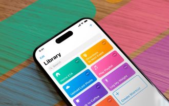 Fix the Wait Limit in iPhone Shortcuts With This Simple Trick
Apr 11, 2025 am 03:05 AM
Apple's Shortcuts app offers a "Wait" action for short pauses, but it's unreliable for longer durations. This limitation stems from iOS's background app restrictions. A clever workaround uses custom Focus modes to achieve extended waits,
 Is the iPhone 17 released?
Apr 09, 2025 am 12:07 AM
The iPhone 17 has not been released yet and is expected to debut in the fall of 2025. 1. Performance improvement: It may be equipped with a more powerful A17 chip. 2. Camera improvement: Possibly improve pixels and sensors, and advance ProRAW and ProRes formats. 3. Design changes: It may adopt a narrower or borderless design, using new materials. 4. New features are introduced: There may be breakthroughs in health monitoring and AR.
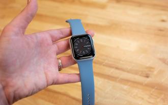 The Apple Watch Is 10 Years Old. Here's Why I Never Bought One
Apr 15, 2025 am 06:09 AM
The Apple Watch: Still Not Convinced After a Decade Despite over 200 million units sold since 2015, the Apple Watch remains absent from my wrist. While its health and fitness features are impressive, they don't appeal to someone like me who doesn't
 Word on iPhone Can Turn Your Voice Notes Into Documents
Apr 22, 2025 am 03:02 AM
Microsoft Word for iOS now transforms your voice notes into fully formatted documents using Copilot AI. This latest enhancement simplifies document creation on mobile devices. To access this feature, tap the "New" button ( ), select "U
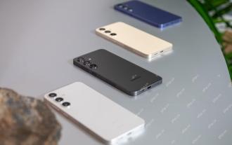 Smartphones Are Boring Now and It's Our Fault
Apr 23, 2025 am 03:06 AM
The golden age of smartphones has passed? Future Outlook Technology enthusiasts often complain that modern mobile phones are the same and lack of innovation. Although manufacturers are to blame, we also play an important role. Let us review the development history of smartphones and explore the causes of the current situation. The Golden Age of Smartphones In 1973, Motorola engineer Martin Cooper made historic calls with the DynaTAC 8000X on the streets of New York. This "brick" phone opened the era of wireless networks. Nearly 20 years later, IBM Simon was released, becoming the world's first smartphone, equipped with a resistive touch screen and simple applications. Today, although it is a hundred times more powerful, the core function of modern smartphones is still used as an application portal. Early innovation slows down
 The Best iPads of 2025
Apr 18, 2025 am 01:01 AM
Choosing the Right iPad: A Comprehensive Guide Apple's iPad lineup offers a tablet for every need, but selecting the perfect one can be overwhelming. This guide simplifies the process, helping you choose the ideal iPad based on your specific requirem


