New York Recreational Cricket League Website Project
This is a submission for Frontend Challenge v24.07.24, CSS Art: Recreation.
Inspiration
Creating a website for the New York Recreational Cricket League was a fantastic opportunity to combine my passion for web development with the vibrant spirit of recreational sports. I aimed to create a lively and engaging online presence that reflects the community and enthusiasm around cricket.
Demo
You can view the live site https://vickyfyn3.github.io/new-york/. Below are some screenshots showcasing various sections of the website:

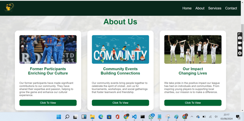
Home Page

About Section

Services Section

Contact Section

Journey
The journey of building the New York Recreational Cricket League website involved several key steps and learning experiences:
Planning and Design
I began by outlining the core sections of the website: Home, About, Services, and Contact Us. My goal was to ensure the site was user-friendly, visually appealing, and aligned with the league's dynamic nature. I used Font Awesome for icons and designed a responsive navigation bar that enhances the user experience.
Building with Flexbox
For the About section, I implemented Flexbox to display the cards in a row, making the design more cohesive and engaging. This approach allowed for a responsive layout that adapts well to different screen sizes.
Theming and Styling
Ensuring consistency in the color scheme and design elements was crucial. I carefully selected colors and styles that reflect the energetic and welcoming environment of the cricket league. I also used the fa-dumbbell Font Awesome icon to creatively represent cricket training in the Services section.
Enhancing the Contact Section
To make the Contact section stand out, I designed a stylish contact form with fields for Name, Email, Subject, and Message. I used a bold Submit button with a gradient background for a modern touch. Additionally, I included contact details in a card layout with distinct backgrounds and embedded an interactive map for easy location access.
Challenges and Solutions
One of the challenges was ensuring the navbar remained fixed while scrolling. I achieved this by using CSS properties:
.navbar {
    position: fixed;
    top: 0;
    left: 0;
    width: 100%;
    z-index: 1000;
    background-color: #333;
    color: #fff;
    display: flex;
    align-items: center;
    justify-content: space-between;
    padding: 1rem;
}
Additionally, I adjusted the content below the navbar to prevent it from being hidden:
.content {
    margin-top: 60px; /* Adjust based on the height of your navbar */
}
Future Plans
Moving forward, I plan to add more interactive features and further optimize the website for performance. I also hope to gather feedback from the cricket league community to continuously improve the site.
The above is the detailed content of New York Recreational Cricket League Website Project. For more information, please follow other related articles on the PHP Chinese website!

Hot AI Tools

Undresser.AI Undress
AI-powered app for creating realistic nude photos

AI Clothes Remover
Online AI tool for removing clothes from photos.

Undress AI Tool
Undress images for free

Clothoff.io
AI clothes remover

Video Face Swap
Swap faces in any video effortlessly with our completely free AI face swap tool!

Hot Article

Hot Tools

Notepad++7.3.1
Easy-to-use and free code editor

SublimeText3 Chinese version
Chinese version, very easy to use

Zend Studio 13.0.1
Powerful PHP integrated development environment

Dreamweaver CS6
Visual web development tools

SublimeText3 Mac version
God-level code editing software (SublimeText3)

Hot Topics
 1664
1664
 14
14
 1421
1421
 52
52
 1316
1316
 25
25
 1266
1266
 29
29
 1239
1239
 24
24
 Google Fonts Variable Fonts
Apr 09, 2025 am 10:42 AM
I see Google Fonts rolled out a new design (Tweet). Compared to the last big redesign, this feels much more iterative. I can barely tell the difference
 How to Create an Animated Countdown Timer With HTML, CSS and JavaScript
Apr 11, 2025 am 11:29 AM
Have you ever needed a countdown timer on a project? For something like that, it might be natural to reach for a plugin, but it’s actually a lot more
 HTML Data Attributes Guide
Apr 11, 2025 am 11:50 AM
Everything you ever wanted to know about data attributes in HTML, CSS, and JavaScript.
 A Proof of Concept for Making Sass Faster
Apr 16, 2025 am 10:38 AM
At the start of a new project, Sass compilation happens in the blink of an eye. This feels great, especially when it’s paired with Browsersync, which reloads
 How We Created a Static Site That Generates Tartan Patterns in SVG
Apr 09, 2025 am 11:29 AM
Tartan is a patterned cloth that’s typically associated with Scotland, particularly their fashionable kilts. On tartanify.com, we gathered over 5,000 tartan
 How to Build Vue Components in a WordPress Theme
Apr 11, 2025 am 11:03 AM
The inline-template directive allows us to build rich Vue components as a progressive enhancement over existing WordPress markup.
 PHP is A-OK for Templating
Apr 11, 2025 am 11:04 AM
PHP templating often gets a bad rap for facilitating subpar code — but that doesn't have to be the case. Let’s look at how PHP projects can enforce a basic
 A Comparison of Static Form Providers
Apr 16, 2025 am 11:20 AM
Let’s attempt to coin a term here: "Static Form Provider." You bring your HTML


