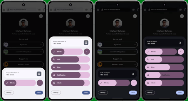
In the latest Android 15 developer preview, Google has brought a new volume adjustment panel design. This design has obvious changes compared with the previous version:
- The newly designed slider form: from a slender bar to a thick bar, supports one-click mute function.
- Media Slider: The media slider will only appear when there is content playing on the device; if there is no media playing, all five controls will appear.
- The dot at the end of each slider: used to indicate the maximum volume for each option.
- New properties: Evidence of properties such as Noise Control and Spatial Audio were also found in the redesigned volume panel, but these features are not currently enabled.
- Auto-positioned text: Text automatically adjusts position as the user increases or decreases the volume, ensuring the name is always visible.
Overall, this new design brings a more intuitive and convenient operating experience to users.
The above is the detailed content of Android 15 new design: The volume adjustment panel has undergone major changes. For more information, please follow other related articles on the PHP Chinese website!


