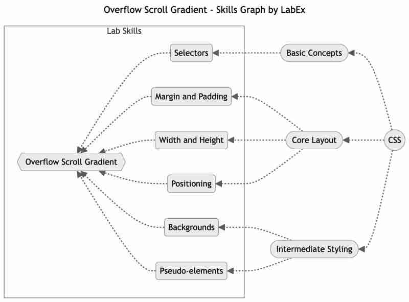
This article covers the following tech skills:

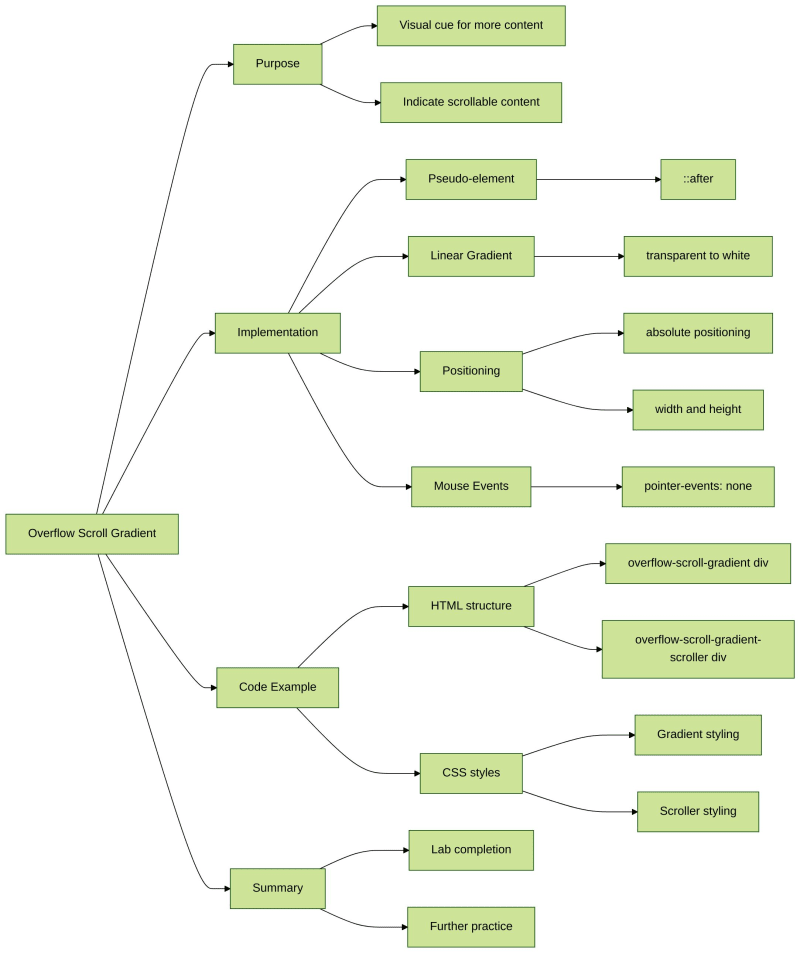
In this lab, we will learn how to add a fading gradient to an overflowing element using CSS. The purpose of this lab is to create a visual cue for users that there is more content to be scrolled. By using the ::after pseudo-element and linear-gradient() function, we can create a gradient that fades from transparent to white, indicating that there is additional content to be viewed.
index.html and style.css have already been provided in the VM.
To add a fading gradient to an overflowing element and indicate that there is more content to be scrolled, follow these steps:
Here is an example HTML and CSS code snippet:
<div class="overflow-scroll-gradient">
  <div class="overflow-scroll-gradient-scroller">
    Lorem ipsum dolor sit amet consectetur adipisicing elit. <br />
    Iure id exercitationem nulla qui repellat laborum vitae, <br />
    molestias tempora velit natus. Quas, assumenda nisi. <br />
    Quisquam enim qui iure, consequatur velit sit? <br />
    Lorem ipsum dolor sit amet consectetur adipisicing elit.<br />
    Iure id exercitationem nulla qui repellat laborum vitae, <br />
    molestias tempora velit natus. Quas, assumenda nisi. <br />
    Quisquam enim qui iure, consequatur velit sit?
  </div>
</div>
.overflow-scroll-gradient {
  position: relative;
}

.overflow-scroll-gradient::after {
  content: "";
  position: absolute;
  bottom: 0;
  width: 250px;
  height: 25px;
  background: linear-gradient(transparent, white);
  pointer-events: none;
}

.overflow-scroll-gradient-scroller {
  overflow-y: scroll;
  background: white;
  width: 240px;
  height: 200px;
  padding: 15px;
  line-height: 1.2;
}
Please click on 'Go Live' in the bottom right corner to run the web service on port 8080. Then, you can refresh the Web 8080 Tab to preview the web page.
Congratulations! You have completed the Overflow Scroll Gradient lab. You can practice more labs in LabEx to improve your skills.

? Practice Now: Overflow Scroll Gradient
The above is the detailed content of Mastering Overflow Scroll Gradient with CSS. For more information, please follow other related articles on the PHP Chinese website!


