

The Solar System has been done in CSS a lot of times — just search Codepen! So why do it again?
Because things get better and simpler — and we can now do a responsive solar system with just a few lines of CSS.
Let's start with some very basic markup:
<ol>
  <li class="sun"></li>
  <li class="mercury"></li>
  <li class="venus"></li>
  <li class="earth"></li>
  <li class="mars"></li>
  <li class="jupiter"></li>
  <li class="saturn"></li>
  <li class="uranus"></li>
  <li class="neptune"></li>
</ol>
We use an ordered list, because the planets are in order.
Next, we unset the default
ol {
  all: unset;
  aspect-ratio: 1 / 1;
  container-type: inline-size;
  display: grid;
  width: 100%;
}
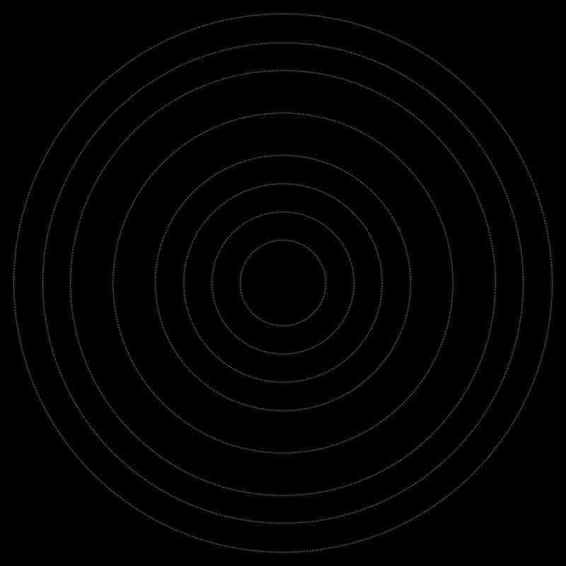
Now, for the planet trajectories, we're going to use a "grid stack". Instead of position: absolute, and a bunch of translations, we can simply stack all the grid items with:
li {
  grid-area: 1 / -1;
  place-self: center;
}
By setting a --d-variable (for diameter) per planet, using width: var(--d);, we get:
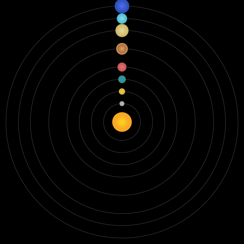
Cool! Let's add the planets using an ::after pseudo-element:
li::after {
  aspect-ratio: 1 / 1;
  background: var(--b);
  border-radius: 50%;
  content: '';
  display: block;
  width: var(--w, 2cqi);
}
Let's ask ChatGPT to generate some nice radial-gradents for each planet — and while we're at it, let's tell it we're creating the Solar System and ask for planetary sizes between 1 and 6cqi — not completely accurate, but still maintaining a sizeable, recognizable difference:
.mercury {
  --b: radial-gradient(circle, #c2c2c2 0%, #8a8a8a 100%);
  --w: 2.0526cqi;
}

.venus {
  --b: radial-gradient(circle, #f4d03f 0%, #c39c43 100%);
  --w: 2.6053cqi;
}

.earth {
  --b: radial-gradient(circle, #3a82f7 0%, #2f9e44 80%, #1a5e20 100%);
  --w: 3.1579cqi;
}

.mars {
  --b: radial-gradient(circle, #e57373 0%, #af4448 100%);
  --w: 3.7105cqi;
}

.jupiter {
  --b: radial-gradient(circle, #d4a373 0%, #b36d32 50%, #f4e7d3 100%);
  --w: 4.8158cqi;
}

.saturn {
  --b: radial-gradient(circle, #e6dba0 0%, #c2a13e 100%);
  --w: 5.3684cqi;
}

.uranus {
  --b: radial-gradient(circle, #7de3f4 0%, #3ba0b5 100%);
  --w: 4.2632cqi;
}

.neptune {
  --b: radial-gradient(circle, #4c6ef5 0%, #1b3b8c 100%);
  --w: 6cqi;
}
And now we have:
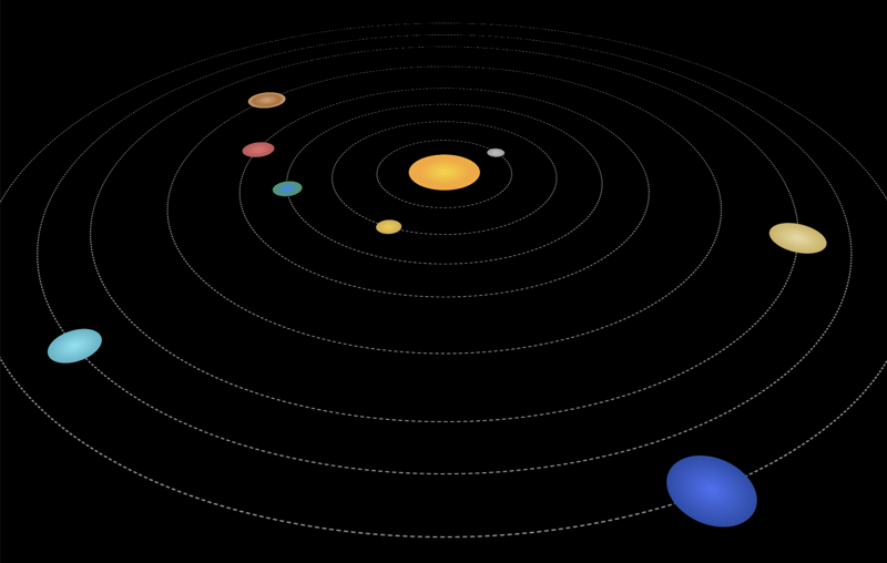
To animate the planets with different trajectory speeds, we add:
li::after {
  /* previous styles */
  animation: rotate var(--t, 3s) linear infinite;
  offset-path: content-box;
}
Notice the offset-path. That's the key to simplifying the trajectory-animations, because all we have to do to move the planet along the shape of the
@keyframes rotate {
  to {
    offset-distance: 100%;
  }
}
And that's all! I asked ChatGPT to calculate the timings based on "Neptune", with a rotation-speed of 20s — and we get:
With just a few rules, we created a simple 2d version of the Solar System in pure CSS. If you want to dive deeper, you can:
... and maybe use matrix3d to "re-flatten" the planets?
Happy coding!
The above is the detailed content of The Solar System in CSS. For more information, please follow other related articles on the PHP Chinese website!


![[Web front-end] Node.js quick start](https://img.php.cn/upload/course/000/000/067/662b5d34ba7c0227.png)


