Six Tailwind CSS Utility Classes to Enhance Your Productivity
Tailwind CSS is one of the popular CSS frameworks that offers many classes. This classes helps to streamline and enhance web development workflows. Among the vast array of classes are some that developers have probably yet to hear of, underestimated, or are relatively new.
These classes possess immense potential to streamline development workflows, enhance the aesthetics of web interfaces, and boost productivity.
In this tutorial, we will examine six of these classes: the container class, size utility, space utility, line-clamp utility, ring utility, and truncate utility. We'll use Tailwind's CDN for this tutorial.
Container class
The container class allows you to create a container that scales its size based on your browser. It is designed to set an element's max-width to match the min-width of the current breakpoint, making it responsive to different screen sizes.
This responsiveness is achieved by adjusting the container's width based on the viewport size, ensuring that the content within the container is displayed appropriately across various devices.
To elaborate, Tailwind CSS uses a set of predefined breakpoints, such as sm, MD, lg, xl, 2xl, that correspond to specific minimum widths. These breakpoints apply different styles to different screen sizes, making it easier to create a responsive design without having to write custom media queries.
The container class leverages these breakpoints to adjust its max-width accordingly, ensuring that the content within the container scales and adapts to the browser's viewport size.
This ensures that your content is responsive and looks good on all devices without needing to write custom CSS for each breakpoint. It saves time by providing a consistent layout structure across your project.
Below is an example that demonstrates the container class:
<div class="container mx-auto px-4 border-2 border-gray-300 rounded-lg">
  <h1 class="text-4xl font-bold mb-4">Container Class</h1>
  <p class="text-lg">
    This is a demonstration of the container class in Tailwind CSS. The
    container is centered and scales its size based on the viewport size.
  </p>
  <div class="mt-8">
    <button
      class="bg-blue-500 hover:bg-blue-700 text-white font-bold py-2 px-4 rounded"
    >
      Click Me
    </button>
  </div>
</div>
When you check the result in your browser, you should have something like this:

You’ll see that the container's width will automatically adjust based on the current breakpoint, ensuring that the content is displayed appropriately across various devices.
Size utility
The size utility allows you to control an element's width and height simultaneously. This feature is particularly useful for creating square elements or ensuring that elements have consistent dimensions across your project.
The size utility provides a variety of options, including fixed pixel sizes like size-48 for a specific pixel size, and predefined sizes from your Tailwind setup, such as size-2, which applies a width and height based on the scale defined in your Tailwind configuration.
Here’s how you can use the size utility:
<div class="container mx-auto px-4 py-8">
  <div class="grid grid-cols-3 gap-1">
    <div class="size-48 bg-green-500 flex items-center justify-center">
      <p class="text-white text-2xl font-semibold">Size 48</p>
    </div>
    <div class="size-64 bg-blue-500 flex items-center justify-center">
      <p class="text-white text-2xl font-semibold">Size 64</p>
    </div>
    <div class="size-80 bg-red-500 flex items-center justify-center">
      <p class="text-white text-2xl font-semibold">Size 80</p>
    </div>
  </div>
</div>
For the first box, the size-48 sets both width and height to 48 of the spacing scale. The second and third boxes follow a similar structure, with size-64 and size-80classes intended to set their sizes.
When you check the result in your browser, you should have something like this:

Space utility
The space utility is designed to control the spacing between elements, making it easier to create visually appealing layouts with consistent spacing.
Tailwind provides two primary classes for managing space: space-x for horizontal spacing and space-y for vertical spacing. These classes can be applied to a container element to automatically apply spacing between its direct child elements.
This is crucial for maintaining consistent spacing throughout your design. It saves time by eliminating the need to write custom CSS for spacing, allowing you to focus on other aspects of your design.
Below is an example of how to use the space utility to add horizontal spacing between buttons within a flex container:
<div class="container mx-auto px-4 py-8">
  <div class="grid grid-cols-3 gap-4">
    <div
      class="p-6 max-w-sm mx-auto bg-white rounded-xl shadow-lg flex flex-col items-center space-y-4"
    >
      <div>
        <p class="text-xl text-black font-medium">Card 1 Title</p>
        <p class="text-base text-gray-500">
          Card 1 description or additional information.
        </p>
      </div>
    </div>
    <div
      class="p-6 max-w-sm mx-auto bg-white rounded-xl shadow-lg flex flex-col items-center space-y-4"
    >
      <div>
        <p class="text-xl text-black font-medium">Card 2 Title</p>
        <p class="text-base text-gray-500">
          Card 2 description or additional information.
        </p>
      </div>
    </div>
    <div
      class="p-6 max-w-sm mx-auto bg-white rounded-xl shadow-lg flex flex-col items-center space-y-4"
    >
      <div>
        <p class="text-xl text-black font-medium">Card 3 Title</p>
        <p class="text-base text-gray-500">
          Card 3 description or additional information.
        </p>
      </div>
    </div>
  </div>
</div>
In the code above, the space-y-4 utility applies vertical spacing between the child elements of each card, thereby creating consistent spacing elements inside each card.
When you check the result in your browser, you should have something like this:

Line-clamp utility
The line-clamp utility is a powerful tool for controlling text overflow. It helps by visually truncating text after a fixed number of lines. It is particularly useful for maintaining a clean and uniform layout, especially when dealing with dynamic content that might exceed the desired display area.
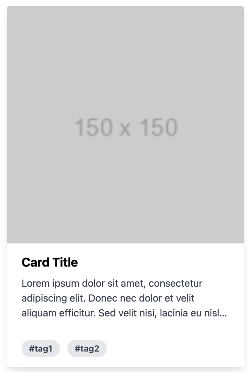
Below is an example of a card that uses the line-clamp utility to control text:
<div class="max-w-sm rounded overflow-hidden shadow-lg m-4">
  <img class="w-full" src="https://via.placeholder.com/150" alt="Card image" />
  <div class="px-6 py-4">
    <div class="font-bold text-xl mb-2">Card Title</div>
    <p class="text-gray-700 line-clamp-3">
      Lorem ipsum dolor sit amet, consectetur adipiscing elit. Donec nec dolor
      et velit aliquam efficitur. Sed velit nisi, lacinia eu nisl id, lacinia
      lacinia nisl.
    </p>
  </div>
  <div class="px-6 pt-4 pb-2">
    <span
      class="inline-block bg-gray-200 rounded-full px-3 py-1 text-sm font-semibold text-gray-700 mr-2 mb-2"
      >#tag1</span
    >
    <span
      class="inline-block bg-gray-200 rounded-full px-3 py-1 text-sm font-semibold text-gray-700 mr-2 mb-2"
      >#tag2</span
    >
  </div>
</div>
The description text is controlled using the line-clamp-3 class, which limits the text to three lines. If the text exceeds three lines, it will be truncated, and an ellipsis will be added to indicate the truncation.
This ensures that the card remains visually clean and that users can quickly understand the content without being overwhelmed by too much text.
When you check the result in your browser, you should have something like this:
Ring utility
The ring utility is used to apply a border around an element. It also provides a way to add outline shadows or focus rings to elements. This is a nice alternative to the older shadow-outline and shadow-xs classes, allowing for more customizable focus states.
It enhances the user experience by providing visual feedback on interactive elements, such as buttons or input fields, without the need for custom CSS. The ring utility is highly customizable, allowing you to control the width, color, and opacity of the ring.
Below is an example of how you can use the ring utility:
<div class="bg-black min-h-screen flex items-center justify-center">
  <div class="flex flex-col items-center space-y-4">
    <button
      class="bg-blue-500 text-white px-4 py-2 rounded ring-2 ring-blue-300 border border-white hover:ring-blue-500 mr-2 focus:ring-4 focus:ring-blue-500"
    >
      Button 1
    </button>
    <button
      class="bg-green-500 text-white px-4 py-2 rounded ring-2 ring-green-300 border border-white hover:ring-green-500 mr-2 focus:ring-4 focus:ring-green-500"
    >
      Button 2
    </button>
    <button
      class="bg-red-500 text-white px-4 py-2 rounded ring-2 ring-red-300 border border-white hover:ring-red-500 mr-2 focus:ring-4 focus:ring-red-500"
    >
      Button 3
    </button>
  </div>
</div>
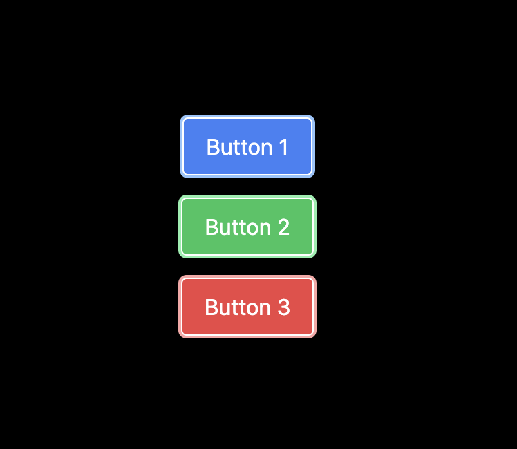
In the code above, the ring utility is used to apply a ring outline around the button elements, which can be customized in terms of width and color.
Additionally, it's combined with other utilities to change the ring's appearance based on different states, such as hover or focus.
This approach allows for interactive and accessible designs by providing visual feedback to users when they interact with the buttons.
When you check the result in your browser, you should have something like this:
Truncate utility
The truncate utility is one of Tailwind's text overflow utilities used to truncate text that overflows its container by hiding the extra content and replacing it with an ellipsis (...).
This ensures that text does not spill out of its designated area, maintaining a clean and professional appearance. It saves time by preventing layout issues caused by overflowing text.
Below is an example showing how to use the truncate utility:
<div class="w-full max-w-lg bg-white shadow-lg rounded-lg p-6 mt-10">
  <h2 class="text-2xl font-bold mb-4">Card Title</h2>
  <p class="truncate">
    Lorem ipsum dolor sit amet, consectetur adipiscing elit. Sed euismod, nunc
    at cursus pellentesque, nisl eros pellentesque quam, a faucibus nisl nunc id
    nisl.
  </p>
</div>
The truncate class is applied to the
tag to truncate the text with an ellipsis if it overflows its container.
When you check the result in your browser, you should have something like this:

And that's a wrap!
Conclusion
In this article, we examined six utility classes that can boost productivity and provided an example for each.
Understanding these utility classes can help you focus more on creating unique and functional designs rather than spending excessive time on repetitive CSS coding tasks.
The above is the detailed content of Six Tailwind CSS Utility Classes to Enhance Your Productivity. For more information, please follow other related articles on the PHP Chinese website!

Hot AI Tools

Undresser.AI Undress
AI-powered app for creating realistic nude photos

AI Clothes Remover
Online AI tool for removing clothes from photos.

Undress AI Tool
Undress images for free

Clothoff.io
AI clothes remover

Video Face Swap
Swap faces in any video effortlessly with our completely free AI face swap tool!

Hot Article

Hot Tools

Notepad++7.3.1
Easy-to-use and free code editor

SublimeText3 Chinese version
Chinese version, very easy to use

Zend Studio 13.0.1
Powerful PHP integrated development environment

Dreamweaver CS6
Visual web development tools

SublimeText3 Mac version
God-level code editing software (SublimeText3)

Hot Topics
 Vue 3
Apr 02, 2025 pm 06:32 PM
It's out! Congrats to the Vue team for getting it done, I know it was a massive effort and a long time coming. All new docs, as well.
 Building an Ethereum app using Redwood.js and Fauna
Mar 28, 2025 am 09:18 AM
With the recent climb of Bitcoin’s price over 20k $USD, and to it recently breaking 30k, I thought it’s worth taking a deep dive back into creating Ethereum
 Can you get valid CSS property values from the browser?
Apr 02, 2025 pm 06:17 PM
I had someone write in with this very legit question. Lea just blogged about how you can get valid CSS properties themselves from the browser. That's like this.
 Stacked Cards with Sticky Positioning and a Dash of Sass
Apr 03, 2025 am 10:30 AM
The other day, I spotted this particularly lovely bit from Corey Ginnivan’s website where a collection of cards stack on top of one another as you scroll.
 A bit on ci/cd
Apr 02, 2025 pm 06:21 PM
I'd say "website" fits better than "mobile app" but I like this framing from Max Lynch:
 Using Markdown and Localization in the WordPress Block Editor
Apr 02, 2025 am 04:27 AM
If we need to show documentation to the user directly in the WordPress editor, what is the best way to do it?
 Comparing Browsers for Responsive Design
Apr 02, 2025 pm 06:25 PM
There are a number of these desktop apps where the goal is showing your site at different dimensions all at the same time. So you can, for example, be writing
 Why are the purple slashed areas in the Flex layout mistakenly considered 'overflow space'?
Apr 05, 2025 pm 05:51 PM
Questions about purple slash areas in Flex layouts When using Flex layouts, you may encounter some confusing phenomena, such as in the developer tools (d...


