

And the Oscar Goes to … Coding a Chronology Component

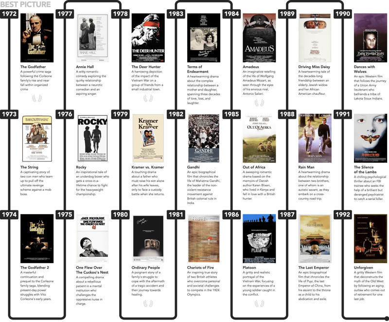
Earlier this year, a friend of mine shared a massive poster he had been working on for the Copenhell festival in Copenhagen, Denmark. The poster, an impressive 2 x 12 meters, showcased a detailed chronology of significant cultural events from the past 50 years, with a particular focus on heavy metal rock — fitting, as Copenhell is a festival dedicated to that genre!
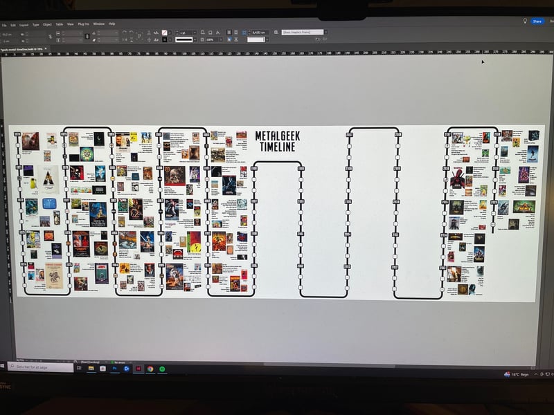
I really loved the design — which featured a unique "snake timeline" layout. Inspired by this, I decided to create my own version using HTML and CSS, but with a twist — focusing on the "Best Picture" Oscar winners from 1972 onwards… and yes, I've seen them all!
Let's start by creating some semantic markup. This HTML will provide the structure for our timeline and will look good even without any CSS styling applied:
<ol>
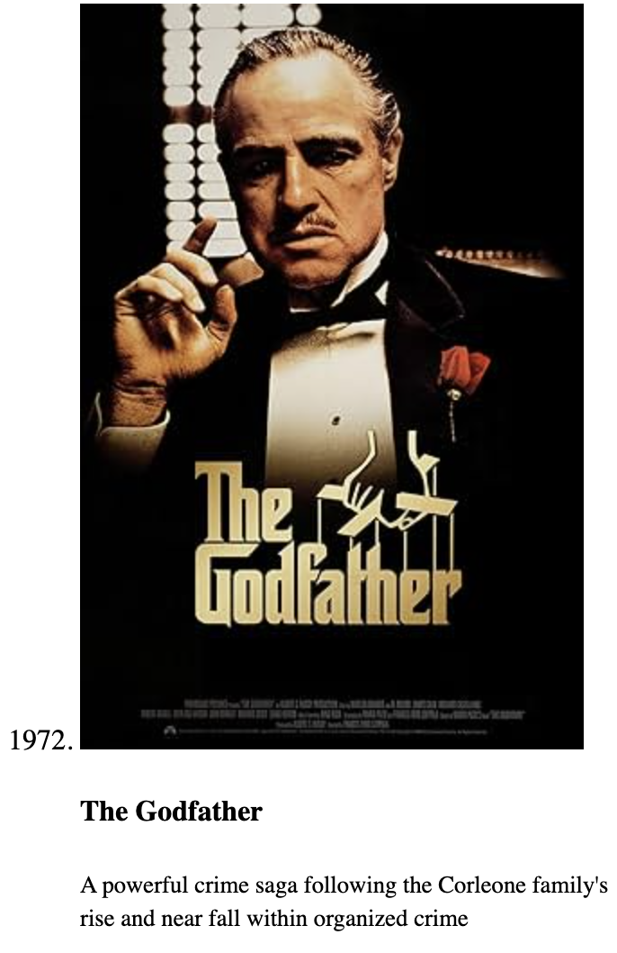
<li value="1972">
<article>
<img src="1972.jpg" alt="The Godfather">
<h4>The Godfather</h4>
<small>A powerful crime saga following the Corleone family's rise and near fall within organized crime</small>
</article>
</li>
</ol>
... and we get:
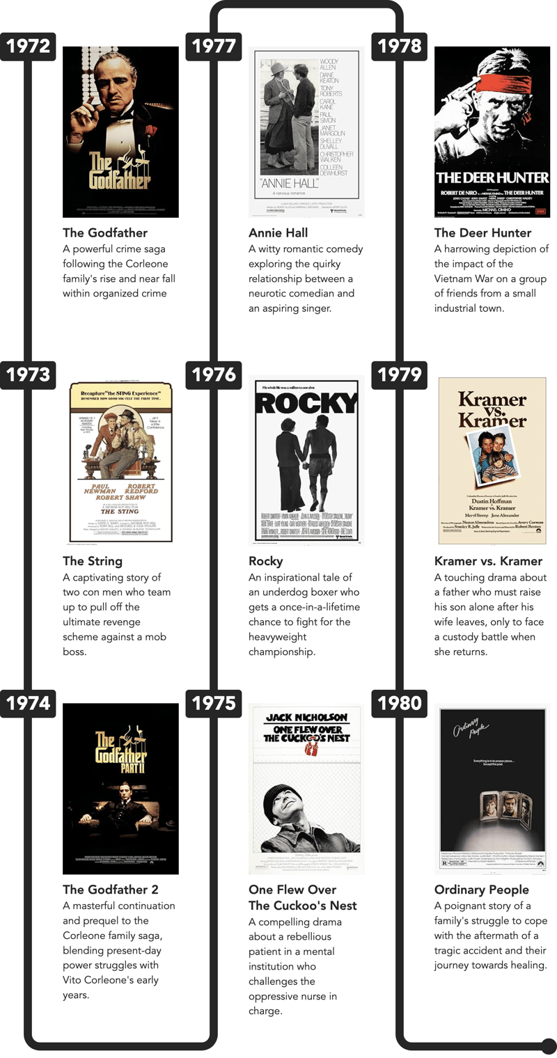
As you can see, the timeline looks quite presentable even with just the default browser styles!
Note: The value-attribute is only valid for
-tags when the parent is an ordered list, .
We'll use ordered lists for each "column" in the timeline, and wrap those those in:
<div class="ui-chronology">
  <ol>...</ol>
</div>
Styling the list-items
Each list item is a grid with two columns. The black line and the year are represented by ::before and ::after pseudo-elements, respectively. Both pseudo-elements are placed in the same grid cell (first column) using a 'grid stack' technique (grid-area: 1 / 1), which allows multiple elements to overlap within the same grid area:
li {
  display: grid;
  grid-template-columns: max-content 1fr;

  &::before { /* Vertical line */
    content: "";
    background: #000;
    grid-area: 1 / 1;
    margin-inline: auto;
    width: var(--bdw);
  }

  &::after { /* Year */
    align-self: start;
    background-color: #000;
    border-radius: .175em;
    color: #FFF;
    content: attr(value);
    font-size: clamp(1rem, 0.2857rem + 2.2857vw, 2rem);
    font-weight: 900;
    grid-area: 1 / 1;
    padding-inline: .5ch;
    width: 5ch;
  }
}
I'm gonna jump ahead a bit, and show how 3
- -tags look next to each other. We're almost there:
- tag. This tag acts as a placeholder for the decorative connectors, ensuring they are positioned correctly without affecting the rest of the timeline’s structure:
<li value="0" aria-hidden="true"><i></i></li>
Copy after loginThese will be placed at the very top and bottom of each
- , and since they're for decorative purposes only, I added aria-hidden="true".
Now, the CSS for the connectors is quite complex, so I'll just show the structure with a few inline comments below — see the final CodePen-demo at the end and dive into the code:
ol {
  &:nth-of-type(odd) {
    li[value="0"] {
      &:last-of-type {
        /* Bottom Left Corner */
        &::before { }
      }
    }
    /* FIRST COLUMN ONLY */
    &:first-of-type {
      li[value="0"]:first-of-type {
        /* Hide Top Left Corner */
        &::before { display: none; }
      }
    }
    &:not(:first-of-type) {
      li[value="0"] {
        &:first-of-type {
        /* Top Left Corner: Reverse */
          &::before { }
        }
      }
    }

    &:last-of-type li[value="0"]:last-of-type i {
      ...
    }
    /* Round dot at the end of the last list */
    &:last-of-type li[value="0"]:last-of-type i::after { ... }
  }

  /* EVEN COLUMNS */
  &:nth-of-type(even) {
    li[value="0"] {
      &:first-of-type {
        /* Top Left Corner */
        &::before { ... }
      }
      &:last-of-type {
        /* Bottom Left Corner: Reverse */
        &::before { ... }
      }
    }
  }
}
Copy after loginPhew! A lot of :first-of-type / :last-of-type-logic!
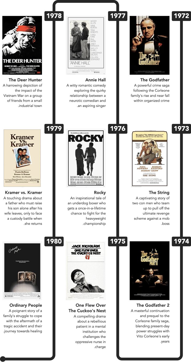
Additionally, all the CSS is also using logical properties, such as:
border-block-width: 0 var(--bdw);
border-inline-width: var(--bdw) 0;
border-end-start-radius: var(--bdrs);
Copy after loginWhy is that? If you're working on a site with a right-to-left text-direction (dir="rtl"), everything will look weird, if you use properties that include left or right in the name (such as padding-left).
With logical properties, everything will look fine, when you switch text-direction:

How cool is that! Now, let's add some more columns:
Notice how the "final round dot" automatically moves to the last column!
And that wraps up this tutorial.
Demo
Please open the demo in a new window and resize to see the columns re-flow.
The above is the detailed content of And the Oscar Goes to … Coding a Chronology Component. For more information, please follow other related articles on the PHP Chinese website!
What we're missing, are the "wavy connectors". To create the 'wavy connectors' between timeline entries, I used a small 'hack' involving a 'dummy'

Hot AI Tools

Undresser.AI Undress
AI-powered app for creating realistic nude photos

AI Clothes Remover
Online AI tool for removing clothes from photos.

Undress AI Tool
Undress images for free

Clothoff.io
AI clothes remover

AI Hentai Generator
Generate AI Hentai for free.

Hot Article
Hot Tools

Notepad++7.3.1
Easy-to-use and free code editor

SublimeText3 Chinese version
Chinese version, very easy to use

Zend Studio 13.0.1
Powerful PHP integrated development environment

Dreamweaver CS6
Visual web development tools

SublimeText3 Mac version
God-level code editing software (SublimeText3)
Hot Topics
 1384
1384
 52
52

 Working With GraphQL Caching
Mar 19, 2025 am 09:36 AM
Working With GraphQL Caching
Mar 19, 2025 am 09:36 AM
If you’ve recently started working with GraphQL, or reviewed its pros and cons, you’ve no doubt heard things like “GraphQL doesn’t support caching” or
 Building an Ethereum app using Redwood.js and Fauna
Mar 28, 2025 am 09:18 AM
Building an Ethereum app using Redwood.js and Fauna
Mar 28, 2025 am 09:18 AM
With the recent climb of Bitcoin’s price over 20k $USD, and to it recently breaking 30k, I thought it’s worth taking a deep dive back into creating Ethereum
 Vue 3
Apr 02, 2025 pm 06:32 PM
Vue 3
Apr 02, 2025 pm 06:32 PM
It's out! Congrats to the Vue team for getting it done, I know it was a massive effort and a long time coming. All new docs, as well.
 Creating Your Own Bragdoc With Eleventy
Mar 18, 2025 am 11:23 AM
Creating Your Own Bragdoc With Eleventy
Mar 18, 2025 am 11:23 AM
No matter what stage you’re at as a developer, the tasks we complete—whether big or small—make a huge impact in our personal and professional growth.
 Can you get valid CSS property values from the browser?
Apr 02, 2025 pm 06:17 PM
Can you get valid CSS property values from the browser?
Apr 02, 2025 pm 06:17 PM
I had someone write in with this very legit question. Lea just blogged about how you can get valid CSS properties themselves from the browser. That's like this.
 A bit on ci/cd
Apr 02, 2025 pm 06:21 PM
A bit on ci/cd
Apr 02, 2025 pm 06:21 PM
I'd say "website" fits better than "mobile app" but I like this framing from Max Lynch:
 Comparing Browsers for Responsive Design
Apr 02, 2025 pm 06:25 PM
Comparing Browsers for Responsive Design
Apr 02, 2025 pm 06:25 PM
There are a number of these desktop apps where the goal is showing your site at different dimensions all at the same time. So you can, for example, be writing
 Stacked Cards with Sticky Positioning and a Dash of Sass
Apr 03, 2025 am 10:30 AM
Stacked Cards with Sticky Positioning and a Dash of Sass
Apr 03, 2025 am 10:30 AM
The other day, I spotted this particularly lovely bit from Corey Ginnivan’s website where a collection of cards stack on top of one another as you scroll.
