

Like the Solar System, The Periodic Table has been done in CSS a lot of times … but it has never been done as simply, as I'm about to show you.
Let's start with some basic, semantic markup:
<ol>
  <li data-mass="1.0078">
    <abbr title="Hydrogen">H</abbr>
  </li>
</ol>
We use an ordered list,
We then have a
The name of the element is an abbreviation for the word “abbreviation”, which is cute.
— Heydon Pickering.
Now, instead of Googling the atomic mass of each element, we just ask ChatGPT to fill out the rest of the markup. We also ask it to add a 3-letter class to each element, indicating which type the element is, ie. a "noble gas" (class="nbl") etc. — and we get 118 elements:
<ol>
  <li data-mass="1.0078" class="rnm">
    <abbr title="Hydrogen">H</abbr>
  </li>
  <li data-mass="4.0026" class="nbl">
    <abbr title="Helium">He</abbr>
  </li>
  <li data-mass="6.941" class="alk">
    <abbr title="Lithium">Li</abbr>
  </li>
  <!-- etc. -->
</ol>
It doesn't look great yet; it's just a numbered list with abbreviations for the elements.
1. H
2. He
3. Li
etc.
Let's turn the list into a 18x10 grid:
ol {
  all: unset;
  container-type: inline-size;
  counter-reset: element;
  display: grid;
  font-size: 2cqi;
  gap: 1px;
  grid-template-columns: repeat(18, 1fr);
  grid-template-rows: repeat(10, 1fr);
}
Now, we set each
li {
  aspect-ratio: 1 / 1;
  background: #EEEEEE;
  counter-increment: element;
  display: grid;
  grid-template-columns: 1fr 1fr;
  grid-template-rows: 1fr 1fr 1fr;
  padding: .25ch;
  transition: scale .125s ease-in;
  &::before {
    content: counter(element);
  }
  &::after {
    content: attr(data-mass);
    grid-area: 1 / 2 / 2 / 2;
    justify-self: end;
  }
  &::before, &::after {
    font-size: .33em;
  }
}
Before we see what we've accomplished, let's ask ChatGPT to add some colors to the "element-type"-classes it added earlier. Now we get:
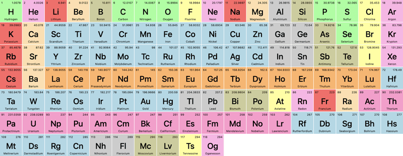
Looks great, but not exactly like the periodic table we learned in school. Let's add some grid-magic.
For Helium, we want it to be pushed to the last column. As we know the grid is 18 columns wide, we simply add:
li {
  &:nth-of-type(2) { grid-column: 18; }
}
Since this is an ordered list, the nth-of-type value will always correspond to the atomic number of each element. We want to move Boron and Aluminum to column 13:
li {
  &:nth-of-type(5), &:nth-of-type(13) { grid-column: 13; }
Let's check it out:
An improvement, for sure, but since grid-column just pushes the grid forward, how can we take elements 58-71 and 90-103 (the lathenides and actinides) completely out of their grid-flow and add them to those 2 rows below the main grid?
For that, we can use grid-area, where we define:
row-start / col-start / row-end / col-end
In our case, that'll be:
li {
   /* Lanthenides */
  &:nth-of-type(58) { grid-area: 9 / 4 / 9/ 4; }
  &:nth-of-type(59) { grid-area: 9 / 5 / 9/ 5; }
  &:nth-of-type(60) { grid-area: 9 / 6 / 9/ 6; }
  /* etc. */

  /* Actinides */
  &:nth-of-type(90) { grid-area: 10 / 4 / 10 / 4; }
  &:nth-of-type(91) { grid-area: 10 / 5 / 10 / 5; }
  &:nth-of-type(92) { grid-area: 10 / 6 / 10 / 6; }
  / etc. */
}
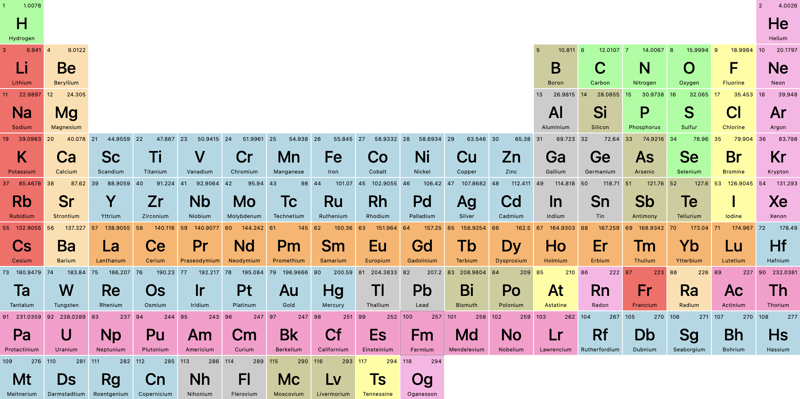
And now we get (for clarity, I've enabled Dev Tools' grid-visualizer):
Notice how the grid-elements after the element we've moved out of the flow, continue in the main flow!
Now, let's use these "element type"-classes, we had ChatGPT generate earlier, to filter the periodic table.
First, let's add some basic HTML:
<fieldset>
  <legend>Filter</legend>
  <label>
    <input type="radio" id="alk" name="filter">
    Alkali Metals
  </label>
</fieldset>
Then, we ask chatGPT to fill out the rest, and add an "All"-option with no id:
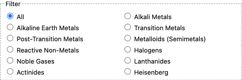
We need a bunch of JavaScript to filter, right? No, we can do this in plain CSS:
body:has(#alk:checked) li:not(.alk) {
  opacity: 0.2;
}
The logic works like this: If the body contains a checkbox with the id="alk" and it's checked, the styles will be applied to all
Repeat for all the types and classes.
Let's click on "metalloids":
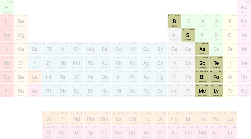
How cool is that?
That concludes this tutorial … but wait … what does that Heisenberg filter do? It wasn't in the list of filters from ChatGPT?
Let's click it:
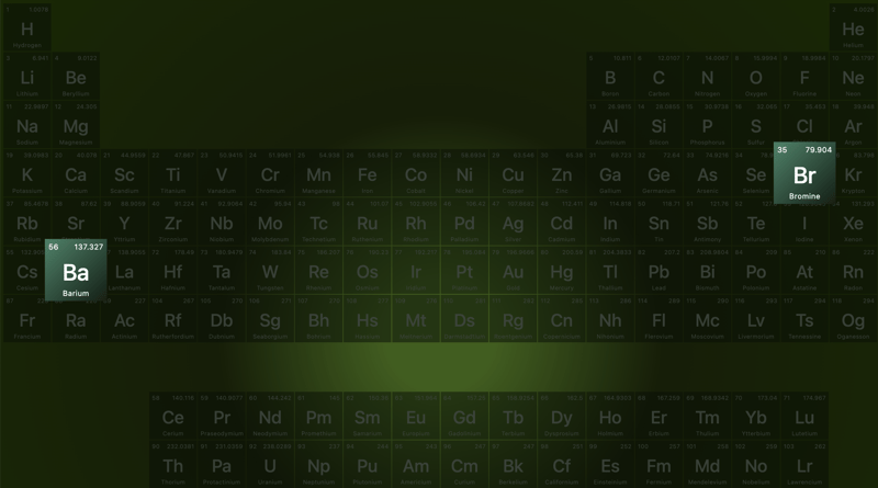
… and now you know my favorite TV-show of all time!
Here's a Codepen — even though it's fully responsive, I recommend viewing it on larger screens:
The above is the detailed content of The Periodic Table in CSS. For more information, please follow other related articles on the PHP Chinese website!
 js gets current time
 What is the Chinese name of fil coin?
 How to solve the problem that the phpstudy port is occupied
 How to solve the problem of invalid database object name
 How to change c language software to Chinese
 Thunder membership patch
 What to do if php deserialization fails
 Check the occupied port status in windows
 The core of computer system software


![[Web front-end] Node.js quick start](https://img.php.cn/upload/course/000/000/067/662b5d34ba7c0227.png)


