

Data Visualization Techniques for Text Data

Python offers a variety of powerful libraries for creating visualizations, including word clouds, bar charts and histograms. These visualizations can be particularly useful for analyzing text data and gaining insights into word frequency, sentiment, and other characteristics.
Let's perform the visualization of the text data.
Steps to perform:
Load the Text Data
Preprocess the Text Data
Create Word Cloud
Create Bar Chart
Create Histogram Chart
- install nltk

We will use the NLTK (Natural Language Toolkit) provides tools for text processing and analysis.
- importing nltk and download punkt

- import other required packages
We use the Seaborn package which a high-level data visualization library built on top of Matplotlib.

- load the sample text data

Word Clouds
Word clouds visually represent the frequency of words in a text by varying the size and position of words based on their importance.
- downloading package stopwords

- remove the stopwords from the text and create wordcloud and show
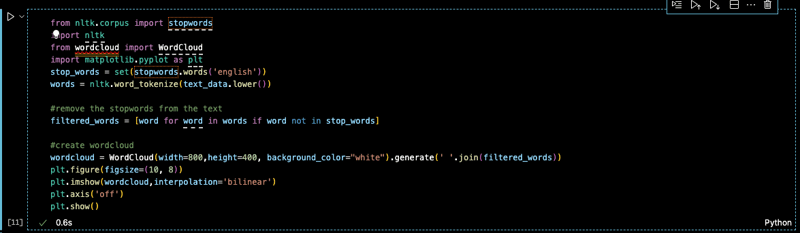

See, this is how the visualization of this word cloud would look like. this has created the word cloud depending on the frequency of the word appearing the one that is in bigger size compared.
Now, Let's see how can we create the bar chart.
Bar Chart
Bar charts are effective for visualizing the frequency of words or phrases in a text corpus.

- Bar chart

I'll access the 20 most common words. We will create a plot using the above. Let's see how can we create histogram chart.
Histograms Chart
Histograms can be used to visualize the distribution of word lengths or other numerical characteristics of text data.


Additional Libraries:
Gensim: A library for topic modeling and document similarity.
Seaborn: A high-level data visualization library built on top of Matplotlib.
By combining these libraries and techniques, you can create informative and visually appealing visualizations to explore and understand the text data.
The above is the detailed content of Data Visualization Techniques for Text Data. For more information, please follow other related articles on the PHP Chinese website!

Hot AI Tools

Undresser.AI Undress
AI-powered app for creating realistic nude photos

AI Clothes Remover
Online AI tool for removing clothes from photos.

Undress AI Tool
Undress images for free

Clothoff.io
AI clothes remover

Video Face Swap
Swap faces in any video effortlessly with our completely free AI face swap tool!

Hot Article
Hot Tools

Notepad++7.3.1
Easy-to-use and free code editor

SublimeText3 Chinese version
Chinese version, very easy to use

Zend Studio 13.0.1
Powerful PHP integrated development environment

Dreamweaver CS6
Visual web development tools

SublimeText3 Mac version
God-level code editing software (SublimeText3)
Hot Topics
 1664
1664
 14
1423
52
1318
25
1269
29
1248
24
14
1423
52
1318
25
1269
29
1248
24

 Python vs. C : Applications and Use Cases Compared
Apr 12, 2025 am 12:01 AM
Python vs. C : Applications and Use Cases Compared
Apr 12, 2025 am 12:01 AM
Python is suitable for data science, web development and automation tasks, while C is suitable for system programming, game development and embedded systems. Python is known for its simplicity and powerful ecosystem, while C is known for its high performance and underlying control capabilities.
 The 2-Hour Python Plan: A Realistic Approach
Apr 11, 2025 am 12:04 AM
The 2-Hour Python Plan: A Realistic Approach
Apr 11, 2025 am 12:04 AM
You can learn basic programming concepts and skills of Python within 2 hours. 1. Learn variables and data types, 2. Master control flow (conditional statements and loops), 3. Understand the definition and use of functions, 4. Quickly get started with Python programming through simple examples and code snippets.
 Python: Games, GUIs, and More
Apr 13, 2025 am 12:14 AM
Python: Games, GUIs, and More
Apr 13, 2025 am 12:14 AM
Python excels in gaming and GUI development. 1) Game development uses Pygame, providing drawing, audio and other functions, which are suitable for creating 2D games. 2) GUI development can choose Tkinter or PyQt. Tkinter is simple and easy to use, PyQt has rich functions and is suitable for professional development.
 Python vs. C : Learning Curves and Ease of Use
Apr 19, 2025 am 12:20 AM
Python vs. C : Learning Curves and Ease of Use
Apr 19, 2025 am 12:20 AM
Python is easier to learn and use, while C is more powerful but complex. 1. Python syntax is concise and suitable for beginners. Dynamic typing and automatic memory management make it easy to use, but may cause runtime errors. 2.C provides low-level control and advanced features, suitable for high-performance applications, but has a high learning threshold and requires manual memory and type safety management.
 Python and Time: Making the Most of Your Study Time
Apr 14, 2025 am 12:02 AM
Python and Time: Making the Most of Your Study Time
Apr 14, 2025 am 12:02 AM
To maximize the efficiency of learning Python in a limited time, you can use Python's datetime, time, and schedule modules. 1. The datetime module is used to record and plan learning time. 2. The time module helps to set study and rest time. 3. The schedule module automatically arranges weekly learning tasks.
 Python vs. C : Exploring Performance and Efficiency
Apr 18, 2025 am 12:20 AM
Python vs. C : Exploring Performance and Efficiency
Apr 18, 2025 am 12:20 AM
Python is better than C in development efficiency, but C is higher in execution performance. 1. Python's concise syntax and rich libraries improve development efficiency. 2.C's compilation-type characteristics and hardware control improve execution performance. When making a choice, you need to weigh the development speed and execution efficiency based on project needs.
 Python: Automation, Scripting, and Task Management
Apr 16, 2025 am 12:14 AM
Python: Automation, Scripting, and Task Management
Apr 16, 2025 am 12:14 AM
Python excels in automation, scripting, and task management. 1) Automation: File backup is realized through standard libraries such as os and shutil. 2) Script writing: Use the psutil library to monitor system resources. 3) Task management: Use the schedule library to schedule tasks. Python's ease of use and rich library support makes it the preferred tool in these areas.
 Learning Python: Is 2 Hours of Daily Study Sufficient?
Apr 18, 2025 am 12:22 AM
Learning Python: Is 2 Hours of Daily Study Sufficient?
Apr 18, 2025 am 12:22 AM
Is it enough to learn Python for two hours a day? It depends on your goals and learning methods. 1) Develop a clear learning plan, 2) Select appropriate learning resources and methods, 3) Practice and review and consolidate hands-on practice and review and consolidate, and you can gradually master the basic knowledge and advanced functions of Python during this period.
