
 Backend Development
Python Tutorial
Python code that generates a stock price chart for the last n days.
Backend Development
Python Tutorial
Python code that generates a stock price chart for the last n days.
Python code that generates a stock price chart for the last n days.

Here’s a detailed description of what each part of the code does:
Importing Libraries:
matplotlib.pyplot is used for creating plots.
yahooquery.Ticker is used to fetch historical stock data from Yahoo Finance.
datetime and timedelta are used for date manipulation.
pandas is used for data handling.
pytz is used for working with time zones.
os is used for file system operations.
Function plot_stock_last_n_days:
Function Parameters:
symbol: the stock ticker (e.g., ‘NVDA’).
n_days: the number of days for which historical data is displayed.
filename: the name of the file where the plot will be saved.
timezone: the time zone for displaying the data.
the Date Range:
The current date and the start date of the period are calculated based on n_days.
Fetching Data:
yahooquery is used to retrieve historical stock data for the specified period.
Checking Data Availability:
If no data is available, a message is printed, and the function exits.
Data Processing:
The index of the data is converted to datetime format and the time zone is set.
Weekends (Saturdays and Sundays) are filtered out.
Percentage changes in closing prices are calculated.
Creating and Configuring the Plot:
A main plot is created with closing prices.
Annotations are added to the plot showing closing prices and percentage changes.
X and Y axes are configured, dates are formatted, and grid lines are added.
An additional plot for trading volume is added, with different colors for positive and negative changes in closing prices.
Adding Watermarks:
Watermarks are added to the bottom-left and top-right corners of the plot.
Saving and Displaying the Plot:
The plot is saved as an image file with the specified filename and displayed.
Example Usage:
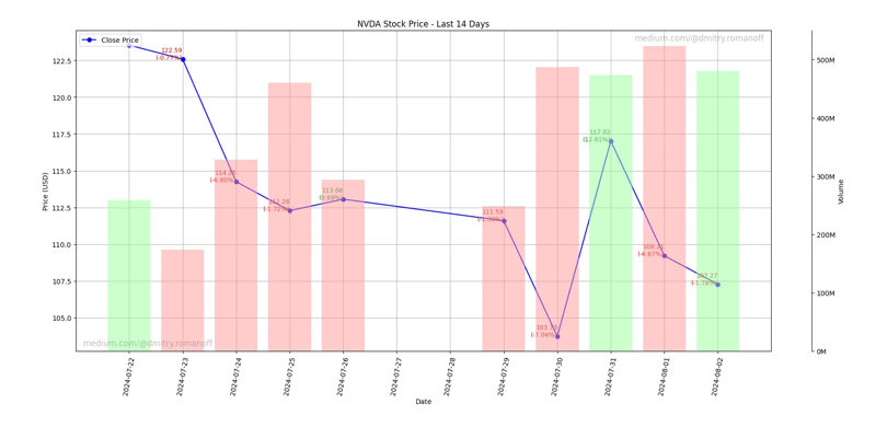
The function is called with the ticker ‘NVDA’ (NVIDIA), displaying data for the last 14 days, saving the plot as ‘output.png’, and using the GMT time zone.
In summary, the code generates a visual representation of historical stock data, including closing prices and trading volumes, with annotations for percentage changes and time zone considerations.
import matplotlib.pyplot as plt
from yahooquery import Ticker
from datetime import datetime, timedelta
import matplotlib.dates as mdates
import os
import pandas as pd
import pytz

def plot_stock_last_n_days(symbol, n_days=30, filename='stock_plot.png', timezone='UTC'):
    # Define the date range
    end_date = datetime.now(pytz.timezone(timezone))
    start_date = end_date - timedelta(days=n_days)

    # Convert dates to the format expected by Yahoo Finance
    start_date_str = start_date.strftime('%Y-%m-%d')
    end_date_str = end_date.strftime('%Y-%m-%d')

    # Fetch historical data for the last n days
    ticker = Ticker(symbol)
    historical_data = ticker.history(start=start_date_str, end=end_date_str, interval='1d')

    # Check if the data is available
    if historical_data.empty:
        print("No data available.")
        return

    # Ensure the index is datetime for proper plotting and localize to the specified timezone
    historical_data.index = pd.to_datetime(historical_data.index.get_level_values('date')).tz_localize('UTC').tz_convert(timezone)

    # Filter out weekends
    historical_data = historical_data[historical_data.index.weekday < 5]

    # Calculate percentage changes
    historical_data['pct_change'] = historical_data['close'].pct_change() * 100

    # Ensure the output directory exists
    output_dir = 'output'
    if not os.path.exists(output_dir):
        os.makedirs(output_dir)

    # Adjust the filename to include the output directory
    filename = os.path.join(output_dir, filename)

    # Plotting the closing price
    fig, ax1 = plt.subplots(figsize=(10, 5))
    ax1.plot(historical_data.index, historical_data['close'], label='Close Price', color='blue', marker='o')

    # Annotate each point with its value and percentage change
    for i in range(1, len(historical_data)):
        date = historical_data.index[i]
        close = historical_data['close'].iloc[i]
        pct_change = historical_data['pct_change'].iloc[i]
        color = 'green' if pct_change > 0 else 'red'
        ax1.text(date, close, f'{close:.2f}\n({pct_change:.2f}%)', fontsize=9, ha='right', color=color)

    # Set up daily gridlines and print date for every day
    ax1.xaxis.set_major_locator(mdates.DayLocator(interval=1))
    ax1.xaxis.set_major_formatter(mdates.DateFormatter('%Y-%m-%d'))

    ax1.set_xlabel('Date')
    ax1.set_ylabel('Price (USD)')
    ax1.set_title(f'{symbol} Stock Price - Last {n_days} Days')
    ax1.legend(loc='upper left')
    ax1.grid(True)
    ax1.tick_params(axis='x', rotation=80)
    fig.tight_layout()

    # Adding the trading volume plot
    ax2 = ax1.twinx()
    calm_green = (0.6, 1, 0.6)  # Calm green color
    calm_red = (1, 0.6, 0.6)    # Calm red color
    colors = [calm_green if historical_data['close'].iloc[i] > historical_data['open'].iloc[i] else calm_red for i in range(len(historical_data))]
    ax2.bar(historical_data.index, historical_data['volume'], color=colors, alpha=0.5, width=0.8)
    ax2.set_ylabel('Volume')
    ax2.tick_params(axis='y')

    # Format y-axis for volume in millions
    def millions(x, pos):
        'The two args are the value and tick position'
        return '%1.0fM' % (x * 1e-6)

    ax2.yaxis.set_major_formatter(plt.FuncFormatter(millions))

    # Adjust the visibility and spacing of the volume axis
    fig.subplots_adjust(right=0.85)
    ax2.spines['right'].set_position(('outward', 60))
    ax2.yaxis.set_label_position('right')
    ax2.yaxis.set_ticks_position('right')

    # Add watermarks
    plt.text(0.01, 0.01, 'medium.com/@dmitry.romanoff', fontsize=12, color='grey', ha='left', va='bottom', alpha=0.5, transform=plt.gca().transAxes)
    plt.text(0.99, 0.99, 'medium.com/@dmitry.romanoff', fontsize=12, color='grey', ha='right', va='top', alpha=0.5, transform=plt.gca().transAxes)

    # Save the plot as an image file
    plt.savefig(filename)
    plt.show()

# Example usage
plot_stock_last_n_days('NVDA', n_days=14, filename='output.png', timezone='GMT')
The above is the detailed content of Python code that generates a stock price chart for the last n days.. For more information, please follow other related articles on the PHP Chinese website!

Hot AI Tools

Undresser.AI Undress
AI-powered app for creating realistic nude photos

AI Clothes Remover
Online AI tool for removing clothes from photos.

Undress AI Tool
Undress images for free

Clothoff.io
AI clothes remover

Video Face Swap
Swap faces in any video effortlessly with our completely free AI face swap tool!

Hot Article
Hot Tools

Notepad++7.3.1
Easy-to-use and free code editor

SublimeText3 Chinese version
Chinese version, very easy to use

Zend Studio 13.0.1
Powerful PHP integrated development environment

Dreamweaver CS6
Visual web development tools

SublimeText3 Mac version
God-level code editing software (SublimeText3)
Hot Topics


 How to solve the permissions problem encountered when viewing Python version in Linux terminal?
Apr 01, 2025 pm 05:09 PM
How to solve the permissions problem encountered when viewing Python version in Linux terminal?
Apr 01, 2025 pm 05:09 PM
Solution to permission issues when viewing Python version in Linux terminal When you try to view Python version in Linux terminal, enter python...
 How to avoid being detected by the browser when using Fiddler Everywhere for man-in-the-middle reading?
Apr 02, 2025 am 07:15 AM
How to avoid being detected by the browser when using Fiddler Everywhere for man-in-the-middle reading?
Apr 02, 2025 am 07:15 AM
How to avoid being detected when using FiddlerEverywhere for man-in-the-middle readings When you use FiddlerEverywhere...
 How to efficiently copy the entire column of one DataFrame into another DataFrame with different structures in Python?
Apr 01, 2025 pm 11:15 PM
How to efficiently copy the entire column of one DataFrame into another DataFrame with different structures in Python?
Apr 01, 2025 pm 11:15 PM
When using Python's pandas library, how to copy whole columns between two DataFrames with different structures is a common problem. Suppose we have two Dats...
 How to teach computer novice programming basics in project and problem-driven methods within 10 hours?
Apr 02, 2025 am 07:18 AM
How to teach computer novice programming basics in project and problem-driven methods within 10 hours?
Apr 02, 2025 am 07:18 AM
How to teach computer novice programming basics within 10 hours? If you only have 10 hours to teach computer novice some programming knowledge, what would you choose to teach...
 How does Uvicorn continuously listen for HTTP requests without serving_forever()?
Apr 01, 2025 pm 10:51 PM
How does Uvicorn continuously listen for HTTP requests without serving_forever()?
Apr 01, 2025 pm 10:51 PM
How does Uvicorn continuously listen for HTTP requests? Uvicorn is a lightweight web server based on ASGI. One of its core functions is to listen for HTTP requests and proceed...
 How to solve permission issues when using python --version command in Linux terminal?
Apr 02, 2025 am 06:36 AM
How to solve permission issues when using python --version command in Linux terminal?
Apr 02, 2025 am 06:36 AM
Using python in Linux terminal...
 How to handle comma-separated list query parameters in FastAPI?
Apr 02, 2025 am 06:51 AM
How to handle comma-separated list query parameters in FastAPI?
Apr 02, 2025 am 06:51 AM
Fastapi ...
 How to get news data bypassing Investing.com's anti-crawler mechanism?
Apr 02, 2025 am 07:03 AM
How to get news data bypassing Investing.com's anti-crawler mechanism?
Apr 02, 2025 am 07:03 AM
Understanding the anti-crawling strategy of Investing.com Many people often try to crawl news data from Investing.com (https://cn.investing.com/news/latest-news)...
