Sharing UI Components: Copy VS Install
In recent years, there's been a noticeable shift in how developers approach UI libraries, moving away from installing entire component libraries via npm packages and toward directly copy-pasting the code into their codebase.
This trend has been largely popularized by Shadcn/UI, a library that provides developers with ready-made, customizable components that can be copied directly into a project for maximum flexibility.

Why Copying Wins for Complex Components
The copy-paste approach shines, particularly for complex UI elements such as authentication pages, detailed dashboards, or intricate data visualizations. These components require fine-tuned customization that’s difficult to achieve through immutable npm packages.
Instead of overwhelming the library’s API with endless configuration options, this approach allows developers to leverage the composable and declarative nature of modern frontend frameworks, enabling greater control over every part of the component.
Instead of long and complex CSS selectors, you can directly apply styles to elements in a component. Instead of injecting components using a complex dependency injection logic, you simply place or rearrange components however you choose.
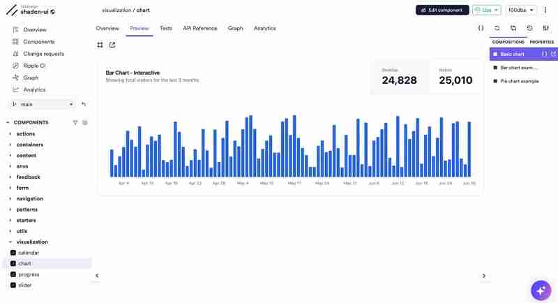
An interactive shadcnui chart on Bit Platform
This approach has gained even greater significance with the introduction of AI coding assistants. Instead of generating components from scratch through AI with long, complex prompts — or engaging in a lengthy conversation with the assistant — you can begin with a pre-built composition close to what you need.
By embedding the code into your project, you give the AI assistant a specific, tangible context. From there, you can ask it to make incremental adjustments, such as tweaking styles, adding accessibility features, or changing the layout.
Bit Components: Packages that you can directly edit
Bit has introduced a new entity to the world of web development: The Bit Component. In short, a Bit component can be thought of as a super-package. You can share it, install it, copy it, and even collaborate on it independently of any particular project setup.
For simplicity, we can divide UI components into two groups: design system components and block components. In the design system, basic components like Card are fundamental building blocks. Meanwhile, block components, such as a MediaCard, are composed of design system elements but offer more advanced functionality.
Choice 1: Composing with Design System Components
When creating a new component, the first option is to compose from your design system. For instance, to build a custom card, you may need to combine components like Card, Button, and Typography.

MUI-based components shared on the Bit Platform
These components can be installed in your project through npm, pnpm, yarn, or Bit’s installation:
npm i @bitdesign/material-ui.surfaces.card bitdesign.material-ui/inputs/button @bitdesign/material-ui.data-display.typography
Choice 2: Utilizing Block Components
When opting for a pre-built block component, you have several flexible choices beyond simple installation.
The easiest route is to install the component package directly and use its API. This approach works well if the component fits your needs out of the box or requires only minor tweaks.
For scenarios where you need to make extensive changes, Bit’s fork command allows you to copy the component’s full code into your project. This includes source files, dependencies, and configurations (including the component’s dev tools).

https://bit.cloud/learnbit-react/material-ui-blocks/content/media-card
For example, to copy the MediaCard component and its configuration, we’ll run bit fork and pass its component ID (not package name) as an argument:
bit fork learnbit-react.material-ui-blocks/content/media-card

It’s worth noting that Bit also provides the bit import command, which allows you to create changes to the component and release a new version. This option requires that you have the proper permissions to modify the component (unlike the bit fork command, which does not affect the original component).
Ejecting dependencies’ source files
When forking components with dependencies, Bit auto-installs them for convenience. However, if you need direct access to the source code of a dependency, you can also fork those dependencies.

For instance, if you want to copy the Button component, you can fork it as well from your team’s collection on Bit Platform:
bit fork bitdesign.material-ui/inputs/button

The above is the detailed content of Sharing UI Components: Copy VS Install. For more information, please follow other related articles on the PHP Chinese website!

Hot AI Tools

Undresser.AI Undress
AI-powered app for creating realistic nude photos

AI Clothes Remover
Online AI tool for removing clothes from photos.

Undress AI Tool
Undress images for free

Clothoff.io
AI clothes remover

Video Face Swap
Swap faces in any video effortlessly with our completely free AI face swap tool!

Hot Article

Hot Tools

Notepad++7.3.1
Easy-to-use and free code editor

SublimeText3 Chinese version
Chinese version, very easy to use

Zend Studio 13.0.1
Powerful PHP integrated development environment

Dreamweaver CS6
Visual web development tools

SublimeText3 Mac version
God-level code editing software (SublimeText3)

Hot Topics
 1664
1664
 14
14
 1423
1423
 52
52
 1317
1317
 25
25
 1268
1268
 29
29
 1244
1244
 24
24
 The Evolution of JavaScript: Current Trends and Future Prospects
Apr 10, 2025 am 09:33 AM
The latest trends in JavaScript include the rise of TypeScript, the popularity of modern frameworks and libraries, and the application of WebAssembly. Future prospects cover more powerful type systems, the development of server-side JavaScript, the expansion of artificial intelligence and machine learning, and the potential of IoT and edge computing.
 JavaScript Engines: Comparing Implementations
Apr 13, 2025 am 12:05 AM
Different JavaScript engines have different effects when parsing and executing JavaScript code, because the implementation principles and optimization strategies of each engine differ. 1. Lexical analysis: convert source code into lexical unit. 2. Grammar analysis: Generate an abstract syntax tree. 3. Optimization and compilation: Generate machine code through the JIT compiler. 4. Execute: Run the machine code. V8 engine optimizes through instant compilation and hidden class, SpiderMonkey uses a type inference system, resulting in different performance performance on the same code.
 Python vs. JavaScript: The Learning Curve and Ease of Use
Apr 16, 2025 am 12:12 AM
Python is more suitable for beginners, with a smooth learning curve and concise syntax; JavaScript is suitable for front-end development, with a steep learning curve and flexible syntax. 1. Python syntax is intuitive and suitable for data science and back-end development. 2. JavaScript is flexible and widely used in front-end and server-side programming.
 JavaScript: Exploring the Versatility of a Web Language
Apr 11, 2025 am 12:01 AM
JavaScript is the core language of modern web development and is widely used for its diversity and flexibility. 1) Front-end development: build dynamic web pages and single-page applications through DOM operations and modern frameworks (such as React, Vue.js, Angular). 2) Server-side development: Node.js uses a non-blocking I/O model to handle high concurrency and real-time applications. 3) Mobile and desktop application development: cross-platform development is realized through ReactNative and Electron to improve development efficiency.
 How to Build a Multi-Tenant SaaS Application with Next.js (Frontend Integration)
Apr 11, 2025 am 08:22 AM
This article demonstrates frontend integration with a backend secured by Permit, building a functional EdTech SaaS application using Next.js. The frontend fetches user permissions to control UI visibility and ensures API requests adhere to role-base
 Building a Multi-Tenant SaaS Application with Next.js (Backend Integration)
Apr 11, 2025 am 08:23 AM
I built a functional multi-tenant SaaS application (an EdTech app) with your everyday tech tool and you can do the same. First, what’s a multi-tenant SaaS application? Multi-tenant SaaS applications let you serve multiple customers from a sing
 From C/C to JavaScript: How It All Works
Apr 14, 2025 am 12:05 AM
The shift from C/C to JavaScript requires adapting to dynamic typing, garbage collection and asynchronous programming. 1) C/C is a statically typed language that requires manual memory management, while JavaScript is dynamically typed and garbage collection is automatically processed. 2) C/C needs to be compiled into machine code, while JavaScript is an interpreted language. 3) JavaScript introduces concepts such as closures, prototype chains and Promise, which enhances flexibility and asynchronous programming capabilities.
 JavaScript and the Web: Core Functionality and Use Cases
Apr 18, 2025 am 12:19 AM
The main uses of JavaScript in web development include client interaction, form verification and asynchronous communication. 1) Dynamic content update and user interaction through DOM operations; 2) Client verification is carried out before the user submits data to improve the user experience; 3) Refreshless communication with the server is achieved through AJAX technology.


