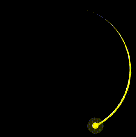
The overall effect is shown below:

Alright, let's walk through the steps to create this animation using CSS.
In this tutorial, we will guide you step-by-step on how to create a rotating trailing effect using CSS. We will achieve this by setting the width, height, border radius, background color, and multiple shadows for an element.
Here is the overall code and demo: https://codepen.io/venzil/pen/MWNVymY
First, we need to define the HTML hierarchy and structure.
The entire screen consists of three parts: first, the black background (.container), then the arc (.circle), and finally the small dot at the end of the arc (.dot).
The overall HTML structure is shown below.
<div class="container">
  <div class="circle">
    <div class="dot"></div>
  </div>
</div>
First, we set the black background of the page by directly modifying the
part of the HTML.body {
margin: 0;
height: 100vh;
display: flex;
align-items: center;
justify-content: center;
background-color: black;
}
By setting height: 100vh;, we ensure that the
background fills the entire viewport. Next, we use flexbox to horizontally and vertically center the content, placing it in the center of the page.Then, we set the size of the content.
.container {
background-color: transparent;
width: 200px;
height: 200px;
}
The first step is to form an arc, which is actually a part of a circle. Therefore, we need to draw the entire circle first.
Start by drawing a square, and the size of this square is the content size we set earlier with a side length of 200px.
.container .circle {
border-color: yellow;
border-style: solid;
width: 100%;
height: 100%;
}

Next, we use border-radius to turn the square into a circle.
.container .circle {
border-color: yellow;
border-style: solid;
width: 100%;
height: 100%;
/* new */
border-radius: 50%;
}

Then, we just need to clip a part of the circle to make it look like an arc.
.container .circle {
border-style: solid;
width: 100%;
height: 100%;
border-radius: 50%;
/* new */
border-color: yellow transparent transparent yellow;
border-width: 3px 3px 0 0;
}

Now that the arc and the endpoint of the arc are generated, we just need to start rotating the arc.
Define a CSS animation keyframe (@keyframes) that specifies an animation sequence called animate.
In this animation sequence, the element will rotate one full turn (1turn is 360 degrees) from its initial state (usually from {}, but here it defaults to the current state).
@keyframes animate {
to {
transform: rotate(1turn);
}
}
Then, apply the animation keyframe to the .circle class.
<div class="container">
<div class="circle">
<div class="dot"></div>
</div>
</div>
Once set, the animation effect will appear as shown below:

Next, we can add a small dot to the rotating head to enhance the animation effect.
body {
  margin: 0;
  height: 100vh;
  display: flex;
  align-items: center;
  justify-content: center;
  background-color: black;
}
This is the final result:

The above is the detailed content of How to Create a Rotating Trailing Effect with CSS. For more information, please follow other related articles on the PHP Chinese website!


