One of the most useful and widely used concepts in the world of React is design patterns, as they help keep code scalable and give added meaning to the components we create.
There are various patterns, and in this article, we’ll discuss Compound Components, an advanced pattern that is especially useful for creating flexible and composable interfaces.
Compound Components is an advanced pattern in React. Its goal is to create a more flexible design by enabling the sharing of state and logic among a group of components. This way, communication between the parent component and child components can be achieved in a flexible manner.
The components work together to achieve certain behaviors without creating complex prop trees or overly complicated logic that would be difficult to refactor or understand in the future.
This pattern helps eliminate prop drilling, where we pass down a large number of props through several component layers. Prop drilling can be problematic, as it may cause unnecessary re-renders every time the state is updated, since each state change will update all child components.
An example of Compound Components can be seen in the HTML structure of select and option tags:

The select element works as the interface’s state manager, while the option elements configure how the select component should function.
In this example, we’ll create a Modal, which is divided into two compound components: Toggle and Content. They will share the open/close state of the modal.
Let’s walk through how to create this component step by step:
We can start by creating the context that will manage the open/close state of the modal:

Creating the base of the Modal component:

Notice that we’re using children to grab the components that will be placed inside the Modal. We want to use it like this:

Now we need to create the toggle component, which will be responsible for opening the Modal:

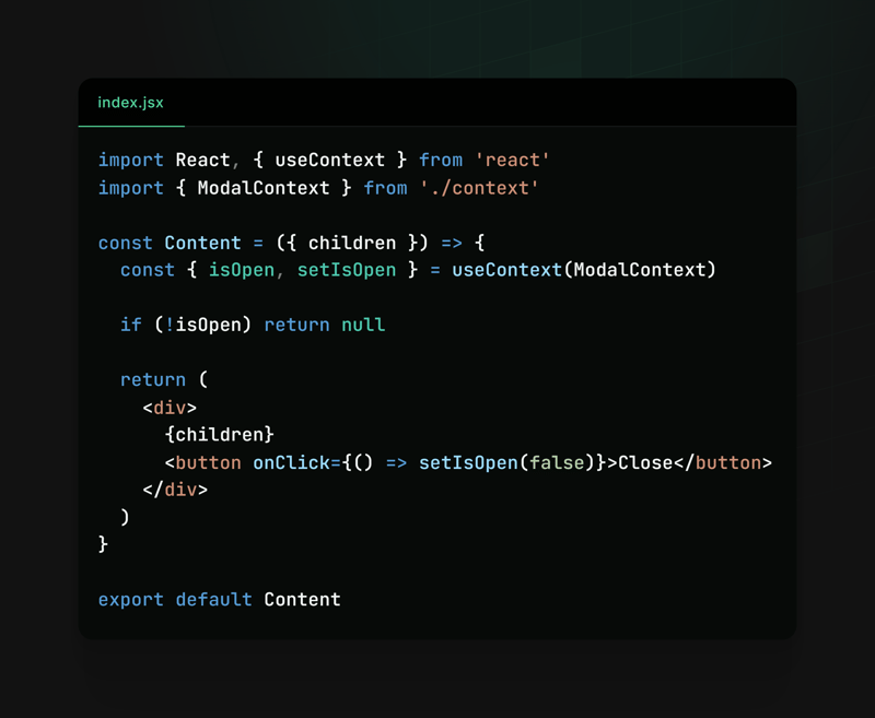
We also need a content component that will be responsible for displaying the Modal’s content:

Finally, we can add both components to our Modal component, and it’s ready to go! ?

Usage:

Result:

This way, we make creating and using modals extremely flexible and reusable. Modal.Toggle is responsible for triggering the modal display, while Modal.Content should display the modal content.
This structure allows developers to easily customize the behavior and content of modals according to the specific needs of their applications, making the code cleaner and more organized.
We can also use Compound Components in other contexts, such as:
Accordion components:

Menu components:

All of these examples are flexible and adaptable, making development, scalability, and component usage easier.
We noticed that the close button was placed inside the content component, but it would be interesting to have a component dedicated to managing the closing of the modal. You could create something like
We’ve seen how writing components using the Compound Components pattern can be useful in our applications. We also explored how to implement it and reviewed examples of where this pattern can fit.
Feel free to explore and experiment with creating components using Compound Components. Use it wisely and assess if it makes sense to apply in your context, as if not implemented well, it could end up being more of a hindrance than a help.
Note: I posted this same content on react4noobs, a BR repository that brings together articles created by developers in the React universe. It’s worth checking out!
The above is the detailed content of Mastering Compound Components: Building Flexible and Reusable React Components. For more information, please follow other related articles on the PHP Chinese website!


