

Image Swap in Pure CSS

Image Swap in Pure CSS
Let's create Image Swap tutorial in Pure CSS without using JavaScript.
- Let's create few elements in html using input radios, labels. At the end, also let's add **
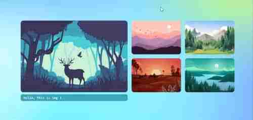
<div>


<p>Let's create <strong>CSS</strong><br>
</p>

<pre class="brush:php;toolbar:false"> * {
    margin: 0;
    padding: 0;
}

html {
    height: 100%;
    scroll-behavior: smooth;
}

body {
    display: flex;
    flex-direction: column;
    height: 100%;
    font-family: monospace;
    place-content: center;
    background-size: 100% 100%;
    background-position: 0px 0px;
    background-image: radial-gradient(18% 28% at 24% 50%, #CEFAFFFF 7%,
 #073AFF00 100%), radial-gradient(18% 28% at 18% 71%, #FFFFFF59 6%,
#073AFF00 100%), radial-gradient(70% 53% at 36% 76%, #73F2FFFF 0%,
#073AFF00 100%), radial-gradient(42% 53% at 15% 94%, #FFFFFFFF 7%,
 #073AFF00 100%), radial-gradient(42% 53% at 34% 72%, #FFFFFFFF 7%,
 #073AFF00 100%), radial-gradient(18% 28% at 35% 87%, #FFFFFFFF 7%,
 #073AFF00 100%), radial-gradient(31% 43% at 7% 98%, #FFFFFFFF 24%,
 #073AFF00 100%), radial-gradient(21% 37% at 72% 23%, #D3FF6D9C 24%,
 #073AFF00 100%), radial-gradient(35% 56% at 91% 74%, #8A4FFFF5 9%,
 #073AFF00 100%), radial-gradient(74% 86% at 67% 38%, #84d9ff 24%,
 #073AFF00 100%), linear-gradient(125deg, #4EB5FFFF 1%, #4C00FCFF 100%);
}

.wrapper {
    width: 860px;
    height: 283px;
    position: relative;
    margin: 0 auto;
}

.wrapper label {
    width: 200px;
    height: 134px;
    cursor: pointer;
    position: absolute;
    transition: 0.25s;
    border-radius: 10px;
}

.wrapper label img{
    max-width: 100%;
    height: 100%;
    border-radius: 10px;
}

.wrapper input[type="radio"] {
    padding: 5px 5px 5px 10px;
    height: 134px;
    width: 200px;
    cursor: pointer;
    position: absolute;
    z-index: -1;
    opacity: 0;
}

.wrapper input[type="radio"]+label span {
    opacity: 0;
    background: var(--bg);
    display: inline-block;
    border-radius: 7px;
    padding: 5px 0 5px 10px;
    margin-top: 5px;
    width: calc(100% - 10px);
    color: white;
}

.wrapper input[type="radio"]:checked+label span {
    opacity: 1;
    animation-delay: 1s;
    animation: fade 1s;
}

/* static positions */
.wrapper input[type="radio"]#s1,
.wrapper input[type="radio"]#s1+label {
    left: 0;
    top: 0;
}

.wrapper input[type="radio"]#s2,
.wrapper input[type="radio"]#s2+label {
    left: 440px;
    top: 0;
}

.wrapper input[type="radio"]#s3,
.wrapper input[type="radio"]#s3+label {
    left: 655px;
    top: 0;
}

.wrapper input[type="radio"]#s4,
.wrapper input[type="radio"]#s4+label {
    left: 440px;
    top: 150px;
}

.wrapper input[type="radio"]#s5,
.wrapper input[type="radio"]#s5+label {
    left: 655px;
    top: 150px;
}

/* onclick shows large image and caption*/
.wrapper input[type="radio"]:checked,
.wrapper input[type="radio"]:checked+label {
    left: 0 !important;
    top: 0 !important;
    width: 425px;
    height: 100%;
}

/* placing first item position when clickced on other thumbnails */
.wrapper input[type="radio"]#s2:checked~#s1+label {
    left: 440px;
}

.wrapper input[type="radio"]#s3:checked~#s1+label {
    left: 660px;
}

.wrapper input[type="radio"]#s4:checked~#s1+label {
    left: 440px;
    top: 150px;
}

.wrapper input[type="radio"]#s5:checked~#s1+label {
    left: 660px;
    top: 150px;
}

@keyframes fade {
    from {
        opacity: 0;
    }

    to {
        opacity: 1;
    }
}

/* changing background color when clicked on thumbnails */
.bg {
    position: fixed;
    left: 0;
    top: 0;
    width: 100vw;
    height: 100vh;
    z-index: -1;
}

.wrapper input[type="radio"]#s2:checked~.bg {
    background-image: radial-gradient(circle, rgba(238, 174, 202, 1) 0%, rgba(148, 187, 233, 1) 100%);
}

.wrapper input[type="radio"]#s3:checked~.bg {
    background-image: radial-gradient(circle, rgb(197, 218, 196) 0%, rgb(88, 167, 204) 100%);
}

.wrapper input[type="radio"]#s4:checked~.bg {
    background-image: radial-gradient(circle, rgb(238, 226, 174) 0%, rgb(177, 139, 131) 100%);
}

.wrapper input[type="radio"]#s5:checked~.bg {
    background-image: radial-gradient(circle, rgb(174, 238, 225) 0%, rgb(36, 163, 136) 100%);
}
Copy after loginNow, we have done the swap animations with static positions. Check the output in below gif animation if it plays else go to the end of this article and view the codepen link for demo.

Now let's try with dynamic width and height using CSS custom variables. Using custom css variables is very useful because just by changing at only 2 places, all the sizes(large and thumbnails) including gaps will get automatically fixed. Let's create variables in :root
 :root {
     --w: 800px;
     --h: 270px;
     --m: 15px;
     --thumbw: calc(var(--w)/4 - 15px);
     --thumbh: calc(50% - var(--m));
     --top: calc(var(--h)/2 + var(--m)/2 + 0px);
 }
Copy after loginNow ignore all the previous CSS and replace with below CSS. You can find below the previous CSS are commented and replaced with custom variables.
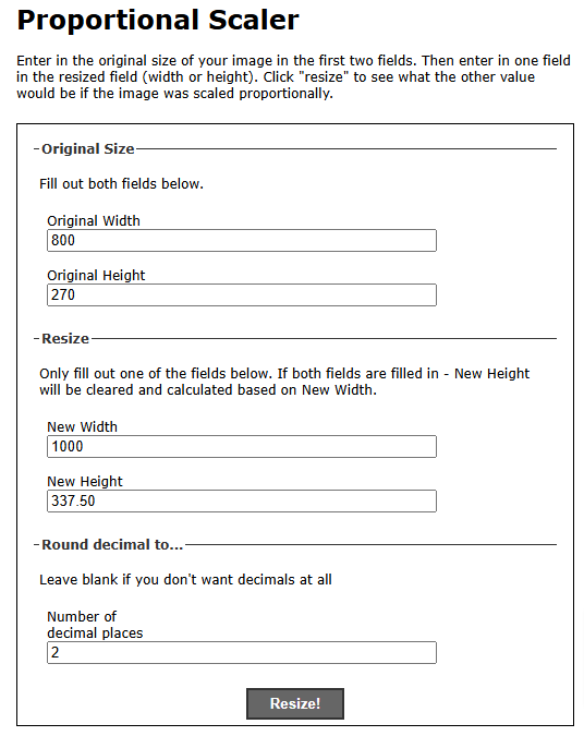
:root {
    --w: 800px;
    --h: 270px;
    --m: 15px;
    --thumbw: calc(var(--w)/4 - 15px);
    --thumbh: calc(50% - var(--m));
    --top: calc(var(--h)/2 + var(--m)/2 + 0px);
}

 * {
     margin: 0;
     padding: 0;
 }

 html {
     height: 100%;
     scroll-behavior: smooth;
 }

body {
    display: flex;
    flex-direction: column;
    height: 100%;
    font-family: monospace;
    place-content: center;
    background-size: 100% 100%;
    background-position: 0px 0px;
    background-image: radial-gradient(18% 28% at 24% 50%, #CEFAFFFF 7%,
 #073AFF00 100%), radial-gradient(18% 28% at 18% 71%, #FFFFFF59 6%,
#073AFF00 100%), radial-gradient(70% 53% at 36% 76%, #73F2FFFF 0%,
#073AFF00 100%), radial-gradient(42% 53% at 15% 94%, #FFFFFFFF 7%,
 #073AFF00 100%), radial-gradient(42% 53% at 34% 72%, #FFFFFFFF 7%,
 #073AFF00 100%), radial-gradient(18% 28% at 35% 87%, #FFFFFFFF 7%,
 #073AFF00 100%), radial-gradient(31% 43% at 7% 98%, #FFFFFFFF 24%,
 #073AFF00 100%), radial-gradient(21% 37% at 72% 23%, #D3FF6D9C 24%,
 #073AFF00 100%), radial-gradient(35% 56% at 91% 74%, #8A4FFFF5 9%,
 #073AFF00 100%), radial-gradient(74% 86% at 67% 38%, #84d9ff 24%,
 #073AFF00 100%), linear-gradient(125deg, #4EB5FFFF 1%, #4C00FCFF 100%);
}

 .wrapper {
     /* width: 860px; */
     /* height: 283px; */
     width: var(--w);
     height: var(--h);
     position: relative;
     margin: 0 auto;
 }

 .wrapper label {
     /* width: 200px; */
     width: var(--thumbw);
     height: calc(50% - var(--m) / 2);
     cursor: pointer;
     position: absolute;
     transition: 0.25s;
     border-radius: 10px;
 }

 .wrapper label img,
 .wrapper label div {
     max-width: 100%;
     height: 100%;
     border-radius: 10px;
 }

 .wrapper input[type="radio"] {
     padding: 5px 5px 5px 10px;
      /* width: 200px; */
     /* height: 134px; */
     height: calc(50% - var(--m) / 2);
     width: var(--thumbw);
     cursor: pointer;
     position: absolute;
     z-index: -1;
     opacity: 0;
 }

 .wrapper input[type="radio"]+label span {
     opacity: 0;
     background: var(--bg);
     display: inline-block;
     border-radius: 7px;
     padding: 5px 0 5px 10px;
     margin-top: 5px;
     width: calc(100% - 10px);
     color: white;
 }

 .wrapper input[type="radio"]:checked+label span {
     opacity: 1;
     animation-delay: 1s;
     animation: fade 1s;
 }

 .wrapper input[type="radio"]#s1,
 .wrapper input[type="radio"]#s1+label {
     left: 0;
     top: 0;
 }

 .wrapper input[type="radio"]#s2,
 .wrapper input[type="radio"]#s2+label {
     /* left: 440px; */
     left: calc((var(--w)/2) + var(--m));
     top: 0;
 }

 .wrapper input[type="radio"]#s3,
 .wrapper input[type="radio"]#s3+label {
     /* left: 655px; */
     left: calc(var(--w)/2 + var(--thumbw) + var(--m) + 15px);
     top: 0;
 }

 .wrapper input[type="radio"]#s4,
 .wrapper input[type="radio"]#s4+label {
     /* left: 440px; */
      /* top: 150px; */
     left: calc((var(--w)/2) + var(--m));
     top: var(--top);
 }

 .wrapper input[type="radio"]#s5,
 .wrapper input[type="radio"]#s5+label {
     /* left: 655px; */
      /* top: 150px; */
     left: calc(var(--w)/2 + var(--thumbw) + var(--m) + 15px);
     top: var(--top);
 }

 .wrapper input[type="radio"]:checked,
 .wrapper input[type="radio"]:checked+label {
     left: 0 !important;
     top: 0 !important;
     /* width: 425px; */
     width: calc(var(--w)/2);
     height: 100%;
 }

 .bg {
     position: fixed;
     left: 0;
     top: 0;
     width: 100vw;
     height: 100vh;
     z-index: -1;
 }

 .wrapper input[type="radio"]#s2:checked~#s1+label {
     /* left: 440px; */
     left: calc((var(--w)/2) + var(--m));
 }

 .wrapper input[type="radio"]#s3:checked~#s1+label {
     /* left: 660px; */
     left: calc(var(--w)/2 + var(--thumbw) + var(--m) + 15px);
 }

 .wrapper input[type="radio"]#s4:checked~#s1+label {
     /* left: 440px; */
      /* top: 150px; */
     left: calc((var(--w)/2) + var(--m));
     top: var(--top);
 }

 .wrapper input[type="radio"]#s5:checked~#s1+label {
     /* left: 660px; */
      /* top: 150px; */
     left: calc(var(--w)/2 + var(--thumbw) + var(--m)*2);
     top: var(--top);
 }


 @keyframes fade {
     from {
         opacity: 0;
     }

     to {
         opacity: 1;
     }
 }

 .wrapper input[type="radio"]#s2:checked~.bg {
     background-image: radial-gradient(circle, rgba(238, 174, 202, 1) 0%, rgba(148, 187, 233, 1) 100%);
 }

 .wrapper input[type="radio"]#s3:checked~.bg {
     background-image: radial-gradient(circle, rgb(197, 218, 196) 0%, rgb(88, 167, 204) 100%);
 }

 .wrapper input[type="radio"]#s4:checked~.bg {
     background-image: radial-gradient(circle, rgb(238, 226, 174) 0%, rgb(177, 139, 131) 100%);
 }

 .wrapper input[type="radio"]#s5:checked~.bg {
     background-image: radial-gradient(circle, rgb(174, 238, 225) 0%, rgb(36, 163, 136) 100%);
 }
Copy after loginNow in the :root {--w: 800px; --h: 270px;}. Just change the width and height proportionately. Go to url https://scriptygoddess.com/resources/proportioncalc.htm and type :root width and height shown in below image
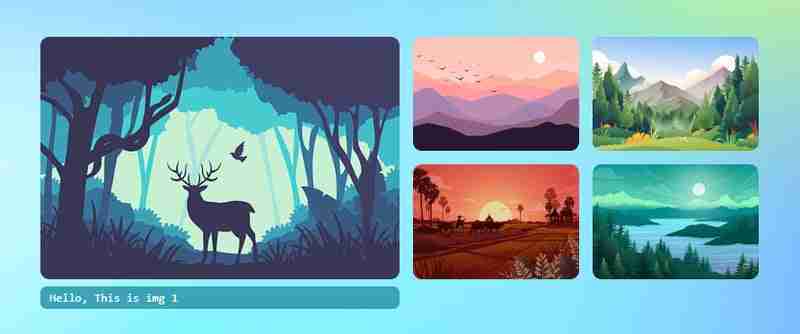
Now type new width or height to get proportionate value. I added my new width 1000 and clicked on resize and I got 337.5 as height and I assigned in :root {--w: 1000px; --h: 337.5px;}. That's all you have to do. You can see the change in all images - width, height, gaps increases proportionately.
You can edit the value of width and height in :root in below codepen link and run. Have fun!
Codepen DemoThank you for watching...
The above is the detailed content of Image Swap in Pure CSS. For more information, please follow other related articles on the PHP Chinese website!


Hot AI Tools

Undresser.AI Undress
AI-powered app for creating realistic nude photos

AI Clothes Remover
Online AI tool for removing clothes from photos.

Undress AI Tool
Undress images for free

Clothoff.io
AI clothes remover

Video Face Swap
Swap faces in any video effortlessly with our completely free AI face swap tool!

Hot Article
Hot Tools

Notepad++7.3.1
Easy-to-use and free code editor

SublimeText3 Chinese version
Chinese version, very easy to use

Zend Studio 13.0.1
Powerful PHP integrated development environment

Dreamweaver CS6
Visual web development tools

SublimeText3 Mac version
God-level code editing software (SublimeText3)
Hot Topics
 1664
1664
 14
1422
52
1316
25
1268
29
1240
24
14
1422
52
1316
25
1268
29
1240
24

 Google Fonts Variable Fonts
Apr 09, 2025 am 10:42 AM
Google Fonts Variable Fonts
Apr 09, 2025 am 10:42 AM
I see Google Fonts rolled out a new design (Tweet). Compared to the last big redesign, this feels much more iterative. I can barely tell the difference
 How to Create an Animated Countdown Timer With HTML, CSS and JavaScript
Apr 11, 2025 am 11:29 AM
How to Create an Animated Countdown Timer With HTML, CSS and JavaScript
Apr 11, 2025 am 11:29 AM
Have you ever needed a countdown timer on a project? For something like that, it might be natural to reach for a plugin, but it’s actually a lot more
 HTML Data Attributes Guide
Apr 11, 2025 am 11:50 AM
HTML Data Attributes Guide
Apr 11, 2025 am 11:50 AM
Everything you ever wanted to know about data attributes in HTML, CSS, and JavaScript.
 A Proof of Concept for Making Sass Faster
Apr 16, 2025 am 10:38 AM
A Proof of Concept for Making Sass Faster
Apr 16, 2025 am 10:38 AM
At the start of a new project, Sass compilation happens in the blink of an eye. This feels great, especially when it’s paired with Browsersync, which reloads
 How We Created a Static Site That Generates Tartan Patterns in SVG
Apr 09, 2025 am 11:29 AM
How We Created a Static Site That Generates Tartan Patterns in SVG
Apr 09, 2025 am 11:29 AM
Tartan is a patterned cloth that’s typically associated with Scotland, particularly their fashionable kilts. On tartanify.com, we gathered over 5,000 tartan
 How to Build Vue Components in a WordPress Theme
Apr 11, 2025 am 11:03 AM
How to Build Vue Components in a WordPress Theme
Apr 11, 2025 am 11:03 AM
The inline-template directive allows us to build rich Vue components as a progressive enhancement over existing WordPress markup.
 While You Weren't Looking, CSS Gradients Got Better
Apr 11, 2025 am 09:16 AM
While You Weren't Looking, CSS Gradients Got Better
Apr 11, 2025 am 09:16 AM
One thing that caught my eye on the list of features for Lea Verou's conic-gradient() polyfill was the last item:
 A Comparison of Static Form Providers
Apr 16, 2025 am 11:20 AM
A Comparison of Static Form Providers
Apr 16, 2025 am 11:20 AM
Let’s attempt to coin a term here: "Static Form Provider." You bring your HTML
