
 Web Front-end
JS Tutorial
How to build type-enforced UI components in React Native using @shopify/restyle
Web Front-end
JS Tutorial
How to build type-enforced UI components in React Native using @shopify/restyle
How to build type-enforced UI components in React Native using @shopify/restyle

It’s been quite some time since I wrote a technical post on my blog, and here’s a new one about building type-enforced UI components in React Native with @shopify/restyle and expo.
@shopify/restyle is a powerful styling library for React Native that brings type safety and consistency to your UI components. Unlike traditional styling approaches, Restyle allows you to create a centralized theme configuration that enforces design system principles across your entire application.
Getting Started
Project Setup
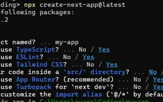
- Setup your react native project using expo
npx create-expo-app@latest
- Go to your project directory and install @shopify/restyle package using expo
cd /path/to/project
npx expo install @shopify/restyle
Creating Your Theme
Create a theme.tsx file to define your design system:
touch theme.tsx
- Copy and paste the default theme configuration
import {createTheme} from '@shopify/restyle';

const palette = {
  purpleLight: '#8C6FF7',
  purplePrimary: '#5A31F4',
  purpleDark: '#3F22AB',

  greenLight: '#56DCBA',
  greenPrimary: '#0ECD9D',
  greenDark: '#0A906E',

  black: '#0B0B0B',
  white: '#F0F2F3',
};

const theme = createTheme({
  colors: {
    mainBackground: palette.white,
    cardPrimaryBackground: palette.purplePrimary,
  },
  spacing: {
    s: 8,
    m: 16,
    l: 24,
    xl: 40,
  },
  textVariants: {
    header: {
      fontWeight: 'bold',
      fontSize: 34,
    },
    body: {
      fontSize: 16,
      lineHeight: 24,
    },
    defaults: {
      // We can define a default text variant here.
    },
  },
});

export type Theme = typeof theme;
export default theme;
Implementing Theme Provider
Update your app/_layout.tsx:
import { DarkTheme, DefaultTheme } from "@react-navigation/native";
import { useFonts } from "expo-font";
import { Stack } from "expo-router";
import * as SplashScreen from "expo-splash-screen";
import { StatusBar } from "expo-status-bar";
import { useEffect } from "react";
import "react-native-reanimated";

import { ThemeProvider } from "@shopify/restyle";
import theme from "@/theme";

// Prevent the splash screen from auto-hiding before asset loading is complete.
SplashScreen.preventAutoHideAsync();

export default function RootLayout() {
  const [loaded] = useFonts({
    SpaceMono: require("../assets/fonts/SpaceMono-Regular.ttf"),
  });

  useEffect(() => {
    if (loaded) {
      SplashScreen.hideAsync();
    }
  }, [loaded]);

  if (!loaded) {
    return null;
  }

  return (
    <ThemeProvider theme={theme}>
      <Stack>
        <Stack.Screen name="(tabs)" options={{ headerShown: false }} />
        <Stack.Screen name="+not-found" />
      </Stack>
      <StatusBar>


<h2>


  Creating Reusable Components
</h2>

<h3>


  Text Component
</h3>


<pre class="brush:php;toolbar:false">touch components/Text.tsx
// In components/Text.tsx

import {createText} from '@shopify/restyle';
import {Theme} from '../theme';

export const Text = createText<Theme>();
Let’s use it in our home screen
import { Text } from "@/components/Text";
import { SafeAreaView } from "react-native-safe-area-context";

export default function HomeScreen() {
  return (
    <SafeAreaView>
      <Text margin="m" variant="header">
        This is the Home screen. Built using @shopify/restyle.
      </Text>
    </SafeAreaView>
  );
}
As you can see in the code above, we’re passing margin as a “m” instead of a number. We’re getting the value from our theme.tsxfile.
// ./theme.tsx

const theme = createTheme({
  spacing: {
    s: 8,
    m: 16, // margin="m"
    l: 24,
    xl: 40,
  },
  textVariants: {
    header: { // our text header variant
      fontWeight: 'bold',
      fontSize: 34,
    },
    body: {
      fontSize: 16,
      lineHeight: 24,
    },
  },
    // ...rest of code
  },
});
This how our the home page view will looks

Skeleton Loader Component
Let’s build a Skeleton Loader card
touch components/SkeletonLoader.tsx
// components/SkeletonLoader.tsx

import {
  BackgroundColorProps,
  createBox,
  createRestyleComponent,
  createVariant,
  spacing,
  SpacingProps,
  VariantProps,
} from "@shopify/restyle";
import { Theme } from "@/theme";
import { View } from "react-native";

const Box = createBox<Theme>();

type Props = SpacingProps<Theme> &
  VariantProps<Theme, "cardVariants"> &
  BackgroundColorProps<Theme> &
  React.ComponentProps<typeof View>;

const CardSkeleton = createRestyleComponent<Props, Theme>([
  spacing,
  createVariant({ themeKey: "cardVariants" }),
]);

const SkeletonLoader = () => {
  return (
    <CardSkeleton variant="elevated">
      <Box
        backgroundColor="cardPrimaryBackground"
        height={20}
        marginBottom="s"
        width="70%"
        overflow="hidden"
        borderRadius={"m"}
      >
      </Box>

      <Box
        backgroundColor="cardPrimaryBackground"
        height={100}
        marginBottom="s"
        width="90%"
        overflow="hidden"
        borderRadius={"m"}
      >
      </Box>
      <Box
        backgroundColor="cardPrimaryBackground"
        height={50}
        marginBottom="s"
        width="70%"
        overflow="hidden"
        borderRadius={"m"}
      >
      </Box>
    </CardSkeleton>
  );
};

export default SkeletonLoader;
- We create a new box as a predefined component from @shopify/restyle package and this will how us to create the Skeleton Box
const Box = createBox<Theme>();
- Create a new CardSkeleton component using the createStyleComponent to create a custom component and we passed props which are spacing and cardVariants that we have to define in our theme.tsx file
type Props = SpacingProps<Theme> &
  VariantProps<Theme, "cardVariants"> &
  BackgroundColorProps<Theme> &
  React.ComponentProps<typeof View>;

const CardSkeleton = createRestyleComponent<Props, Theme>([
  spacing,
  createVariant({ themeKey: "cardVariants" }),
]);
- Create a SkeletonLoader Component to render our Skelton Card component
// components/SkeletonLoader.tsx

export const SkeletonLoader = () => {
  return (
    <CardSkeleton variant="elevated">
      <Box
        backgroundColor="cardPrimaryBackground"
        height={20}
        marginBottom="s"
        width="70%"
        overflow="hidden"
        borderRadius={"m"}
      ></Box>

      <Box
        backgroundColor="cardPrimaryBackground"
        height={100}
        marginBottom="s"
        width="90%"
        overflow="hidden"
        borderRadius={"m"}
      ></Box>
      <Box
        backgroundColor="cardPrimaryBackground"
        height={50}
        marginBottom="s"
        width="70%"
        overflow="hidden"
        borderRadius={"m"}
      ></Box>
    </CardSkeleton>
  );
};
We have one thing left to make it working, update theme.tsxfile to have cardVariants
const theme = createTheme({
  colors: {
    // Add Black Color to use it later on
    black: palette.black,
  },
  // Add Border Radius Variants
  borderRadii: {
    s: 4,
    m: 10,
    l: 25,
    xl: 75,
  },
  // Add Card Variants
  cardVariants: {
    elevated: {
      shadowColor: "black",
      shadowOffset: { width: 0, height: 2 },
      shadowOpacity: 0.1,
      shadowRadius: 4,
      elevation: 3,
      borderRadius: "m",
    },
    defaults: {
      padding: "m",
      borderRadius: "m",
    },
  },
});
That’s great, but let’s animation to our component
// components/SkeletonLoader.tsx

const ShimmerAnimation = () => {
  const shimmerTranslate = useRef(new Animated.Value(0)).current;

  useEffect(() => {
    Animated.loop(
      Animated.timing(shimmerTranslate, {
        toValue: 1,
        duration: 1500,
        useNativeDriver: true,
      })
    ).start();
  }, [shimmerTranslate]);

  const translateX = shimmerTranslate.interpolate({
    inputRange: [0, 1],
    outputRange: [-300, 300],
  });

  return (
    <Animated.View
     >


<p>and let’s use it in our Skeleton Loader Component<br>
</p>

<pre class="brush:php;toolbar:false">// components/SkeletonLoader.tsx

export const SkeletonLoader = () => {
  return (
    <CardSkeleton variant="elevated">
      <Box
        backgroundColor="cardPrimaryBackground"
        height={20}
        marginBottom="s"
        width="70%"
        overflow="hidden"
        borderRadius={"m"}
      >
        <ShimmerAnimation />
      </Box>

      <Box
        backgroundColor="cardPrimaryBackground"
        height={100}
        marginBottom="s"
        width="90%"
        overflow="hidden"
        borderRadius={"m"}
      >
        <ShimmerAnimation />
      </Box>
      <Box
        backgroundColor="cardPrimaryBackground"
        height={50}
        marginBottom="s"
        width="70%"
        overflow="hidden"
        borderRadius={"m"}
      >
        <ShimmerAnimation />
      </Box>
    </CardSkeleton>
  );
};
And here’s the full component code:
// components/SkeletonLoader.tsx

import { useEffect, useRef } from "react";
import { Animated } from "react-native";
import {
  BackgroundColorProps,
  createBox,
  createRestyleComponent,
  createVariant,
  spacing,
  SpacingProps,
  VariantProps,
} from "@shopify/restyle";
import { Theme } from "@/theme";
import { View } from "react-native";

const Box = createBox<Theme>();

const ShimmerAnimation = () => {
  const shimmerTranslate = useRef(new Animated.Value(0)).current;

  useEffect(() => {
    Animated.loop(
      Animated.timing(shimmerTranslate, {
        toValue: 1,
        duration: 1500,
        useNativeDriver: true,
      })
    ).start();
  }, [shimmerTranslate]);

  const translateX = shimmerTranslate.interpolate({
    inputRange: [0, 1],
    outputRange: [-300, 300],
  });

  return (


Et voila, we made a skeleton loader card using @shopify/restyle using


  Support for dark mode


Let’s start with adding dark theme configuration, in your theme.tsxfile


// theme.tsx

export const darkTheme: Theme = {
  ...theme,
  colors: {
    ...theme.colors,
    mainBackground: palette.white,
    cardPrimaryBackground: palette.purpleDark,
    greenPrimary: palette.purpleLight,
  },
  textVariants: {
    ...theme.textVariants,
    defaults: {
      ...theme.textVariants.header,
      color: palette.purpleDark,
    },
  },
Copy after login 
Add our dark theme configuration in our app layout by adding it to our layout.tsx file
npx create-expo-app@latest
- Based on the color schema, use the default light theme or in dark mode use the darkTheme config defined in theme.tsx file
 // app/_layout.tsx

 import theme, { darkTheme } from "@/theme";

 //... rest of the code

    <ThemeProvider theme={colorSchema === "dark" ? darkTheme : theme}>
      <Stack>
        <Stack.Screen name="(tabs)" options={{ headerShown: false }} />
        <Stack.Screen name=" not-found" />
      </Stack>
      <StatusBar>


<p>Here’s it dark and light mode.</p>

<p><img src="/static/imghw/default1.png" data-src="https://img.php.cn/upload/article/000/000/000/173310152340178.jpg" class="lazy" alt="How to build type-enforced UI components in React Native using @shopify/restyle"></p>

<p><img src="/static/imghw/default1.png" data-src="https://img.php.cn/upload/article/000/000/000/173310152557660.jpg" class="lazy" alt="How to build type-enforced UI components in React Native using @shopify/restyle"></p>

<p>Et voila, we managed to create type-enforced UI component using @shopify/restyle package</p>

<p>Thank you :)</p>
The above is the detailed content of How to build type-enforced UI components in React Native using @shopify/restyle. For more information, please follow other related articles on the PHP Chinese website!

Hot AI Tools

Undresser.AI Undress
AI-powered app for creating realistic nude photos

AI Clothes Remover
Online AI tool for removing clothes from photos.

Undress AI Tool
Undress images for free

Clothoff.io
AI clothes remover

Video Face Swap
Swap faces in any video effortlessly with our completely free AI face swap tool!

Hot Article
Hot Tools

Notepad++7.3.1
Easy-to-use and free code editor

SublimeText3 Chinese version
Chinese version, very easy to use

Zend Studio 13.0.1
Powerful PHP integrated development environment

Dreamweaver CS6
Visual web development tools

SublimeText3 Mac version
God-level code editing software (SublimeText3)
Hot Topics
 1663
1663
 14
1420
52
1315
25
1266
29
1239
24
14
1420
52
1315
25
1266
29
1239
24

 Demystifying JavaScript: What It Does and Why It Matters
Apr 09, 2025 am 12:07 AM
Demystifying JavaScript: What It Does and Why It Matters
Apr 09, 2025 am 12:07 AM
JavaScript is the cornerstone of modern web development, and its main functions include event-driven programming, dynamic content generation and asynchronous programming. 1) Event-driven programming allows web pages to change dynamically according to user operations. 2) Dynamic content generation allows page content to be adjusted according to conditions. 3) Asynchronous programming ensures that the user interface is not blocked. JavaScript is widely used in web interaction, single-page application and server-side development, greatly improving the flexibility of user experience and cross-platform development.
 The Evolution of JavaScript: Current Trends and Future Prospects
Apr 10, 2025 am 09:33 AM
The Evolution of JavaScript: Current Trends and Future Prospects
Apr 10, 2025 am 09:33 AM
The latest trends in JavaScript include the rise of TypeScript, the popularity of modern frameworks and libraries, and the application of WebAssembly. Future prospects cover more powerful type systems, the development of server-side JavaScript, the expansion of artificial intelligence and machine learning, and the potential of IoT and edge computing.
 JavaScript Engines: Comparing Implementations
Apr 13, 2025 am 12:05 AM
JavaScript Engines: Comparing Implementations
Apr 13, 2025 am 12:05 AM
Different JavaScript engines have different effects when parsing and executing JavaScript code, because the implementation principles and optimization strategies of each engine differ. 1. Lexical analysis: convert source code into lexical unit. 2. Grammar analysis: Generate an abstract syntax tree. 3. Optimization and compilation: Generate machine code through the JIT compiler. 4. Execute: Run the machine code. V8 engine optimizes through instant compilation and hidden class, SpiderMonkey uses a type inference system, resulting in different performance performance on the same code.
 Python vs. JavaScript: The Learning Curve and Ease of Use
Apr 16, 2025 am 12:12 AM
Python vs. JavaScript: The Learning Curve and Ease of Use
Apr 16, 2025 am 12:12 AM
Python is more suitable for beginners, with a smooth learning curve and concise syntax; JavaScript is suitable for front-end development, with a steep learning curve and flexible syntax. 1. Python syntax is intuitive and suitable for data science and back-end development. 2. JavaScript is flexible and widely used in front-end and server-side programming.
 JavaScript: Exploring the Versatility of a Web Language
Apr 11, 2025 am 12:01 AM
JavaScript: Exploring the Versatility of a Web Language
Apr 11, 2025 am 12:01 AM
JavaScript is the core language of modern web development and is widely used for its diversity and flexibility. 1) Front-end development: build dynamic web pages and single-page applications through DOM operations and modern frameworks (such as React, Vue.js, Angular). 2) Server-side development: Node.js uses a non-blocking I/O model to handle high concurrency and real-time applications. 3) Mobile and desktop application development: cross-platform development is realized through ReactNative and Electron to improve development efficiency.
 How to Build a Multi-Tenant SaaS Application with Next.js (Frontend Integration)
Apr 11, 2025 am 08:22 AM
How to Build a Multi-Tenant SaaS Application with Next.js (Frontend Integration)
Apr 11, 2025 am 08:22 AM
This article demonstrates frontend integration with a backend secured by Permit, building a functional EdTech SaaS application using Next.js. The frontend fetches user permissions to control UI visibility and ensures API requests adhere to role-base
 From C/C to JavaScript: How It All Works
Apr 14, 2025 am 12:05 AM
From C/C to JavaScript: How It All Works
Apr 14, 2025 am 12:05 AM
The shift from C/C to JavaScript requires adapting to dynamic typing, garbage collection and asynchronous programming. 1) C/C is a statically typed language that requires manual memory management, while JavaScript is dynamically typed and garbage collection is automatically processed. 2) C/C needs to be compiled into machine code, while JavaScript is an interpreted language. 3) JavaScript introduces concepts such as closures, prototype chains and Promise, which enhances flexibility and asynchronous programming capabilities.
 Building a Multi-Tenant SaaS Application with Next.js (Backend Integration)
Apr 11, 2025 am 08:23 AM
Building a Multi-Tenant SaaS Application with Next.js (Backend Integration)
Apr 11, 2025 am 08:23 AM
I built a functional multi-tenant SaaS application (an EdTech app) with your everyday tech tool and you can do the same. First, what’s a multi-tenant SaaS application? Multi-tenant SaaS applications let you serve multiple customers from a sing
