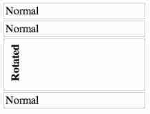
In this article, we'll explore the challenge of rotating certain elements within columns without distorting their parent's height. Let's consider an example with four columns, where we want to rotate the values in one of them as shown below:
<div class="container">
    <div class="statusColumn"><span>Normal</span></div>
    <div class="statusColumn"><a>Normal</a></div>
    <div class="statusColumn"><b>Rotated</b></div>
    <div class="statusColumn"><abbr>Normal</abbr></div>
</div>Using the following CSS:
.statusColumn b {
  writing-mode: tb-rl;
  white-space: nowrap;
  display: inline-block;
  overflow: visible;
  transform: rotate(-90deg);
  transform-origin: 50% 50%;
}This results in a rotated element that overlaps with the other columns:

Objective: To achieve a result where the rotated element's size still contributes to its parent's height, preventing text overlap:

Solution:
As pointed out by G-Cyr, modern browsers offer decent support for writing-mode. By combining writing-mode with a simple rotation, we can achieve the desired result:
.statusColumn {
  position: relative;
  border: 1px solid #ccc;
  padding: 2px;
  margin: 2px;
  width: 200px;
}

.statusColumn i,
.statusColumn b,
.statusColumn em,
.statusColumn strong {
  writing-mode: vertical-rl;
  transform: rotate(180deg);
  white-space: nowrap;
  display: inline-block;
  overflow: visible;
}This code sets the rotated elements' writing mode to "vertical-rl," ensuring that the text flows vertically after rotating 180 degrees. It also enables proper wrapping and avoids text overlap.
The above is the detailed content of How to Accurately Maintain Parent Height When Rotating CSS Elements?. For more information, please follow other related articles on the PHP Chinese website!


