

Floating Cats and Cubes

I couldn't wait to have some "free" time so I could add styling to my project. Something about a little bit of interactivity adds life to the page.
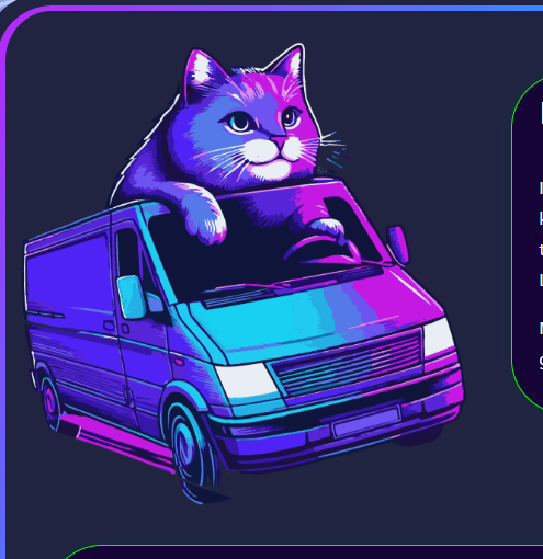
You want a floating cat? No problem. I made an image of a cat using AI and extracted the background in Illustator "by hand" to get a nice cut-out effect for my .png image. Bam. Cat.
Lets make him move a little bit so it looks like he's floating. One of my favorite CSS animations is orbit. It is really useful and you can do a lot with it.
Cat
In the view, I bring the image of my cat in and assign it the class "cat"
<%= image_tag "favicon.png", alt:"vendor booth", width:"40%", height:"40%", class:"cat" %>
Now, in my css file, I build my style for "cat". In cat, we call our animation, orbit, as shown below.
.cat {
  animation: orbit 3s infinite linear;
}

@keyframes orbit {
  from {
    transform: rotate(0deg) translateX(15px) rotate(0deg);
  }
  to {
    transform: rotate(360deg) translateX(15px) rotate(-360deg);
  }
}
You see here that we are "rotating the cat starting at an angle of 0 degrees", at 15px away from the x-origin, starting at 0 degrees.
The cat goes a full circle to 360 degrees, at 15px away, all the way around. The second rotation of -360 is canceling out the first rotation, to keep the cat upright. It's easier if you just see the animation. XD.
We are just moving him a tiny amount, as we don't want him flying all over the page. Just enough to be exciting.
A little bit to the left,
A little bit to the right.

Magic!
Cube
I had previously learned how to create a cube with css. While that's fine and dandy, I got the wild hair idea today about re-using the cube in a dynamic way. I wanted to populate the cube faces with data in real time. Like say, the next few upcoming events. As like a fun discovering thing on the landing page. Why not. This is exciting.
So as anything, I build out the skeleton in the view. Our cube needs a home after all.
I've got some radio buttons so the user can interact with the cube.
Each radio button will show a different cube face.
I add the information I want to display on each face in a loop:
  <div>


<hr>

<p>Handling the css is a bit of a dance. Especially with viewports and what not. This is not the answer for mobile but it will work and be functional on a bigger screen, LOL. I'm just gonna leave this here for you. Open to suggestions for handling a small screen size. <br>
</p>
<hr>


<p><img src="/static/imghw/default1.png" data-src="https://img.php.cn/upload/article/000/000/000/173429456116557.jpg" class="lazy" alt="Floating Cats and Cubes"><br>
<br><br>
</p>

<pre class="brush:php;toolbar:false">
/*===========
rotating cube
==============*/

.cube-container {
  width: 30vw;
  height: 40vh;
  text-align: center;
  perspective: 100em;
}

.cube {
  width: 100%;
  height: 100%;
  position: relative;
  transform-style: preserve-3d;
  transition-duration: 2s;
  border: 5px solid transparent;
  margin-top:100px;
  display: block;
}

.cube-side {
  position: absolute;
  width: 300px;
  height: 300px;
  background-color: rgb(64, 0, 148);
  border: 1px solid white;
  background-position: center;
  background-size: cover;
  border: 4px solid lime;
}

.cube-side:nth-child(1){
  transform: rotateY(0deg) translateZ(10em);
}

.cube-side:nth-child(2){
  transform: rotateY(90deg) translateZ(10em);
}

.cube-side:nth-child(3){
  transform: rotateY(180deg) translateZ(10em);
}

.cube-side:nth-child(4){
  transform: rotateY(-90deg) translateZ(10em);
}

.cube-side:nth-child(5){
  transform: rotateX(90deg) translateZ(9.75em);
  border-top: 8px solid lime;
  border-bottom: 8px solid lime;
}

.cube-side:nth-child(6){
  transform: rotateX(-90deg) translateZ(9.3em);
  border-top: 8px solid lime;
  border-bottom: 8px solid lime;
}


/* cube radio buttons */

.radio-button {
  transform: translateX(-50px);
}

.radio-button:checked ~ .cube{
  transition-duration: 3s;
  transition-timing-function: cubic-bezier(0.19. 1, 0.22, 1);
}

.radio-button:nth-child(1):checked ~ .cube {
  transform: rotateX(-15deg) rotateY(20deg);
}

.radio-button:nth-child(2):checked ~ .cube {
  transform: rotateX(-15deg) rotateY(180deg);
}

.radio-button:nth-child(3):checked ~ .cube {
  transform: rotateX(-15deg) rotateY(90deg);
}

.radio-button:nth-child(4):checked ~ .cube {
  transform: rotateX(-15deg) rotateY(-90deg);
}

.radio-button:nth-child(5):checked ~ .cube {
  transform: rotateX(-105deg) rotateY(0deg);
}

.radio-button:nth-child(6):checked ~ .cube {
  transform: rotateX(75deg) rotateY(0deg);
}
Each button and side is being handled individually. I'd love to see a more elegant solution if it exists.
I'm just really excited it worked.
Thanks for looking!
The above is the detailed content of Floating Cats and Cubes. For more information, please follow other related articles on the PHP Chinese website!

Hot AI Tools

Undresser.AI Undress
AI-powered app for creating realistic nude photos

AI Clothes Remover
Online AI tool for removing clothes from photos.

Undress AI Tool
Undress images for free

Clothoff.io
AI clothes remover

AI Hentai Generator
Generate AI Hentai for free.

Hot Article
Hot Tools

Notepad++7.3.1
Easy-to-use and free code editor

SublimeText3 Chinese version
Chinese version, very easy to use

Zend Studio 13.0.1
Powerful PHP integrated development environment

Dreamweaver CS6
Visual web development tools

SublimeText3 Mac version
God-level code editing software (SublimeText3)
Hot Topics
 1376
1376
 52
52

 Working With GraphQL Caching
Mar 19, 2025 am 09:36 AM
Working With GraphQL Caching
Mar 19, 2025 am 09:36 AM
If you’ve recently started working with GraphQL, or reviewed its pros and cons, you’ve no doubt heard things like “GraphQL doesn’t support caching” or
 Making Your First Custom Svelte Transition
Mar 15, 2025 am 11:08 AM
Making Your First Custom Svelte Transition
Mar 15, 2025 am 11:08 AM
The Svelte transition API provides a way to animate components when they enter or leave the document, including custom Svelte transitions.
 Show, Don't Tell
Mar 16, 2025 am 11:49 AM
Show, Don't Tell
Mar 16, 2025 am 11:49 AM
How much time do you spend designing the content presentation for your websites? When you write a new blog post or create a new page, are you thinking about
 Building an Ethereum app using Redwood.js and Fauna
Mar 28, 2025 am 09:18 AM
Building an Ethereum app using Redwood.js and Fauna
Mar 28, 2025 am 09:18 AM
With the recent climb of Bitcoin’s price over 20k $USD, and to it recently breaking 30k, I thought it’s worth taking a deep dive back into creating Ethereum
 What the Heck Are npm Commands?
Mar 15, 2025 am 11:36 AM
What the Heck Are npm Commands?
Mar 15, 2025 am 11:36 AM
npm commands run various tasks for you, either as a one-off or a continuously running process for things like starting a server or compiling code.
 How do you use CSS to create text effects, such as text shadows and gradients?
Mar 14, 2025 am 11:10 AM
How do you use CSS to create text effects, such as text shadows and gradients?
Mar 14, 2025 am 11:10 AM
The article discusses using CSS for text effects like shadows and gradients, optimizing them for performance, and enhancing user experience. It also lists resources for beginners.(159 characters)
 Creating Your Own Bragdoc With Eleventy
Mar 18, 2025 am 11:23 AM
Creating Your Own Bragdoc With Eleventy
Mar 18, 2025 am 11:23 AM
No matter what stage you’re at as a developer, the tasks we complete—whether big or small—make a huge impact in our personal and professional growth.
 Let's use (X, X, X, X) for talking about specificity
Mar 24, 2025 am 10:37 AM
Let's use (X, X, X, X) for talking about specificity
Mar 24, 2025 am 10:37 AM
I was just chatting with Eric Meyer the other day and I remembered an Eric Meyer story from my formative years. I wrote a blog post about CSS specificity, and
