THere are multiple options on how to show extra content your user needs, such as forms for creating new records or editing existing ones. UI/UX best practices are to not clutter the screen with unnecessary options unless the user really needs them.
Because of that, there are different types of dialogs you can show to your user, like modals, drawers, and so on.
One drawback of modals is that they hide content. They are great for when users want to create new records, but not when they edit existing records.
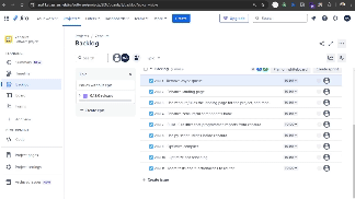
If you ever used Jira, you probably noticed their unique collapsible content panel in the backlog section. How did they do it?
Here is what I am talking about:

I have achieved the same behavior with the Layout and Sider components from Ant Design in React; here is the sandbox:
https://codesandbox.io/p/sandbox/responsive-persistent-modal-97s3fd
If you are using something other than React & Ant Design. Here is the catch: it's just a sidebar on the right with a collapse width of 0.
BR
Ahmed.
The above is the detailed content of How to Build a Collapsible Side Content in React, Inspired by Jira. For more information, please follow other related articles on the PHP Chinese website!


